How to Choose Abstract Mural Wallpaper
Judge shape, movement, colour balance, scale and visual rhythm rather than searching for a literal subject.
Article focus: pricing and measurement
The cost and measurement decision
Start with accurate wall measurements; the final custom mural price depends on area, material and any finishing options.
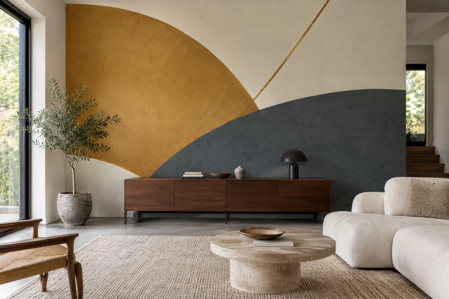
Example application: Living room · pricing and measurement
Abstract mural wallpaper is easiest to choose when you stop asking what the image “is” and start asking how its shapes behave on the wall. Broad curves can soften a room of straight furniture; a diagonal can add movement; a quiet colour field can connect several materials without depicting a literal scene. Scale, contrast, negative space and crop matter more than a general abstract label. A strong design should still make sense after a sofa, cabinet or doorway covers part of it.
Name the visual structure
Look at the mural from a distance and describe its main forms. Is it built from overlapping arcs, straight blocks, loose brush marks or a single gradient? Where does the eye enter and where does it stop? Is there one clear focal area or activity spread evenly across the surface? These questions turn a subjective first impression into something you can compare with the actual room.
An abstract made of a few large shapes may feel calm despite strong colour. A pale image full of tiny intersecting lines may feel busy. Do not use saturation as the only measure of visual intensity. Pattern density, edge sharpness and direction of movement all affect the result. View the entire image at room scale, not just a close crop that highlights attractive detail.
If the artwork suggests stone, plaster or fabric, remember that the finished mural is a flat print unless the product specifies a physical texture. Judge the visual effect on its own terms rather than expecting the wall to acquire the material shown in the image.
Try reading the whole design as a small rectangle before comparing colours. Does one movement remain obvious, or does the wall become an even field? Neither result is automatically wrong. The first may provide a focal point across a living room; the second may make a better background for art and shelving. Enlarge the preview afterwards to inspect the quiet areas. A beautiful corner cannot rescue a composition that loses its main gesture on the intended wall.
Choose scale against furniture
One large arc behind a low sideboard can act as a clear focal point. The same arc behind a tall bookcase may be reduced to disconnected fragments. A tight repeat can tolerate furniture changes, while a single composition depends on precise placement. Put the room's major furniture silhouettes over a full-wall mock-up before ordering.
Scale also changes the experience from different positions. Across a living room, broad forms remain legible. In a narrow hallway, they may be too large to take in at once; a smaller rhythm or more open ground may work better. In a dining room, the mural is viewed both standing and seated, and a pendant can obscure its centre. Test those real sightlines.
Do not assume an abstract can be cropped anywhere just because it lacks a literal object. Its balance may depend on a specific proportion of ochre to slate, or on one diagonal ending at the edge. A narrow crop can turn a thoughtful composition into one oversized colour block.
The feature-room example illustrates the point. A broad ochre curve begins high on the left, a dark slate sweep anchors the lower right, and a fine diagonal connects the open ivory ground between them. The sideboard hides some of the lower mural, but the large forms remain readable. If the same artwork were shifted so the ochre curve sat entirely behind the sideboard, the room would lose the visual counterweight that makes the dark sweep feel balanced.
Distinguish enlarging from repositioning. Enlarging the file makes every mark bigger and may leave less of the composition visible. Moving a crop changes which part of the artwork occupies the wall without necessarily making its marks larger. Compare both operations at the actual wall ratio. If one decisive curve must be cut by the ceiling while another ends at a door, a different artwork may be more coherent than either adjustment.
Let the room's lines guide the wall
Rectangular cabinets, shelves and windows create a lot of straight geometry. A curved mural can relieve that structure. A room with a rounded sofa, circular table and arched doorway may benefit from a more linear abstract, or from curves at a noticeably different scale. Exact repetition of the room's shapes can look too literal. A useful relationship may be contrast rather than match.
Direction matters. A strong diagonal can draw the eye across a wall and towards another feature. A horizontal band may connect a long sofa and low table. A vertical form can emphasise a tall wall. These are compositional effects, not guarantees that the architecture will physically appear altered. Try the mural in a photograph of your own room to see whether its movement helps or competes.
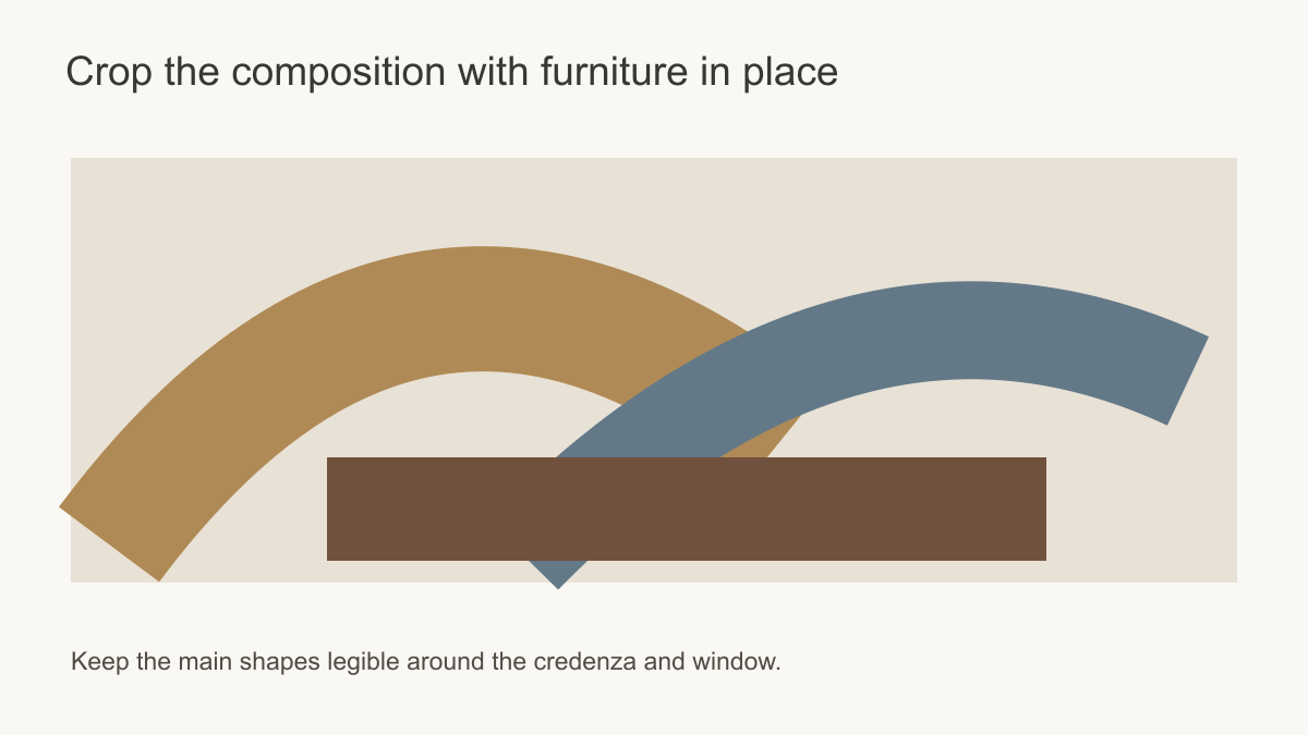 Protect the artwork's visual balance when cropping around real objects.
Use colour with clear roles
A three-colour abstract can look more complex than a detailed landscape because its colour areas are large and distinct. Decide which hue dominates, which supports it and which provides contrast. If the room has a walnut sideboard, an ochre form may connect with its warmth, while a slate form gives separation. A warm ivory ground may keep both from feeling heavy. The exact answer depends on the room's existing materials and light.
Compare printed samples with floor, upholstery, timber and paint. Screen colour can mislead, especially when the artwork includes near-neutrals or subtle tonal transitions. A sample confirms print appearance but not the overall wall balance. Use a full-wall mock-up for the latter.
Resist the urge to repeat every mural colour in cushions and accessories. One or two small connections can make the wall feel integrated. If every item matches a shape in the print, the room can become over-coordinated. Natural timber, stone or linen can be useful neutral partners because they bring their own variation without another graphic pattern.
Think in areas, not just swatches. An ochre chip beside a timber floor may look restrained, while an ochre shape covering a third of the wall becomes a major room colour. In the pictured living room, ivory gives the eye a pause between ochre and slate. A crop that removes much of the ivory would make the same three colours feel denser. Decide which area should dominate before choosing matching accessories.
Choose what the abstract should do
Set three candidates at the same wall size: one broad arc with open ground, a field of small blocks and a tonal wash without a hard centre. The arc can make an otherwise plain wall into a single piece of artwork, but it needs its curve to remain legible. The blocks create distributed rhythm and tolerate some furniture movement, yet introduce many more edges. The wash contributes atmosphere behind bookshelves or existing art, though it may not establish a focal point on an empty wall.
Check the spaces between forms as carefully as the forms. In the feature image, an ivory interval separates the ochre curve from the slate sweep. That gap allows two strong shapes to coexist. If a cabinet covers it, the wall may read as one dense band. A block field depends less on one interval; a wash depends less on any single edge. Choose according to how permanent the room's furniture and openings are, rather than assuming all abstracts are equally flexible.
Overlay each candidate with the same furniture silhouette and look from the normal seat. A diagonal cut by a lamp can become a broken line; an arc divided by a doorway may become an unexplained fragment. This check concerns the internal gesture of a particular image. The broader geometry-versus-abstract comparison addresses when a repeated geometric order or a freer abstract language is preferable.
Know when a design is too quiet or too busy
A pale tonal wash can be the right choice when a room already contains patterned curtains, a strong rug or a gallery wall. Yet on a long, almost empty wall it may have too little structure to establish a focal point. Conversely, a lively composition can give a sparse room energy but may overwhelm a wall already interrupted by doors and built-in storage. Photograph the room without artwork and mark its existing high-contrast areas. If the proposed mural adds a second competing centre of attention, try a calmer crop or a different wall.
Negative space is functional. It can give a floor lamp, artwork or shelving an uncluttered background and keep the mural's main shapes from colliding with real objects. But empty ground needs to be in the right place: a broad quiet margin behind a sofa may be helpful, while an accidental blank strip beside a door may make the whole image appear off-centre. The useful question is where the quiet area lands after the room's objects are drawn over the print.
Make the wall-scale decision first
Before approving an abstract, name the one relationship it must keep: the turn of an arc, the rhythm between blocks or a gradual change of tone. Preview that relationship at the measured wall ratio with doors, furniture and lamps in place. If fixed interruptions remove it, try another placement or a more distributed composition. A different colour cannot repair a broken gesture. Once the structure works, use a printed sample to assess the actual tones beside the room's timber, stone and upholstery.