Warm or Cool Mural Wallpaper Colours: How to Choose
Compare undertones, daylight, flooring, trim and furnishings before deciding whether a warm or cool palette suits the room.
Article focus: installation and removal
The installation choice in practice
The right installation method depends on the chosen material and wall condition, so prepare the wall before ordering and follow the material-specific instructions.
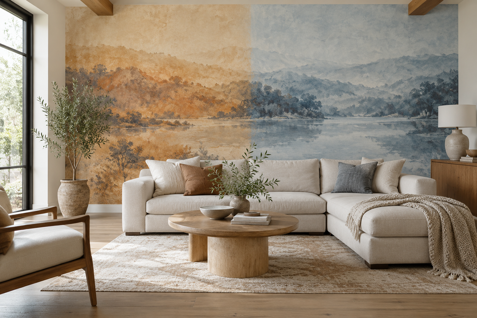
Example application: Living room · installation and removal
Choosing between warm and cool mural colours is not a vote for one side of a colour wheel. The decision depends on the room's fixed materials, the light at the intended wall and the atmosphere you want to create. A clay-and-ochre landscape may sit naturally with oak and cream; a mist-blue scene may give the same room a useful counterpoint. Neither is universally right. Compare the mural in the complete furnished room rather than judging its hue on a white product page.
Compare equivalent scenes before choosing a temperature
A warm clay panorama and a cool blue panorama can be compared meaningfully when their lightness, subject and amount of detail are similar. A pale peach wash against a dense navy forest is a poor test of temperature: one mural may win simply because it is lighter or has more empty space. Keep the room photograph, furniture and wall crop constant while changing only the candidate artwork.
Look at what occupies most of the printed wall. A blue leaf on an ivory ground may still make the wall feel predominantly warm; a blue ground with a few ochre leaves will read differently from across the room. The split-wall feature image is an illustrative comparison of two colour directions, not a proposal to combine them in one mural. Against the same timber furniture, the clay side continues the room's warmth while the blue side creates contrast. Neither effect is an upgrade by itself.
After the first comparison, try a second candidate in the more promising colour direction. If the warm landscape relates well to the room but its horizon falls behind a sofa, another warm image may solve the crop problem without reopening the entire colour decision. Keep a note of why each option was rejected: an undertone mismatch, an unsuitable focal point and insufficient contrast call for different corrections.
Some greens, greys and creams have a less obvious temperature than their label suggests. The undertone guide examines those printed backgrounds against fixed finishes. Here the decision is broader: whether the mural continues the room's existing warmth, deliberately contrasts with it or bridges warm and cool elements already present.
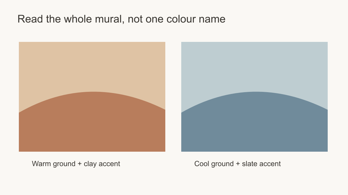 Judge the dominant ground and the accents separately.
Begin with what the room already has
Flooring, kitchen cabinetry, stone, large upholstery and window frames are harder to change than cushions. Put those fixed elements at the centre of the decision. A honey-coloured timber floor can be repeated by a warm landscape, producing a continuous gentle scheme. Or it can be balanced by a muted blue mural, making the timber more noticeable. One strategy unifies; the other contrasts. Choose based on whether the room needs calm continuity or clearer separation.
Cool grey tile beside a cool mural can look coherent, but it may need a warm timber table or textile to avoid visual flatness. Warm stone beside a warm mural can feel rich, but a small cool accent may sharpen the composition. These are design possibilities, not colour laws. Make a mock-up with your actual furnishings so you can judge whether the relationships are intentional.
Do not chase an exact match. Printed colour, paint, timber and fabric each reflect light differently. A mural can connect to a material by sharing a general undertone or by providing a considered contrast. A near-match that is slightly wrong may be less satisfying than a clear contrast.
In a room with oak flooring and cream upholstery, a sand mural may continue the warmth while a muted blue one makes the oak stand forward. Now add a cool stone fireplace that cannot be changed. Matching the floor alone may leave the fireplace isolated; matching the stone alone may make the floor look unusually yellow. A neutral ground with a warm foreground and restrained cool distance can mediate between them. Keep one direction dominant, though: an equal division of unrelated warm and cool patches rarely reads as a considered bridge.
Let the room's most-used hour break a tie
Daylight and lamps can change how the same printed colour appears, but a compass direction is not enough to choose warm or cool. Put samples from both candidates on the intended wall and look at them when the room is normally occupied. A breakfast area used mostly in morning light asks a different question from a dining room appreciated after sunset.
If the warm and cool options both work by day, repeat the comparison under the lamps you will keep. One may lose too much detail or merge with the furniture after dark. That is a reason to reject it for this room even if its daytime photograph is stronger. Check the darker end of an unevenly lit wall as well as the brightest part; a large mural will span both.
Give each tool a separate job. A physical sample answers whether the printed blue, clay or cream works beside the actual stone and timber under normal light. A wall-size crop answers whether the image's opening is hidden by a sofa or its darkest band fills the view from the door. If the sample favours one temperature but the crop fails, try another artwork in that colour direction before declaring the whole temperature unsuitable.
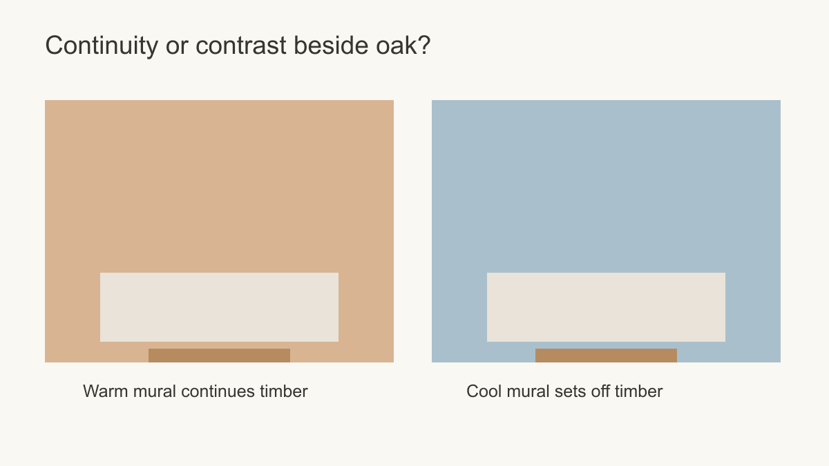 Warm continuity and cool contrast are different, valid design aims.
Choose by the mural's subject as well
A warm desert-toned landscape may suggest dry, sunlit distance; a cool misty mountain scene may suggest air and water. That is partly a response to subject and drawing, not colour alone. The same warm palette in a dense geometric mural may feel energetic rather than calm. A cool botanical with broad open ground may feel gentle rather than cold. Do not choose a colour temperature without viewing the actual artwork at room scale.
Think about where the image's focal point falls. A cool landscape with a bright horizon may open up a wall, while a warm botanical with large foreground leaves may bring visual detail closer. If the objective is to make a seating area feel enclosed and intimate, the second could be useful. If the objective is a distant view, the first may suit it better. The composition drives the result.
Use a subject swap to test an assumption. If a pale blue geometric seems busy beside the dining table, compare it with a blue scene that has more open ground. If a warm desert panorama feels calm but the room lacks structure, try a warm graphic with firmer edges. A change in drawing can answer the problem without reversing the mural's temperature. Words such as warm, cool and calming describe different properties; treating them as synonyms leads to weak choices.
When a mixed palette works better
Many rooms already contain both warm and cool notes. A warm timber floor and blue sofa, for example, may be connected by a mural with an ivory ground, muted blue distance and a little clay in the foreground. The image should have a clear hierarchy rather than equal amounts of every colour. Select one side to dominate and let the other appear as a bridge.
A bridge can also connect adjoining spaces, but it should reflect something durable. If a living room opens onto a cooler kitchen with blue cabinetry, a restrained blue distance in a predominantly warm scene may link the two views. If the only blue object is a sofa likely to be replaced, let a neutral ground or the permanent oak floor guide the mural instead. The amount of cool colour should follow the importance of the surface it connects, not a rule that every room needs an equal warm-cool split.
Make the choice explicit
At the end of the comparison, write down the intended relationship in one line: the mural continues the room's warmth, contrasts with it, or bridges two permanent finishes. Then check the chosen print under the light used most often and at the wall's real crop. A blue-grey scene that gives oak furniture a clear outline is a successful contrast; a sand landscape that lets the floor and wall flow together is a successful continuation. Neither is a safer answer in general. The better one performs the job the room actually needs.