What Mural Wallpaper Suits an Industrial Loft?
Use architectural, abstract, tonal or weathered-looking imagery with exposed materials, open volume and strong structural lines.
Article focus: pricing and measurement
The cost and measurement decision
Start with accurate wall measurements; the final custom mural price depends on area, material and any finishing options.
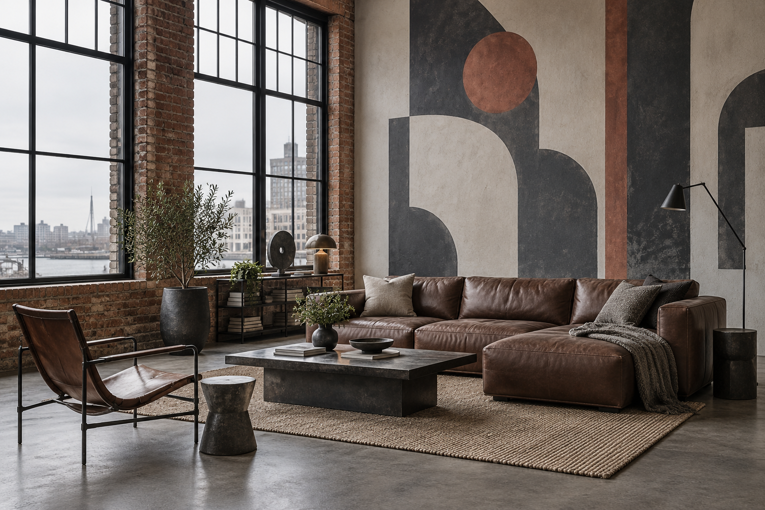
Example application: Living room · pricing and measurement
An industrial loft already has strong visual material: exposed brick, steel frames, concrete and long open sightlines. A mural should work with those elements rather than imitate all of them at once. The most effective options are often a large architectural abstract, a restrained graphic composition or a quiet landscape that counterbalances hard surfaces. Put the mural on a suitable smooth wall, not automatically on the exposed brick that gives the loft its character.
What is the mural meant to add?
Begin with what the room lacks. Brick and steel create texture and linear rhythm; a mural can add colour, a softer shape or a focal point for a seating zone. If the space feels cold, a muted rust or warm cream accent may help visually. If it feels busy because every wall has a different finish, an image with broad quiet areas can settle it. The word “industrial” does not require a printed concrete effect or another brick pattern.
A cityscape can be apt in an urban loft, but a literal skyline is not the only choice. Abstract forms inspired by arches, windows or structural grids can suggest architecture without copying the view outside. A large atmospheric landscape may create contrast with the building fabric, especially if the room has little greenery. The best choice depends on whether you want the mural to reinforce the loft's edges or relieve them.
Map the room's visual anchors first. A brick wall may already be the dominant surface, and a row of black windows may make another tight grid redundant. If the seating area lacks a centre, a mural on the plain partition behind it can define the zone without adding a divider. If the room already contains strong artwork and open shelving, a lower-contrast wall may be more useful than another high-impact image. The style label “industrial” does not tell you which problem the wall needs to solve.
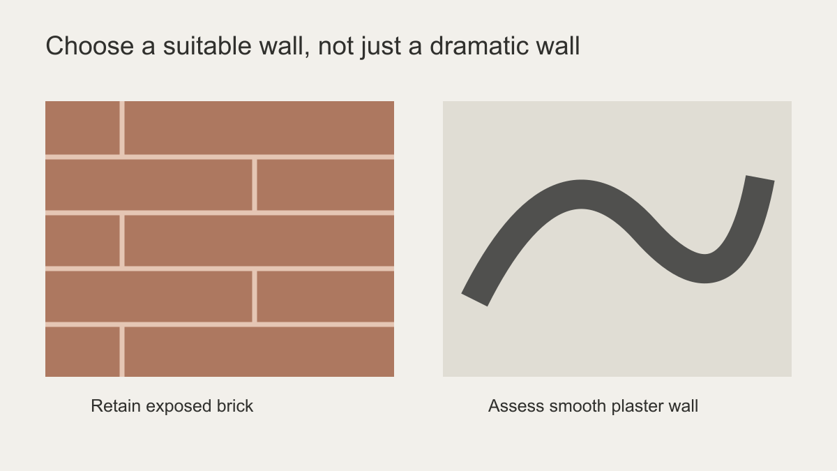 Preserve the character of exposed masonry; assess the smooth wall separately.
Do not confuse a visual effect with a building finish
Printed concrete, brick and metal effects are images. They do not reproduce the physical depth, wear or reflectivity of the actual material. In a loft with genuine exposed brick, another printed brick wall may look redundant or visibly artificial. A graphic mural on a smooth partition can sit beside the real brick more honestly. It lets one surface provide actual texture and the other provide artwork.
A smooth-looking loft wall still needs a separate surface check. Dust, dampness, unevenness and porosity are installation questions, not aesthetic reasons to buy a heavier mural. Do not assume wallpaper will hide rough masonry or adhere to raw concrete. Ask an installer to assess the selected material against the actual wall and use the wall-preparation guide for the general sequence; this article is about choosing the right surface and visual role within the loft.
If the only available wall is raw brick, ask whether a separate smooth lining system or another display method is feasible. That is a building decision, not something to solve by selecting a heavier print. In a rented space, confirm what changes are permitted before undertaking any substrate work.
There may also be services on the wall: conduits, radiators, switches or access panels. A mural should not conceal components that need to remain accessible. Mark them on a measured drawing, then see whether the artwork can be cropped around them. A large central shape broken by an access hatch will look different from the same shape on a continuous plaster partition. If substantial construction would be needed to create a usable wall, price and feasibility belong in the decision before the mural is ordered.
Scale matters more in an open plan
An open-plan loft makes one wall serve several viewing distances. From the kitchen, a small repeat may collapse into texture; from the sofa, the same print may feel busy. Test a wall-size crop from both positions. A broad curve or atmospheric field can define the lounge from afar, but inspect it near the seating area too: an oversized form should not become an awkward fragment at arm's length.
Height is a separate constraint from width. Enlarging a standard-room image to a double-height wall can make a figure, window or circle far larger than intended. Cropping it to a tall narrow field may remove the edges that explain the composition. Ask for a preview at the actual print dimensions and compare the motif with the scale of the loft's doors, windows and furniture. A design with open ground may adapt more easily than one built around a single fixed-size subject.
Draw the mezzanine edge, beams, ducts, high windows and tall shelves on the same elevation as the artwork. A large arch broken by a mezzanine can stop reading as an arch; a landscape horizon crossing a high window may fragment into disconnected strips. These interruptions are not equivalent to minor trim. If the continuous visible field is narrow, choose a composition that remains coherent within it rather than letting a room mock-up conceal the missing portion.
Finally, ask what the mural is zoning. A shape visible across the full loft can mark a seating area without a partition; a quieter print beside a home office can define that corner at close range. The largest available wall is not automatically the best one. Choose the eligible surface whose image can be seen from the relevant use positions and whose crop survives the architecture.
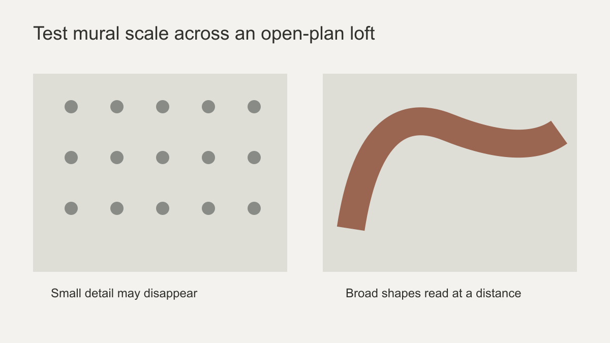 Test the design from across the loft, not just beside the wall.
Choose a palette that relates to real materials
Charcoal, chalk, rust and muted blue-grey can connect concrete, steel and brick, but using all of them at full strength can make the room heavy. Look at the dominant fixed material first. Red brick may call for a cooler or lighter counterpoint; pale concrete may accept more warmth. Black steel frames already establish a strong outline, so a mural with a little dark ink can tie in without becoming another grid of black lines.
Leather, timber and textiles soften the space. If the sofa is cognac leather, a rust-heavy mural may be too close in colour and make the seating disappear. A chalk ground with a restrained warm accent may separate the two. If furnishings are pale and minimal, a deeper wall can create a visual anchor. Check samples under the loft's actual daylight, which may change dramatically between a window wall and the interior of the room.
Compare the mural at the boundary with the real material it sits beside. A deep blue print may make warm brick more prominent, while a sandy ground can lighten the visual weight of black steel. The sample's flat ink will still differ from reflective metal or polished concrete; that contrast can be useful when each surface has a distinct job. Judge the junction in the room, not by expecting the print to mimic the texture and sheen of its neighbour.
Which mural subjects fit different loft layouts?
For a large open-plan living area with brick on one side, a broad abstract on the opposite smooth wall can define the lounge without installing a physical partition. For a narrow corridor leading into the loft, a simple architectural line drawing can guide movement without crowding the passage. For a home office corner, a calm landscape may counteract the amount of screen and equipment in view. For a dining area with a long table, an off-centre composition can keep the main motif visible when people are seated.
Photography-based murals can work too, but inspect resolution at the proposed size. An enlarged image of a building façade or landscape must retain sufficient detail to be pleasant at close range. A digital preview may show placement but not necessarily the printed sharpness. Request a sample or print proof when image quality is uncertain.
Imagine two layouts. In the first, genuine brick borders a bright window and a smooth plaster wall sits behind the sofa. A broad terracotta-and-charcoal abstract on the plaster wall can connect brick to steel while the brick remains untouched. In the second, a loft has pale concrete, black-framed windows and little colour. A soft landscape on one eligible wall may bring visual depth without adding yet another construction-like texture. The same mural would not be equally useful in both rooms; its role changes with the material already present.
A practical selection sequence
Compare two eligible wall positions, not just two images. On a smooth partition behind the sofa, a broad abstract may identify the lounge from across the loft while genuine brick remains untouched. On a narrower wall beside the work area, a quieter landscape may be more useful to the person seated there than a dramatic shape visible only from the entrance. Reject a position if its services must be concealed, if a mezzanine removes the artwork's main form, or if the surface cannot be prepared for the selected covering. Once a wall survives those tests, approve the crop and material-specific installation plan for that exact surface.