What Rooms Suit Architectural Mural Wallpaper?
Explore courtyards, arches, facades and architectural lines while considering perspective, room proportions and furniture placement.
Article focus: pricing and measurement
What to settle before pricing
Start with accurate wall measurements; the final custom mural price depends on area, material and any finishing options.
Example application: Bedroom · pricing and measurement
Architectural mural wallpaper can suit a hallway, dining room, study or living area, but each room asks something different of the image. Arches and colonnades can lead the eye along a passage; a drawn courtyard can create a focal destination; a restrained elevation can bring order behind furniture. The subject is printed artwork, not an extension of the building. Choose a composition that works with the real doors, windows and ceiling lines rather than one that pretends those features are not there.
First identify the architecture in the picture
An architectural mural might show a real city, an imagined courtyard, an engraved façade, abstract arches or a geometric plan. These are different visual tools. A photograph of a building can create a strong sense of place but may carry many small details. An ink drawing may feel lighter and more compatible with furniture. A stylised arch can act almost as abstract pattern. Describe what you see rather than assuming every architectural image is a historically accurate view.
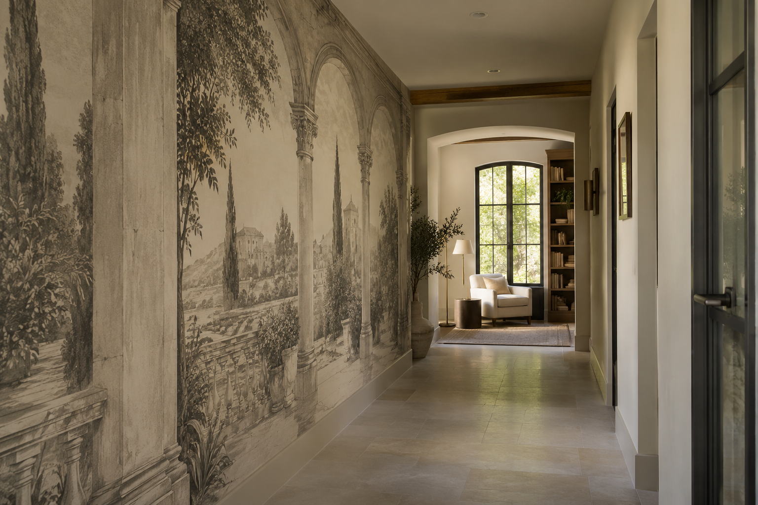
Perspective is the most important structural feature. Lines that converge into a doorway or distant square can draw the eye across a room. Symmetrical columns can frame a table or console. An off-centre arch can create movement on a long wall. If the perspective point falls behind a cabinet or is cropped away, the composition may feel arbitrary. Preview the whole image with furniture and actual wall dimensions.
Pay attention to how the pictured architecture meets the real one. A printed arch directly beside a real arched doorway can be elegant if their scales are clearly different; an almost-matching arch may look accidental. A mural with a strong painted floor line may clash with the real skirting or dado. These issues are easier to spot in a room-scale mock-up than in a product thumbnail.
Why hallways are a natural candidate
A hallway is experienced in motion. A colonnade or receding courtyard can reinforce the direction of travel, giving a long wall a destination. An engraved scene may add detail without requiring bright colour. Yet halls often contain multiple doors, switches and narrow viewing angles. A panorama with one central building might be repeatedly interrupted. Choose a composition whose perspective survives those breaks or place it on the clearest wall.
The pictured hallway shows an unusually clear relationship between image and building. Printed arches run along the left wall while the real passage continues to an opening and a reading chair. The drawing's apparent depth reinforces the direction of travel without replacing the real doorway. A face-on façade would do the opposite: it would stop the eye like framed art. If the corridor bends or contains many doors, walk its actual route and check whether the printed perspective still has a legible destination.
Do not use the mural to imply a false doorway where people might confuse it with an actual opening. In a busy circulation space, clear real wayfinding remains more important than an optical effect.
An entryway is seen more briefly and often from closer range. One framed arch or a simple façade may register faster than a skyline of tiny windows. Test the view with the front door open and coats in their normal place. If a door leaf, mirror and hooks divide the wall, a quieter drawing can survive those interruptions better than a scene whose entire meaning depends on one vanishing point.
Dining rooms: use architecture as a backdrop
A dining room often has a long, visible wall and relatively stable furniture. A courtyard view can sit behind a table, provided the central opening remains above seated heads. Symmetry can be useful, but centre the image on the visible dining arrangement, not only on the measured wall. A pendant may obscure the mural's focal point, so include it in the mock-up.
Architectural imagery can bring formality without a small repeat. Warm stone and ink tones may connect to timber and simple upholstery. A high-contrast black-and-white façade can be dramatic but may compete with patterned chairs or a strong rug. Decide whether the mural leads or supports the dining setting.
Use a seated view rather than an empty-wall rendering. The table hides pictured paving; a pendant may cross the central arch. If the courtyard opening remains visible above the diners, the image can still function as a view. Columns may line up with the table or deliberately sit to one side, but a nearly centred column directly behind a chair can appear accidental. This is a relationship among printed architecture, real furniture and the fixed light fitting—not a demand for perfect symmetry.
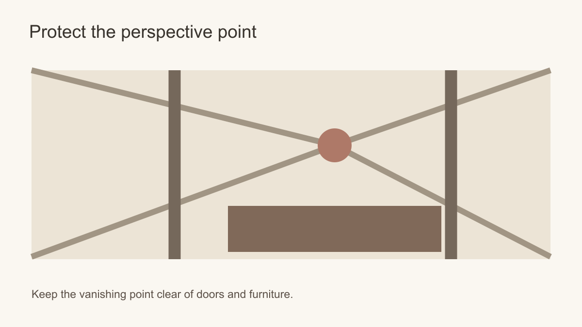 Keep the perspective point clear of doors and tall furniture.
Studies and reading rooms: detail at close range
A study can reward an architectural drawing with finer linework because people often view the wall from nearby. An engraved city or measured façade can add structure behind a desk or reading chair. Shelves and screens, however, may hide the image's most detailed area. A lighter composition with open ground can tolerate equipment better than a dense panorama.
If the mural is behind a video-call position, consider what appears in the camera frame. A cropped arch or strongly converging perspective may look odd when only a small section is visible. That is a practical design concern, not a reason to avoid architectural art. Test the camera view as well as the room view.
At a home-office desk, decide whether the mural is in front of you or behind you. Dense windows and strong converging lines may be tiring if you face them for hours, while a small architectural detail may vanish in a video-call frame behind you. Test both the seated view and the camera crop. A distributed façade drawing can tolerate shelves and pinboards; a single grand arch may not if equipment covers its opening.
Living rooms and feature walls
In a living room, an architectural mural can define a seating zone or provide an imagined view where the real window is limited. A broad colonnade may visually extend a wall, but the effect depends on the artwork's scale and the room's viewing angle. Do not promise that a printed image will physically enlarge the space. It can suggest depth if its perspective remains legible.
A sofa or sideboard can cover the lower part of the mural. Look for artwork whose key arches, windows or skyline remain visible above furniture. If a television is planned, a busy architectural scene behind it may be distracting. Place the main image to the side, choose a quieter drawing or use a different wall.
From a living-room sofa, the wall is often seen obliquely. A perfectly symmetrical printed arcade may make sense from the entrance yet feel skewed from the seat used every day. An oblique courtyard can suit that angle better. Where a fireplace occupies the same wall, leave a calm margin rather than cutting a pictured doorway in half with the real surround. The image can suggest a setting, but the sofa, fireplace and actual window must remain the room's understandable structure.
Can an architectural mural work in a bedroom?
Yes, but the choice is usually quieter than it would be in a corridor. A softly drawn arch, pale stone elevation or lightly detailed courtyard can frame a bed without making the room feel like a stage set. The headboard will hide part of the image, so a doorway whose opening begins at mattress height is a poor candidate for that wall. Either raise the focal area in the preview or select artwork whose important lines sit above the headboard. A blanker section behind the pillows also gives bedside lamps room to read clearly.
Check the bedroom under its normal evening lamps as well as daylight. Fine grey linework may become less prominent while dark arches form a stronger frame around the bed. If ceiling beams or mouldings already give the room architectural character, a spare drawing can complement them; another elaborate colonnade may compete. The criterion is whether the printed building supports the real room and bed rather than turning the wall into a theatrical set.
Rooms where the wall condition matters more than the subject
A bathroom, kitchen or other splash-prone space should not be chosen on the basis of the mural image alone. Suitability depends on the selected wallcovering, the wall condition, ventilation and the supplier's stated installation limits. Do not assume a printed mural is waterproof or suitable behind a sink or hob. If the product is not specified for that location, choose a drier wall or another finish. The same caution applies to damp external walls: an attractive architectural scene will not solve a moisture problem beneath it.
In a child's room, a simple illustrated streetscape or playful arches may be easier to live with than a detailed historic façade, but keep the image recognisable at the child's eye level. In a small room with a wardrobe across most of one wall, the clearest available wall may be a short one. A mural designed around a single grand central view might fail there, whereas an architectural rhythm that can be cropped at either end can remain coherent.
What about historic rooms?
A newly printed architectural scene can complement antiques or traditional mouldings, but it is not an original period finish unless its source is documented. In a genuinely historic or listed building, first establish whether the proposed wall carries significant decoration or could conceal earlier layers. Do not cover original fabric just to create a period effect. Seek appropriate conservation or local authority advice where the building's status and significance call for it.
In a modern room with traditional furniture, this concern is different: the choice is primarily about visual compatibility and proper wall preparation. Keeping these situations separate makes the advice more useful.
Match the image to the room's way of seeing
Choose a receding arcade for a route that lets its perspective develop, a face-on façade for a wall that can present its whole outline, and fine architectural drawing where people can approach to enjoy detail. Keep the real doors open and furniture visible in the preview. If a cabinet divides the façade or a doorway erases the arcade's destination, change the wall or the kind of image. A hallway, dining room and study can all suit architectural art, but not for the same reason.