How Beige Mural Wallpaper Can Add Depth to a Room
Use warm neutrals, tonal landscapes, texture and shadow to create interest without making a room feel visually heavy.
Article focus: pricing and measurement
What to settle before pricing
Start with accurate wall measurements; the final custom mural price depends on area, material and any finishing options.
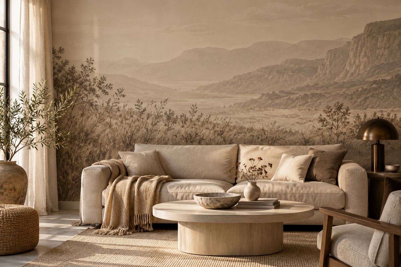
Example application: Bedroom · pricing and measurement
Beige does not have to make a mural disappear. A design in sand, chalk, stone and warm taupe can create a convincing sense of depth when its near and distant elements are composed carefully. The key is variation in value, edge and scale, not simply adding more beige shades. An atmospheric landscape, a layered botanical or an abstract with clear overlap can make a quiet wall interesting without relying on strong colour.
What does “depth” mean on a flat printed wall?
A mural is a two-dimensional print. It cannot create physical depth, but its composition can suggest space. A pale distant ridge behind a darker foreground, grasses that overlap a horizon, or translucent shapes crossing one another give the eye clues about near and far. If every mark has the same strength and size, the wall may read as a flat beige field. That may be desirable for a subtle background, but it is a different goal from adding visual depth.
Look beyond the product thumbnail. Zoom out until the artwork is about the size it would be from the room's doorway. Can you still distinguish foreground from background? Does the focal point remain clear? A design with exquisite tiny marks may lose its structure at a distance, while one with a broad horizon and a few darker notes may read much more clearly.
Depth is also relative to furniture. A pale sofa against a pale mural can merge into one shape. A dark lamp, timber table or slightly deeper linework can separate the layers. You do not need high contrast everywhere. A small, deliberate anchor is often enough to prevent an all-beige interior from feeling washed out.
Read the print as three bands, even if it is not a literal landscape. What sits in front, what occupies the middle, and what seems to recede? A dune scene might use darker grasses, a sand-coloured slope and a chalky sky. An abstract can achieve the same sequence through overlapping shapes with different edges. If the middle layer disappears when the design is viewed small, the image may still be beautiful, but it will behave more like a textured backdrop than a spatial scene.
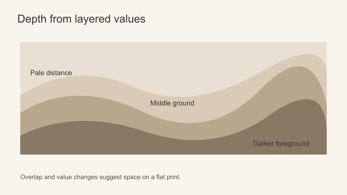 Near and far become clearer when their values and edges differ.
Choose the right kind of beige subject
A landscape is the clearest way to suggest distance. Misty hills, dunes or a quiet garden path can recede naturally, provided the crop preserves the horizon. A botanical mural can create a different kind of depth through overlapping stems and leaves. Keep some open ground visible between them; a wall of equally dense foliage may feel patterned rather than spatial.
Abstract murals can also work. Broad translucent shapes, soft gradients and changes in scale can make an engaging field behind furniture. Evaluate whether the movement suits the room: horizontal layers may complement a long sofa, while taller shapes can animate a narrow wall. These are visual tendencies, not guarantees that the room will appear physically larger.
Printed plaster, linen or stone effects offer texture to the eye, but they are still flat prints. A tiny screen preview can exaggerate their realism. View a physical sample from both close range and the normal seating distance. If the effect looks like a repeat of the same mark every few centimetres, it may distract from the broader composition.
Subject and wall width work together. A panorama needs enough horizontal span for its foreground and distant landmark to coexist; on a narrow strip between doors, it may become only a fragment of sky or hillside. A layered botanical tolerates interruptions better when leaves overlap across the design rather than gathering in one central bouquet. For an abstract, trace one large movement across the proposed crop. If it still has a beginning and an end, the wall can retain direction even where a sofa conceals smaller marks.
Warm, cool and greyed beige
Beige is not one neutral. Some versions lean towards cream, others towards grey, pink or yellow. Compare the proposed mural with the fixed surfaces that will remain: floor, joinery, stone, large upholstery and ceiling. A warm sand ground can sit well beside oak but may turn too yellow under warm lamps. A grey-beige can look refined with cooler stone yet flat beside honey-coloured timber. Samples in the actual room are more informative than names such as “oatmeal” or “limestone”.
Do not aim to make every beige match exactly. A room with one identical tone on walls, sofa and rug can lose definition. A useful scheme contains a light ground, a middle tone and a controlled darker note. The darker note might already exist in a walnut side table or bronze lamp. The mural can repeat just enough of that value to feel connected.
Consider a cream sofa, an oat rug and an oak floor. If all three meet an equally pale mural, their outlines can dissolve. A thin brown foreground or taupe botanical line behind the sofa may restore separation without turning the entire wall dark. Reverse the arrangement for a walnut sofa: a pale open area directly behind its back gives a cleaner silhouette than a dense brown thicket. This figure-and-ground relationship matters more than whether every beige is a perfect colour match.
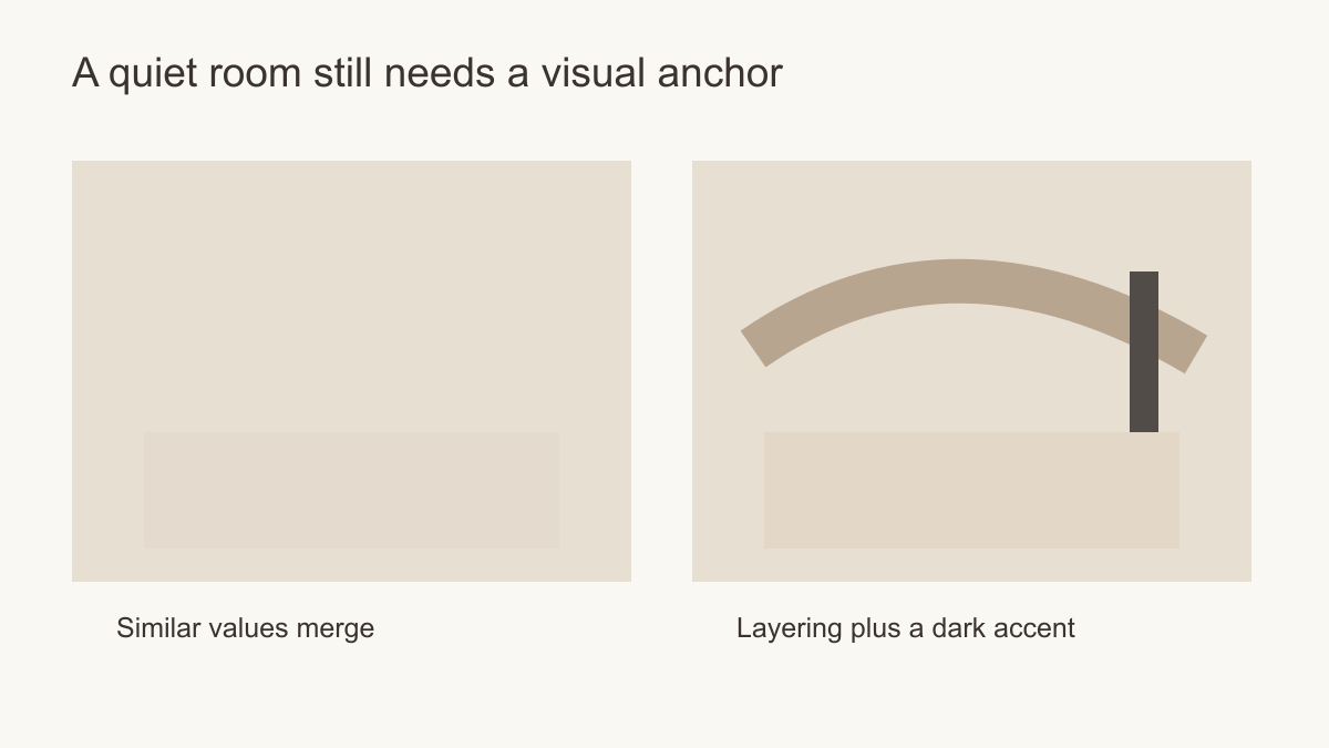 One darker anchor can give a restrained room shape.
Use the room's light rather than fighting it
Light changes the legibility of subtle murals. In a bright room, a very faint design may almost disappear at midday and become more apparent in evening shadow. In a dim room, a deeper taupe foreground may turn visually heavy. Put a sample on the intended wall and view it at different times with the actual lamps on and off. Check the side of the room that receives the least light, not only the sunny corner.
If the mural contains a pale sky or blank ground, decide whether that openness is useful behind furniture. A lot of open space can give relief to a room full of objects. In a sparse room, the same openness may feel unfinished. The right amount of detail depends on how much visual information the furniture, artwork and textiles already supply.
Notice which layer changes most between daylight and evening. A warm lamp may pull a sand-coloured middle ground forward until it competes with the brown foreground; cool side light may make a chalky distance look flatter. The aim is not to preserve an identical image at every hour. It is to ensure that the design still has a legible foreground and a quieter area when the room is used most. If only the sunny end reads clearly, compare a version with slightly stronger mid-tone separation rather than assuming more detail will help.
Where should the composition sit?
Place the most important foreground forms where they will not be hidden by a sofa or headboard. If the artwork includes a winding path, avoid cropping its entrance away. If the horizon is close to furniture height, it can create an awkward near-alignment; move it clearly above or below. A made-to-measure preview should show the actual wall ratio and major furniture silhouettes.
In a living room, a wide scenic composition can frame the seating area. In a bedroom, a calmer upper half may be more useful because bedside lamps and a headboard interrupt the lower wall. In a hallway, a repeating botanical or abstract may be more forgiving of doors and short sightlines than a panorama. The question is not simply which beige design is prettiest, but which remains coherent after installation.
Use the crop preview to protect the sequence that creates depth. Mark three points on it: the nearest form, the transition into the middle distance and the furthest visible area. Then overlay the real height of the sofa or headboard and the position of doors and windows. If the nearest form is completely hidden, the remaining scene may look like a pale wash; if the distant opening is cropped away, it may feel dense. A slightly off-centre crop can be better than a geometrically centred one when it preserves that sequence from the main viewing position.
Make the final comparison
Place two candidates into the same wall-size view rather than comparing unrelated product thumbnails. One may have more intricate leaves or stone marks, while the other has a clearer near-to-far structure. Keep the furniture silhouette in both views and choose according to what remains visible from the doorway and the main seat. A printed sample, where available, can settle the ground colour and surface appearance; the full-wall crop settles composition. Neither test substitutes for the other.
Before ordering, measure the wall and use the supplier's trim allowance, then check where panel joins will cross any long line or horizon. Prepare a sound, clean, smooth surface according to the chosen material's instructions. A printed plaster or stone image remains a flat decoration and will not remedy dampness or failing plaster. The strongest beige mural is not necessarily the one with the most marks: it is the one whose tonal steps and overlaps remain readable on the actual wall.