How to Choose Blue Mural Wallpaper for a Home
Compare pale, muted, deep and atmospheric blue artwork with daylight, furniture, flooring and room purpose.
Article focus: installation and removal
What the installer needs to know
The right installation method depends on the chosen material and wall condition, so prepare the wall before ordering and follow the material-specific instructions.
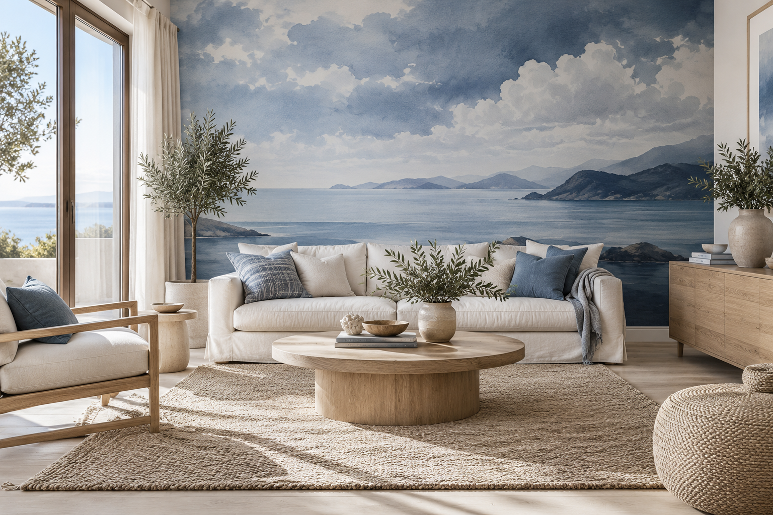
Example application: Bedroom · installation and removal
Blue mural wallpaper can suggest open sky, deep water or an ink-drawn pattern, yet those three walls will feel entirely different. Choosing well starts with the kind of blue you want to see at the scale of a whole room, not a small product thumbnail. Consider its lightness, undertone, subject and how much of the wall it covers. Then compare it with the floor, furniture and daylight already present.
First decide what blue should do in the room
A pale blue landscape can add a distant view behind a bed or sofa. A saturated navy abstract can anchor an otherwise light living room. A blue line drawing on ivory creates pattern without making the wall read as solid blue. These are different design jobs. Ask whether the wall needs depth, an architectural focal point, or merely a colour connection to furnishings. That question narrows the options more usefully than searching for “blue mural” alone.
Look at the room from its usual entrance. If the mural is the first surface seen, a large high-contrast image will dominate. That may be desirable in a plain sitting room but tiring in a room with patterned upholstery and a strong view outside. If the mural sits behind a sofa, much of its lower portion will be hidden. A composition with its main interest above seat height can be more effective than a dramatic subject that vanishes behind furniture.
Compare blue undertones against the room's largest fixed surfaces. Powder blue, green-leaning sea blue and violet-leaning ink blue can relate differently to cream upholstery, oak flooring and existing paint even when they appear equally light in thumbnails. Place printed samples beside those surfaces; a colour name cannot settle the choice.
Two murals described as “navy” can still fill very different amounts of the room. One may place a thin dark shoreline beneath a broad ivory sky; another may be dark blue almost edge to edge. Put both into the same wall outline and cover the lower area occupied by the actual sofa or headboard. If the shoreline disappears, the first design becomes mostly sky in the lived-in room. If dark furniture merges into the second, a lighter ground or a clearer value break may be needed. The visible blue area matters more than the catalogue colour label.
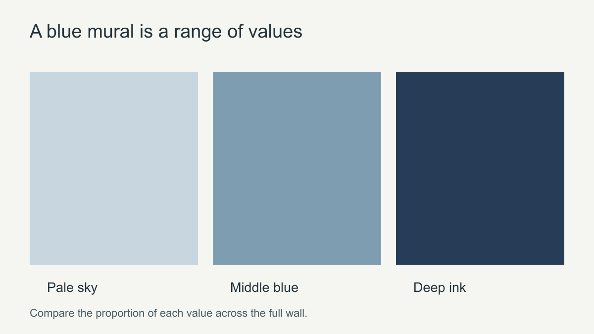 Judge the proportion of pale, middle and dark blue across the whole wall.
Choose a subject that suits the viewing distance
Blue can describe a place or act as a graphic mark. In a wide living room, a sky or water scene with broad areas may remain legible from the doorway; in a compact study, an ink drawing can reward closer viewing. A small, dense repeat may collapse into texture across a long wall. A few ultramarine geometric blocks on ivory can feel stronger than a landscape that contains more blue overall, because the blocks concentrate the contrast.
For a scenic design, identify what gives the view its depth: distant ridge, water band, near shore or open sky. A crop that keeps only one of those layers may change the image's purpose. For an abstract, note whether horizontal washes or tall strokes relate better to the room's existing lines. Those are visual effects to test in a wall-size preview, not promises that a print will physically enlarge the room.
Compare subjects within the same role. If the aim is a quiet blue view, test two landscapes with different land-to-sky proportions. If the aim is a sharp accent beside neutral furniture, compare an ink drawing with spacious geometry. A pale mountain scene and a high-contrast abstract are not close alternatives merely because both appear under a blue filter.
How does blue interact with daylight?
A blue sample can read differently beside a bright window and in a shadowed corner. A north-facing room may give certain blues a cooler appearance; strong warm evening light may soften them. The direction of light is only one variable: glazing, neighbouring buildings, bulbs and wall colour also matter. Move the sample to the actual feature wall and view it morning, afternoon and evening before committing.
Check the amount of white or ivory in the design. In a room with limited daylight, an open sky or pale ground may keep the wall from becoming visually heavy. In a sunlit room, a deeper ink-blue feature can bring useful contrast. If the floor is dark, the sofa is navy and the mural is almost entirely navy, the room may lose separation between its major shapes. Introduce a lighter ground or a different value in one of those elements.
Pay attention to evening use. A room that looks bright in a midday photograph may be used chiefly under lamps. Test the printed sample under the bulbs you actually use, with curtains in their normal position. Do not assume a phone display can predict the print's exact hue or surface appearance. A small sample is best for colour and finish; it cannot show whether a large dark foreground will occupy half the wall once the mural is scaled up.
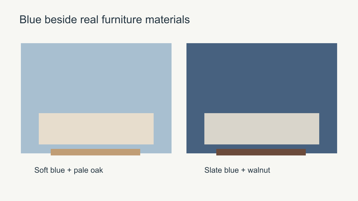 Connect blue to the room through contrast, not exact colour matching.
Which rooms benefit from which blue?
In a bedroom, a soft landscape or low-contrast botanical may sit comfortably behind bedding and bedside lamps. A very active marine scene is more likely to become the room's central feature, which is fine if the rest of the scheme is quiet. In a living room, a layered blue panorama can provide depth behind a neutral sofa. In a home office, a graphic ink drawing may look more deliberate than a scenic view if the room already has strong shelves and equipment.
A dining room can support a deeper blue because it is usually experienced under different lighting from a bedroom, but the mural still needs to relate to the table and pendant. If the room opens into another space, compare the two sightlines. A wall that looks balanced from inside the dining room may read as a dark rectangle from the adjoining hallway. The right blue is partly a question of how the entire home is seen in sequence.
For example, a living room with pale oak flooring and cream seating might welcome a layered sky-blue landscape whose darkest notes sit above the sofa. The same image beside a cool grey floor could feel too pale if the room needs an anchor; an ink drawing on warm ivory might provide clearer structure. In a bedroom with dark walnut furniture, a slate-blue mural with ample light ground can connect the timber to the wall without swallowing the headboard. These are relationships to test, not universal room-to-colour rules.
Compare the blue that remains visible
Make three wall-size previews with the same furniture overlay. In the first, let pale sky occupy most of the print with a smaller blue waterline. In the second, let deep water or navy abstract colour occupy most of the field. In the third, let blue appear chiefly as ink lines on a light ground. From the room's normal entrance, ask which one reads as a view, which one anchors the furniture and which one simply adds drawing. This comparison is more revealing than three small swatches labelled with the same colour name.
Check the furnished crop, not just the ordered rectangle. If the sofa hides the first design's waterline, it may now function as an atmospheric sky; if the second merges with a dark sofa, its furniture outline may disappear. The line-drawn option may keep separation but feel too slight from a distant doorway. Adjust the crop only after inspecting all four edges, since saving one blue band can cut off an important tree or building elsewhere.
Use a physical sample, if available, to settle the printed hue and finish against the actual floor, paint and upholstery under daytime and evening light. The sample cannot establish how much of the wall is sky, water or ink; the full-size preview answers that. Choose the candidate whose visible blue distribution and subject serve the room's intended role after furniture and openings are shown, rather than the one with the most appealing thumbnail.