How to Balance a Bold Mural Wallpaper Colour
Keep a strong colour intentional by coordinating scale, supporting tones, furniture and the amount of visual rest around the wall.
Article focus: pricing and measurement
Budgeting this wall with confidence
Start with accurate wall measurements; the final custom mural price depends on area, material and any finishing options.
Example application: Bedroom · pricing and measurement
A bold mural colour can be the best part of a room, but it needs a deliberate supporting cast. Saturated cobalt, rust, emerald or coral will command attention at wall scale. Balancing it does not mean covering the rest of the room in beige; it means deciding which surfaces stay quiet, which objects echo the colour and where contrast is needed. Start with the mural's visual weight, then arrange the room around the feature it creates.
Identify the actual source of intensity
“Bold” may describe saturation, darkness, pattern density or scale. A bright blue wall with large simple shapes can feel calmer than a smaller mural full of high-contrast details. A deep green botanical may be dramatic because it is dark, even if its hues are muted. Name what makes the candidate artwork powerful before deciding how to balance it. Otherwise you may remove the wrong element.
View the mural as a complete elevation rather than a cropped detail. Notice whether the most saturated area covers the whole wall or sits in one section. If it is concentrated behind a dining table, the rest of the room can stay relatively neutral. If colour reaches every edge and corner, furniture may need stronger shape or lighter value to remain legible.
The mural's subject also affects balance. A single broad abstract gives the eye a clear path. A dense floral with several saturated colours asks for more attention. Neither is inherently too much; they need different surroundings. Do not assume that all bold murals require the same rule about furniture or lighting.
Compare the two designs in the illustration. Both use saturated blue and orange, but the broad arc offers one large movement and a quiet blue interval, while the repeated dots create many small visual events. On a dining wall already crossed by chair legs and a pendant, the arc can hold the room together. In a spare room, the repeat might supply the rhythm that furniture does not. Saturation alone cannot tell you which print will feel busier.
Also consider the view from the next room. A vivid wall seen through a doorway can act as a visual destination; the same wall beside the entry may dominate only when viewed close up. Stand at the places where you will actually encounter it. If the colour occupies the entire sightline, leave a quiet foreground such as a plain rug or uncluttered table. If you see only part of the mural through an opening, make sure that part still reads as an intentional shape rather than a random fragment.
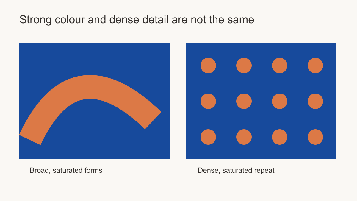 Colour strength and pattern density create different kinds of visual weight.
Choose a hierarchy for the room
Ask what the eye should notice first, second and third. If the mural is first, allow the principal furniture to provide a readable second layer and let smaller accessories recede. If a sculptural sofa or important artwork should lead, choose a mural with open space around it or a less intense area behind it. A room can have several strong pieces, but they work better when their scales and contrasts differ.
One practical approach is to keep adjacent walls quieter while allowing the mural to anchor a dining or seating zone. Another is to extend one of its quieter colours into curtains or upholstery, making the wall feel less isolated. A third is to pair a saturated mural with strong timber or stone that has visual presence without another competing print. None is a universal formula; choose the route that fits the furniture you already own.
Repeating a mural colour can connect the scheme, but repeat it sparingly. A cobalt wall may need only one blue ceramic or cushion. Matching the sofa, curtains, rug and tableware to that cobalt can flatten the room into a themed set. Borrow a secondary colour or a neutral ground from the mural as well, so the supporting palette has range.
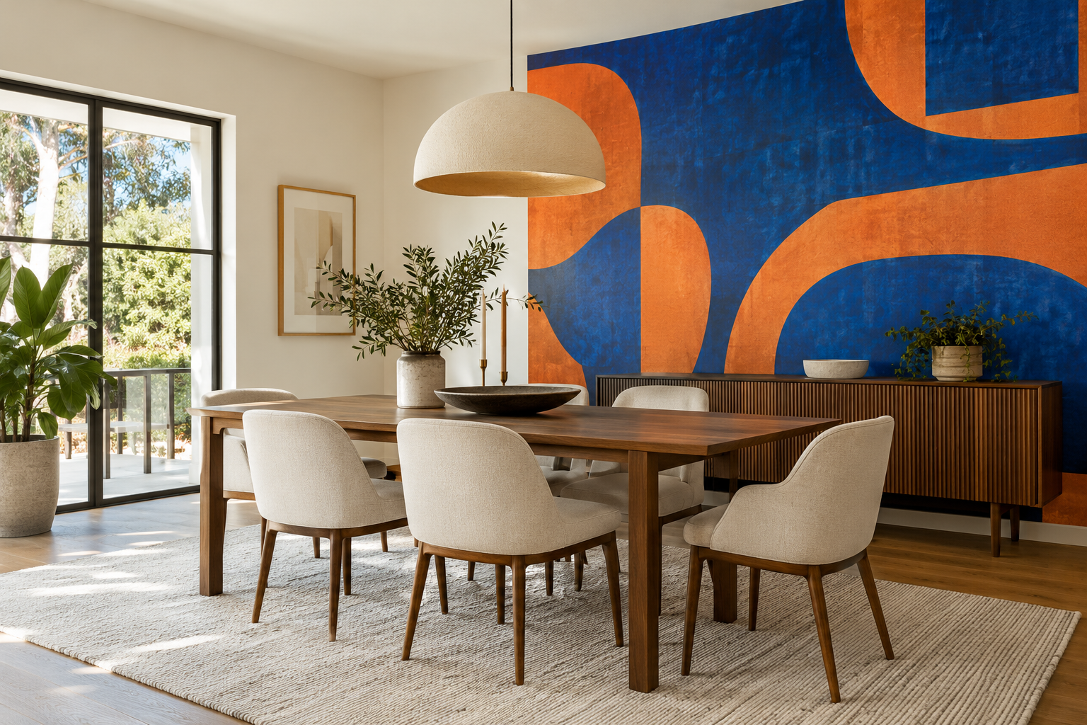
In the illustrated dining room, the mural leads and the timber table supplies a substantial second shape. Cream chairs and a pale rug keep the foreground legible. Nothing requires orange chairs or blue curtains: the table's warmth already connects with the wall without duplicating its colours. If the table were replaced by a vividly painted one, reconsider the smaller objects first. The strongest colour need not always be the thing you remove.
If you already own a patterned rug, do not automatically discard it. Compare motif sizes. A large, sweeping wall shape can sit with a rug of small, low-contrast marks because the patterns operate at different scales. A tightly patterned mural over a high-contrast rug of similarly sized motifs will likely ask the eye to process both at once. Try removing one temporary accessory in a room photograph before deciding that the two permanent patterns are incompatible.
Use value contrast to keep furniture visible
A dark sofa against a dark, saturated mural may vanish. A light chair against a pale yellow mural can have the same problem despite the cheerful colour. Compare the furniture and wall in a greyscale photograph: if their values merge, consider a different crop, a lighter or darker textile, or a design with more contrast where the furniture sits.
A white or cream table can stand clearly in front of a strong wall, but it is not the only solution. Walnut, blackened timber or an olive chair may provide a controlled counterweight. The point is that each major object should be recognisable. If a saturated mural already contains several colours, a natural timber surface can be calmer than introducing another painted hue.
Two saturated hues can look distinct in colour but nearly identical in greyscale. If a chair back crosses their boundary at the same value, it may lose its outline despite the vivid palette. Try the same furniture against two crop positions: one with a lighter printed area behind it, one with the saturated boundary behind it. A better placement can solve the problem without adding another accent hue or replacing the furniture.
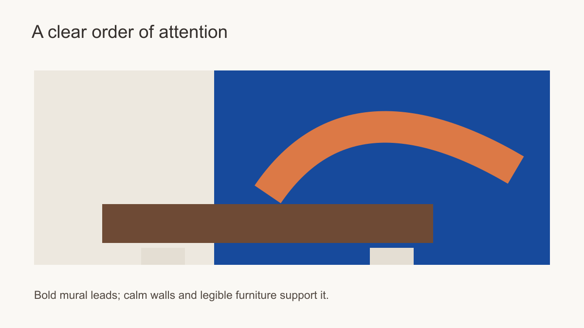 Let one wall lead while other surfaces give furniture room to read.
Consider daylight and artificial lighting
Strong printed colour can appear different throughout the day. A warm lamp may make rust more prominent; a window can intensify cobalt in daylight. Test a sample on the actual wall under both conditions. Also observe the mural from adjoining rooms. A colour that feels balanced within a dining room may dominate a long view from a hallway, or may provide exactly the visual destination that an open plan needs.
Do not judge a colour only from a backlit monitor. Print and screen are different viewing conditions, and the selected wallcovering's surface may affect the look. A sample can confirm colour and detail close up, while a full-wall mock-up tests the amount of colour in the room. Neither test alone answers the whole question.
Do the light test at the time the room is normally used. A dining mural admired in daylight may be seen mostly under pendants; a study wall may be judged during the day beside a bright screen. Note which colour field becomes dominant and whether the furniture still reads clearly. If a warm lamp makes one orange area too insistent, compare the actual print sample and lamp position before ordering a paler mural. A screen mock-up cannot reliably predict the printed surface under that fixture.
Where does a bold mural work best?
A dining room can accommodate strong colour when the table, chairs and lighting form a simple foreground. An entryway may benefit from a decisive mural because it is seen briefly and can set the tone for adjacent spaces. In a living room, a bold print behind a sofa must be assessed with cushions, rug and art in place; otherwise the finished room may feel busier than the mock-up. In a bedroom, consider whether the intensity supports the atmosphere you want at the end of the day.
A small room is not automatically disqualified. A compact powder room or study can carry a vivid mural if its scale is suited to the sightline and the remaining surfaces are handled intentionally. Conversely, a large room can feel chaotic if every wall and object is equally assertive. Size is only one variable among contrast, composition, lighting and use.
Ask how long each view lasts. An entryway mural may be registered in seconds, making a single legible gesture more useful than intricate storytelling. A living-room wall is examined from a sofa for much longer, alongside television, shelves and cushions. Behind a bed, the bold wall may dominate the entrance view but recede when someone is resting. This duration test is more informative than assigning a universal safe colour intensity to each room name.
Plan the crop and joins carefully
Strong shapes can become awkward if a doorway removes the edge that explains them or a cabinet hides the main focal point. Measure width and height, record doors, windows, sockets and furniture, and preview the mural at the true wall proportions. If the print repeats, note whether bold lines cross panel joins. If it is a single panorama, make sure its important shapes survive the crop.
Change one source of visual weight at a time
If the bold wall feels overwhelming in a mock-up, identify the cause before rejecting its colour. Too many tiny contrasting marks call for a simpler motif or quieter nearby textiles. Furniture disappearing against the print calls for a different value behind it, often through a revised crop. A strong wall seen from every adjoining room may need a calmer return wall or a more deliberate placement. These are different corrections. Make one change, compare the same viewpoints again, and keep the mural vivid when the problem lies elsewhere in the composition.