What to Look for in Botanical Mural Wallpaper
Compare leaf scale, stem direction, negative space, colour density and the way botanical artwork sits behind furniture.
Article focus: pricing and measurement
Budgeting this wall with confidence
Start with accurate wall measurements; the final custom mural price depends on area, material and any finishing options.
Example application: Bedroom · pricing and measurement
A good botanical mural is more than a green wall with leaves. Look at what plants are actually drawn, how the stems move across the wall, the amount of open ground and whether the artwork still reads when furniture covers part of it. Botanical designs range from fine engraved studies to oversized painterly foliage. The right one depends on whether the room needs a quiet pattern, a strong feature or a sense of being surrounded by a garden.
Identify the botanical subject
Begin by describing what you can see rather than relying on the product's style label. Are the leaves long and narrow, broad and tropical, or delicate and fern-like? Are there flowers, seedheads, branches or fruit? Does the artwork depict recognisable species, or is it a decorative interpretation? A precise description helps you decide whether the image suits the room and prevents expectations based on a generic “botanical” tag.
Different subjects create different rhythms. Drooping willow branches can lead the eye downward and soften a tall wall. Upright grasses and seedheads bring vertical movement. Broad foliage can give a room a strong scale, especially behind simple furniture. A mixture of many plant forms can feel like a garden, but it may also become busy if every element receives equal emphasis. Choose the composition that solves a specific need in the space.
Do not assume every plant illustration is scientifically accurate. Some are stylised, composite or deliberately abstract. That can be aesthetically effective, but describe it as artwork rather than a verified botanical plate if provenance is unknown.
Compare a hanging branch, upright grasses and a few oversized leaves without looking at their colours. The branch needs a visible point of entry and draws the eye down; grasses build a vertical field that can tolerate a narrow wall; broad leaves become room-scale silhouettes. A wall with strong arches or large houseplants may not need another canopy of competing curves. This is a decision about how plant forms move through the space, not about whether green is fashionable.
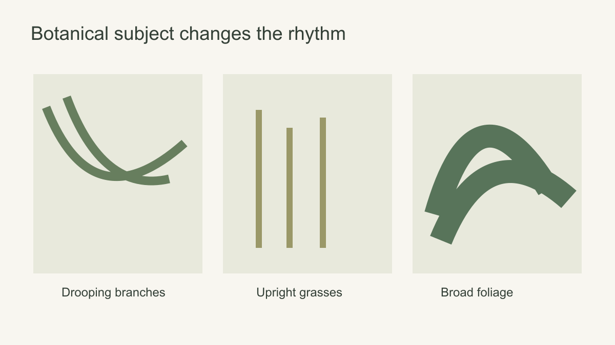 Plant form sets the wall's rhythm before colour is considered.
Examine scale at the size it will be printed
A leaf that looks modest in a thumbnail can become larger than a dining chair when enlarged. That may be exactly the desired feature, but it should be intentional. Make a full-wall mock-up and place the principal furniture in front of it. If the main branch disappears behind a sideboard, the image may lose its structure. If the leaves are too small, they may merge into a texture from the doorway.
Scale also determines how the mural relates to real plants. Large printed leaves behind a tall houseplant can make the silhouette difficult to read when both are similar in size and colour. Place the plant against a calmer area of the image or choose a different scale. An abstract botanical may work better than a literal leafy mural if the room already contains a strong plant collection.
Repeating patterns and scenic botanical murals behave differently. A repeat can tolerate doors, shelves and changing furniture arrangements. A single composition needs its key stems, flowers or opening to land in the right places. Decide which format suits the wall's interruptions and the room's likely use over time.
For a scenic mural, mark where stems enter and where they lead the eye. A branch entering from the upper left can frame a dining table on a wide wall but vanish in a narrow alcove crop. For a repeat, check its interval: a distinctive leaf may reappear at a frequency that feels mechanical on a large wall. Record motif size against a familiar object. A leaf wider than a chair back is an architectural shape, not a small detail, regardless of how modest it looked in the thumbnail.
Look for enough negative space
Open ground is not wasted wall. It helps the foliage read and gives furniture a visual backdrop. A dining room with a dark table and pendant may benefit from an ivory ground with controlled branches. A simple room with little other pattern can carry a denser canopy. The useful measure is not a fixed percentage of empty wall, but whether the main forms remain distinct from one another and from the objects in front of them.
Locate the open ground before deciding where the mural belongs. A pale centre can give a sofa or pendant a calm backdrop while foliage frames the edges. A design with a central cluster asks furniture to sit elsewhere or to leave that cluster visible above it. On a wall broken by windows, evenly distributed leaves may be more forgiving than a carefully balanced border.
Pattern density can also change the apparent colour. A design with many thin olive leaves on a pale background may read mostly cream from across the room. A sparse arrangement of very large dark leaves may read strongly green. Judge the entire wall from the doorway, not only the close-up drawing.
Empty space only helps when it survives in the visible portion of the finished wall. Check the space above a headboard, beside a pendant and around an existing picture rather than calculating an abstract percentage of pale background. If a window removes one half of a framed botanical, the remaining side may feel unexpectedly heavy. In that case, a distributed print or a different crop may be more coherent than preserving the original image at all costs.
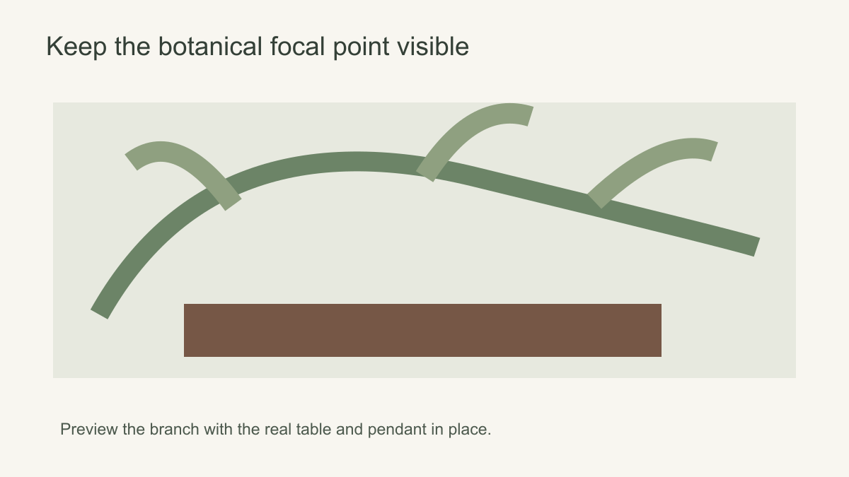 Preserve the main branch or focal cluster in the usable crop.
Choose drawing style deliberately
Engraved linework can feel precise and structured beside traditional timber or simple contemporary furniture. Watercolour foliage has softer edges and may suit a quieter bedroom. Bold graphic leaves can sharpen a minimal interior. A mural described as hand-painted may refer to the look of the source artwork, not the finish applied to your wall. Check the product information and the actual print rather than assuming a surface technique from the style name.
Colour should relate to the room's materials. Sage, olive, charcoal, blush and cream can all appear in botanical art, but not every room benefits from every combination. Compare a printed sample with flooring, upholstery and the daylight on the intended wall. The white or beige ground is just as important as the leaf colour because it covers much of the wall.
Drawing style should suit the viewing distance. Engraved lines and the joins between stems and leaves can reward a close view in a corridor, even if they merge into a broader tonal pattern from the doorway. In an open-plan room, painterly foliage needs distinct silhouettes if the plant forms are meant to remain recognisable across the space. A print that resolves into one green mass from the usual seat may still be useful as a textured backdrop, but it is not the same effect as a legible botanical scene.
Shortlist by growth pattern and wall use
Compare three candidates at the same proposed wall size: a branch entering from one edge, a distributed leaf field and a design with an open centre. Overlay the real doors, shelving and furniture. The branch needs its source and direction to survive; the repeat needs to remain coherent around openings; the framed design needs its central breathing room. Reject a candidate when the wall removes the very structure that makes it appealing, not because a catalogue places it in the wrong room category.
Then check the real plants in the room. A tall palm in front of broad printed leaves of similar size can blur into the wall, while the same palm may stand beautifully against a fine line drawing or open ground. Note which silhouettes should stay separate and which can overlap. Finally, compare the complete wall from the doorway and a full-size detail from the closest usual viewpoint. Those two views reveal whether the chosen drawing works as both composition and surface.
Check how the plants enter the wall
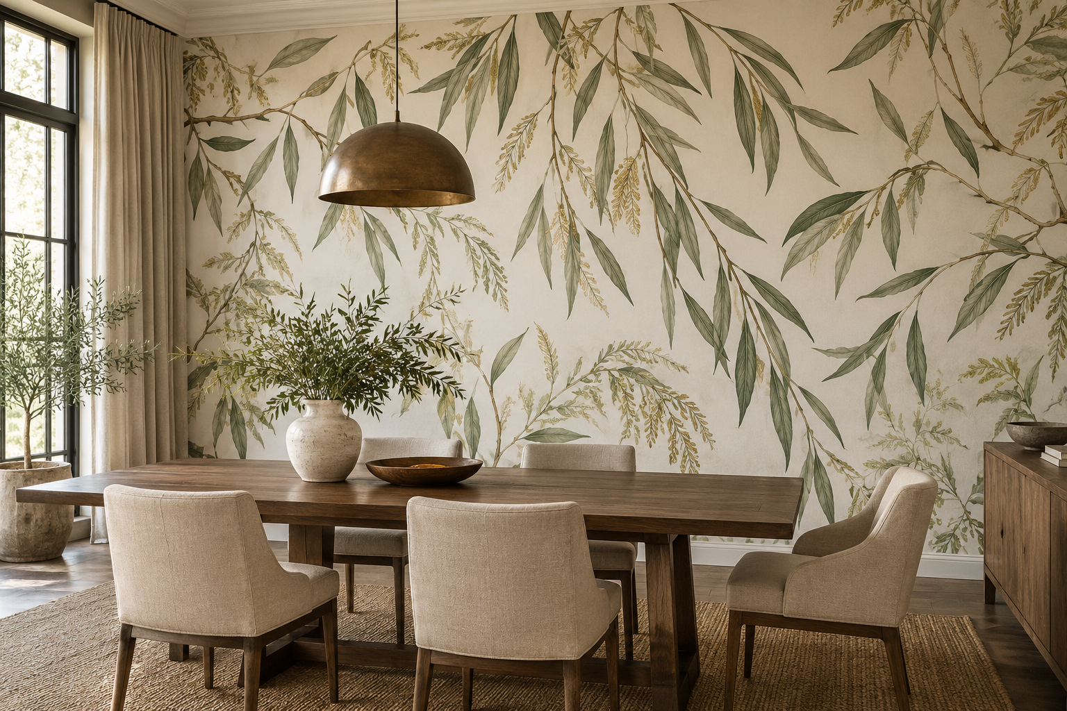
In the pictured dining room, slender leaves hang from the top of the wall and the light ground stays visible behind the chairs. Trace the main branches on a crop preview: if a doorway removes their point of entry, the remaining leaves may appear to float without structure. A distributed leaf repeat would survive that interruption more easily, though it would not frame the table in the same way. When comparing botanical prints, identify whether the plants frame, climb, scatter or enclose. That spatial behaviour will matter more on the finished wall than a broad “leaf” label.