Botanical or Landscape Mural Wallpaper: Which Should You Choose?
Compare botanical and landscape compositions by depth, scale, room mood, furniture coverage and visual focus.
Article focus: pricing and measurement
Budgeting this wall with confidence
Start with accurate wall measurements; the final custom mural price depends on area, material and any finishing options.
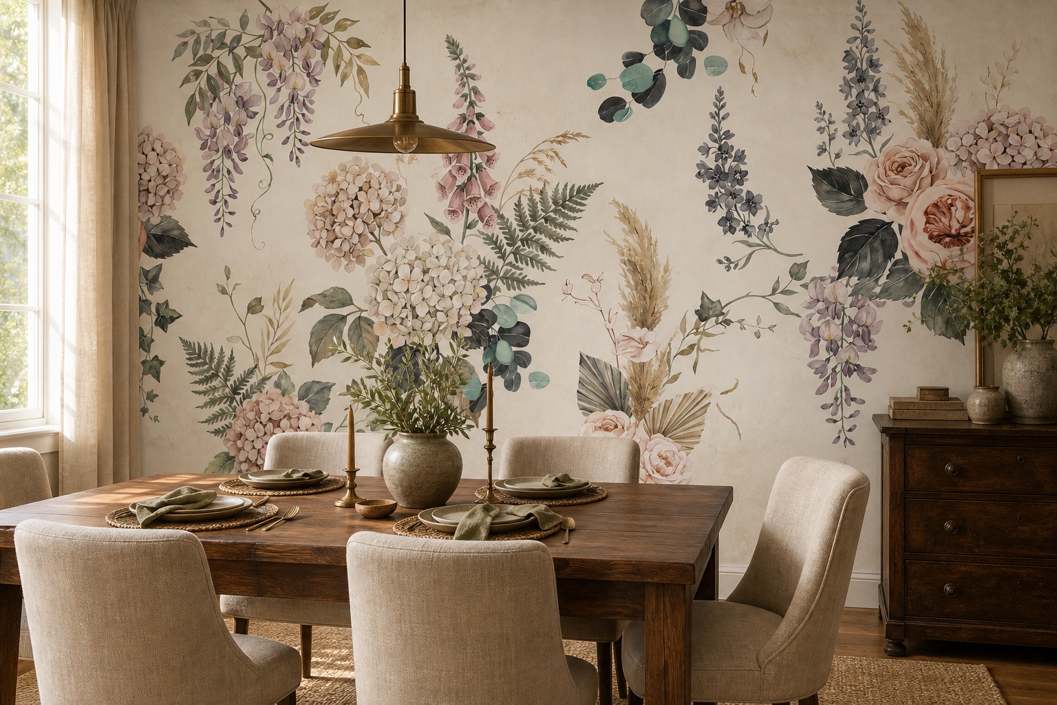
Example application: Dining room · pricing and measurement
The choice between botanical and landscape mural wallpaper is really a choice about viewpoint. Plants tend to occupy the foreground: leaves, stems and flowers share the wall with the furniture. A landscape asks the eye to travel beyond the wall, usually through a foreground to water, hills or sky. Both can be quiet or dramatic. To choose fairly, compare the same wall at the same scale and ask whether you want to look at nature up close or look into a scene.
What the eye does with each image
A botanical mural often keeps attention near the wall surface. Large leaves can frame furniture, and branches can rise or spread across the composition. There may be little implied distance, though layered foliage can still create depth. A landscape usually invites the eye beyond the wall: foreground, middle distance and horizon establish a view. That can be effective in a room where you want the wall to feel open, but a strong horizon must be placed carefully relative to furniture and windows.
Look at the actual artwork rather than assuming every botanical design is busy or every landscape is serene. A sparse engraved branch may be quieter than a dramatic mountain scene. A misty lake can be low contrast, while a saturated garden panorama can be energetic. Compare density, contrast and negative space in the candidates you are considering.
From close range, fine botanical lines and painted petals can become a rich texture. From across a large room, those details may merge. A landscape may reveal its main composition from a distance but feel soft up close if the source is highly painterly. View previews at both distances before choosing.
The dining room in the feature image is a useful botanical test. Roses, hanging lilac flowers and foliage occupy the entire wall behind a timber table. The table masks the lower stems, yet recognisable blooms remain above the diners’ heads. There is no single horizon that must be preserved. The scene feels decorative and enveloping rather than like a distant window; whether that is desirable depends on how much pattern the rest of the room already contains.
How furniture changes the choice
A headboard or sofa hides the lower wall. In a botanical design, this can be acceptable if the stems or foreground disappear behind furniture while flowers or leaves remain visible above. In a landscape, hiding the foreground may still leave the horizon intact, or it may remove the path or water that gives the scene its depth. Compare the proposed crop with a separate furniture elevation and inspect what remains.
Windows and doors are also important. A loose botanical arrangement may tolerate an opening between branches. A landscape with a continuous shoreline or mountain ridge can look broken if a window removes its centre. That is not a reason to reject landscapes, but it may require a crop adjustment. Keep important subjects away from fixed openings and trim zones.
If the room contains many houseplants, a botanical mural can echo them, but the combined foliage might feel crowded. A distant landscape could provide contrast. If the furniture is hard-edged and minimal, botanical forms may soften the room. These are possibilities to test, not rules about style labels.
Compare both at the size the wall will actually show
Start with one measured outline, not two attractive catalogue rooms. Put the botanical and landscape candidates into that identical rectangle, at the proposed print size. Mark the doorway height and the top of the table or sofa on both copies. Are the flower heads still legible above the furniture? Does the landscape retain enough foreground below its horizon to read as a view? These are different failures, and a small product thumbnail will reveal neither.
Next, stand where the room is first seen. If a botanical's single leaf becomes nearly as tall as the door, it will act as a focal shape; if that feels excessive, try a smaller motif or a design with more open ground. If a landscape's distant trees disappear into a narrow band at that distance, choose a stronger scene or give it more visible wall. Do not enlarge one candidate until it looks good while leaving the other at catalogue scale.
Test a second position close to the wall. Fine engraved lines should still look intentional; softness in a watercolour scene can be part of the painting, but blurred source detail is a different matter. If the design is to be enlarged substantially, ask for a print-size detail view of each candidate. This compares the visual evidence you will live with, not a style label.
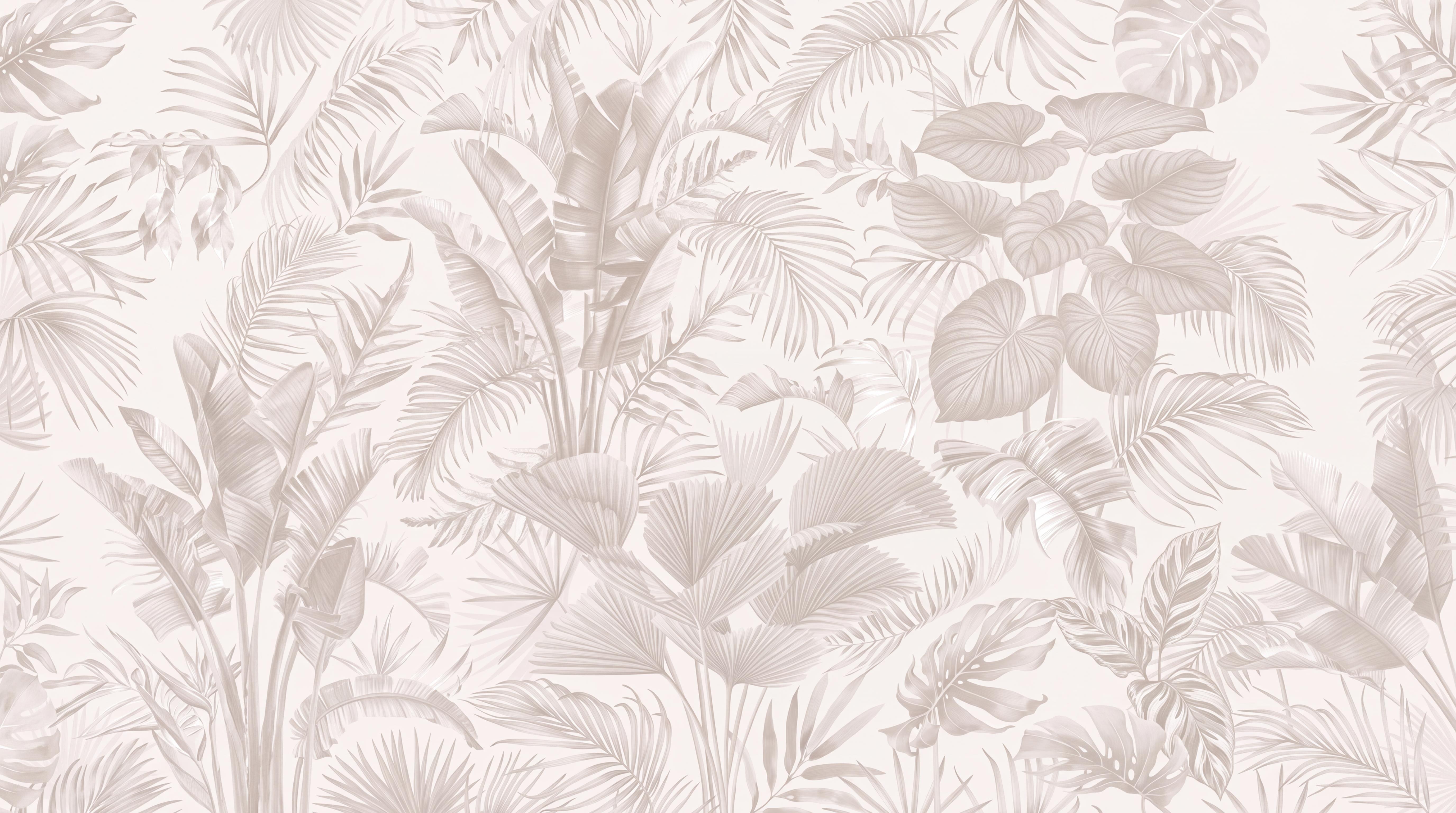
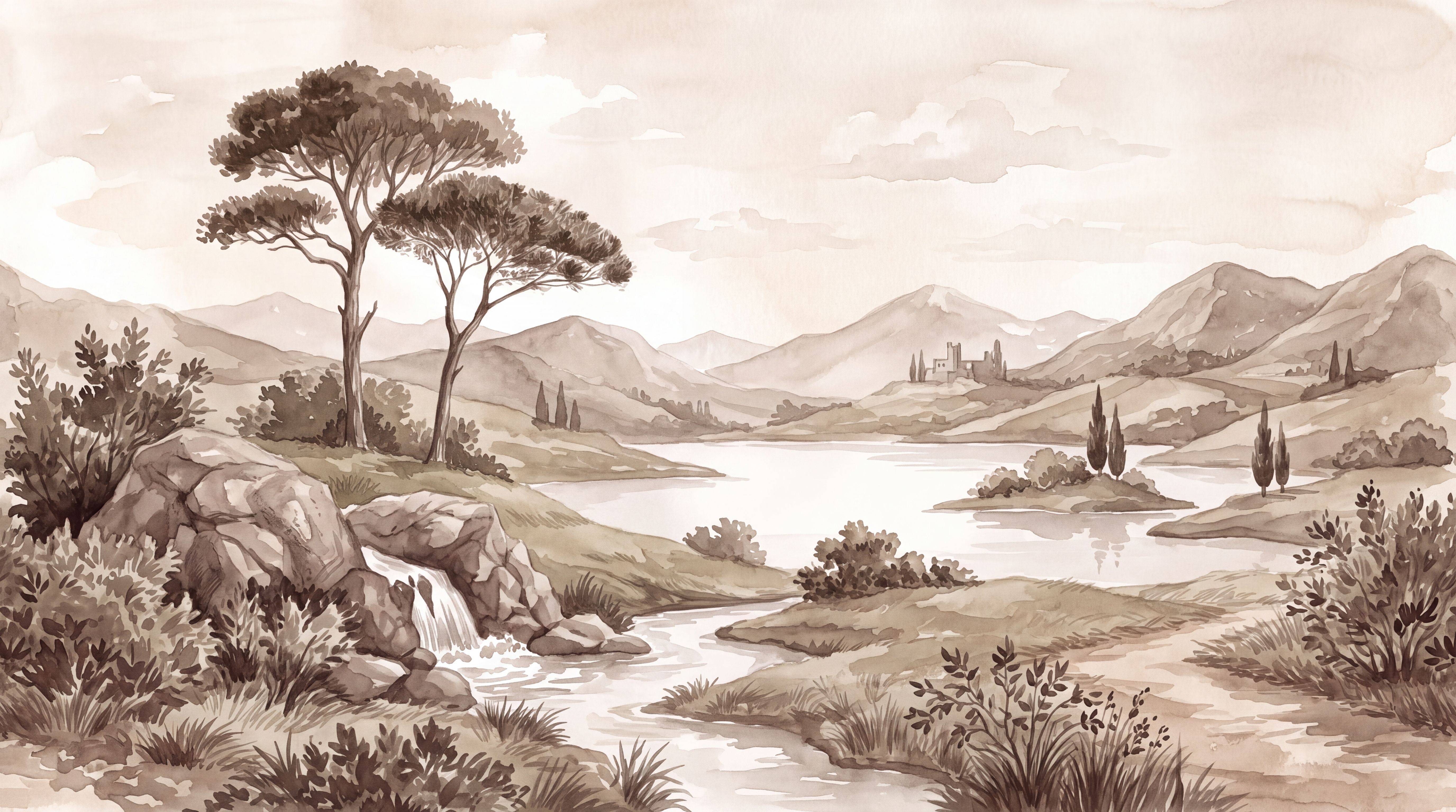
Finally, compare what a necessary crop removes. The pale frond artwork has relatively even coverage, so losing an edge may leave the overall rhythm intact. A flowering branch with one main bloom could be much less forgiving. In the lake scene below, removing the near bank or placing the horizon behind a cupboard may flatten the depth. Ask for revised previews if those subjects are obscured; do not assume that every botanical is crop-flexible or every landscape is fixed.
Decide whether the wall should surround or recede
Imagine the dining table beneath each candidate. With flowers above and around the seated group, the wall becomes part of the room's decoration; the eye returns to nearby leaves and blooms. With the lake beyond the table, the eye is invited past the furniture towards the far hills. Neither effect is inherently calmer. The floral example has stronger colour and detail, while the pictured lake is muted; replacing those artworks could reverse the impression.
Make the choice from the room's normal viewing positions. At a desk close to the wall, you might enjoy detail that rewards a near look; from a living-room doorway, a distant view may read more clearly. Then check the other surfaces: patterned upholstery and crowded shelves can compete with dense foliage, but they can also interrupt a pale landscape's quiet horizon. If both options seem plausible, favour the one whose main visual idea remains clear after furniture, openings and the approved crop are shown together.
Let the least flexible feature break the tie
If both candidates still work in the measured preview, identify what cannot move. A doorway through the middle of the wall is permanent; a dining table may eventually change. On a heavily interrupted wall, the pale frond design can keep its rhythm in several separated sections, while the illustrated lake depends more on an unbroken route from foreground to horizon. On a broad wall opposite the seating, that lake's distant view may be the reason to choose it. This is a judgement about these two compositions, not a rule that every plant print is easier to crop.
Ask for a revised crop of the stronger candidate only if its essential subject is lost. Then compare a physical sample of its intended finish beside the room's fixed paint, floor and upholstery in daylight and evening light. The preview answers where the image sits; the sample answers how its colour and surface look nearby. Choose botanical detail if you want the wall to remain part of the room's foreground, or a landscape if the preserved view is what you will enjoy from your usual seat.