How to Coordinate Mural Wallpaper with Existing Decor
Use undertones, repeated accents, furniture silhouettes and sightlines to connect a new mural to an established room.
Article focus: pricing and measurement
Budgeting this wall with confidence
Start with accurate wall measurements; the final custom mural price depends on area, material and any finishing options.
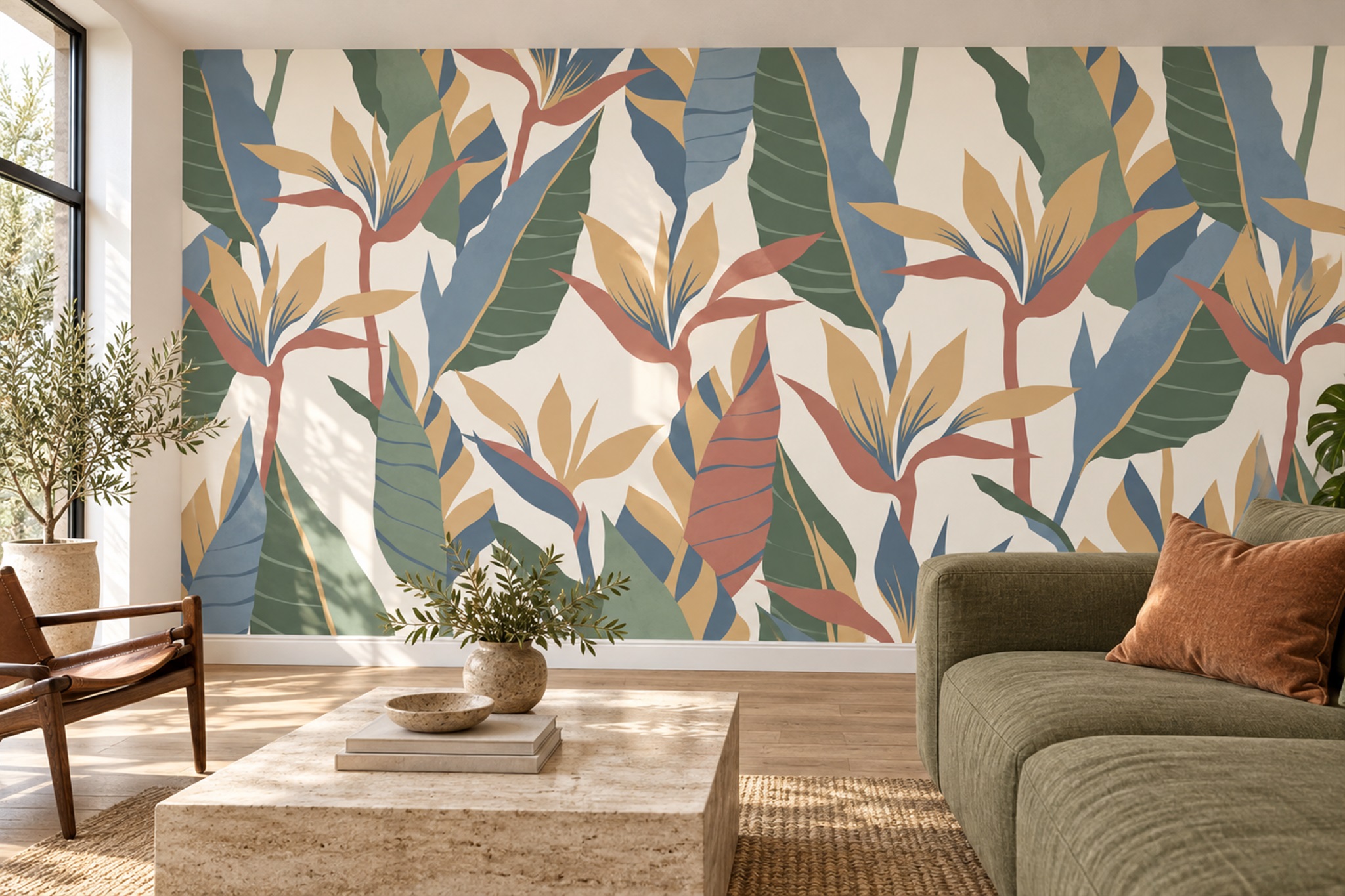
Example application: Living room · pricing and measurement
When the sofa, floor and cabinets are already in place, a mural has to join an existing room rather than dictate a new one. The botanical living room shown here demonstrates one route: muted green leaves relate to the sofa, clay-coloured flowers pick up a cushion, and blue shapes add a note not already dominant in the furnishings. The sepia hallway and blue-and-white desk area below solve different problems. Begin with what cannot change, then decide what the wall should contribute.
Start with the pieces that cannot easily move
Photograph the room in daylight and rank what will stay by visibility, not just size. A stone floor may be mostly hidden by a rug, while a built-in bookcase dominates a smaller area at eye level. Record warm or cool timber, the sofa's main colour and any strong pattern. These fixed surfaces deserve more weight than a cushion that can be changed next season.
Then identify what the room lacks. It may need colour, a sense of depth, a focal point or simply a softer transition between hard materials. A pale scenic mural can extend the eye beyond a compact sitting area. A broad abstract can connect several upholstery tones. A botanical can introduce organic lines into a room dominated by straight cabinetry. Naming the job helps eliminate images that are attractive but irrelevant.
Notice where the wall is seen from. The view from the doorway often determines the first impression; the view from a sofa or desk determines whether you enjoy the mural every day. Photograph both. A beautiful central subject can be lost behind a wardrobe from one angle, while a quiet area may be exactly what is needed behind a television or workstation.
The feature image works because the large olive sofa relates to green leaves, while the clay cushion picks up a smaller note in the mural. That does not mean every green sofa needs another leaf print. A greyed landscape with a small olive accent could create a quieter relationship; the fixed sofa colour matters, but the removable cushion should not dictate the entire wall.
Build a colour bridge
A mural does not need to repeat every colour in the room. One shared mid-tone can connect otherwise different elements. If the room has a grey sofa and warm timber floor, a grey-brown or taupe detail in the mural may bridge them. If the existing palette is cream and olive, a mural with cream open space and muted green forms may feel integrated without becoming a monochrome set.
Be attentive to undertones. Two greys can diverge: one blue, one brown. A product image shown on a bright screen may not reveal that difference. Compare a print sample with upholstery, paint and flooring on the intended wall. Look in daylight and under the lamps normally used there. The digital preview remains important for placement, but it cannot replace a real colour check.
Introduce contrast consciously. If the furnishings are all mid-tone, a mural with some pale space can lift the wall; if everything is very light, a darker tree or hill can anchor it. A new accent colour can work, but give it a modest echo elsewhere, perhaps in a book spine, ceramic or small textile. That echo should be a connection, not an obligation to buy a whole matching collection.
Compare artwork with the room's existing lines
Architecture and furniture have their own geometry. A long, low sofa creates a horizontal line; tall shelving creates a vertical rhythm; a window may divide the intended wall in two. A scenic tree mural can soften hard lines, while a geometric mural might reinforce them. Neither approach is automatically correct. Ask whether the new line pattern clarifies the room or makes several competing grids.
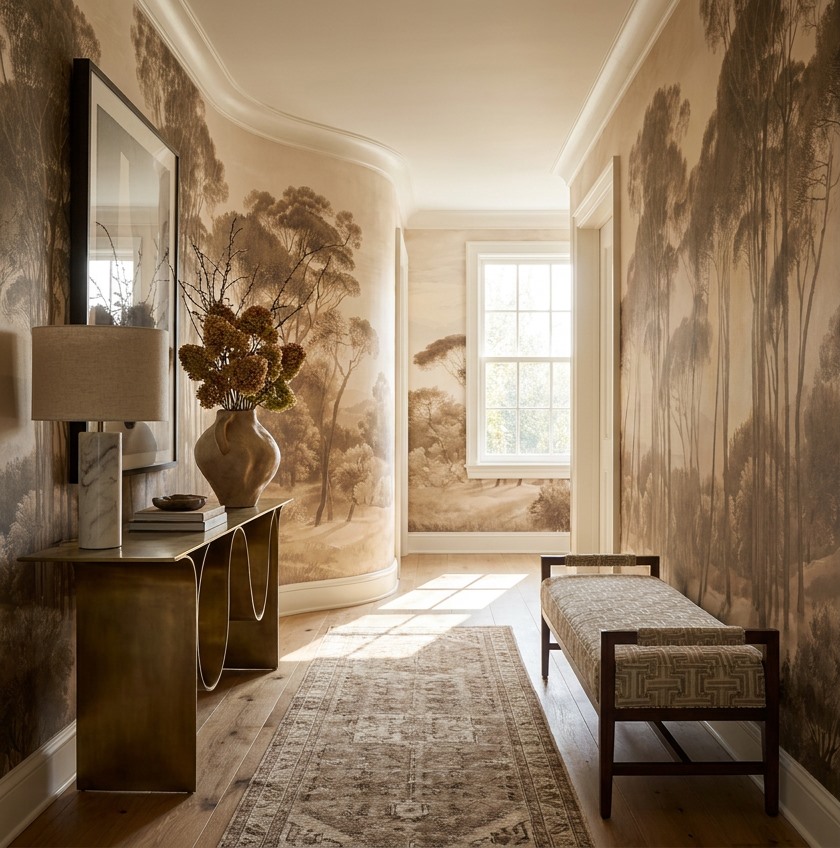
Study the artwork itself rather than relying on a style label. In the hallway below, sepia trees provide vertical movement, while the warm ground relates to the timber floor, console and bench frame. The long rug and patterned bench already add smaller-scale detail. A more graphic, high-contrast mural might compete with both. This woodland image is not necessarily right for another hallway with dark grey tiles and chrome fittings; its relationship to the existing finishes is the point.
Resolve pattern and texture before installation
If there is already a patterned rug, curtain or sofa, decide which pattern should lead. A broad woodland scene may act as a backdrop to a fine woven stripe. A highly detailed mural beside a strong floral sofa could make both harder to read. Vary scale and leave at least one large quiet surface. You may not need to remove any existing pattern; a simpler mural or a different crop can be enough.
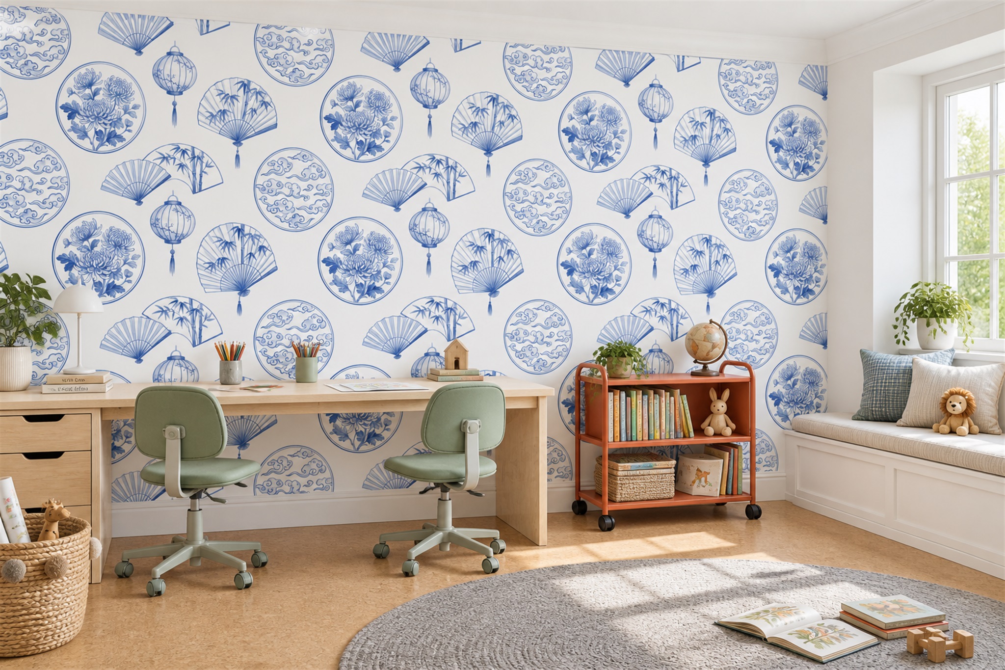
Printed texture deserves the same scrutiny. Artwork that depicts brush marks, plaster or stone may look visually tactile, but that does not prove the wallcovering has a raised surface. If your room already has textured plaster, brick or prominent wood grain, a mural with a smoother visual treatment may offer relief. In the blue-and-white desk scene below, repeated drawn fans, lanterns and floral medallions create visual detail without resembling a physical texture. Ask for a sample of the actual material if surface feel and sheen matter.
Do not ignore lighting fixtures. A wall lamp can create a bright patch over a focal area, and strong side light may make seams more apparent. Test samples where the mural will go. If a fixture interrupts the central subject, compare the crop with a sketch of its position before ordering. Moving a lamp may be possible, but it is not always sensible to reorganise a finished room around an image.
Work with the furniture that will cover the wall
Draw the approximate outline of the sofa, headboard, sideboard or desk on a separate wall elevation and compare it with the measured-wall crop. This can reveal that a scene's only clear horizon sits behind furniture or that a large subject balances it neatly. A crop considered without the room's permanent objects tells only part of the story.
Check the visual weight of each side. A tall cabinet plus a dense motif on the same side can make the room lopsided. The blue desk scene presents a different challenge: the repeating motifs run behind a long work surface and continue above it. If your desk is taller or cabinets occupy the upper half, far less pattern may remain. Mark those outlines on your sketch; if the crop leaves awkward fragments, choose another design rather than hoping installation will solve it.
Check the transition into adjoining spaces
An existing room is rarely seen in isolation. From a hallway, the mural may appear beside a glimpse of the next room's paint, flooring and furniture. Stand at the doorway and photograph that combined view before choosing the final crop. The sepia woodland example relates to timber in its own hall; if the adjoining room is much cooler and more graphic, decide whether the mural should bridge those moods through a shared neutral or deliberately mark a change of atmosphere. Copying every colour across rooms is unnecessary, but an abrupt clash at the doorway may be distracting.
In an open-plan room, look at the mural from the dining seat, the sofa and the main entrance. A colour that seems minor in a close-up can become a large block across a long sightline. The blue decorative desk scene contains a warm orange bookcase; from another room that bookcase may be the element that connects the mural to existing timber or warm upholstery. If the same orange appears nowhere nearby, it can remain a single accent rather than prompt the purchase of matching accessories.
Make one final test with the permanent room
Put two candidate crops into the same photograph of the actual room, preserving the wall's proportions and fixed furniture. Compare how each relates to flooring, adjacent paint and architectural lines as well as to the main sofa or desk. Then remove temporary flowers, cushions and other easily changed accessories from the judgement. A mural that depends on one small styling prop may feel less integrated when the room returns to everyday use.
Use a physical sample to check the leading colours under the light in both the mural room and the adjoining view. Save the chosen crop with a doorway photograph and a note of the fixed elements it was selected to complement. In the olive living room, sepia hallway and blue desk example, those elements differ; there is no universal matching formula. The useful outcome is a wall that has a clear role within the rooms people actually move between, while small accessories remain free to change.