How to Use Dark Mural Wallpaper Without Closing In a Room
Balance deep colour with lighting, negative space, reflective surfaces, furniture scale and the position of the mural.
Article focus: installation and removal
Planning the work and the exit
The right installation method depends on the chosen material and wall condition, so prepare the wall before ordering and follow the material-specific instructions.
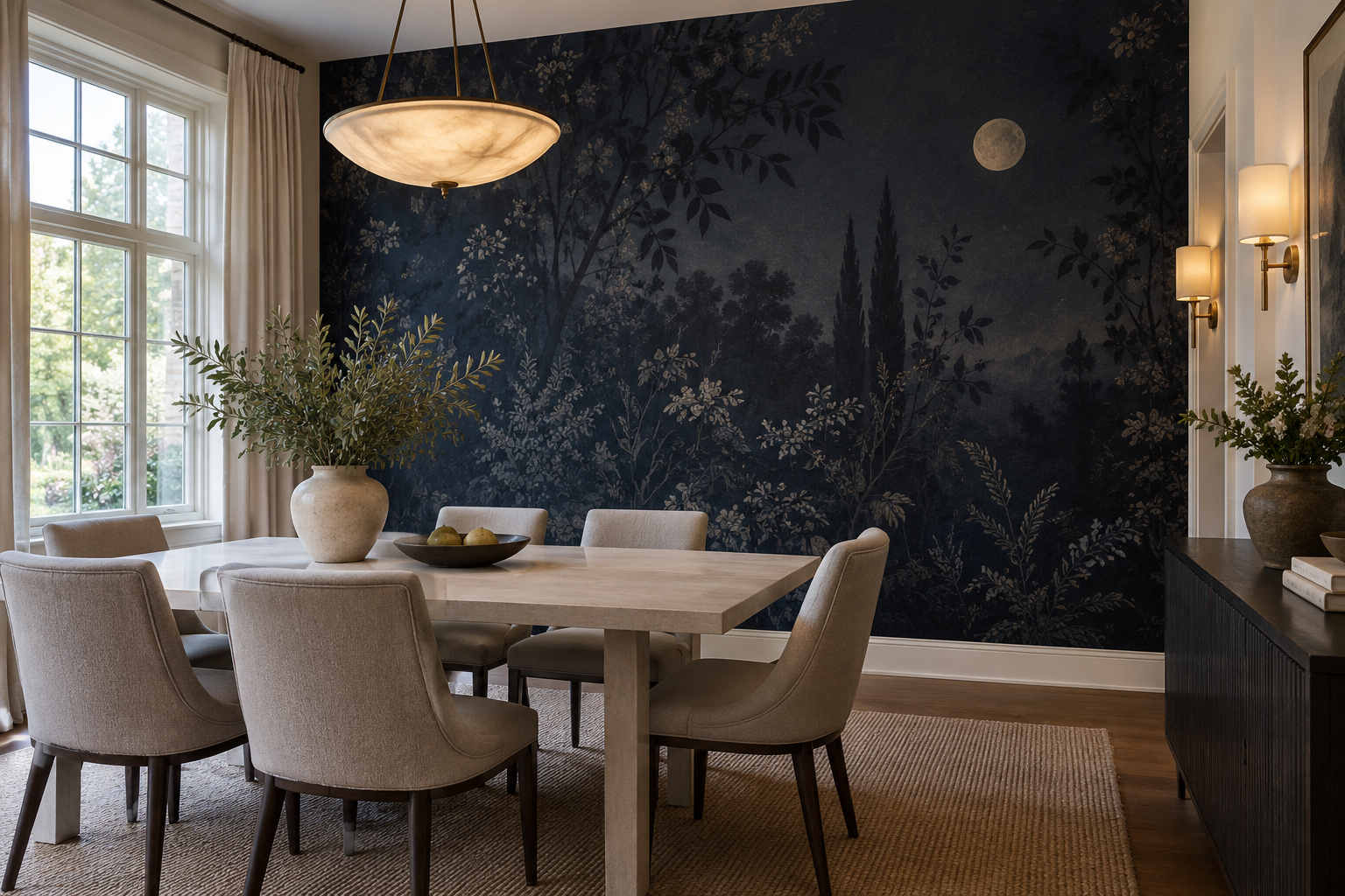
Example application: Bedroom · installation and removal
A dark mural does not automatically make a room feel closed in. Its effect depends on the relationship between the printed wall and the room's other planes: ceiling, floor, openings and adjacent walls. A navy night garden can act as a destination at the end of a long room, while the same artwork beside a dark corridor may merge with it. Plan the route into and through the room before deciding whether the print feels enclosing.
Ask what kind of darkness you want
Dark mural wallpaper can be almost solid colour, a scene with a deep foreground, or a light subject on a charcoal ground. Those designs create different visual effects. A sparse botanical on navy gives the eye places to rest. A detailed forest at night may be immersive but can compete with furniture and art. A dark abstract with broad areas of colour may serve as a backdrop rather than a literal scene. Choose the subject according to how much information the room already contains.
Darkness has gradations. Ink blue, charcoal, forest green and near-black each relate differently to timber, stone and upholstery. Carry a small trace of the chosen hue beyond the mural only if it helps the room read as one scheme: a blue chair opposite the wall can connect the two ends of a living room, while matching every accessory can flatten the contrast. Inspect a sample beside the actual paint and floor, not in isolation.
A useful first question is whether the dark wall should be the primary focal point. If yes, simplify the room's other strong patterns. If not, select a lower-contrast design and let a fireplace, window or artwork remain dominant. It is possible for a dark mural to be quiet, but it requires control of scale and contrast.
Separate the amount of dark ground from the amount of visual detail. A largely plain charcoal background with a few pale branches may be calmer than a lighter print covered in high-contrast marks. Equally, a night landscape with a moon or distant opening can guide the eye beyond the foreground. Look at the design from the doorway, not only at the intricacy of its leaves on a screen. Ask what the eye notices first, what it notices second, and whether those points make a coherent route through the wall.
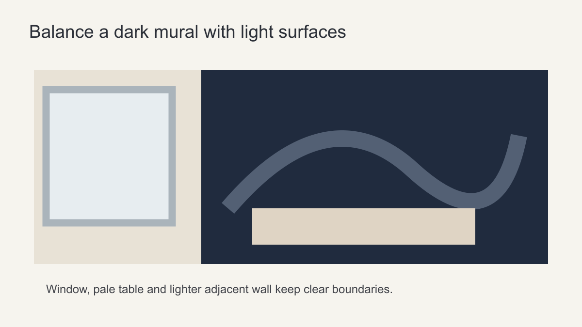 Balance the dark surface with light and clear furniture outlines.
Use light surfaces deliberately
A dark feature wall may feel more open when the ceiling and adjacent walls remain lighter, because their boundaries are easy to read. A pale table, sofa or headboard can stand forward from the mural. That contrast creates layers rather than a single dark block. If the floor, curtains and major furniture are also deep in tone, consider adding a lighter rug or upholstery before assuming the mural itself is wrong.
Natural light matters, but a large window does not guarantee a balanced scheme. Look at the wall in the evening, when it may rely on lamps and wall lights. Lighting aimed only at the centre can leave the edges in shadow; a lamp at the far side of the room may make the mural feel more integrated. The best arrangement depends on the fixtures, reflectance of neighbouring surfaces and how the room is used. Test samples with the actual lighting plan.
Separate artwork contrast from material finish. A digital mock-up can show whether a pale moon or opening is in the right place, but it cannot show exactly how the printed surface will look under a lamp. If that difference is important, compare the actual material samples in the room. A change of finish should not be treated as a substitute for a legible composition.
Compare the route from the entrance with the view from the main seat. A wall that reads as a distant destination on entry may occupy most of someone's field of vision from a dining chair. If the seated view feels too dense, a lighter adjoining wall or a composition with an opening may help. If the entrance view lacks a clear focal point, shifting the mural to the far wall may be more effective than changing its colour.
Choose one wall or more?
One feature wall is a practical starting point when it marks the end of a long room or anchors a dining area. More than one dark surface can work, but each additional plane changes how the room's boundaries are read. An adjoining dark-painted wall may soften the abrupt edge of a mural; a second illustrated wall can instead create two competing destinations. Decide whether the second surface extends the atmosphere or divides attention.
Think about which wall you see first. If the mural sits opposite the entrance, it can draw you into the space. If it is beside the entrance, you may see it obliquely and notice pattern rather than scene. A dark mural behind a television may visually reduce the screen's contrast with the wall, but the television can also cover the artwork's focal point. Preview the composition with the screen and cabinet in place before ordering.
In a bedroom, a dark mural behind the bed can give the headboard a strong frame if the bedding remains lighter. In a dining room, a night garden can make an evening setting feel deliberate when the table and pendant are clearly lit. In a narrow hall, a dark panorama may be hard to read at close range; a simpler vertical composition could be more effective.
Check the corners where dark meets light. A crisp edge may deliberately frame a feature wall, especially if an arch or door opening makes a natural stop. In an open-plan room, however, stopping the print in the middle of a continuous wall can make the zones feel arbitrary. Draw the boundaries on a floor plan and mark the views between zones before deciding where the mural ends. The question is spatial continuity, not a fixed number of dark walls.
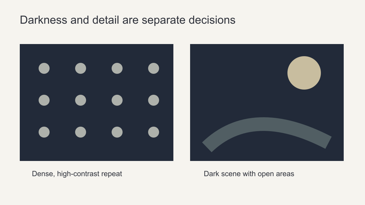 Darkness and visual busyness are separate decisions.
Apply the boundary test to the actual layout
At the end of a lighter hallway, a dark mural can become the destination. Its ceiling line and door frame usually remain visible as you approach, so a night garden can be dramatic without making the whole route feel dark. But if the hall and the room beyond are both painted similarly deep colours, that distinction may disappear. Test the view with the connecting door open. A lighter door lining or return wall may restore the threshold more effectively than changing the mural.
In an open-plan living and dining room, the problem is different: the print may end halfway along a continuous wall. There is no doorway to explain the stop. Align its edge with a change in architecture, such as a recess or column, or make the painted return part of the composition. A second illustrated wall can produce two competing destinations; extending a related solid colour may make the zone feel connected without repeating the entire scene.
Behind dark furniture, the crucial boundary is the furniture outline rather than the wall corner. A charcoal sofa against a charcoal landscape may become one heavy silhouette. Check whether a lighter area of the artwork can sit immediately behind the sofa, or whether a pale rug and side table can separate the seating plane. A bright window may perform that job by day but not after sunset, so make the comparison under ordinary evening lamps as well.
These are not instructions to make every surrounding surface pale. Choose the one edge that needs to remain readable for the room's purpose: a threshold in the hall, a deliberate stopping point in open plan, or an upholstered silhouette in the living room. Keeping that edge clear often allows the rest of the mural to remain richly dark.
What should you test before ordering?
If limited floor area is your main concern, see the small-room dark mural guide. Here the test is how a dark wall relates to the whole interior, including the rooms seen beyond it.
Make two wall-size views with the real furniture and openings: one from the entrance and one from the seat used most often. Mark the lightest part of the artwork in both. If it is hidden by a cabinet in the first view or falls behind a chair in the second, adjust the crop before judging the colour. Then view a physical print sample under the lamps normally used in that room; a backlit screen cannot settle the printed tone or finish.
Keep a record of the chosen wall edge, furniture silhouette and evening light source alongside the approved crop. This turns a vague hope that the room will feel open into a few visible conditions that can be checked after paint and furnishings are selected. Follow the supplier's trim and installation instructions separately; a good composition does not replace a suitable wall surface.
Let the dark wall have a clear purpose
Give the dark mural one job and test it after sunset. A night garden behind pale dining chairs can frame their outlines even if the smaller branches disappear under the usual lamps. If the garden itself is the subject, keep its opening or lightest motif clear of cabinets and check that it remains visible during an ordinary evening meal. A charcoal repeat behind dark shelving has another purpose: it can quiet the storage, but it will not create the same distant view. Preserve the contrast needed for the chosen job rather than brightening every dark area indiscriminately.