Are Dark Mural Wallpapers Suitable for Small Rooms?
Learn how dark colour, lighting, contrast, furniture and negative space affect the mood of a smaller room.
Article focus: installation and removal
Planning the work and the exit
The right installation method depends on the chosen material and wall condition, so prepare the wall before ordering and follow the material-specific instructions.
Example application: Bedroom · installation and removal
Will a dark mural make a small room feel smaller? Sometimes, but colour alone cannot answer the question. A navy ground with spaced flowers behaves differently from a near-black landscape full of fine highlights, and a white wall printed with dark motifs is different again. In a compact bedroom, study or reading corner, the amount of empty space in the artwork, the crop and the available light matter as much as the depth of the colour.
Dark colour and visual weight are different things
A broad field of deep navy with widely spaced pale flowers can feel calmer than a light mural crowded with tiny high-contrast marks. Equally, a nearly black scene containing many bright edges can pull the wall forward. The important questions are how much of the print is dark, where the lightest areas sit and how often the eye encounters a strong boundary.
Look at the design from the doorway and from the place where you sit or sleep. A large dark background may become a quiet backdrop at a distance, while fine pale outlines can become busy close to the wall. Do not infer the room effect from a thumbnail. Print the preview at a useful scale or ask for a crop showing how large one recognisable motif will actually be.
Think about what surrounds the mural. Dark artwork behind a light headboard can frame the bed. The same artwork beside a dark wardrobe, dark curtains and a heavy floor covering may concentrate too much visual weight on one side. A few lighter surfaces can help the room retain contrast without requiring every remaining wall to be white.
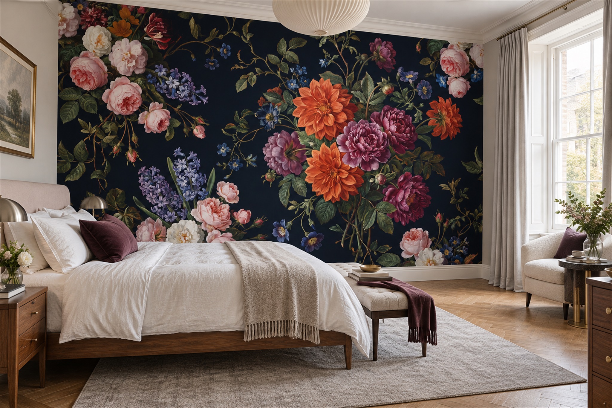
Consider the dark floral bedroom shown in the feature image. Cream bedding and daylight from the window interrupt the deep navy ground, while pink and warm-toned flowers make the wall a focal point. That photograph demonstrates a useful balance of dark print and light furnishing; it does not establish that the photographed bedroom is small. For your own smaller wall, the key test is whether its main flower clusters remain visible beside the bed and within the available width.
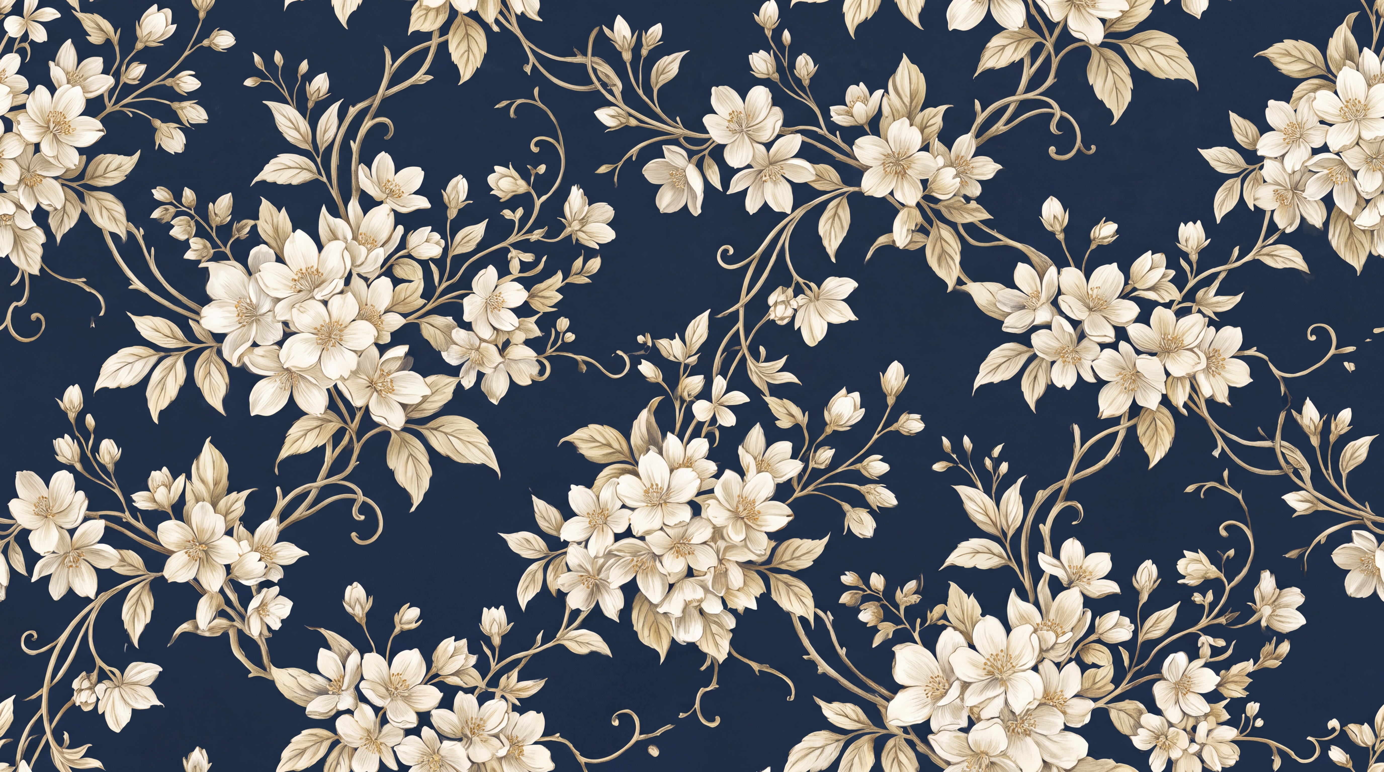
The navy-and-cream blossom print above makes the difference between background and detail easy to inspect. Its cream flowers are separated by substantial stretches of navy. Seen from across a room, those gaps may read as one quiet field; up close, each pale outline remains visible. Before committing, check a crop the width of your wall: if only one oversized blossom survives, the rhythm in the sample image will not survive in the installed mural.
Use the room's light as a design constraint
Visit the room at the times it is normally used. A north-facing bedroom and a room lit mainly after dark present different conditions from a sunny study. Dark areas may look flatter under weak illumination, while a strong side light can emphasise printed detail and panel joins. Test a sample on the intended wall, not on a table near a window. View it in daylight, with the curtains closed if that is normal, and under the lamps you actually use.
Plan layered lighting if the mural is meant to be appreciated in the evening. A bedside lamp or wall light may illuminate only one part of the composition. A ceiling fixture may brighten the centre but leave corners in shadow. Before choosing a very dark image, decide whether that unevenness is atmospheric or whether it hides the subject you wanted to see.
Material finish also changes perception. A digital image cannot reliably show how a matte or more reflective print will behave beside the room's windows. Request the actual material sample where available. A dark printed background is not proof of any particular texture, opacity or cleaning performance.
Choose the right wall and crop
One uninterrupted wall usually gives a dark mural the strongest chance to work. A compact room may have a window, door, radiator and tall furniture competing for the same surface. Draw those obstacles on a separate wall elevation and compare it with the crop preview. If a pale focal motif is cut in half by a wardrobe, the intended light-dark balance may disappear. A revised crop or a different design may solve the problem.
The darkest area does not have to sit behind the largest piece of furniture. For example, a dark floral cluster above a headboard can anchor a bedroom, while a quieter area behind a desk may reduce distraction. In a tiny reading room, the mural can sit opposite the chair to be seen as a picture rather than directly behind the reader. Placement is about the sightline, not simply the biggest available wall.
Be careful with apparent horizons and gradients. A landscape that is almost black at the base and pale at the top can suggest depth, but if a low cabinet hides the dark foreground the composition changes. Conversely, a pale opening in the centre can give relief, provided it remains visible after the bed or sofa is placed. Review the crop with furniture outlines, not only with empty-room dimensions.
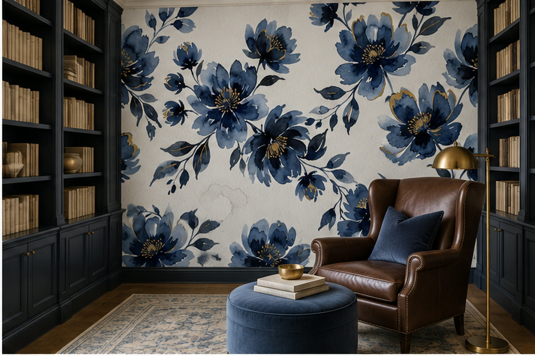
The second image reverses that relationship: blue flowers sit on a light ground, while dark shelves and a leather chair supply much of the room's visual weight. This is a useful alternative when a fully navy wall feels too enclosing, but it is not automatically the lighter-looking room. Furniture, books and the amount of exposed wall all affect what the eye reads first. Compare the two designs alongside the furnishings you will actually keep.
Decide how much contrast the room can carry
High contrast is not inherently wrong in a small space. It can sharpen the room's character and make a feature wall deliberate. The challenge is repetition. If the floor has a strong pattern, the bedding is patterned and shelves are visually full, a dramatic mural may leave the eye nowhere to rest. Keep some large, relatively quiet surfaces in view: a plain duvet, a simple curtain or an uncluttered adjacent wall.
A dark mural need not require dark paint on every other wall. One approach is to take a mid-tone from the print for the neighbouring paint, producing a softer transition than bright white. Another is to retain light walls and repeat the mural's dark hue in a small textile or frame. Test both arrangements with samples; the right transition depends on the actual undertones and light in the room.
Watch the ceiling line. A deep mural ending abruptly under a bright ceiling can create a strong horizontal boundary. This can be crisp and intentional, but it may emphasise a low ceiling if the composition also has a heavy top edge. A design with lighter detail near the top, or a related ceiling colour, can change that reading. Do not assume dark always lowers the ceiling; inspect the specific edge treatment.
Three practical small-room scenarios
In a narrow bedroom, a navy botanical behind the bed can provide a calm backdrop when the motifs are large enough to read and the bedding remains relatively simple. Place the main flowers where the headboard will not hide them. If there are bedside wall lights, check whether their pools of light illuminate the print evenly enough for the intended look.
In a compact home office, a dark abstract mural can make the video-call wall distinctive, but fine, high-contrast marks directly behind the chair may look distracting on camera. Test the laptop view as well as the room view. A quiet area around head height often works better than a bright central motif. Glare from a nearby window may change the result during the day.
In a small reading nook, a deep scene can feel enveloping, particularly when a lamp lights the chair and the mural has some open space. It may not need to cover every wall. A single well-composed surface gives the eye a destination; wrapping the same dense image around several short walls could fragment the artwork at each corner.
Try the dark-ground and light-ground versions in the same corner
Judge the two under the room's least flattering normal light. In an evening bedroom, close the curtains and use the bedside lamps; in a daytime study, include the window glare. If the navy loses its floral detail, a crop with more pale motifs may help, but a different image could be the better answer. If the light-ground option looks restless beside books and patterned fabrics, give the darker, more spacious design another look. The decision belongs to the occupied room, not to a rule about dark colours and floor area.