How to Choose Forest Mural Wallpaper
Compare tree density, mist, depth, horizon, colour and the amount of visual quiet needed in the room.
Article focus: installation and removal
Planning the work and the exit
The right installation method depends on the chosen material and wall condition, so prepare the wall before ordering and follow the material-specific instructions.
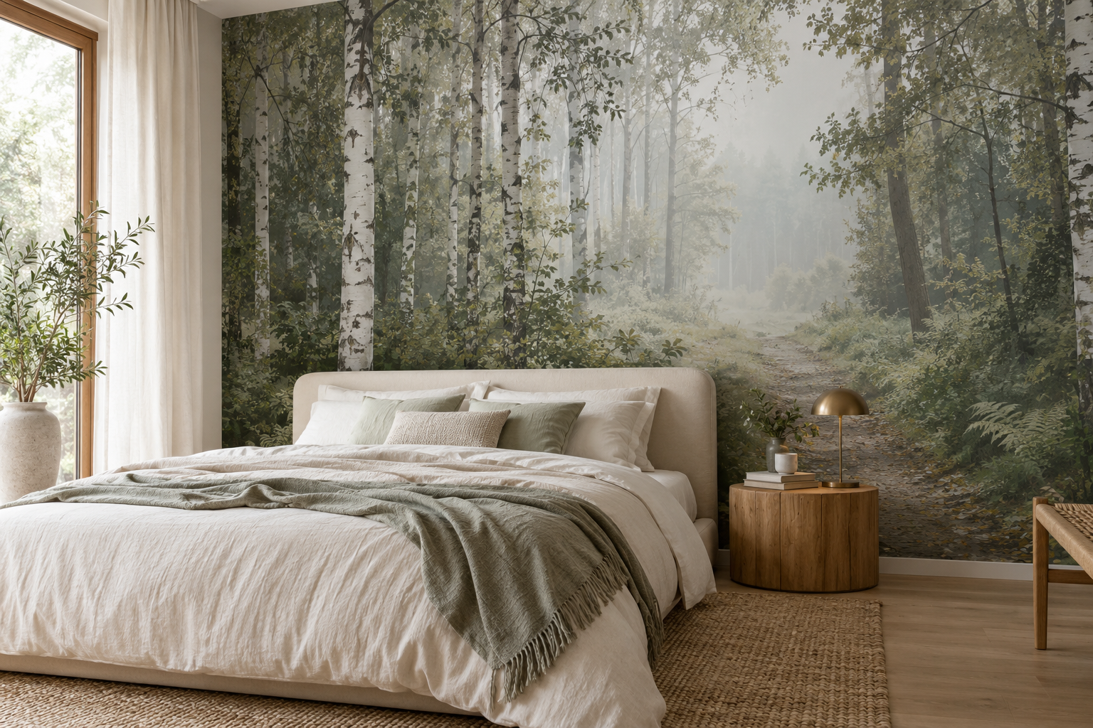
Example application: Bedroom · installation and removal
Forest mural wallpaper can make a room feel sheltered, expansive or unexpectedly dark. The result depends on the spacing of trunks, the openness of the sky, the contrast between foreground and distance, and where the principal path or clearing lands on your wall. A dense canopy may be perfect for a dramatic dining room but too visually heavy behind a small bed. Choose the actual forest composition, not just a green swatch.
Decide whether you want enclosure or distance
Some forest murals bring trees close to the viewer. Large trunks at the front and dark foliage along the edges create an immersive feeling. Others open towards a clearing or path, allowing the eye to travel into the wall. Neither is inherently better. Ask whether the room needs a more enclosed atmosphere or a sense of a distant view. A compact room can support either, but the amount of detail and light should be chosen deliberately.
Look at how much of the composition is sky, mist or pale ground. A wall dominated by dark trees will have more visual weight than one with open distance. Even if both are labelled sage or grey forest, they can behave differently at full scale. Zoom out on the complete image and judge the light-to-dark balance before selecting a favourite detail.
A path or clearing is not merely a decorative detail: it provides an apparent route through the trunks. If the opening is cropped away, the same scene can become a close wall of foliage. Before selecting a colourway, decide whether you want to look into the forest or be surrounded by its near trees. The two effects can be made from similar greens but ask very different things of the room.
Consider the bedroom shown in the feature image. The bed takes much of the lower left wall, while the lighter woodland opening and visible path remain to its right. That placement lets the forest retain a sense of distance without asking the path to run through the headboard. A centred path might look balanced in an empty product preview yet disappear once the bed is added. The right focal position is the one that survives the room's actual layout.
Read the picture in three parts from the doorway: the near trunks, the canopy overhead and the space between them. Closely spaced trunks with foliage across the top can make a deliberate enclosure. A break in that canopy and a pale route between trees can make the image feel more open. This is visual depth in a flat print, not a change in the room's physical dimensions. Choose the arrangement you will want to see on entering every day.
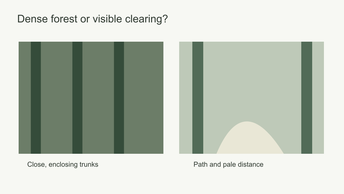 Tree spacing and a visible clearing alter the sense of depth.
Choose tree scale for the room
A birch trunk as wide as a door can become a striking architectural element. It can also make a low-ceiling room feel crowded if several such trunks fill the wall. Fine distant trees may create atmosphere but vanish from across a large open-plan living area. Compare the expected printed size with a doorway, sofa or bed rather than the size shown on a phone.
Trunk direction matters. Strong vertical lines can echo a tall window or wall panelling. A room already full of vertical shelving might benefit from a softer canopy or a landscape with a clear horizontal opening. A forest scene with diagonally leaning branches has more movement and may require quieter furnishings.
Repeating woodland patterns and panoramic forest scenes require different planning. A repeat tolerates interruptions and furniture changes. A panorama depends on its intended focal area remaining intact. Choose based on the wall's doors, windows and likely furniture arrangement.
Count the dominant trunks at full size. Three widely spaced forms can give a wide wall structure and leave calm areas behind furniture. Many equally spaced trunks may instead read like stripes. That can suit a hallway where the mural is seen obliquely and briefly, but it will not provide the same far view as a misty clearing. Compare those verticals with existing shelving, panelling and narrow windows so the room does not become a stack of unrelated upright lines.
Tree species can contribute character without being the only criterion. Pale birch-like trunks offer light contrast; darker broadleaf silhouettes can give the wall more weight. But an artistic woodland need not be a scientifically exact depiction to work in a room. Inspect the actual shapes and tonal structure before leaning on the product's species label. If authenticity is important, confirm it from reliable product information rather than inferring a geographic forest from a colourway.
How dark can the forest be?
Dark forest imagery can make a room feel rich and enveloping, especially with well-planned lighting and furniture that stands out against it. It can also absorb the visual space behind dark upholstery. A cream headboard or lighter sofa may separate clearly from an olive woodland, while a charcoal sofa may need a paler section of the artwork behind it. Consider value contrast, not just whether the green matches.
In a room with limited daylight, mist or a pale distant opening can keep the woodland readable. In a bright room, a deeper foreground may create useful contrast. Test a printed sample on the intended wall during the day and with the room's evening lights. A digital render cannot show how the print will look under your lamps.
Forest colour varies beyond green. Grey birch, warm sepia, blue mist and ochre foliage can suit different materials. Compare the mural with timber, stone and textiles already in the room. A richly green design may connect beautifully to an oak floor, or it may need an ivory ground to keep the room from becoming too saturated.
Darkness is distributed across a forest, not contained in one swatch. A dark canopy above a pale clearing draws the eye inward; an evenly mid-dark woodland from edge to edge creates a more continuous envelope. The first can frame light bedding, while the second may be effective beside a simple dining table. Check where the darkest foliage actually sits. If it runs directly behind charcoal upholstery, the furniture may lose its outline even when the distant trees are beautifully painted.
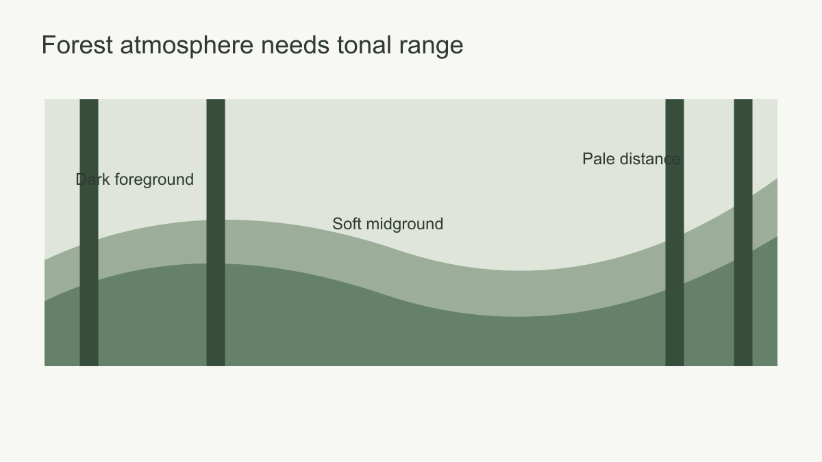 Check the proportions of dark canopy and light distance.
Test the view with the room furnished
Overlay the bed, sofa or table at its real height on the wall crop. Mark the nearest trunk, the canopy edge and the lightest clearing. All three need not be fully visible, but the relationship that creates the chosen effect must survive. Add bedside lamps, wall lights and curtains to the overlay: these smaller objects can hide a narrow opening or divide a trunk even when the bed or sofa leaves it clear.
Change the viewpoint as well as the crop. From a seated position, lower trunks may be hidden by a sofa, while the canopy fills more of the visual field. From a hallway, the scene may be seen at an angle through a doorway, and a simple rhythm of trunks may read better than a delicate winding path. In a close reading nook, finer woodland detail has more chance to be noticed. The best forest is the one whose spatial structure remains clear from the room's real viewing positions.
Actual plants add another foreground. Put a tall plant against a pale opening if its silhouette should remain distinct; against dense printed foliage, it may almost disappear. If several plants already occupy the room, consider whether a simpler woodland drawing gives both the real and printed leaves enough space. This question is specific to a forest mural: it can feel lush without asking every layer to be equally dense.
Drawing style and print detail
Watercolour forests use softened edges; engraved woodlands rely on line; photographic scenes depend on image detail; painterly interpretations may make broad shapes more important than individual leaves. Each can be effective. At the proposed size, inspect the print quality of the selected artwork. A photographic trunk that looks detailed on a small screen may become soft when enlarged. A sample or proof is more useful than assumptions about resolution.
Printed bark or paper grain is a visual effect, not physical tree texture. Do not expect the wall to gain relief. If the surface itself is uneven, follow the selected product's preparation instructions rather than relying on a busy forest to conceal it.