How to Use Green Mural Wallpaper Indoors
Explore olive, sage, moss and deeper green artwork while considering natural light, timber, upholstery and room scale.
Article focus: installation and removal
What the installer needs to know
The right installation method depends on the chosen material and wall condition, so prepare the wall before ordering and follow the material-specific instructions.
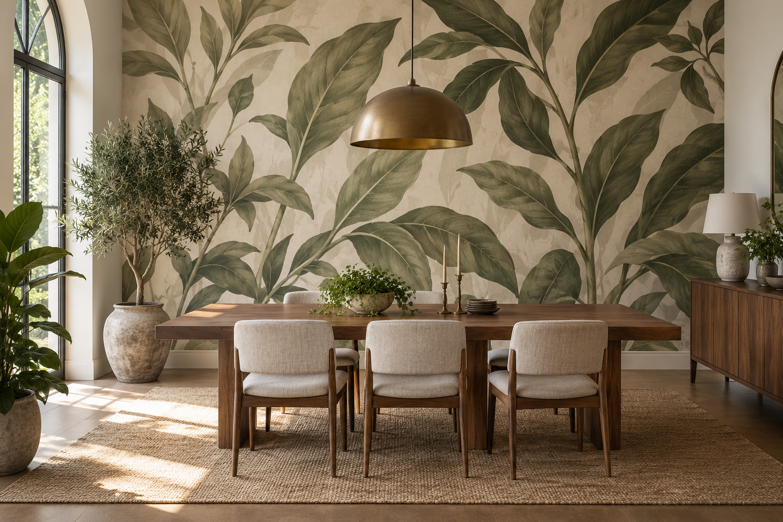
Example application: Bedroom · installation and removal
Green mural wallpaper is often chosen to bring a garden or woodland reference indoors, but it can also act as a quiet architectural colour. Sage leaves on an ivory ground, a deep olive canopy and an abstract moss-coloured wash will behave very differently in the same room. Before choosing a subject, decide how the green should relate to timber, stone, upholstery and any real plants already present. The strongest result is usually a deliberate relationship rather than an attempt to turn every surface green.
Begin with the room's fixed materials
Look at flooring, joinery, stone and large upholstery before naming a shade. A grey-leaning sage beside honey oak makes a different transition from a yellow-leaning olive; a blue-leaning forest green may sit differently against cool stone. Put printed samples upright beside those fixed surfaces. Their relationship in the actual room matters more than a label such as “sage” on a screen.
Next estimate how much of the installed wall will read as green. Fine leaves on ivory may function as a mostly light patterned wall, while a dense olive canopy can make the whole surface feel dark. A dark walnut cabinet may need pale ground around its outline to remain distinct. In an almost neutral room, a broader green field may supply the visual weight that the furniture lacks. Compare the whole print rectangle, not only a leaf detail.
Nearby colour changes the impression too. Rust, terracotta or warm timber can make some greens appear more vivid; blue upholstery may emphasise a cooler note. Use a controlled contrast rather than forcing an exact match. Repeat one small green accent elsewhere only if it helps the wall belong to the room; the mural does not need a matching cushion, pot and curtain to justify it.
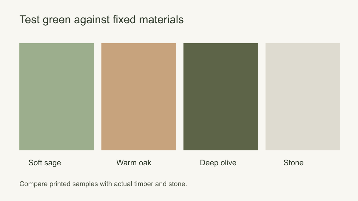 Compare greens beside the room's actual permanent materials.
Botanical, woodland or abstract?
The subject controls where green sits in the picture. A botanical on ivory may concentrate colour in isolated leaves, leaving light ground behind furniture. A woodland scene can spread green across foreground, trunks and canopy, so the wall reads as one larger colour field. An abstract wash can distribute green without repeating leaf shapes at all. These differences remain even when the three designs use a similar named shade.
Look at the edges and interruptions. A spaced branch can survive a doorway if its main leaves remain visible; a grove needs enough of its path or clearing to retain depth. An abstract field may tolerate furniture moving later, though a single large geometric shape can still be cut in half by a window. Compare candidates at the actual wall size and view them from the main seat, not only as close-up samples.
Scale changes colour distribution. A few oversized leaves create sculptural patches of green above a table; the same leaves reduced to a tight repeat may merge into an all-over tone from across the room. A misty grove may stay light because pale sky separates its trees, while a close canopy can make an equally small room feel visually dense. A printed brushstroke or plaster effect remains a flat image, not a textured finish. Choose the design whose visible light and dark areas suit the furniture, rather than treating all “green botanical” results as equivalent.
How should the mural coexist with houseplants?
Put a photograph of the actual plant over the proposed wall-size crop. If its dark leaves merge with equally dark printed foliage, move the pot against a pale area or choose an image with a clearer difference in shape or value. A green abstract can keep the colour without doubling the leaf silhouette. The plant will grow and cast changing shadows, so do not build the whole composition around its current outline.
Colour coordination is not the same as treating the print as living nature. A mural can provide a botanical image where plants are impractical, but it does not bring daylight or ventilation. The biophilic-interior guide covers those broader room connections. Here the practical task is to leave enough visual separation for the real plant and the printed green to be recognised independently. Keep routine watering or misting away from a covering unless its material-specific care instructions support that exposure.
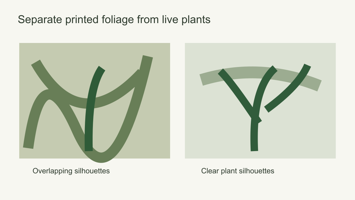 Leave enough visual contrast for live plants to remain legible.
Green in different rooms
A dining room can carry a fairly assertive botanical mural if the table and chairs have simple outlines. Position the main leaves above chair backs and away from a large pendant that may obscure them. A living room with patterned upholstery may benefit from a landscape with broad pale areas rather than a second dense pattern. In a bedroom, consider whether a darker forest behind the bed feels appropriately dramatic or whether a lighter grove better supports the bedding and daylight.
In a home office, a mural can establish a distinct background for the work zone, but avoid placing its most detailed area behind a screen and shelves. In a hallway, a repeated leaf design may tolerate doors and interruptions better than a single panoramic scene. The design needs to make sense from the main direction of travel as well as straight on.
An open-plan room adds a second view: the green wall may be seen from the kitchen or corridor long before its leaves are distinguishable. From that distance, a pale botanical can read almost ivory while a deep olive canopy becomes a strong block beside neighbouring paint and cabinetry. Photograph that longer sightline and compare the candidates at their actual wall proportions. If the deep green interrupts an otherwise light sequence of rooms, decide whether that contrast is a welcome destination or whether a design with more open ground would connect the spaces better.
Kitchens and bathrooms introduce practical conditions that cannot be answered by colour alone. Moisture, heat and cleaning demands vary by location and substrate. Check the selected wallcovering's guidance and consult an installer before placing it near a sink, hob or wet zone. A green mural on a separate, suitable feature wall is a different proposition from wallpaper directly in a splash area.
Make the final green comparison
Hold furniture and plants fixed in one wall-size photograph, then compare three green distributions: a light botanical with separated leaves, a darker woodland field and a wash with no plant motif. From the doorway, note how much wall reads as green; from the main seat, check whether table, lamp and live foliage remain distinct. If the dark canopy absorbs those objects, the lighter botanical or abstract may serve the room better. If the wall looks empty beside very few plants, a larger branch can be the intended feature.
Only after selecting the composition should a printed sample settle whether the chosen sage, olive or moss tone works beside the actual timber, stone and upholstery. The preview answers distribution and silhouette; the sample answers colour and printed finish. A good green mural is the one whose visible shapes remain coherent in the furnished room, not merely the one with the most appealing leaf in a product thumbnail.