Which Mural Wallpaper Suits a Japandi Interior?
Explore restrained landscapes, natural textures, quiet botanical artwork and softened colour for Japandi-inspired rooms.
Article focus: pricing and measurement
Budgeting this wall with confidence
Start with accurate wall measurements; the final custom mural price depends on area, material and any finishing options.
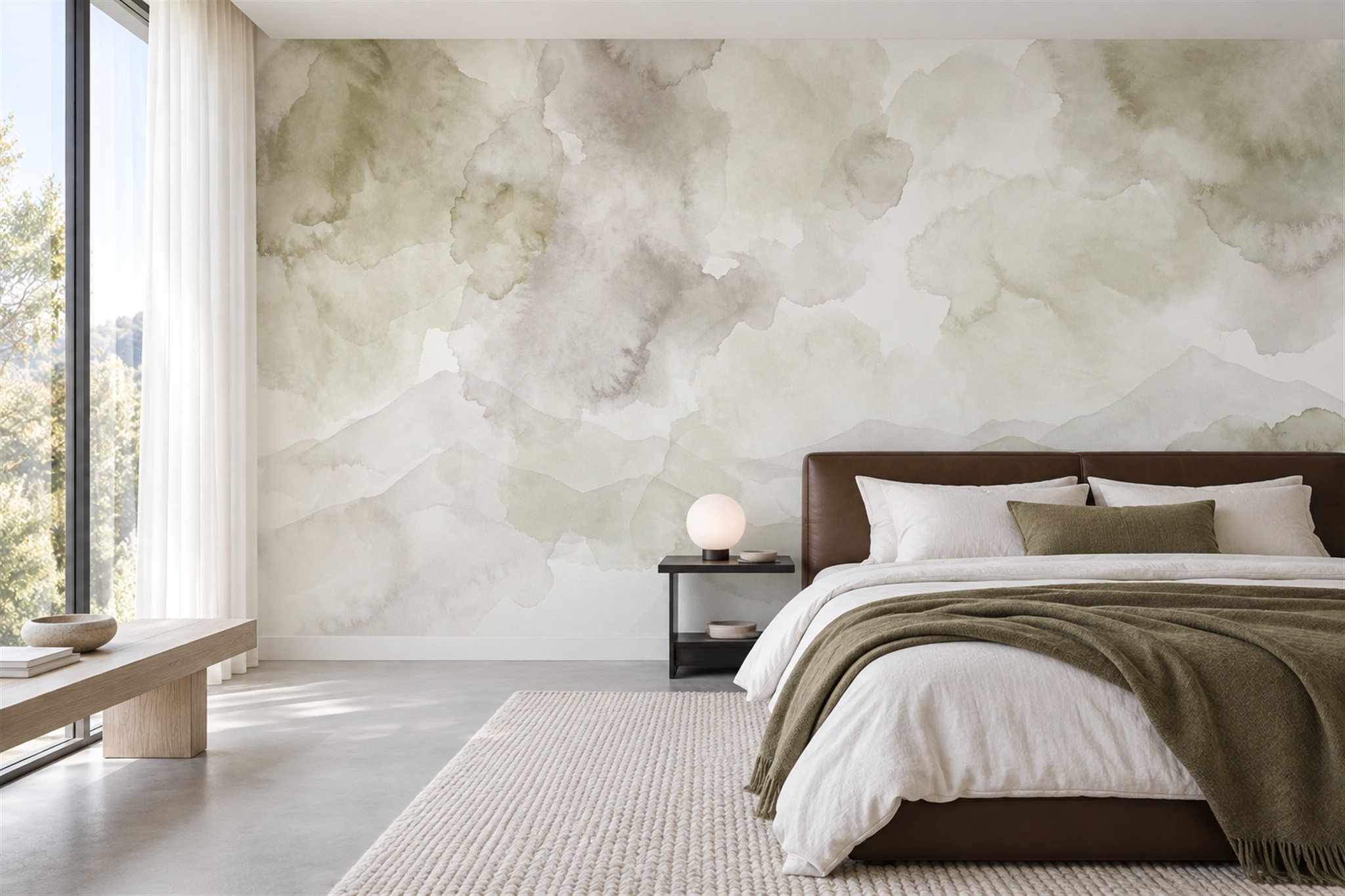
Example application: Bedroom · pricing and measurement
Which mural works with a Japandi-inspired room? Begin with the relationship between the wall and the furniture, not a motif sold under the style name. The grey-green wash in the feature bedroom lets the low bed, pale timber bench and soft textiles remain distinct. A more strongly defined mountain scene or an oversized beige abstract could also work, but each asks for a different amount of visual attention. The aim is a considered balance of natural materials, useful furnishings and open space, not a room made empty for its own sake.
Begin with the room, not a style tag
Take stock of the furniture and architecture you already have. Low timber furniture, clean lines, woven textiles and a few meaningful objects can create a strong foundation. A mural with many tiny details may make those objects disappear visually; one with vast blank areas may leave the wall too weak if the room is otherwise bare. The goal is not maximum minimalism but a balance between interest and rest.
Notice wood undertones. Pale ash and oak may favour soft sand, grey-green or warm off-white. Dark walnut can hold a deeper ink-like accent. A cool concrete floor and a warm wooden table may need an image containing both cool and warm notes. Place actual material samples beside the wood rather than selecting from a screen, where delicate neutrals are easily misread.
Avoid assuming that a Japanese-looking symbol makes a mural Japandi. A pagoda, character or decorative emblem should not be used as a shortcut for Japanese design, particularly when its meaning or provenance is unknown. An abstract wash, a distant ridge or a sparse botanical can relate to the room's proportions without inventing a cultural story for the artwork. Treat Japandi as a description of the interior direction here, not as an origin claim for any of these prints.
Use open space with purpose
Negative space lets the eye settle. It can sit above a low headboard, beside a single branch or between two soft tonal fields. But the open area must survive the room's actual crop. A door or wardrobe may remove most of it, leaving only the dense portion of the design. Compare the measured-wall crop with a separate sketch of fixed features and furniture.
Asymmetry can feel composed when it relates to the furniture. A pale, broad wash on one side may balance a darker chair or cabinet on the other. A branch that enters from the edge can guide the eye towards a reading seat. These are placement choices, not rules: forcing a central subject into every room can make an otherwise quiet image rigid.
The feature bedroom shows the quietest of the three choices in this article. Green-grey washes and faint ridges have few hard outlines, so the timber bench, dark headboard and plain bedding remain legible. Its open portions are not all concentrated above the bed: some sit between the coloured clouds and hills. On a much narrower wall, check that those pale intervals remain in the crop. The printed artwork suggests texture, but the physical wallcovering's finish must be judged from a material sample.
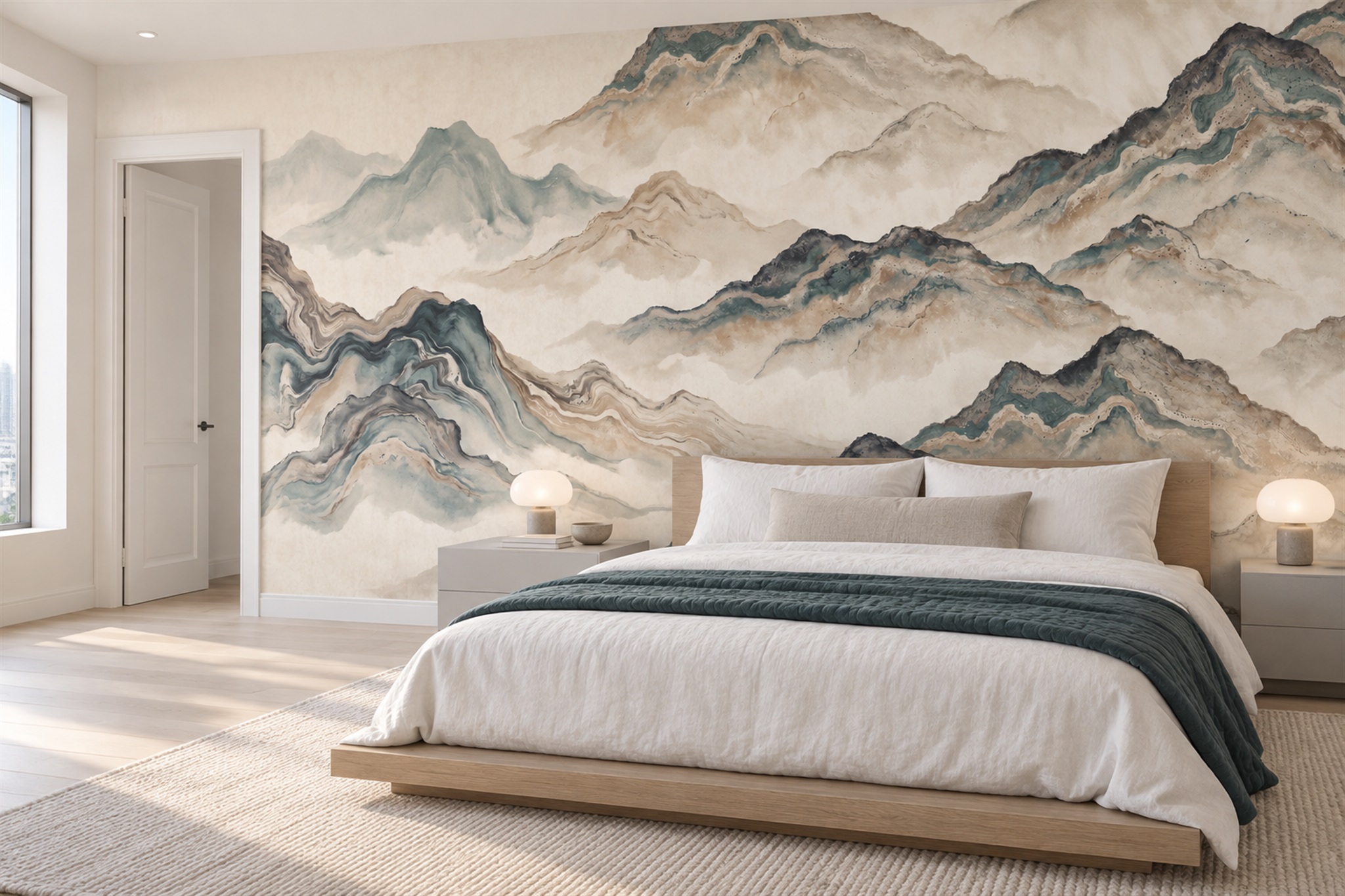
The mountain mural below is a useful comparison rather than a universal recommendation. Darker blue-grey ridges and veined lines create a stronger focal wall behind another low bed. The bed and bedding are simple enough to give the image room. If your own bedroom already has slatted timber, patterned curtains and many displayed objects, this version may ask for more attention than the space can comfortably carry. Compare both mountain images from the doorway at the dimensions of your wall.
Choose palette through materials and light
Useful starting colours include stone, warm ivory, mushroom, charcoal and muted olive. They are starting points, not a compulsory palette. In the pictured wash, muted olive works with a similarly coloured throw; in the more defined mountain scene, pale beige sits between the timber bed and blue-grey ridges. A honey-coloured floor may change how either appears. Hold print samples beside your actual wood, rather than copying the photographed pairing.
Keep contrast measured. A black line on white can be beautiful, but many repeated black marks may dominate an otherwise restful room. A low-contrast wash can offer movement that emerges gradually. Try looking at the preview from across the room. Does the mural read as one calm gesture or as a collection of small demands for attention?
Daylight is part of the scheme. A north-facing room can cool pale colours; warm evening lamps can deepen creams and greens. Test samples on the intended wall at the hours the room is used. The site's crop preview is useful for composition; the printed sample is more reliable for colour and finish.
Give a mural one clear role
In a bedroom, a soft landscape behind the bed can form a quiet backdrop. Keep its most interesting transition above the headboard rather than hidden behind it. In a living room, an abstract wash might connect a pale sofa and darker timber table. In a dining area, a restrained botanical can introduce an organic line opposite straight cabinetry. The artwork does not need to cover every wall to influence the room.
If the room already contains an expressive ceramic collection, slatted timber, patterned cushions and open shelving, a still quieter mural may be needed. Japandi is not achieved by adding every “natural” element at once. Edit the visible field. Give furnishings room to breathe and allow the mural to provide atmosphere rather than another inventory of motifs.
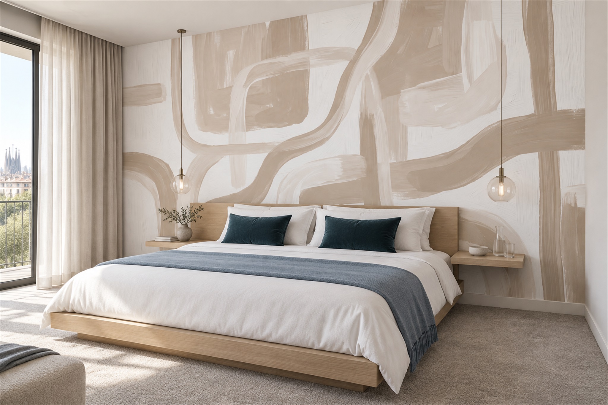
Conversely, an almost empty room may benefit from a more visible wall gesture. The beige abstract below uses large cream and sand brush-like forms rather than a repeated scene. They relate to the pale timber bed and light curtains, while dark blue cushions and a throw provide contrast. It is not an example of a Japanese painting technique simply because the room is spare. What matters is that the broad marks supply movement without requiring another collection of decorative objects.
These three routes suggest a practical sequence: first decide whether the wall should recede, frame a landscape or become an abstract focal point. Then test one candidate of each type against the same photograph of your room. If the furniture disappears beside a candidate, reduce the mural's contrast or simplify the composition; if the wall looks vacant, a stronger but still controlled gesture may be the better choice.
Use an editing test before committing to the mural
Set the three artwork previews beside a photograph of the room as it is actually used, then temporarily hide only the movable decorative objects in the photograph. Do not remove the bed, storage or lighting to make a candidate appear successful. If the defined mountain becomes convincing only after every book, cushion and lamp disappears, the wall may be asking the household to maintain a staged emptiness. The grey-green wash might support those same necessary objects with less visual competition; the beige brushwork might give a sparse room enough movement without adding more things.
Return the objects one group at a time and look for the point where the mural and furnishings start competing. You may find that one favourite ceramic needs a clearer patch of wall behind it, or that a textured throw and strong ridge line already provide sufficient contrast. This is a practical way to decide whether the mural should recede or speak more clearly. Keep cultural labels separate from that visual test: a restrained wall is not evidence that the artwork has a Japanese origin. For a different light-and-rhythm approach to pale timber rooms, see the Scandinavian mural selection guide.