How Does Lighting Change the Look of Mural Wallpaper?
Understand daylight direction, warm bulbs, shadows, surface texture and colour sampling before ordering a mural.
Article focus: installation and removal
Planning the work and the exit
The right installation method depends on the chosen material and wall condition, so prepare the wall before ordering and follow the material-specific instructions.
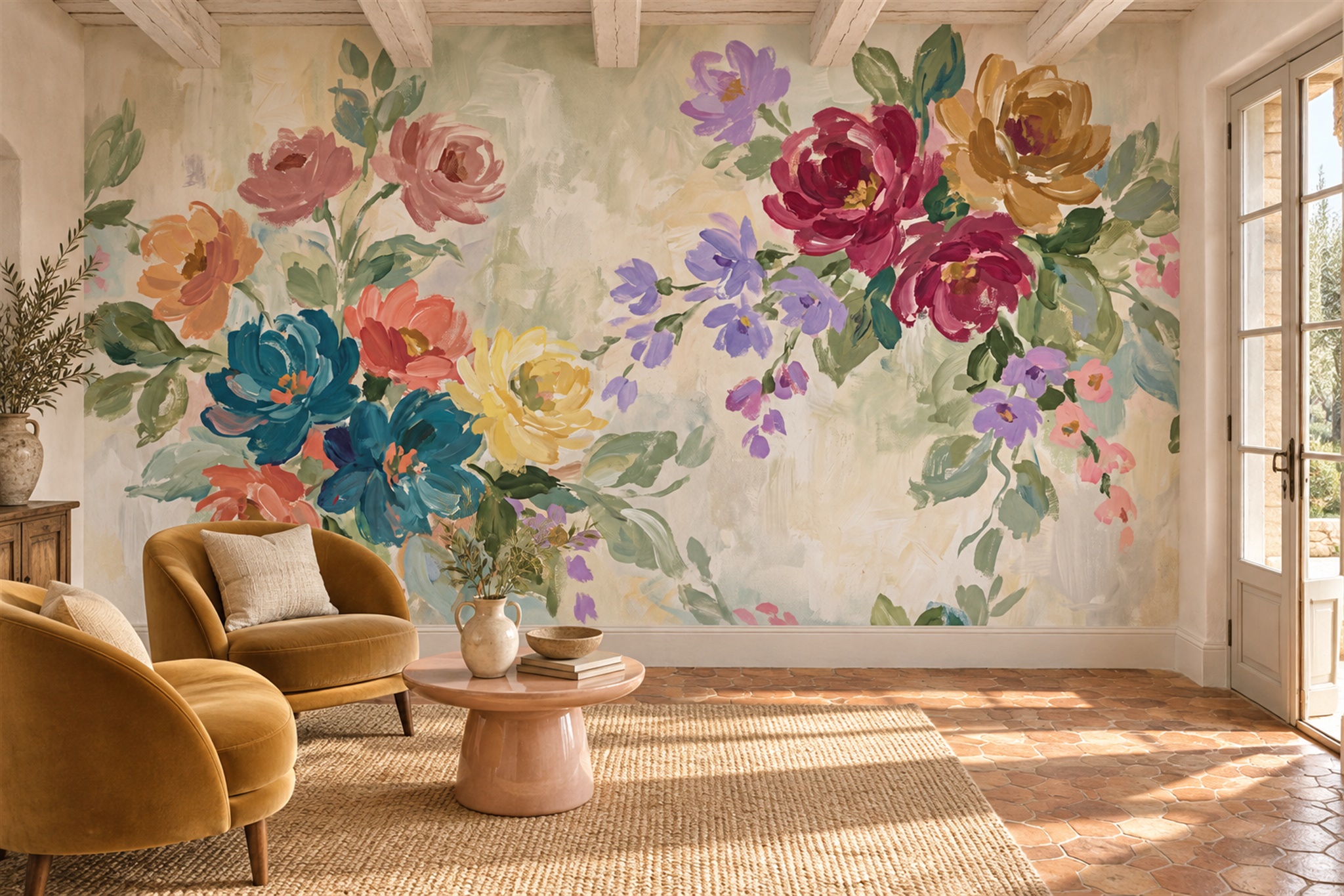
Example application: Bedroom · installation and removal
A mural has fixed printed colours, but the room does not have fixed light. The blue in a coastal scene may look crisp beside a bright window and much quieter after sunset; an olive background can appear warmer near an amber lamp. Lighting also changes contrast, glare and how readily you notice the wallcovering’s surface. That is why a digital preview can approve the image crop but cannot settle every colour decision. Test the actual print finish on the intended wall at the times you use the room.
Daylight changes through the room and the day
A wall facing a large window may receive fairly even light for part of the day. A wall beside a window may be lit obliquely, making changes in the underlying surface or panel edges more apparent. A pale mural in a shaded room can look more subdued than the same image in a bright product photograph. Window orientation matters, but surrounding buildings, trees and curtains can change the result; “north-facing” is not a full lighting description.
Watch the intended wall at several times. Where does direct sun fall? Does a neighbouring building cast a moving shadow? Put the sample upright rather than flat on a table, because its angle to the window changes what you see. Move it between a bright and shaded part of the wall if illumination varies across its width. For a mural with subtle mist, thin branches or a soft horizon, ask whether those details remain legible at the dimmest time you expect to see the room.
A mural that includes a subtle gradient can read differently where half the wall is strongly lit and half remains shaded. That can be attractive, but it may also hide a delicate subject. If a composition depends on a barely visible line or misty layer, check it under the room’s less favourable light as well as at its brightest moment.
Artificial light has colour and direction
Separate a colour shift from a surface effect during the test. Hold the same sample in place while switching between the room's usual lamps; if the hue seems to change, note which light source caused it. Then move to the seat and look at the sample from an angle. A bright patch that moves as you move is a reflection, while a pale printed area stays in the artwork. That distinction helps you decide whether to change the lamp position, the chosen finish or the image itself.
Warm bulbs can make cream, terracotta and olive feel richer while shifting the impression of some blues and greys. Cooler task lighting can make a warm mural appear flatter. The exact result depends on the bulb, shade, wall paint and printed substrate. Do not choose a mural colour from a screen under one lighting condition and assume it will behave the same beside your evening lamps.
Wall washers, picture lights and spotlights create a different effect from a central pendant. Grazing light can reveal seams, edges or irregularities in the wall beneath the print, while diffuse light tends to be more forgiving. If you plan dedicated feature-wall lighting, move the sample to the likely fixture position before buying the full mural. An image of an illuminated room is not evidence of how your wallcovering will respond to your fittings.
Consider glare too. A smooth or slightly reflective finish may show a bright window or lamp reflection from one seating position. Ask for the exact material’s sheen and view a sample from the sofa or bed, not only standing in front of the wall. A product photograph cannot show every reflective angle in your room.
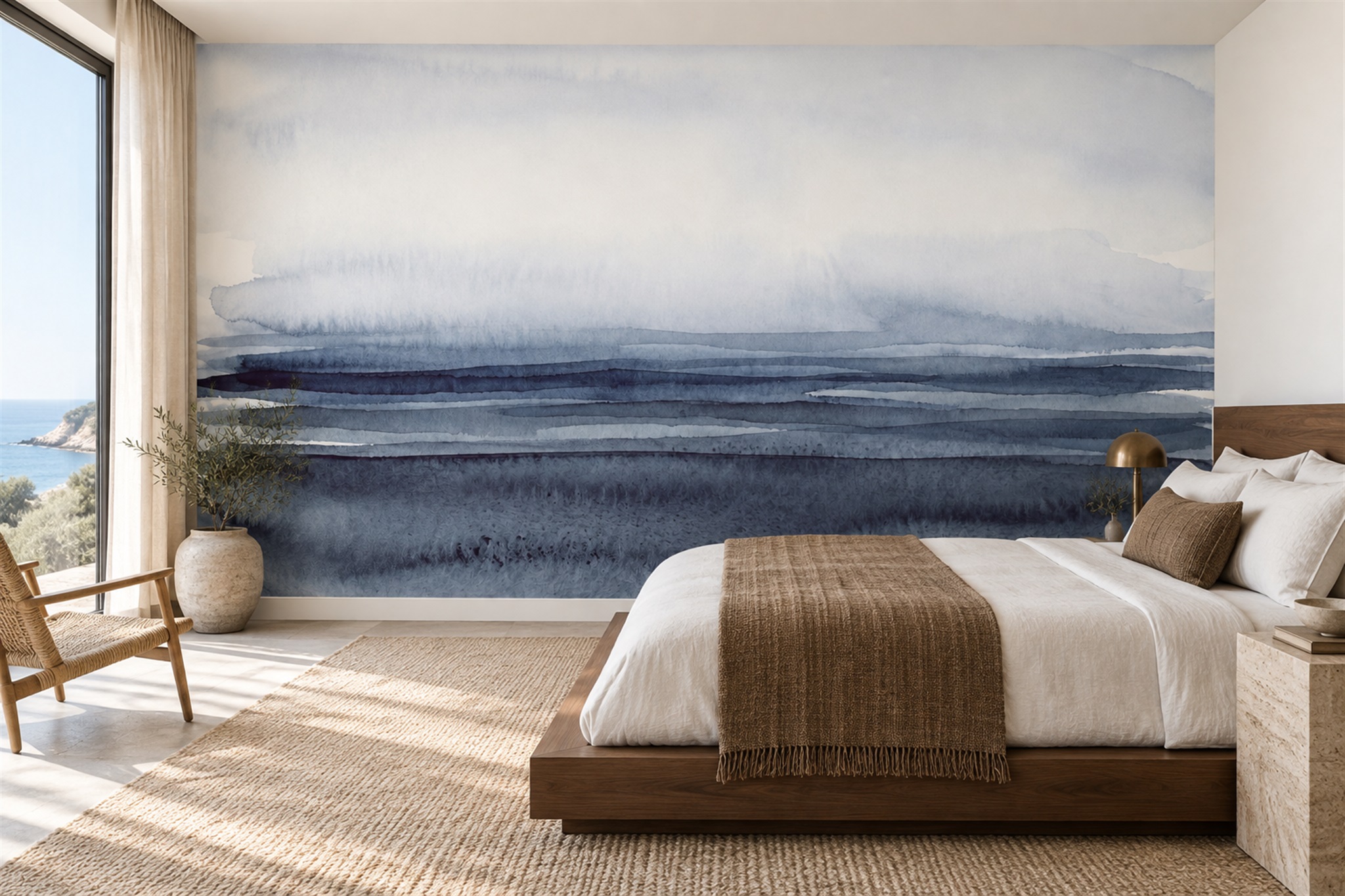
Print, paint and screens behave differently
A phone or monitor emits light; a mural reflects the light available in the room. Two screens can also display the same file differently because of their settings. The site's crop preview helps confirm which part of the artwork will be printed and where it will sit, but it is not a physical colour standard. A sample of the actual finish is better evidence for colour and surface appearance, though a small piece still cannot show the whole composition.
Adjacent paint affects perception too. Pale blue beside cool white will read differently from pale blue beside warm beige. Flooring, curtains and furniture add further colour to the scene. Compare the mural sample against actual paint swatches and fixed finishes rather than selecting each on a separate website. Benjamin Moore’s sampling guidance likewise recommends viewing colour in both natural and artificial light. The principle is especially useful when paint and printed artwork meet at a corner.
Print finishes can differ in surface character and sheen. Ask for a sample of the material you intend to order rather than assuming the appearance of one finish represents all others. Check the real sample from the sofa or bed, where an angled reflection may be more noticeable than when you stand directly in front of the wall. The same check can reveal whether side lighting draws unwanted attention to a panel join.
Work out what actually changes in the image
Hold the print sample in one position and compare it at the hours the room is used. If the blue ground looks greyer at dusk but its shoreline remains readable, the shift is principally in perceived colour. If the shoreline disappears while the ground still looks acceptable, the problem is detail contrast. If a bright patch appears only from the sofa and moves when you change seats, you are seeing a reflection rather than a pale printed motif.
Each observation leads to a different design decision. A colour shift may call for another colourway or a sample of the exact finish. Lost detail may call for artwork with a clearer focal edge, especially if that area sits in permanent shade from a cupboard or reveal. Reflection should be tested with the real viewing angle and light source before rejecting the image itself. Record which observation changed your judgement; “it looks darker” is not precise enough to guide the next choice.
A bedroom seen mostly under evening lamps may accept a quieter print at night, while a dining mural may need to retain its subject at both lunch and dinner. The artwork does not have to look identical at every hour. It does need to keep the parts you value visible during the times you will actually see it. Mark persistent shadows and furniture on a separate crop sketch so a digital preview is not mistaken for a lighting test.
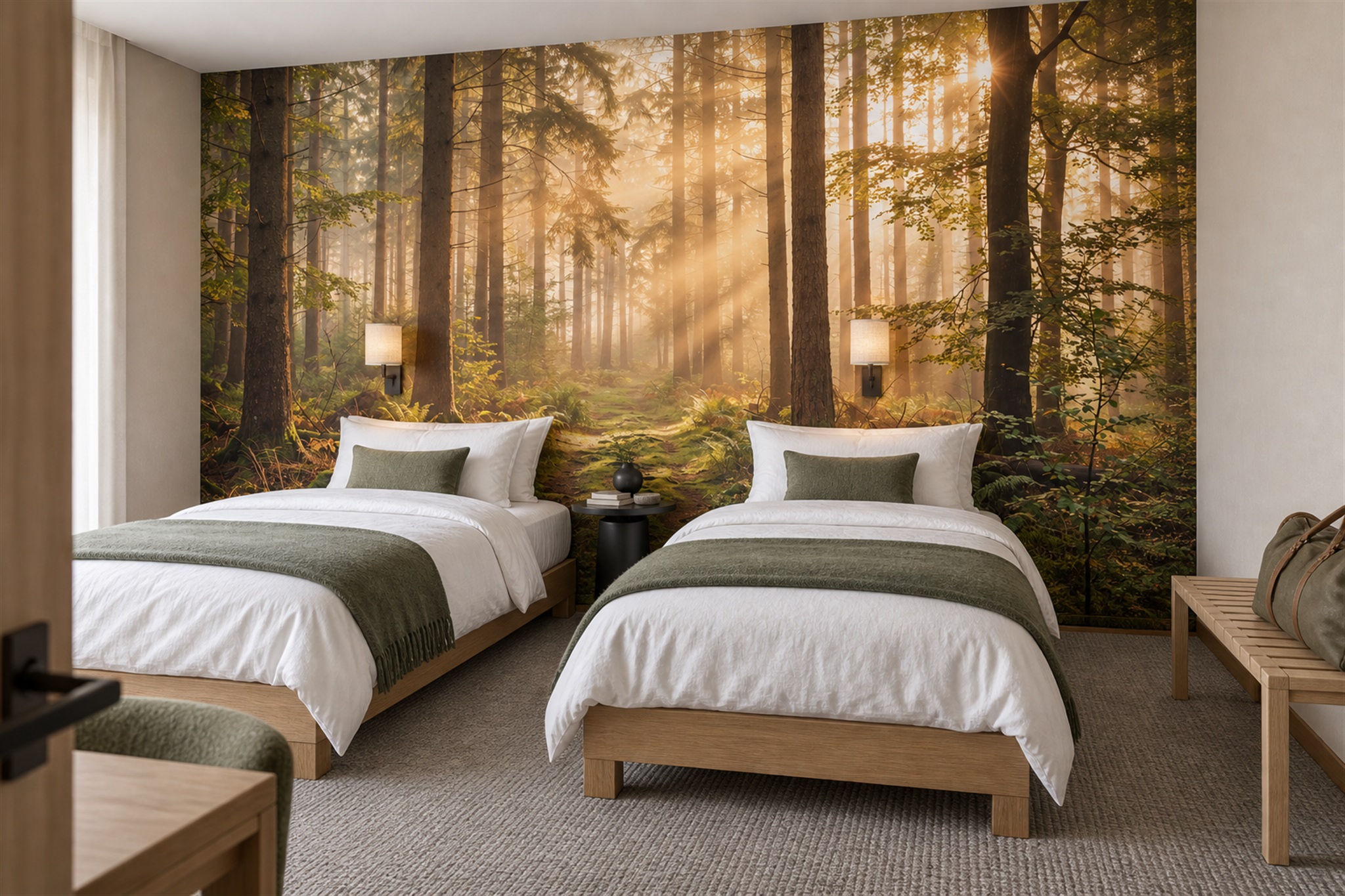
Keep appearance testing separate from lighting design
Attach the exact selected material sample upright at the height of the artwork's main subject, using a temporary method the supplier permits. Inspect it from the normal seat in daylight, normal shade and the lamps already used in the room. If the wall is unevenly lit, move the sample to both ends. Note the time and light source; a phone photograph may adjust exposure and white balance, so it is a record of the setup rather than a dependable colour standard.
Write down which part of the artwork remains legible and which does not. A crop proof confirms placement, while the printed piece shows colour and surface response in ordinary light. If the mural only reads when an additional fixture is switched on, decide whether that fitting belongs in the room for other reasons too. The lighting-plan guide addresses fixture placement, beam coverage and glare across the whole wall. This article's task is narrower: establish how the print you are considering already appears under the light you have.