Can Monochrome Mural Wallpaper Still Feel Atmospheric?
Use tonal contrast, line, texture and composition to create depth when the palette is limited to black, white or grey.
Article focus: pricing and measurement
The cost and measurement decision
Start with accurate wall measurements; the final custom mural price depends on area, material and any finishing options.
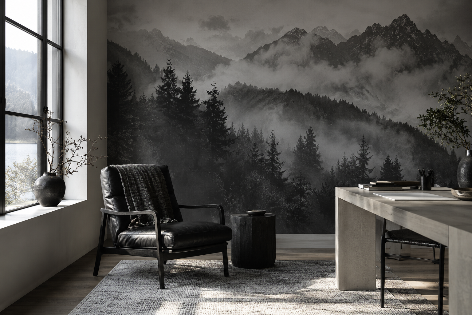
Example application: Bedroom · pricing and measurement
Monochrome mural wallpaper can feel deeply atmospheric because atmosphere is not the same thing as colour. A misty ridge, an engraved woodland or a soft charcoal abstract can suggest distance, weather and movement using only shifts between light and dark. The strongest monochrome designs have a clear range of values and an intentional focal point. A wall that is uniformly grey may be quiet, but it will not necessarily provide the layered feeling you want.
Look for tonal depth, not just a black-and-white label
Many product images are called monochrome even though their compositions differ dramatically. One might use crisp black linework on white; another might build several levels of foggy grey; a third might be mostly black with a few pale highlights. The first feels graphic, the second atmospheric, and the third dramatic. Ask which effect suits the room before choosing a subject.
A distant mountain scene relies on value changes: the nearest trees are darker, the far ridges lighter and the mist falls between them. An engraved mural gets its depth from density of line. A lightly etched sky can sit behind a detailed foreground without any colour shift. An abstract can use overlapping translucent-looking forms, although the print remains flat. In each case, some visual information must recede so other parts can come forward.
Judge the whole wall at normal viewing distance. Fine details visible on a phone may merge when printed at large scale and seen from across a room. Equally, a very pale image may disappear under strong daylight. A sample helps with print detail, while a full-wall mock-up helps with composition.
Compare a sharp black botanical with a soft grey wash at the same wall size. The botanical can be lively through the rhythm of its marks, even if it offers little sense of weather or distance. The wash can feel still and hazy, even without a recognisable landscape. Neither is more atmospheric by default. Decide whether the room needs movement, a quiet pause or a view that seems to recede, then ask whether the drawing delivers that particular feeling.
Edges are as important as shades. A sharply outlined foreground against a gently fading background gives the eye a place to enter the image. In an engraving, closely spaced lines can darken one area while a few open strokes let another breathe. If every mark is equally crisp, the result will often read as graphic pattern rather than mist. This is a useful distinction when the product photographs look similarly black and white at thumbnail size.
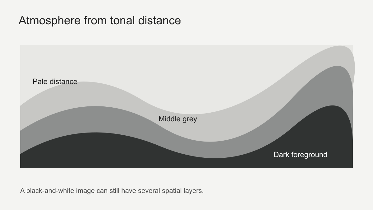 Dark foreground, middle tone and pale distance create visual layers.
Choose a subject that can carry the mood
Landscapes are well suited to atmospheric monochrome because distance is built into their subject. Mist, water and receding trees can lead the eye into the print. A botanical scene can be atmospheric too, especially when branches are drawn with varied line weight and there is open space between them. A dense black floral repeat may feel decorative rather than spacious, which is not a flaw if pattern is the goal.
Architectural sketches and city silhouettes offer another route. Strong outlines can give a room structure, while fading the background keeps the image from becoming a hard graphic statement. Choose the actual drawing carefully. A photographed city at night may lose important detail when converted to greyscale; an illustration designed around black, white and grey can hold its composition more reliably.
For a bedroom, a hazy horizon may offer a softer backdrop than a sharp black grid. For a study, an engraved forest or architectural drawing can give the wall more definition. In a dining room, a high-contrast mural may work when furniture and lighting are simple. There is no rule that monochrome belongs only in minimal rooms; it can also support richly textured interiors.
Those rooms also call for different amounts of unresolved space. Behind a bed, a broad pale interval can let the eye rest above the headboard. Beside study shelves, a lighter drawing can provide detail without turning the book spines and mural into one dense grid. In a dining room, a more theatrical charcoal scene may hold attention during an evening meal. Test the subject from the place where it will actually be seen: a mural admired from a doorway can feel much stronger from a chair only a short distance away.
Use room materials as the second palette
Black-and-white artwork is not experienced in a vacuum. Timber, linen, leather, stone and metal give it context. Warm oak can soften a charcoal landscape. A black leather chair can connect to a dark foreground, but may disappear if the wall immediately behind it is equally black. A pale desk or sofa can establish separation. If the room already contains patterned textiles, a quieter monochrome mural can give them space.
Monochrome does not require removing all colour from the room. A small green plant, warm wood or a single coloured textile can be effective because the mural does not compete with it. The question is whether the colour feels deliberate. If several bright objects scatter attention across the room, the mural's subtle tonal atmosphere may be lost. If the objects are restrained, the black-and-white wall can make them more noticeable.
Also consider the colour of the supposedly white areas. Printed white may look cooler or warmer beside the room's paint and bedding. Compare a sample with those materials rather than assuming all whites match. The difference can be more apparent on a large wall than in a small product image.
Use material as the room's second palette, not as a colour you must print into the mural. Oak and oatmeal linen can lend warmth to a cool grey scene, while black metal can make the same scene feel more severe. Lay out those materials in the furnished-room mock-up to see whether the monochrome wall remains the intended focus or becomes a backdrop for them.
Furniture value matters as much as material. A dark chair against a dark printed foreground may intentionally recede; a pale desk against that same area becomes a clear foreground object. If the chair should lead the room, place a lighter part of the crop behind it or move it out from the wall. Keep some contrast where it serves the hierarchy, rather than trying to make every object equally conspicuous.
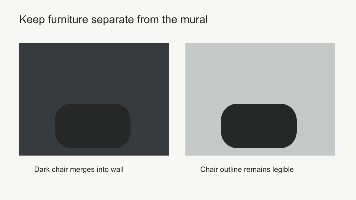 Place furniture against a different value so its outline remains clear.
Lighting changes the story
A greyscale mural can look distinct in morning light and quite subdued at night. Side light may make a real wall surface and its joins more visible, while a focused lamp may pick out only part of the composition. Try a sample on the intended wall at different times. If the room is dim, choose an artwork with enough light area to retain its layers. If the room is flooded with daylight, a slightly stronger mid-tone may keep the scene legible.
Do not rely on a printed texture to behave like real relief. A photographed plaster mark may suggest depth visually, but the covering is still a flat print. If the installation wall is uneven, the effect can be less convincing. Prepare the surface according to the chosen material's instructions and address damp or loose paint first.
Check the middle tones under the lamps normally used in the room. A design can retain its black outlines and white highlights at night while its gentler grey passages become difficult to distinguish. If those passages carry the atmosphere, a sample from the relevant area is more informative than a sample of the darkest corner. A mural with a slightly stronger middle tone may keep its mood better than one with more intricate detail but almost no tonal separation.
Plan the crop around the atmospheric effect
The focal point of an atmospheric scene is not always a single object. It may be the opening between trees, the line of a ridge or the space where mist meets water. Losing that area to a window, sofa or headboard can change the whole image. Measure the wall accurately, mark furniture heights and preview the crop at the true ratio. A landscape that looks spacious in a wide product image may feel compressed on a narrow wall.
Not every atmospheric design has a centre to protect. On a misty panorama, the open interval between forms may matter more than either form itself. On an engraved woodland, preserving variation between densely drawn and spare areas may matter more than preserving one tree. Overlay the actual window, headboard and shelving on the crop preview, then name the visual relationship that must survive. Moving the artwork off-centre is worthwhile if it protects that relationship, not merely because it exposes more detail.
Decide what kind of atmosphere you want
A foggy mountain view offers distance through soft transitions and open space. An engraved woodland offers movement through changing line density; a charcoal abstract can create tension by placing one dark mass against a pale field. All can be monochrome, yet they ask different things of a room. Choose the effect in words before choosing the image: restful, weathered, lively or dramatic. Then look for the drawing, middle tones and crop that actually support it. Colourful timber or a plant can remain in the room; monochrome describes the mural, not a rule for everything around it.