What Makes Mountain Mural Wallpaper Work Indoors?
Use distance, atmospheric perspective, horizon height and tonal scale to bring a mountain landscape into an interior.
Article focus: pricing and measurement
The cost and measurement decision
Start with accurate wall measurements; the final custom mural price depends on area, material and any finishing options.
Example application: Bedroom · pricing and measurement
Mountain mural wallpaper works indoors when its broad landscape relates to the room's proportions and leaves furniture clearly in the foreground. Layered ridges can suggest distance on a flat wall; a dramatic peak can become an architectural focal point; a pale mountain silhouette can provide quiet atmosphere. The subject alone is not enough. Horizon height, contrast, crop and viewing distance decide whether the image feels integrated or merely pasted behind a sofa.
Before comparing colourways, stand where you normally enter the room and imagine what part of a mountain scene you would see above the principal furniture. A mural that presents a wide sequence of ridges can give the eye somewhere to travel. A single summit may work more like a framed artwork. A low mountain band hidden by a sofa may do neither. This first spatial question is more useful than asking whether the room is “large enough for mountains”.
Look at the layers, not only the peak
A convincing mountain composition often has a near layer, a middle ridge and a more distant range. The near layer can be darker and more detailed, while distant forms become lighter or softer. That gives the eye a path through the image. A single sharply outlined mountain can be effective as graphic art, but it creates a different result from an atmospheric panorama. Decide which kind of wall the room needs.
Evaluate the whole landscape at the size it will be printed. A thumbnail may emphasise a beautiful central summit, but the edges can become important across a wide wall. Does the scene taper naturally or stop abruptly? Is there enough sky to give the room breathing room? Is the foreground so dark that it will swallow furniture? These questions matter more than whether the product title contains “Alpine” or “misty”.
A mountain mural need not depict a verified location. Many are composite or stylised scenes. If the image is not documented as a particular range, describe its visual character rather than assigning a geographic identity. Its usefulness indoors comes from composition, not from a place name.
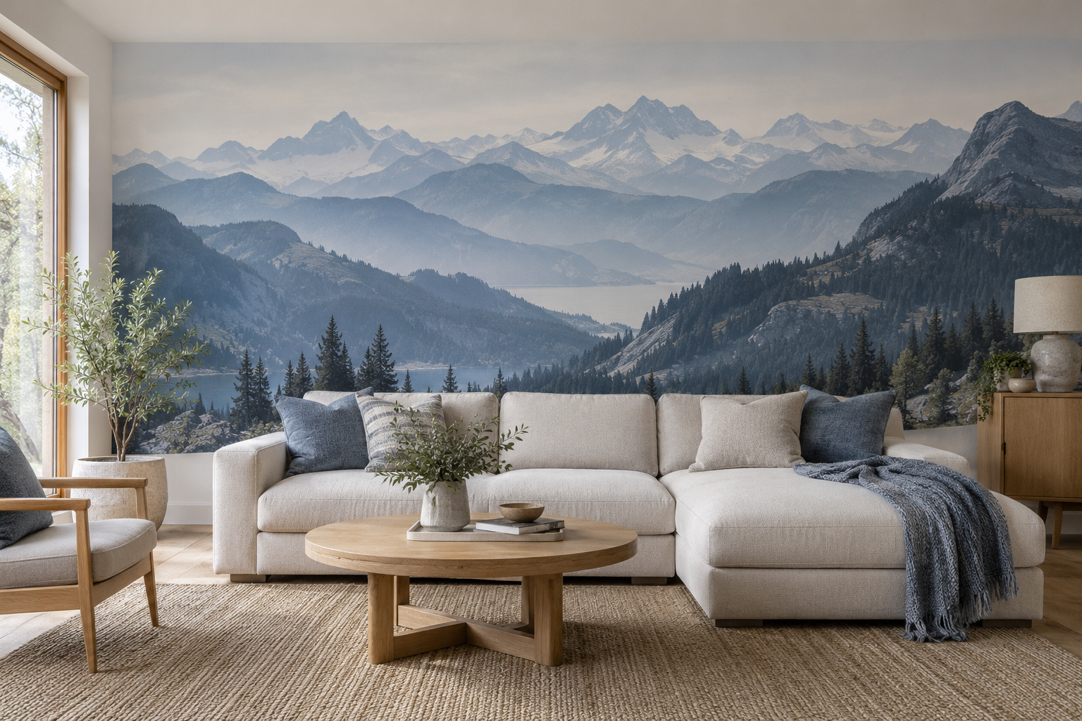
The feature image gives a concrete example of depth without a named location. Snowy peaks sit beyond blue-grey ridges, while darker slopes and trees come forward around a lake. The cream sofa remains distinct against the darker lower portion, and the broad pale sky keeps the upper wall relatively quiet. If you cropped away the distant peaks, the mural would become more about dark foreground. If you removed the foreground, the room might lose its visual anchor. The layers work together.
A summit is only one possible landmark. In a scene with several ridges, the space between them may carry more depth than the highest point. On an asymmetrical wall, a peak slightly to one side can balance a tall cabinet or window, but only if the rest of the range still reads as a connected landscape. Do not centre the file by habit and then discover that the side crop has removed the route into the scene.
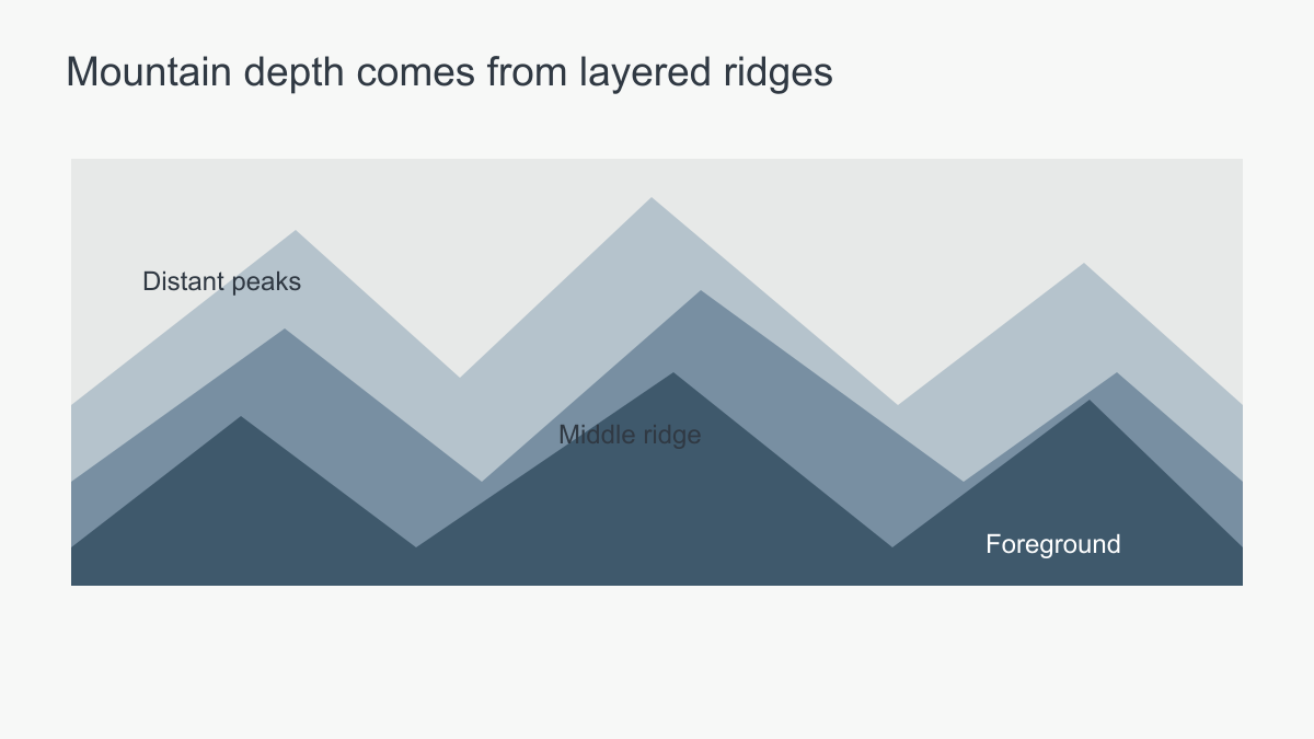 Layers of value make a flat printed landscape feel spacious.
Set the horizon deliberately
The horizon is often the line that gives the mural its stability. If it falls exactly at the top of a sofa, the two edges may compete or nearly merge. Raise it clearly above the furniture, or choose a crop in which the foreground continues behind the sofa and the distant ridge remains visible. A tall headboard can hide the most interesting middle of a landscape, so the bedroom crop needs particular care.
On a wall with windows, the horizon may be interrupted. That can still work if the visible sections connect logically, but a narrow strip of mountain between two windows may feel accidental. Consider a composition with a large open sky or a side-weighted peak that accommodates the openings. Preview the actual wall with curtains and furniture included.
Use the measured wall ratio, not the manufacturer's room photograph, to place the horizon. Mark the sofa or headboard at its real height, including cushions and lamps. In the featured room, the sofa covers lower trees while the middle slopes and distant peaks remain visible; a taller headboard could remove the middle distance that links them. This is more consequential than hiding a few foreground rocks.
Mark windows and curtains in their usual positions too. A peak covered by a curtain most of the day is functionally absent. Where several openings interrupt a wall, a sequence of ridges may be more forgiving than one exact summit. Check whether enlargement changes the apparent scale of trees and rocks, then choose a crop whose landscape still makes sense around the permanent interruptions.
How much contrast suits the room?
Slate blue and charcoal mountains can give a pale living room a strong focal point. A softer grey or stone palette may sit more quietly behind a bedroom. Neither option is automatically better for a particular room type. Look at floor, sofa, curtains and light. A dark foreground can help a cream sofa stand out; the same foreground may make a dark sofa disappear. Adjust either the furniture contrast or the mural crop.
In a room with limited daylight, a large dark mountain may feel heavy unless the scene contains open sky or mist. In a bright room, a pale mountain may need clearer mid-tones to remain legible. View a print sample on the intended wall during the day and in evening light. A screen image is useful for imagining placement but not for judging final printed colour.
Separate colour from value when comparing candidates. A blue mural can be very light and understated; a beige one can have a nearly black foreground. Reduce room photographs to greyscale if you are unsure whether a dark sofa will disappear against a slope. If the furniture and backdrop merge, choose another crop or a mural whose middle band is lighter behind it. Adding a different hue will not necessarily solve a value problem.
Also examine the sky. A large area of pale sky can leave a room with artwork, books and patterned textiles some visual rest. In a very sparse room, the same amount of empty sky may feel underwhelming unless the ridge line is strong. This is a balance between mural and interior, not a fixed rule about how much sky every mountain image should include. Compare the complete furnished room at normal scale.
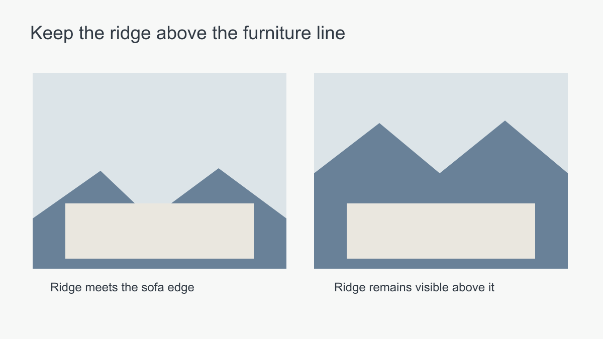 Keep the important ridge readable above the furniture line.
Match the scene to viewing distance
A panorama has an advantage on a broad wall seen from across the room. The ridges can be read as a continuous landscape. On a short narrow wall, the same artwork may be cropped until only one fragment remains. A simpler mountain silhouette may be more effective there. In a long hallway, the mural is seen obliquely, so strong peaks may distort in perspective; a gentler sequence of ridges may carry through the movement.
Photographic mountain imagery needs adequate resolution at the proposed print size. Check a sample or proof where details matter. Painterly or graphic mountain art may rely on broad shapes instead of fine detail, but it still needs clean print edges at normal viewing distance. Choose the medium for the effect you want, not because one is inherently more “realistic” or more suitable indoors.
Choose a range, a summit or an outline
Compare three structures in the same furnished-wall view. A continuous range carries the eye across several ridges and can hold a broad seating wall together. An isolated summit acts more like one piece of art: it needs space around the crest and a position that does not fight a window or tall cabinet. A simple silhouette gives the wall a mountain shape without asking the viewer to read several depths. These differences matter before blue, sand or grey enters the discussion.
In a minimal office, the summit may become the sole focal point. In a living room with several framed pictures, it might compete with existing art, while a softer range recedes behind them. On a short wall between doors, a quiet outline may survive the crop better than either. Keep the preview size, furniture and viewing position consistent so the comparison is about landscape structure rather than the quality of three unrelated supplier photographs.
Consider palette beyond blue and grey
Mountains can be shown in warm sand, lavender, olive or near-monochrome as well as blue. A warm range may sit naturally with oak and linen; a cool misty range may contrast usefully with warm timber. Compare the background and foreground values, not just the hue. A mural with a pale sky and dark trees can feel more dramatic than a mid-blue image with little contrast.
If the room opens into another space, view the mural from both. A strong slate-blue wall may frame the living area beautifully from the hallway but overpower a small adjoining dining nook. A physical sample and a room-scale mock-up answer different questions, and both are worth using.
Keep the intended landscape after cropping
The final proof should still deliver the effect you selected. If a narrow wall removes most of the ridge sequence, the remaining peak is now focal artwork rather than the panorama shown in a wide product photograph. If a curtain hides that peak, the scene may no longer have a useful centre. Inspect the complete wall crop from the entrance and principal seat, then use a print sample for colour and detail. The crop decides what view survives; the sample decides how the chosen print reads under the room's light.