Should You Order a Colour Sample Before Choosing a Mural?
Use a sample to compare undertones, daylight, artificial light, nearby paint and the visual weight of the artwork.
Article focus: installation and removal
The installation choice in practice
The right installation method depends on the chosen material and wall condition, so prepare the wall before ordering and follow the material-specific instructions.
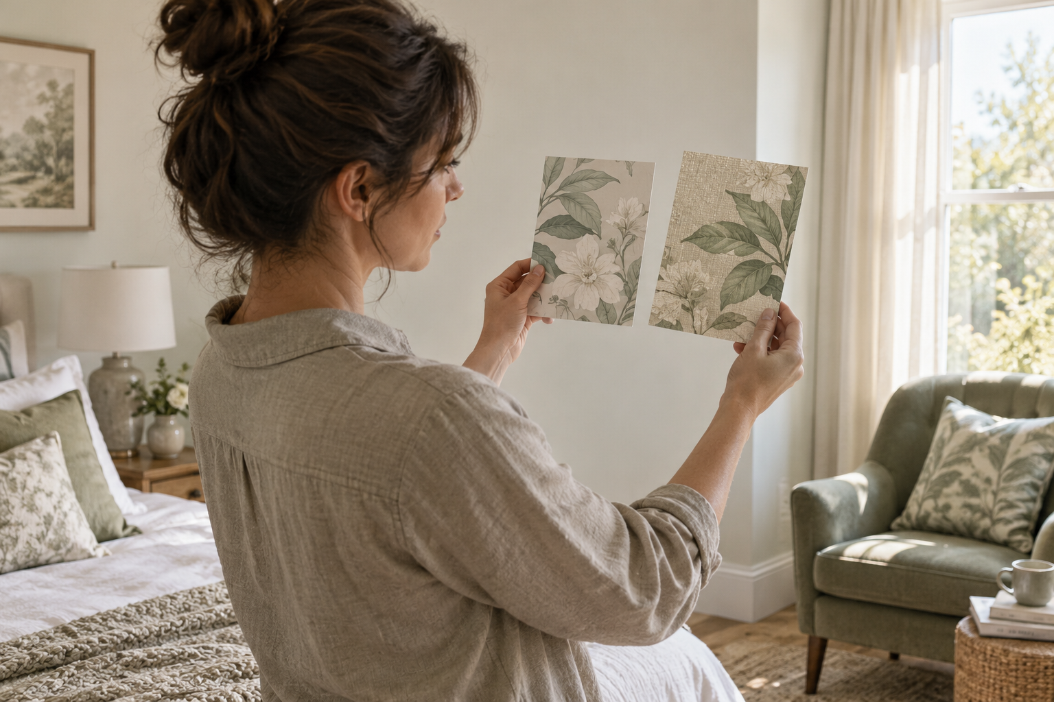
Example application: Any room with a suitable, prepared wall · installation and removal
Order a colour sample before committing to a mural when a wrong background hue would force you to change fixed furnishings, repaint the room or accept a large mismatch. If you are free to build the palette around the mural, sampling may be less urgent—but the uncertainty should be deliberate. The key question is not whether samples are universally necessary. It is whether seeing the intended print in your room could change the artwork, material or colour you order before custom production begins.
Ask for the colours that occupy the most wall
A tiny flower or leaf may be the reason you noticed a design, but a broad ground colour may dominate the finished room. If the sample can show only one portion, ask for the ground first or for a piece containing both ground and accent. Note what it excludes. A swatch containing only a bright blossom cannot tell you whether the surrounding ivory will clash with a cool-white cabinet across three metres of wall.
Specify the material as well as the artwork. A generic unprinted substrate can help with feel; a standard design printed on that material can show finish; neither establishes the exact colours of your chosen mural. Ask the seller which of these you will receive before paying. Graham & Brown's sample service illustrates why this distinction matters: its mural sample packs present a chosen design on the available finishes. Do not assume another retailer supplies the same type of pack.
Write down the decision the sample must settle. “Does the ground work beside the fixed grey sofa in daylight and under the evening lamps?” is testable. “Will I love this mural?” is too broad for a small printed section. Decide what counts as a pass before it arrives: perhaps the ground must sit comfortably against the cabinet without making the adjacent white paint look yellow. If it fails, request another colourway or finish rather than repeatedly judging the same mismatch. Colour, sheen and surface feel can be evaluated with a sample; washability, removability and full-wall composition require separate product information or a dimensioned proof.
Before ordering, ask four practical questions: is this the exact design, is it printed on the finish you may buy, which part of the image does the cut piece show, and is the artwork printed at its intended scale? A cropped leaf can show pigment and paper texture while concealing how large that leaf will look on the wall. If the seller sends a generic material card, use it to judge feel only. If the design is custom-coloured, confirm whether the sample reflects the approved edited artwork rather than its original colourway.
Put it on the wall, not on the desk
Hold the sample upright against the intended wall, or use a temporary fixing only if it is suitable for the existing paint; tape and adhesive can lift a weak finish. Place it near the height where that part of the mural will appear. A pale flower viewed on a table under a task lamp may read differently when it is upright beside a shaded window. Check it in morning daylight, at the brightest part of the day, and under the lamps normally used after dark. Move it to another part of the wall if the light falls unevenly.
Keep the surrounding room visible rather than judging the sample in isolation. Hold it beside the fixed floor, sofa fabric or cabinet front it needs to live with, then step back to the distance from which the mural will normally be seen. The goal need not be a literal colour match: an ivory print may sit comfortably beside warm oak even when neither has the same undertone. A conflict becomes more obvious when two near-whites touch, so test at their actual boundary if possible. Graham & Brown recommends viewing samples vertically and at different times because changing light alters how the same colour reads.
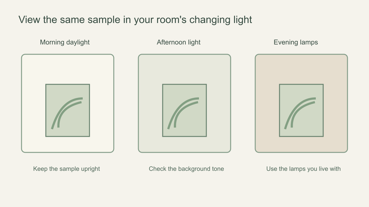 Return to the same sample under the light in which you actually use the room.
If the room uses warm lamps at night, view the swatch with those lamps rather than a phone torch. A cool grey-green can look calmer in daylight and muddier under a warm bulb; a cream ground may appear more yellow. Note which version you prefer at the hour you spend most time in the room. Also observe surface glare from the side. A difference in sheen can matter even when two printed colours look similar head-on.
Use the result to decide, not just to admire
Give the sample a specific pass-or-change decision. If its ground looks right in daylight but muddy under the room's usual lamps, first check the light source and the printed finish; changing the artwork may not solve a sheen problem. If the undertone clashes with fixed joinery at every viewing time, ask for another colourway before placing a custom order. Label the sample you approved so the chosen material and design do not get lost among similar-looking swatches.
Do not let a successful colour test answer unrelated questions. The sample cannot show whether a tree will be hidden behind a bed or a horizon cut by a window. It also cannot certify that the wall is suitable for adhesive. Use a dimensioned crop for placement, the product specification for performance and an appropriate wall test where the supplier recommends one. Keeping these decisions separate prevents a pleasing swatch from rushing an unresolved order.
A sample also has a limit as a production reference. Ask the seller whether the eventual mural will use the same print process and material as the piece in your hand, and whether small colour variation is possible between a sample and a later custom print. Keep the sample and its order details until the panels arrive. If the delivered mural looks materially different, you can describe the comparison precisely instead of relying on a screen image or memory.
Decide whether colour is a reversible choice
Now identify what you could change if the print arrived warmer or cooler than expected. Repainting a small adjacent wall may be manageable; replacing fitted joinery is not. When several fixed surfaces constrain the palette, waiting for a printed colour sample is a practical decision. When the room is still empty and the paint has not been chosen, the mural can lead the colour scheme instead.
If the sample changes nothing because the room's other colours are genuinely flexible, proceed with the separate crop and wall checks. If it changes a fixed-colour decision, pause the order and request a different colourway or material sample. This is a narrower decision than the general question of whether to order any mural sample: here the test is whether a specific hue can coexist with the surfaces you cannot change.
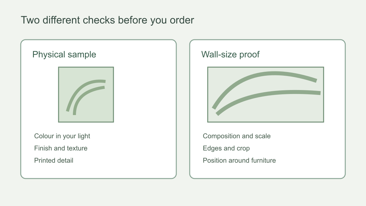 The sample and the scaled proof solve different problems; neither replaces the other.
How to compare two samples fairly
Label the back with the design and material so two similar pieces do not become confused. Put them side by side at the same height and in the same light. Compare the background first, then the stronger colours, then surface texture. Check them beside the upholstery or joinery they need to complement. Step back to see the overall impression; the most detailed area may be less important than the colour cast you notice from across the room.
Photographing the samples can document your choice, but the photograph itself introduces a screen and camera interpretation. Make the final colour judgement from the physical pieces. If the sample differs substantially from your expectation, ask the seller what portion of the artwork it represents and whether an alternate section or material can be sampled. Do not place a full custom order while a known mismatch is unresolved.
Leave both pieces in position for a day rather than swapping them quickly in your hands. Then ask what each does to the room from the doorway: does the background recede, or does its undertone pull attention away from the furniture? Invite another decision-maker to view them in the same light and ask for a specific observation, not a vote for whichever design looks more vivid in a close-up. If the stronger colour wins only in the sample but overwhelms the room in the proof, the larger view should guide the choice.
Carry the colour decision into the final order
When the mural arrives, compare an uninstalled panel with the retained sample in the same light before fitting. Ask the seller about any difference that materially changes the agreed colour decision; do not assume a screen image is the reference. Colour approval is still separate from checking the panel sequence, wall condition and final crop. A successful swatch answers one precise question: whether the printed hue works with the fixed room.