How Colour Undertones Affect Mural Wallpaper Choices
Compare warm and cool undertones in the mural with flooring, paint, furniture and daylight before making a selection.
Article focus: installation and removal
Planning the work and the exit
The right installation method depends on the chosen material and wall condition, so prepare the wall before ordering and follow the material-specific instructions.
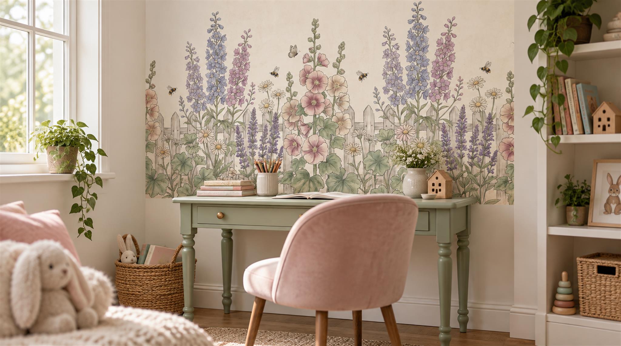
Example application: Bedroom · installation and removal
“Ivory” is not one dependable colour. The floral mural shown above has a warm ground behind pink blossoms, lavender stems and soft green foliage; beside the sage desk and blush chair, those quieter tones become part of the scheme. Put the same print next to a cool white wardrobe and its ground may appear noticeably creamier. That apparent lean beneath the main colour is what designers mean by an undertone. The useful question is not whether the label says neutral, but how the largest printed areas relate to finishes already in your room.
Read the background before the accent colours
People often point to the most colourful flower first, yet the pale ground may occupy most of the finished wall. In the illustrated garden scene, the warm ivory behind the stems will have more influence on the room than any single lavender flower. Examine the broadest field first, then the greens and lilacs, and finally the tiny accents. This order prevents you from choosing an entire mural because one blossom happens to match a cushion.
In the bedroom view below, the same artwork sits beside pale timber tables, a cream headboard and warm lamplight. The background feels connected to those surfaces, while the lavender flowers remain a cooler accent. The bed also hides part of the lower printed garden, changing the balance of ivory and colour visible from the doorway. An undertone judgement therefore belongs to the final crop and furniture arrangement, not just an isolated swatch.
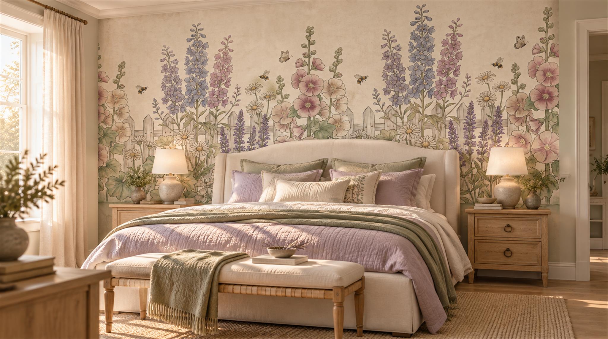
Warm and cool are relationships, not labels
Warm and cool are comparisons, not permanent labels. An ivory may seem warm next to a crisp blue-white trim but comparatively quiet beside honey-coloured timber. A grey can reveal a blue, green or brown cast only when it is placed beside another grey. Hold samples close to the fixed finish you are matching, then step back to see the whole wall. Do not try to judge an undertone from a product name or a phone screen with automatic colour adjustment.
Small differences become obvious over a large surface. A sample that looks nearly white on a desk can tint the entire room once printed across a wall. This is why vague names such as beige, stone or ivory are insufficient. Request a physical sample of the exact finish and design, and compare it to the permanent finishes you cannot easily change.
Look for undertones in grey, brown and green
Grey is rarely just grey. A blue-grey landscape may look crisp against pale oak but conspicuously cool beside a warm greige sofa. A brown-grey tree scene may relate better to the sofa yet seem dull beside cool stone. Greens vary too: sage can have a silvery cast, while olive often feels earthier. Rather than extracting one colour chip and calling it the answer, look at the proportions of all these tones across the printed scene.
The chinoiserie-inspired room below provides a useful counterexample to exact matching. Brown branches and muted green foliage sit on a smoky ground, while a warm ochre cushion punctuates a cooler grey sofa. The upholstery is not identical to the mural background, and it does not need to be. Clear, intentional contrast is often easier to read than two almost-matching neutrals whose different undertones only become obvious when placed side by side.

Test under the light the room actually receives
Daylight and artificial light can change the appearance of the same print over a day. A sample held in direct sunshine may look lighter than it does on the shaded part of the wall; a warm lamp can shift how ivory and mauve read after dark. Put the sample on the intended surface, check it when the room is normally occupied, then move it between the window side and the darker side. The aim is not identical colour in every light, but a relationship you still like as conditions change.
Phone photographs are useful for remembering comparisons but can change white balance automatically. If you photograph two samples, capture them together in one frame under the same light. Even then, make the final choice by eye with the real print, not from the phone image. Screens are also poor judges of very pale shifts: their brightness and colour settings differ from one device to another.
Compare with fixed finishes first
Flooring, built-in cabinets, stone worktops and large upholstery are expensive to change. Compare the mural's broad background with them before worrying about cushions and vases. Lay a floor sample or fabric swatch near the mural sample, then step back. If a timber floor has a strong orange cast, a grey mural with blue undertones can create pronounced contrast. That may be desirable, but it should be a design decision, not a surprise after printing.
Paint is easier to adjust, yet repainting an entire room because the mural undertone was overlooked is still avoidable. Sometimes a new adjoining wall colour solves a mismatch; sometimes choosing a different mural background is simpler. Test both options with samples. A print with varied tones can connect several fixed finishes, while a nearly monochrome mural makes its one dominant undertone more noticeable.
Do not mistake printed imagery for physical finish
A mural may depict plaster, linen, stone or watercolour paper. The perceived texture can influence colour because shadows and highlights are printed into the image. That does not mean the surface actually has the depth or material shown. Order the exact substrate sample if tactility matters. A different substrate or matte level may change how the print appears under grazing light, even when the artwork file is the same.
If several panels make up the mural, check that any sample or optional proof refers to the same design, material and colour version you intend to order. Do not try to correct a perceived undertone by manually adjusting a screen image unless the printer can provide a controlled proofing process. Communicate the issue in plain terms: “the background looks pink beside my sofa” is more actionable than “make it neutral.”