Which Mural Wallpaper Colours Create a Calm Room?
Choose soft, balanced mural colours for bedrooms, reading spaces and interiors designed to feel settled rather than visually busy.
Article focus: pricing and measurement
Budgeting this wall with confidence
Start with accurate wall measurements; the final custom mural price depends on area, material and any finishing options.

Example application: Bedroom · pricing and measurement
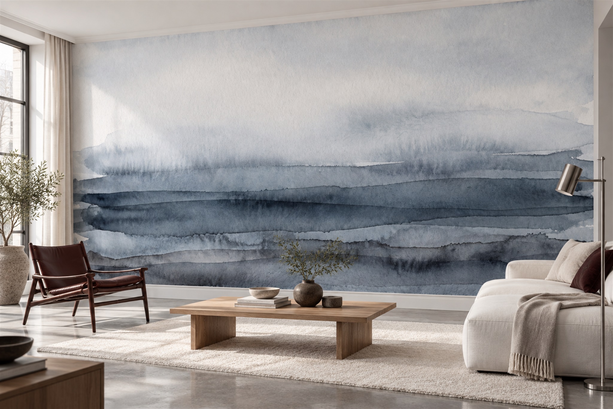
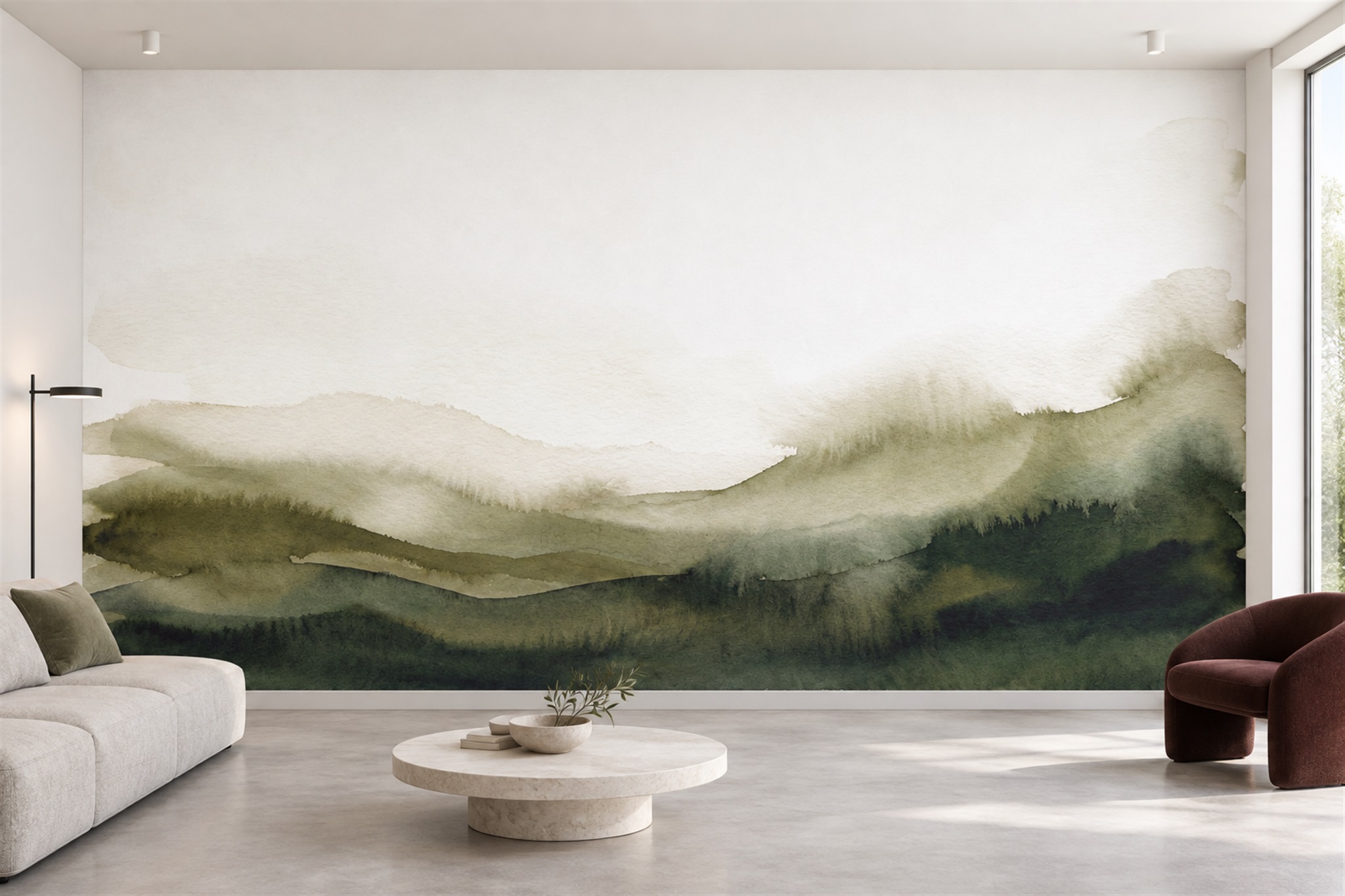
Which mural colours actually make a room feel calm? Muted blue, softened green and warm neutrals are useful starting points, but none is a guarantee. The pale blue abstract and olive hillside shown below both leave the eye space to rest, despite having different palettes. Meanwhile, the woodland in the feature image is considerably darker yet may still suit a quiet reading corner. The answer depends on the colour's area, its contrast with nearby tones and the room around it.
Look beyond the colour name
Two wallpapers labelled “blue” may have very different effects. One might be a greyed, hazy blue spread across wide painterly areas; another might use intense cobalt in narrow, repeated strokes. The first usually recedes more easily, while the second asks for attention. Similar differences exist between dusty rose and bright pink, or between softened olive and vivid green. Colour names are useful for finding candidates, not for predicting how a room will feel.
Notice the proportion of each colour. A mural with a small amount of dark blue beneath a large cream sky is mostly a light mural, even if its strongest accent is navy. Reverse that ratio and the same colours create a much more enveloping wall. Read the image as large areas before studying details. From the doorway, which colour reaches your eye first, and how much space does it occupy?
Colour temperature matters beside existing surfaces. A blue with a green undertone can sit comfortably near muted olive or natural linen. A violet-blue may relate better to cool stone. Cream can turn yellow next to a crisp white ceiling, while a pink-beige can look unexpectedly rosy beside grey upholstery. Lay a physical print sample against the paint, curtains and furniture that will remain, then view the grouping under the room's usual light.
The feature image offers a counterexample to the idea that calm always means pale. Its shadowy green woodland covers most of the wall, but soft transitions between trees and a lighter distant opening stop it reading as a uniform dark block. The cream chair, timber and window light also matter. In a room without that window, or with darker furniture, the same mural could feel substantially more enclosed. Use the photograph to study relationships, not as a promise of a particular mood in your home.
Why blue, green and warm neutrals so often work
Desaturated blue can suggest air, water or distance. In a mural with broad, blended forms, it gives the eye room to move without demanding close inspection. The blue-grey wash pictured here has uneven horizontal bands rather than a repeated small motif. A pale upper area softens the deeper lower strokes, so the colour remains legible from the sofa without filling every part of the wall with detail. The artwork appears flat in this room scene, but a material sample is still needed to judge the actual print finish.
Sage and olive connect readily with timber, linen and other natural colours. The hillside image below concentrates its deepest olive at the bottom and leaves a large pale upper field. This distribution matters more than the simple label “green”: the eye can settle above the dark band, and low furniture can overlap part of it without hiding every recognisable contour. A garden mural full of sharply defined leaves would create a different rhythm, even if its greens were equally muted.
Warm creams, oat and soft taupe can create a quiet background without the starkness of pure white. They are especially useful when the room already has a dark floor or substantial furniture. Be careful with an almost monochrome mural: subtle differences visible on a backlit screen may flatten in print or under low light. Request a sample to judge the distinctions that matter to you.
Let contrast set the volume
Try a quick “squint test” on a wall-size preview. If bright accents and dark outlines still jump out when fine detail disappears, they will probably define the room's first impression. If the image settles into two or three broad value areas, it may feel quieter from across the room. This test does not measure anyone's emotional response, but it separates colour choice from the distribution of contrast. A pastel mural with sharp repeated edges can look more active than a darker wash with soft transitions.
Test the blue abstract and olive hills at two distances. From the doorway, the abstract's darker horizontal washes may register first, while the hills read as a pale upper field above a green base. Near a desk or bed, inspect whether any sharp edges keep drawing attention. This does not predict how every person will feel, but it reveals whether the proposed wall relies on quiet transitions or repeated visual interruptions.
Look for visual pauses. Areas of sky, mist, open paper or a softly blended ground give the eye somewhere to rest. A mural need not be empty to be calm, but its focal points should have a hierarchy. One cluster of detail beside open space is easier to accommodate than evenly distributed detail at every height. This is particularly important behind a bed or desk, where the wall stays within peripheral vision for long periods.
Motif scale changes the reading too. Tiny repeated leaves can create visual texture, while a few large shapes can make a wall feel simple. But a single oversized high-contrast flower may dominate a compact bedroom. Compare the design at the exact planned width against your separate furniture sketch. The colour balance visible in the uncropped image may change when a large pale area is removed.
Choose for the room's real lighting
A room can change character during the day. North-facing light may cool an already cool blue; warm lamps can bring out yellow or pink in a neutral background. If the room is mainly used in the evening, test the sample with those lamps switched on. A mural that looks delicate at noon may seem much darker after sunset, while a warm cream may become richer.
Do not rely on a phone screen for an exact colour match. Brightness settings, screen calibration and image editing all affect the preview. The digital mock-up is excellent for composition and scale; a physical sample is better for colour, finish and how the print meets the room's light. If possible, examine a sample containing both the lightest and darkest important areas of the artwork.
Also consider the colour of adjacent walls. A calm mural can look unusually vivid next to pure white paint and more integrated beside a soft off-white drawn from the image. Conversely, painting every wall in a dark accent colour may remove the relief the mural needs. Test small adjacent paint samples rather than ordering an exact match by name alone.
Compare the same mood in three different colour structures
The blue abstract offers layered washes against a pale ground; the olive hills place most of their weight low on the wall; the woodland surrounds the viewer with darker green but leaves a lighter opening. These are not simply three colour swatches. Place them at the same wall dimensions and ask which one leaves the room's existing furniture easiest to see. A quiet effect can come from open pale ground, low-set weight or a distant clearing.
Now compare where each design asks the eye to stop. The blue wash gathers into a darker band, the hills lead across a long horizon, and the woodland draws attention towards its opening. In a room with a large window view, another literal landscape may be unnecessary; a gentle abstract could support the view. In a reading corner without a view, the woodland's clearing may provide a destination. The answer depends on the room's attention pattern, not an assumed emotional property of blue or green.
Keep contrast and crop constant as far as possible when making that comparison. If the woodland is much darker than the other two, decide separately whether you like its enclosed feeling. If the olive crop removes most of its pale sky, it is no longer the calm example shown in the full artwork. A physical sample still helps with printed colour, but the room-size crop is what shows whether each design's visual pause survives the wall and furniture.