How to Choose a Focal Point for Mural Wallpaper
Place the main subject around sightlines, furniture, doors, windows and the way people enter and use the room.
Article focus: pricing and measurement
What to settle before pricing
Start with accurate wall measurements; the final custom mural price depends on area, material and any finishing options.
Example application: Bedroom · pricing and measurement
Choosing a focal point for mural wallpaper means deciding what should catch the eye first once the artwork is on your wall—not just identifying your favourite detail in a catalogue image. It may be a mountain peak, a sunlit clearing, one large flower or the quiet opening between two dense areas. The right position depends on the view from the doorway, the place where people usually sit and the parts furniture will conceal. Mark those conditions on a wall elevation before committing to a crop.
Find the first view before choosing the centre
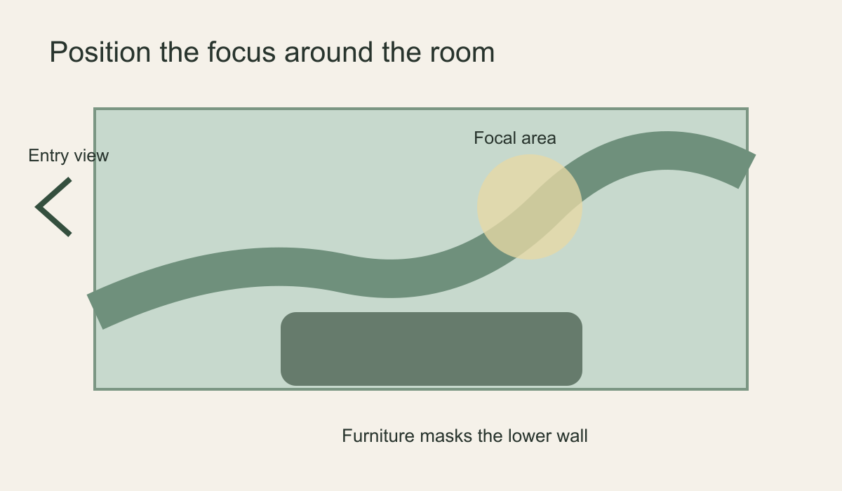
Stand at the room entrance and note the part of the wall you see immediately. Then sit where the room is actually used: on the sofa, at the dining table or at the desk. A focal subject that looks perfect in a front-on product mock-up may disappear behind a tall chair or be seen only from the side. If a doorway opens near one end of the wall, an off-centre tree or architectural detail can draw the eye deeper into the room. Centring everything on the measured wall is a valid option, but it is not the only balanced one.
Take a photograph from each viewing position at roughly normal eye height. Do not rely on one wide-angle phone photograph alone; it can make a wall seem larger and a focal subject smaller than they will feel in person. On each image, mark where your eye naturally lands and what is blocked by a door leaf or tall furniture. If the wall is glimpsed only briefly as people pass, a strong silhouette may read better than a tiny intricate subject. If the room is used for long periods, a layered composition can reward closer looking.
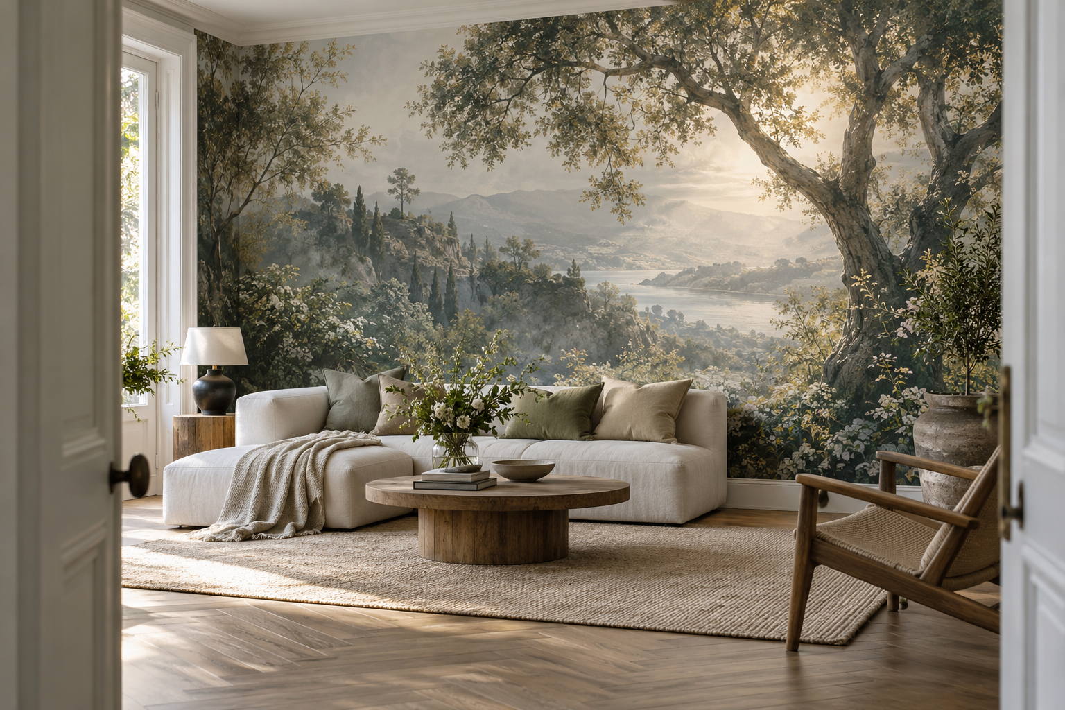
In the landscape shown above, the dark tree frames a sunlit opening from the entrance. Move that opening behind a tall bookcase and the tree becomes the only visible subject; shift it too close to the wall edge and the view can look abruptly cut off. On your wall elevation, mark openings, radiators, headboards, shelves and lamps before trying the same test. Keep the focal relationship that makes the scene readable, even if its position on the wall is not mathematically central.
What makes an area visually dominant?
Size is only one factor. A pale opening inside dark foliage can attract attention even if it is not large. A sharply drawn bird can pull the eye away from a much broader soft landscape. Warm colour against cool surroundings, strong light against shadow and a solitary object among repeated marks all create emphasis. Identify the dominant contrast in the artwork before cropping. If you cut that subject at the wall edge, the image may feel unfinished; if you place it behind the sofa, the remaining wall may look like an accidental background.
Try reducing the preview until it is about the size of a postcard. What remains legible is probably the artwork's strongest large-scale emphasis. Then zoom in to check whether a small face, bird or bright blossom steals attention once seen closer. This two-distance check prevents a detail that looked minor on a product page from becoming an unintended visual anchor at wall scale. A focal point should be intentional, not an accident of enlargement.
For an abstract design, follow the direction of the strongest movement. Where do the arcs, brushstrokes or diagonal lines converge? For a panoramic landscape, find the place where foreground, midground and distant view establish the clearest depth. A botanical arrangement may be intentionally distributed, with no single flower more important than the whole canopy. In that case, the focal zone might be an open breathing space rather than an object. Do not force every mural to have a bullseye.
Decide which parts of the focal image are essential
Not every hidden detail damages a composition equally. In a layered landscape, concealing part of the foreground can leave a convincing distant view; removing the narrow gap between two trees may destroy its sense of depth. A large flower can survive losing part of an outer petal yet lose its identity if its centre disappears. Mark the artwork's essential relationship—not just its brightest object—before asking whether a crop or obstruction is acceptable.
Make two copies of the preview and cover different regions with plain rectangles. In one, hide the lower third; in the other, hide the brightest or most detailed zone. Which version still tells the same visual story? If both remain coherent, the mural may have a distributed focus and tolerate more placement choices. If only one works, protect that focal zone when selecting the crop. This image-first test is different from planning furniture clearances and circulation; the furniture-layout guide handles that room-planning question.
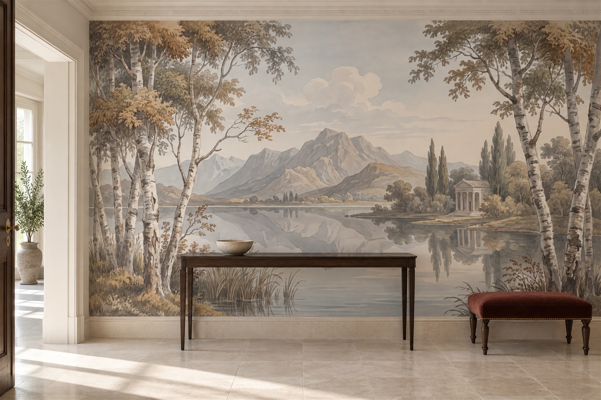
The entryway image below uses side trees to direct attention towards a mountain and lake. A low console hides some foreground without removing the distant opening, so the scene remains readable. Cover the opening instead and the framing trees lose much of their purpose. That contrast shows why a focal point is a relationship among shapes and light, not a fixed height that every mural should use.
Balance the image across the whole wall
After you locate a focal point, inspect what happens at both ends. A large subject pushed toward one edge can feel unstable unless the opposite side carries enough colour, texture or open space to balance it. A doorway or window may become part of that balance. If the image must wrap around a corner, check where the key element lands on each wall. The eye reads the installed room in perspective, not as one flat rectangle. A beautiful crop on screen can become lopsided when one third of it is concealed by a door swing.
Compare three crops on the same measured wall rectangle: one with the subject centred, one that favours the entrance view and one shifted clear of furniture or a door. Leave the bed, window and lamps in identical positions on every mock-up so the comparison is fair. A central mountain may make a calm axis above a bed; an off-centre tree may balance a window opposite it. Reject a crop if the apparent improvement from one seat comes at the cost of a cut-off subject at the doorway or a sliver of detail left at an edge.
Check scale as well as position. A tree intended to frame a sofa should not have its trunk enlarged to an implausible width without deliberate design intent. A small animal can become unnervingly prominent when blown up; an abstract shape may be more tolerant. Ask for a full wall mock-up with furniture or make a simple paper elevation. Print a small crop at scale if fine detail matters. The important question is what people will perceive from the normal viewing positions, not whether the image obeys an abstract “rule of thirds”.
Match the focal point to the room's purpose
A dining room can accommodate a more animated focal scene if guests usually sit with time to look at it. A bedroom may benefit from a broad, gentle area that does not compete with the bed. In a hallway, movement changes the view continuously, so a subject placed near the far end may draw people through the space. A reading nook might use a vertical grove beside the chair rather than directly behind it. These are design possibilities, not rules; room lighting, other artwork and your own preferences matter more than a fixed room-by-room formula.
Consider what else already has visual priority. A fireplace, large window or sculptural pendant may be the room's natural centre. A mural need not compete with it: soft hills or distributed foliage can support that feature without adding a second dominant object. Conversely, in a plain room with no architectural anchor, a clearly placed landscape opening can give the wall its own direction. Decide whether the mural should lead or accompany the room before selecting its focal zone.
Consider artificial light at night. A wall sconce or spot can strengthen a focal area, while a bright window next to it can draw the eye away. Check whether a dark detail becomes invisible under evening lighting or whether a glossy frame on an adjacent wall competes with the mural. A physical sample under the intended lights can help with colour, but you still need a full-wall view to judge the composition.
Confirm the crop before production
Measure the full wall width and height, including the specified installation allowance, and use the supplier's crop preview. Move the image until the focal subject is in the chosen zone, then check the top, bottom and both sides for awkward cuts. If the wall is unusually wide or tall, the image may have to be cropped severely; do not sacrifice the subject merely to fill every centimetre. Ask whether a different aspect-ratio design or a deliberate border would be more coherent.
Keep the safe visible area separate from the trimming allowance. A face, small building or bird placed within the outer allowance may disappear when the installer squares the edges. Check the visible wall boundary and ask about panel positions if a join might cross the subject. Save the selected crop with dimensions and note the intended left-to-right start position. A different crop in production could shift the visual focus, even when the mural's title and colours are unchanged.
In the living-room scene shown in the feature image, the bright distant opening is partly framed by a heavy tree on the right. From the doorway, the opening reads across the sofa; shift the crop too far right and the trunk begins to dominate, while a taller sofa could hide more of the lake. Make three equal-size previews with the sofa silhouette in the same place each time, then compare them from the doorway and the main seat. Keep the version that preserves the opening and leaves enough breathing room around the trunk, even if the light falls off the wall's mathematical centre. Save that marked crop for the installer.