Can Mural Wallpaper Support a Biophilic Interior?
Use botanical, woodland, water and natural-texture imagery alongside daylight, timber, plants and calm material choices.
Article focus: installation and removal
Planning the work and the exit
The right installation method depends on the chosen material and wall condition, so prepare the wall before ordering and follow the material-specific instructions.
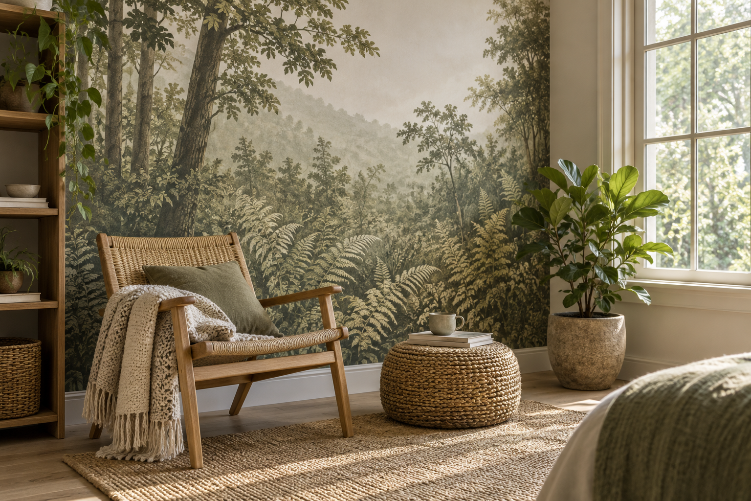
Example application: Hallway or entryway · installation and removal
A woodland mural can make a room look closer to nature, but a photograph of trees is not a tree. That distinction matters when people describe a space as biophilic. Nature imagery can contribute to a visual connection, while daylight, actual plants, fresh air, natural materials and a view outdoors involve other parts of the room. Mural wallpaper is most useful when it is planned as one layer of that wider interior rather than advertised as a substitute for living nature.
What does “biophilic” mean in this context?
Biophilic design is an approach to creating connections with nature in built spaces. One recognised pattern is a visual connection with natural elements or processes. Terrapin Bright Green's 14 Patterns of Biophilic Design includes artwork depicting nature among possible simulated visual connections. The same framework distinguishes that from direct sensory experiences, natural light, air movement and material connections. Calling a room biophilic solely because it has leaf wallpaper skips these other dimensions.
This is a design framework, not a medical claim for a particular mural. Research about nature views should not be turned into a promise that a printed wall will lower stress or improve sleep for every occupant. A mural can offer visual interest and a reference to landscape; how a room feels also depends on furniture, noise, temperature, daylight and personal preference.
At the planning stage, separate three visual roles. A forest photograph can suggest a view beyond the wall; a botanical drawing invites close attention to leaf and stem; an abstract branching pattern brings natural geometry without pretending to be a window. Pick the role that complements the room's real daylight and view. These are different printed experiences, not interchangeable evidence of a biophilic design.
Identify the nature connection the room already has
Begin with a simple inventory rather than a pattern catalogue. From the desk, sofa or bed, can people see an actual tree, garden or patch of sky? Is daylight strong or limited when the room is used? Are plants present and healthy, or would keeping them alive be impractical? Does the room contain timber, stone or another material whose character can be seen and touched? A printed scene can support one of these existing connections or give visual interest where a view is absent; it cannot replace every missing condition.
In a study facing a garden, the window may already provide the main changing image. A restrained branch drawing on the side wall could relate to it without producing a second competing panorama. In an internal corridor with no daylight, a woodland scene might offer an intentional visual reference, but lighting and ventilation still need separate attention. A room with a generous window and many plants may not need another dense canopy; an open landscape might let those living elements remain visible.
Choose the mural's role before choosing its species or style label. Is it a view-like image that people will face while seated, a quiet background for living plants, or a natural rhythm that softens hard-edged furniture? The botanical-versus-landscape guide compares near plants with distant scenes as image types. Here the more important question is what the room can already provide without the print.
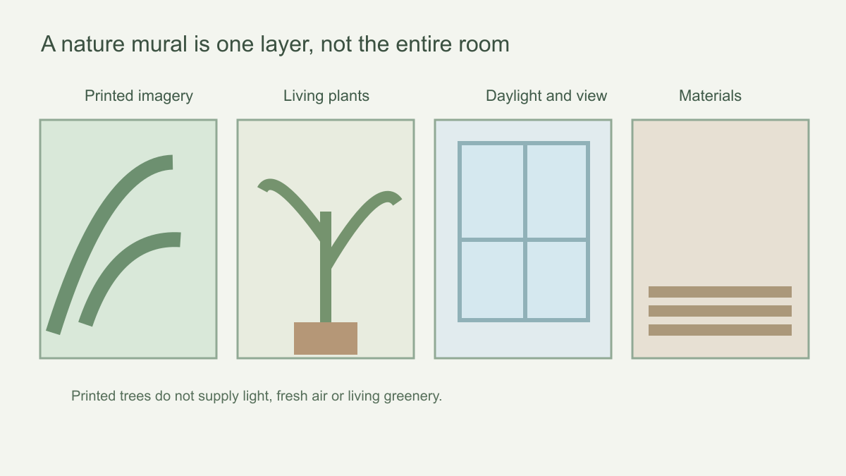 A mural contributes an image; other aspects of a nature-connected room must be designed separately.
Work with the actual daylight
Check where sunlight enters the room and what time the space is usually occupied. A misty woodland mural can look soft in diffuse light and flatter after dark under a cool lamp; a dark leaf canopy may become more dramatic in a shaded corner. Place a physical sample on the intended wall if available and view it under the room's normal lighting. The wall's colour, window size and nearby fabrics can all shift the perceived greens.
Keep an existing view outdoors visible if it is one of the room's strengths. A mural can frame that view rather than compete with it. Consider placing the mural on a side wall where its colour supports the landscape outside, or choose a quieter scene when the window already provides the primary focal point. In a windowless circulation space, the mural can offer visual imagery, but it cannot introduce daylight or ventilation by itself.
If a window faces trees, compare the mural's season and palette with what you usually see outside. A saturated tropical canopy beside a cool winter garden may feel like two unrelated views; a muted woodland or botanical drawing could make the transition gentler. You do not have to copy the local landscape exactly. The point is to make a deliberate relationship between real and represented nature. Check it from the chair or desk, not only while standing at the wall.
Pair the print with real elements judiciously
A few well-chosen plants can bring living shape and seasonal change that the printed scene cannot. Choose plants for the room's actual light and care capacity; dead or struggling plants undermine the intended effect. Natural timber, stone, wool or linen can add tactile contrast, provided their finish and maintenance suit the room. The goal is not to collect a mandatory checklist of “natural” items, but to create a coherent combination of sight, touch and use.
Sometimes less is more. A full-wall fern mural plus many large plants can obscure the printed artwork and feel crowded. A pale landscape with one well-placed plant may make both elements more legible. If the mural shows large leaves, smaller real foliage can vary the scale; if the mural is finely detailed, a simple timber chair might be a better counterweight than more pattern.
Plan maintenance as part of the combination. A plant beside the mural needs appropriate light and access for watering, but soil, dripping pots or sprays should not damage the wallcovering. A plant that blocks the only clear view of the printed scene may be better positioned near the window, where its silhouette is visible without covering the image. Natural materials have similar practical limits: timber may need care, stone may feel cold and a woven textile may collect dust. Select them for actual use, not for a photograph of an idealised nature-themed room.
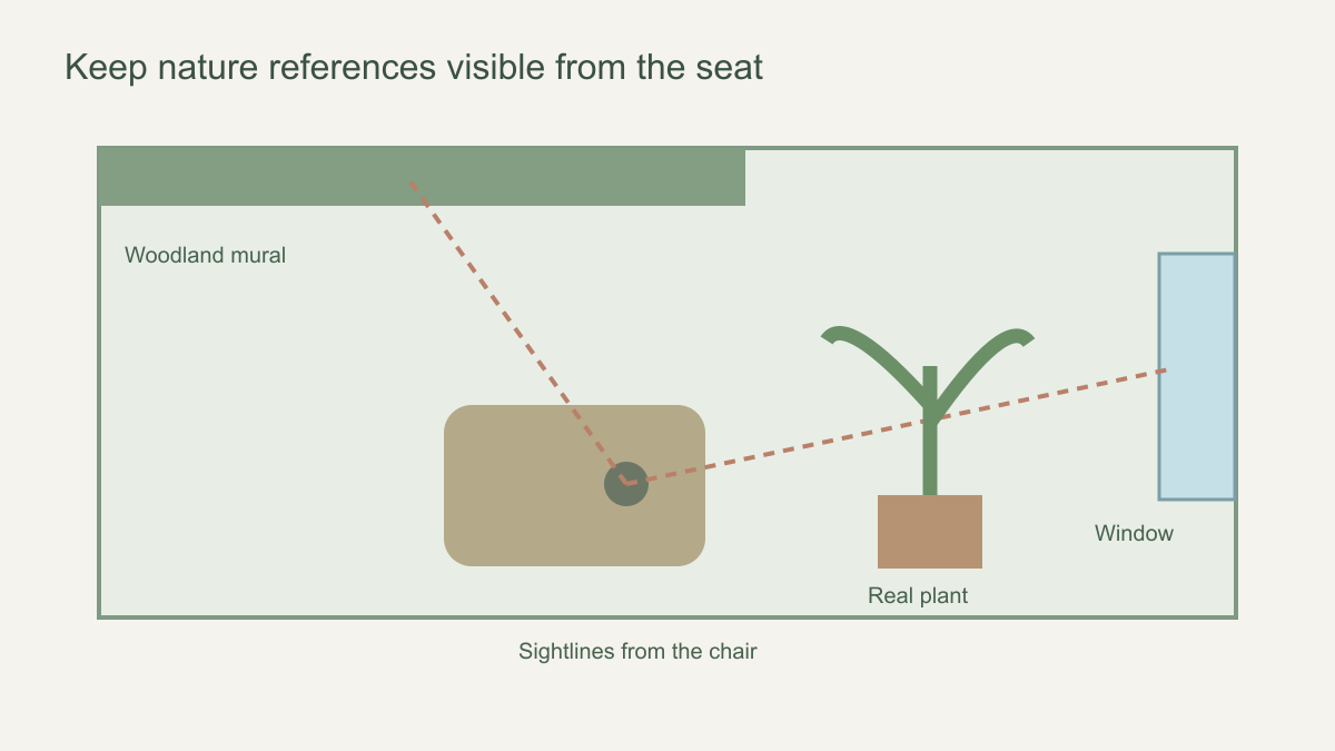 Plan what is actually visible from the place where people sit or enter.
Map access to real and represented nature
Draw a simple room plan showing regular seats, the window, the proposed mural wall, tall storage and any substantial plants. From each seat, trace what is actually visible. A mural behind a bookcase may look impressive in an empty-room photograph but contribute little to daily experience. Equally, putting the mural where it blocks a real window with furniture or heavy curtains would weaken the existing view that the design is meant to support.
Consider the sequence of the room. Someone entering an office may first see a printed woodland, then sit facing a real courtyard; that gives the mural an introductory role. In a reading corner with no direct window view, the print may be the principal nature image from the chair. If the only open wall is behind the seated person, a modest image visible on entering may be more honest than claiming an immersive daily view. The use position, not the marketing photograph, determines the visual connection.
After choosing the wall, inspect the exact crop to confirm that the intended natural cue remains visible from those positions. A wall-sized image whose clearing falls behind storage no longer offers a clear scene; moving the subject or choosing a quieter botanical surface may work better. This is a placement decision within the wider room plan, not a claim that larger trees or more leaves produce a stronger biophilic effect. For the detailed comparison of plant foregrounds and distant landscape views, use the separate image-choice guide.
Material and wall conditions still matter
A nature-themed design has no special moisture, air-quality or safety properties by virtue of its image. Choose material according to the product's documented characteristics and the wall's condition. A wall with dampness, mould or unstable paint needs its underlying problem addressed first. Do not use wallpaper to hide damage. In rooms with plants, consider how watering, splashes and maintenance will affect the wall, and keep pots or irrigation away from an unsuitable covering.
Follow the selected wallpaper's installation and cleaning guidance. If the design is printed in panels, inspect the continuity of branches and horizon lines before installation. A natural scene can be particularly sensitive to awkward seam placement if a trunk or single focal leaf runs through a join. A careful crop and panel check will help the artwork read as one intended composition.
Be especially cautious about claims attached to nature imagery. The word “green” on a design page may describe colour or subject, not a verified environmental attribute of the material. Likewise, a picture of woodland does not prove that the covering is breathable, non-toxic or suitable for a damp room. Check the actual product specification and ask the supplier for documentation if those properties affect your decision. This keeps the design discussion separate from material performance.
Use the mural as a starting point, not the whole claim
Judge the mural from the chair people use, not only from the door. In a room overlooking water, printed reeds might echo the real view; a dense forest could compete with it. In a windowless study, a woodland image may give the eye a landscape to explore, but it does not change the room's daylight or air. Terrapin's framework treats artwork depicting nature as a simulated visual connection, not as a living system. Describe that contribution precisely: it is an image that can support the composition of a nature-connected room, while plants, ventilation, comfort and any claimed health outcome require separate evidence and decisions.