How to Choose Mural Wallpaper for a High Ceiling
Balance vertical scale, focal height, furniture and architectural proportions so a tall wall feels considered rather than empty.
Article focus: pricing and measurement
What to settle before pricing
Start with accurate wall measurements; the final custom mural price depends on area, material and any finishing options.
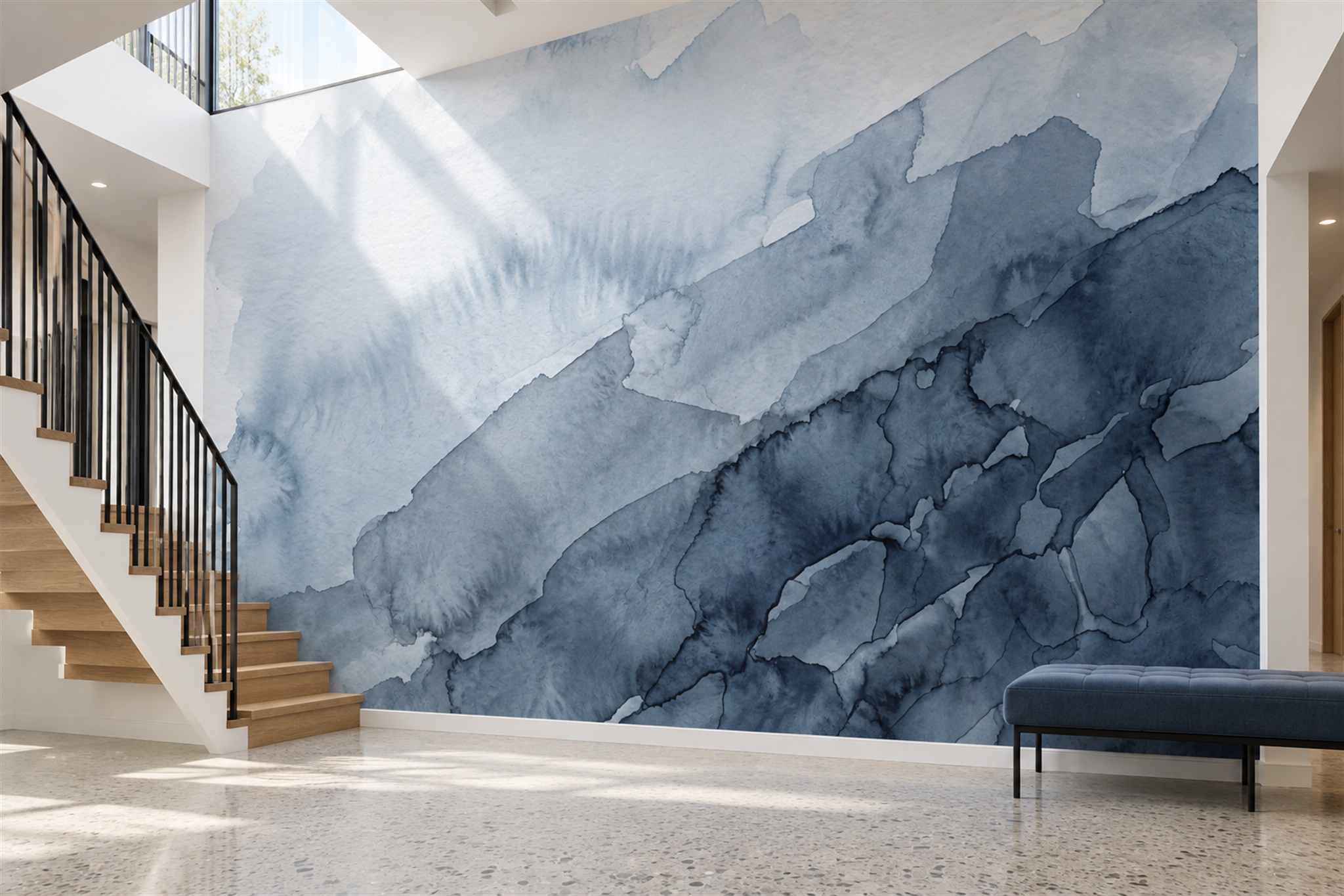
Example application: Any room with a suitable, prepared wall · pricing and measurement
A high ceiling changes how mural wallpaper is seen, not merely how much of it is needed. In a stair hall, the lower wall may be viewed from across the room while the upper wall is inspected at arm's length from the landing. The pale-to-navy abstract design in the featured stair space shows why broad shapes can work across both distances: its sweeping colour remains visible around the stair and upper window without relying on tiny details. Before choosing a design, decide what each viewpoint should reveal.
What counts as the important view?
Begin at the places where someone will actually pause: the doorway, a sofa opposite the wall, the foot of the stairs and the landing. Look up from the first two and across from the last. A landscape horizon that looks balanced in a rectangular catalogue image could be above everyone's head on a two-storey wall; a low floral cluster could vanish behind a railing. Mark the standing eye level at each location on a simple elevation drawing. That gives a more useful brief than height alone.
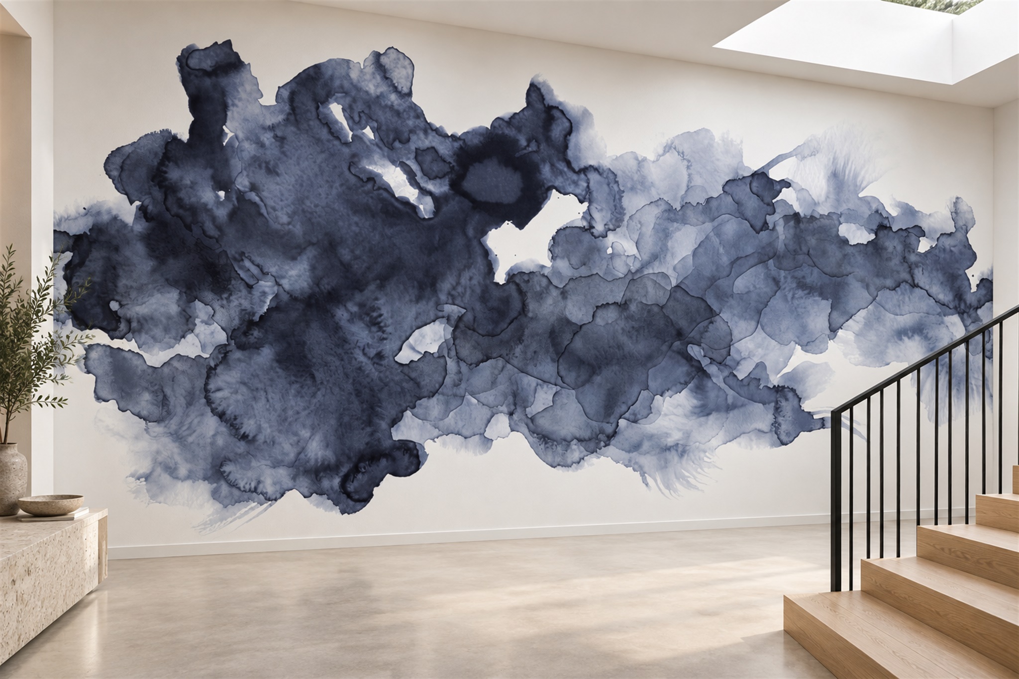
The navy stair-hall example below places a broad, dark ink-like mass through the middle of a largely white wall. From below, that central movement establishes a strong focal band; near the upper window, the surrounding pale space lets the wall breathe. Compare it with the featured blue wash, whose colour travels more continuously across the height. One approach concentrates attention, the other connects the levels. Neither is automatically better: the right choice depends on where the stairs, daylight and furniture break the view.
Do not solve every tall wall by stretching the art
Many murals are composed for a broad horizontal wall. Stretching one vertically to reach a ceiling can elongate leaves, distort circles and change the spacing between motifs. Enlarging it uniformly preserves shapes but may crop the sides and make details unexpectedly large. A designer may be able to extend an abstract wash or provide additional artwork; a figurative scene may not allow that without obvious repetition. Ask what is actually possible for the chosen image rather than assuming every design can be adapted in the same way.
Use the site's crop preview at the intended width and height, then ask the supplier whether it can confirm the final size of a recognisable element: a branch, bird, flower or arch. If a small bird becomes enormous at print scale, reconsider before ordering. Ask whether the source artwork supports the intended enlargement without visibly soft or blocky detail; a sample printed at the proposed scale is useful when fine detail matters. A room mock-up is helpful for mood, but it does not establish production resolution.
Use vertical movement with intention
Vertical trunks, climbing stems and rising abstract forms can echo the architecture, but a tall wall does not need detail in every corner. Open space beside a window or near the ceiling can keep a busy stair hall from feeling crowded. With a landscape, check whether a generous area of sky belongs to the original composition or merely results from forcing a short image into a tall crop. Compare the full artwork with the dimension-based crop preview before accepting that much empty upper wall.
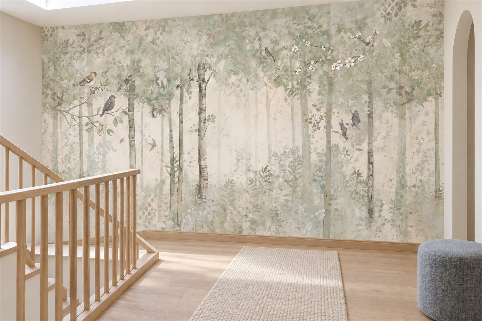
The sage stair-hall image below offers a more delicate alternative to the large blue forms. Slim trees and soft foliage draw the eye upward, while small birds and blossoms reward a closer look from the landing. From the ground floor, those fine details may read as texture rather than individual subjects. The railing and upper doorway also conceal or interrupt parts of the printed wall. For a similar design, place the most important motif where it remains visible from the primary viewpoint and let the smaller details serve the closer one.
Balance the lower and upper halves
Trace the silhouette of a sofa, console, staircase or balustrade on a separate measured elevation and compare it with the crop preview. A dense botanical border at the bottom may be hidden from the room, while a single portrait at the top may feel detached from the furniture below. Move the focal area into the portion of wall people can see most often. Deliberate asymmetry is fine; what matters is whether the lower and upper portions belong to the same visual story when viewed together.
Colour distribution affects that relationship. The featured blue stair mural shifts from pale, open colour near the top to deeper blues lower down, which gives the eye a way to follow the wall. The navy example carries more weight in one central band. Try viewing both from across the room and from the landing before choosing how much contrast you want. If possible, inspect a physical print sample in both the shaded lower area and near the upper daylight; the same colour can look different in those conditions.
Record measurements at several points
Take widths and heights at several points, especially where a stair return, sloping ceiling or beam changes the outline. Use one fixed corner as the reference for every door, window, socket and architectural opening. Record the heights of railings and permanent furniture as well. A photograph with these measurements overlaid helps the supplier distinguish the print area from the empty space in front of it. Confirm the supplier's recommended trim allowance for both dimensions rather than treating the artwork's visible crop as the cutting size.
Ask for a panel plan as well as the overall image. On a high wall, a seam may cross a prominent tree trunk or a strong abstract edge, and alignment near the ceiling can be harder to manage than at eye level. Find out the panel widths, numbering and starting edge. If a join falls across an essential face or fine architectural line, ask whether the layout can be adjusted before production. Do not assume that a mock-up showing one uninterrupted image describes the physical panels you will receive.
Plan installation access before ordering
A stair wall poses different access problems from an equally tall wall above level ground. Discuss access with a qualified installer before ordering, including whether a suitable platform or scaffold can be positioned around the stairs. A household ladder on a stair tread is not an installation plan. Confirm wall preparation for the selected covering, the panel sequence and how top-edge trimming will be handled. If access constraints affect where panels can start or how they can be aligned, that information belongs in the production conversation.
Include pendant lights, picture rails and shelving on your wall elevation even if they will be fitted later. Their outlines may cross the strongest part of the image. Consider whether the mural should continue around a corner or stop at an architectural edge; either decision changes the crop. A tall room does not automatically need every wall covered. Sometimes one carefully placed mural defines the volume more clearly than a pattern repeated across all surfaces.
Approve a two-level view, not one flat rendering
Put two views beside the final crop: one photograph from the main floor and one from the landing at ordinary eye height. Mark what each must show. The broad blue wash should retain its overall rise when viewed from below; the concentrated navy band should remain visible above the stair rail; the woodland may reserve its fine birds and foliage for the nearer landing view. A detail that disappears from downstairs is not necessarily wasted if the upper position is genuinely used, but the ground-floor image still needs a readable large-scale structure.
Use the same marked elevation to show the installer where the upper focal detail, railing and window fall, and ask for the physical panel sequence and an access plan. Keep these as separate sign-offs: the crop answers what the two viewpoints will see, while the panel and access review answers whether the chosen wall can be fitted as planned. A single attractive, front-on rendering cannot settle both questions.