What Mural Wallpaper Suits a Library or Reading Room?
Balance quiet detail, comfortable contrast, shelving, seating and the close viewing distance of a reading room.
Article focus: pricing and measurement
The cost and measurement decision
Start with accurate wall measurements; the final custom mural price depends on area, material and any finishing options.
Example application: Any room with a suitable, prepared wall · pricing and measurement
A library or reading room usually has plenty of small-scale visual detail already: book spines, shelf divisions, labels and lamps. The mural that suits it best often supplies something different, such as an open landscape, a broad botanical silhouette or a restrained abstract field. Choose from the reading position and the wall area that will remain visible between shelves. A beautiful full-size image is little help if its subject disappears behind the collection.
Begin at the reading chair
Sit where people actually read and look up from a book. Which wall enters that view? A mural behind the chair may be impressive on entering but almost absent from the reading experience. One opposite or beside the seat can act as a visual pause. Repeat the test from each main chair or desk, at seated height, with lamps and shelves in place.
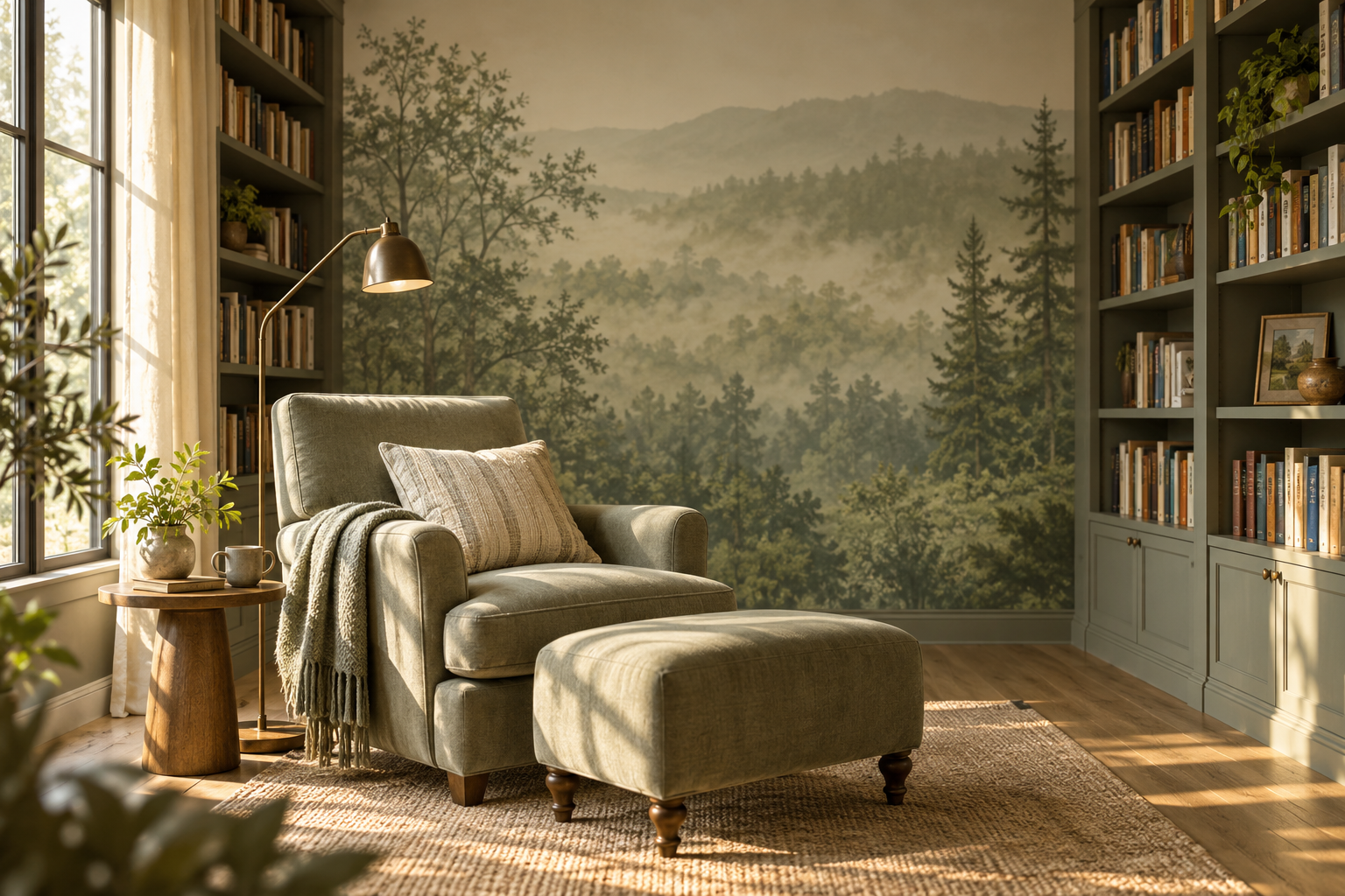
The accompanying room photograph shows a useful arrangement: a misty woodland scene occupies the exposed wall between two bookcases. The chair faces it, and the distant hills and open mist remain legible above the foreground trees. The mural does not pretend to be another shelf; it offers a different visual scale from the rows of books. That is a design observation, not a claim that the image will improve concentration or replace good reading light.
Make a simple room plan with the seat, shelving and candidate wall. In a multi-use study, also check the desk and video-call view. A bold graphic might be pleasant from a chair yet dominate the camera background. Decide which use has priority before ordering the crop.
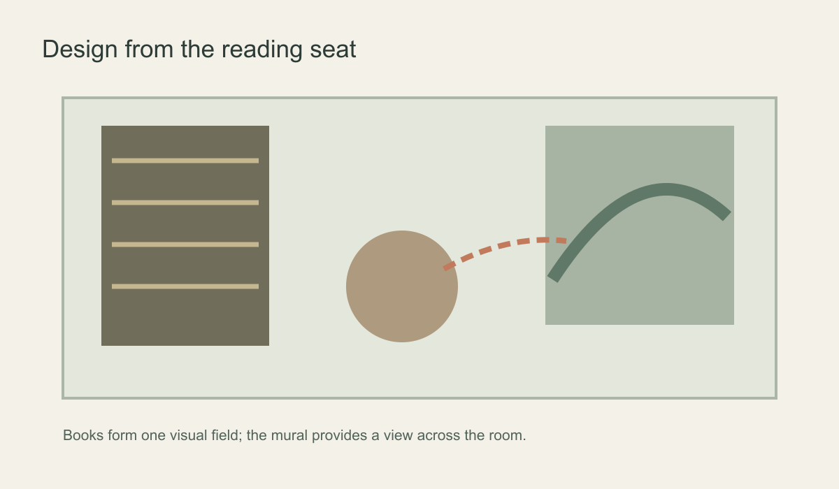 Judge the candidate wall from a seated reading position.
Let books provide the fine detail
Open shelving forms its own pattern of lines, colours and titles. When the collection is varied and dense, a mural with larger forms and softer transitions can balance it better than another field of tiny marks. A few layered tree silhouettes, a pale mountain view or a broad colour wash may read clearly without competing with the shelves. Conversely, uniform bindings or mostly closed cabinets can leave room for an engraved landscape or more intricate botanical.
Contrast is more informative than a simple “light versus dark” rule. A pale design with crisp outlines across every inch can feel busier than a dark image with gradual tonal changes. Hold a full-size sample beside the actual books, then step back to the reading seat. Does the print still have a clear subject? Does the main branch or shape pull attention every time you lift your eyes? The answer depends on the room, not on a universal library palette.
Do not use colour descriptions as promises about mood or productivity. Describe what the artwork does visually: it can leave open ground beside a lamp, echo the wood of the shelves or introduce depth beyond a wall of spines. Lighting, acoustics and seating comfort remain separate practical decisions.
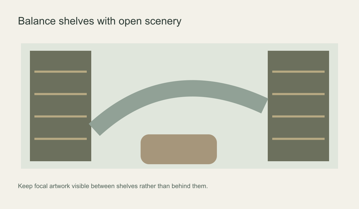 Keep the focal artwork visible between shelves rather than behind them.
Choose a scene for an open wall, a repeat for a broken one
A single landscape needs sufficient uninterrupted width for its horizon and focal forms to make sense. Between tall cases, a forest may still work if several trees and the distant layers remain visible; a wide lakeside panorama reduced to a narrow strip may not. Draw every case at its measured height and width over the proposed image. Include any shelves expected to be added as the collection grows.
A repeated botanical or geometric pattern is less dependent on one centre point and may suit short wall sections beside shelves. Yet a repeat is not automatically better: isolated flowers emerging from behind shelf uprights can still look accidental. Check the actual repeat scale and where motifs will fall at edges. A vertical composition may be a stronger choice for one tall, narrow alcove than either a panorama or a small all-over pattern.
Pay particular attention to horizons. From a low chair, a high horizon may leave most of the visible wall filled with dense foreground. A crop with more open sky or mist might better counterbalance crowded bookcases. There is no fixed height that works in every room; preview the image at the installed dimensions from the seat before approving it.
Test day and evening light separately
Reading rooms often shift from window light to a focused floor or desk lamp. Stand the print sample upright on the proposed wall and inspect it at both times. Warm lamps may make cream look more yellow or change the apparent green of a woodland scene. Darker detail may vanish in an unlit corner. A wall-washing light may also make uneven substrate or panel joins more visible, so surface preparation deserves attention.
Keep task lighting aimed at the page and independent of the artwork. A mural cannot substitute for adequate light where someone reads. Check whether a high-contrast part of the image sits immediately behind a bright lamp or a reflective screen, and move the crop or the lamp if that combination is uncomfortable. The sample test is about the wall's appearance; the reading-light decision should be made on its own merits.
Be careful with words, maps and illustrated books
A literary theme can be appealing, but readable text introduces a different requirement from purely decorative marks. For a map, quotation or illustrated bookcase, inspect the full-size proof. Check spelling, legibility and which letters will be cut off by a door, shelf or switch. Decorative pseudo-lettering should not be presented as usable information.
In a public library, directions and shelf labels need to be clear independently of the mural. A quotation behind a desk may look striking in a photograph while making a functional sign harder to find. At home, a map or favourite passage may be personal enough to justify the extra detail, provided it survives the proposed crop and can be read from its intended distance. A reading room does not have to advertise that it contains books; an unrelated landscape can offer a more useful visual counterpoint.
Coordinate shelves, safety and wallcovering specification
Decide whether bookcases will be moved, extended or fixed to the wall before measuring for print. Mark brackets, sockets and switches on the layout. Do not let wallpaper interfere with proper furniture anchoring. The US Consumer Product Safety Commission's Anchor It guidance explains the importance of securing tall furniture; the mural is decorative, never an anchor point.
A private reading room and a public library may face different wear, cleaning and building requirements. Request technical information for the exact chosen wallcovering where those requirements apply. The Wallcoverings Association's ratings guidance makes product-specific performance central to selection. Do not assume that a printed forest, a vinyl label or an attractive sample proves a commercial rating, cleanability or acoustic effect.
Before installation, confirm the final shelf positions and expose the wall so the installer can assess its surface. Keep the approved crop, panel sequence and manufacturer's care instructions with the room records. If the collection later expands, those details will help you decide whether another bookcase can be added without erasing the scene that made the mural suitable in the first place.
The practical choice is therefore driven by the room's existing detail and the reader's view. Give a busy library an image with enough open structure, reserve intricate artwork for a wall where it can be seen whole, and test the composition in the light and shelf layout that the room will actually have.