What Mural Wallpaper Suits a Long Narrow Wall?
Plan crop, rhythm, furniture clearance and viewing distance to keep a long wall visually balanced.
Article focus: pricing and measurement
Budgeting this wall with confidence
Start with accurate wall measurements; the final custom mural price depends on area, material and any finishing options.
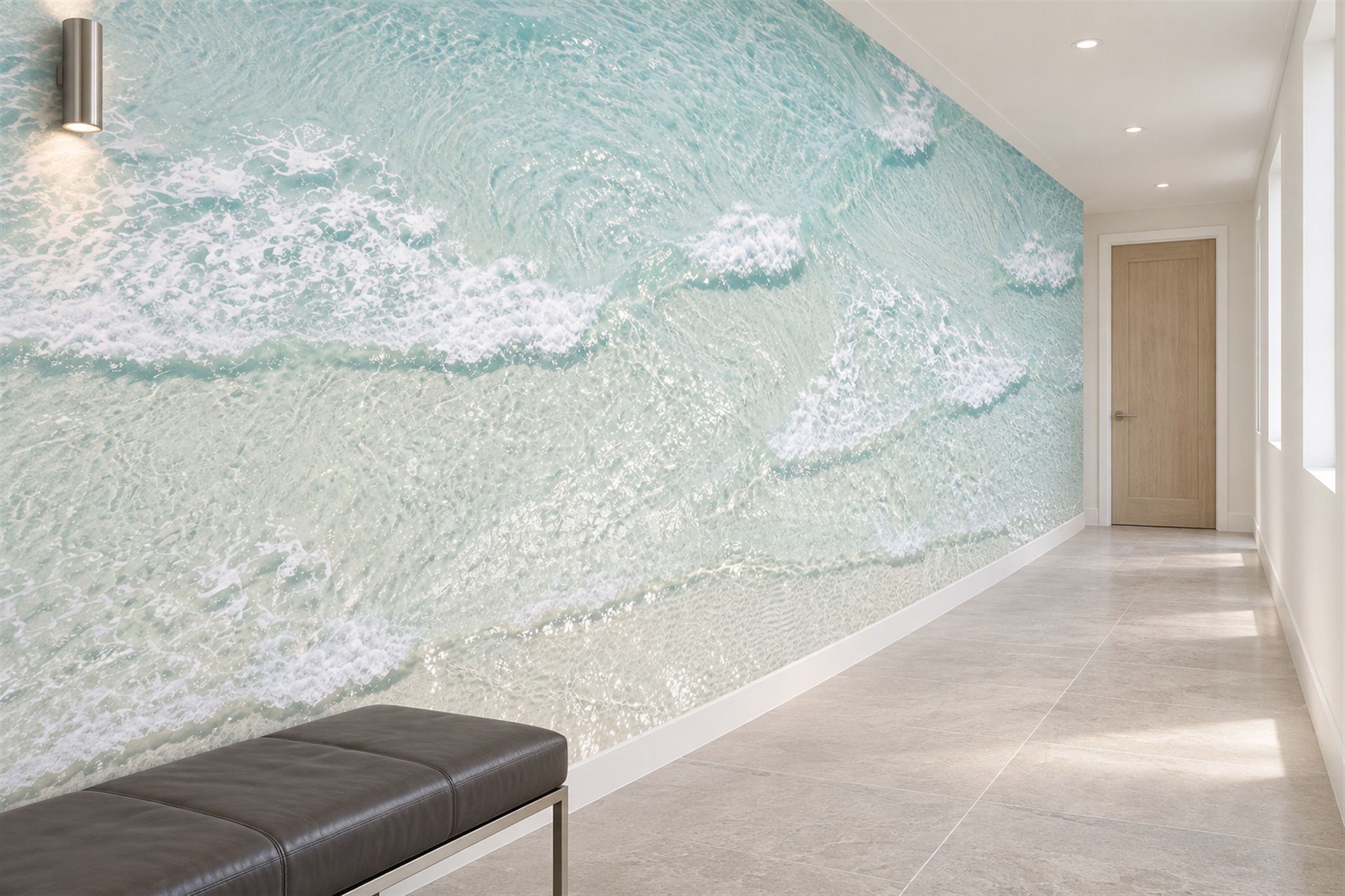
Example application: Living room · pricing and measurement
A long, narrow wall could be a corridor side, the space behind a dining banquette or the full width of a living room above a low sofa. Those walls share an unusual proportion, but they are not viewed in the same way. The aqua surf in the featured hallway stays coherent as one moves alongside it; a sofa wall may instead be seen in one broad glance. Choose an image whose composition suits both the wall's width-to-height ratio and the room's real viewing position, rather than assuming every long wall needs a repeating pattern.
Decide whether the image will be seen whole or in sections
Photograph the bare wall from the primary seat, doorway and far end, keeping the camera at normal eye height. On a living-room wall, a person opposite may see almost the entire panorama at once; on a corridor side wall, someone walking past may see only a moving slice. A dining banquette falls between those cases: guests at the table see local detail, while people arriving see the whole run. Mark which of these views must carry the main subject before choosing a crop.
The surf image's swirling foam holds together as broad aqua-and-white movement from the far end and provides smaller details beside the viewer. That two-scale reading would also help a long wall above a low sofa, provided the sofa does not cover the useful lower movement. A single oversized flower could be striking on an uninterrupted wall seen from opposite, yet become an unrecognisable fragment along a narrow passage. Judge the actual viewing geometry before rejecting or selecting a focal image.
Use horizontal movement without creating a rigid stripe
The sage watercolour hallway below illustrates a quieter route than the foaming sea. Several low, overlapping ridges travel along the wall, with a broad pale field above them. The darkest green sits near the skirting and echoes the passage's length without imposing one hard, ruler-straight stripe. There is enough variation in the ridge edges for a short section to feel complete, yet the scene also holds together from the far end of the corridor.
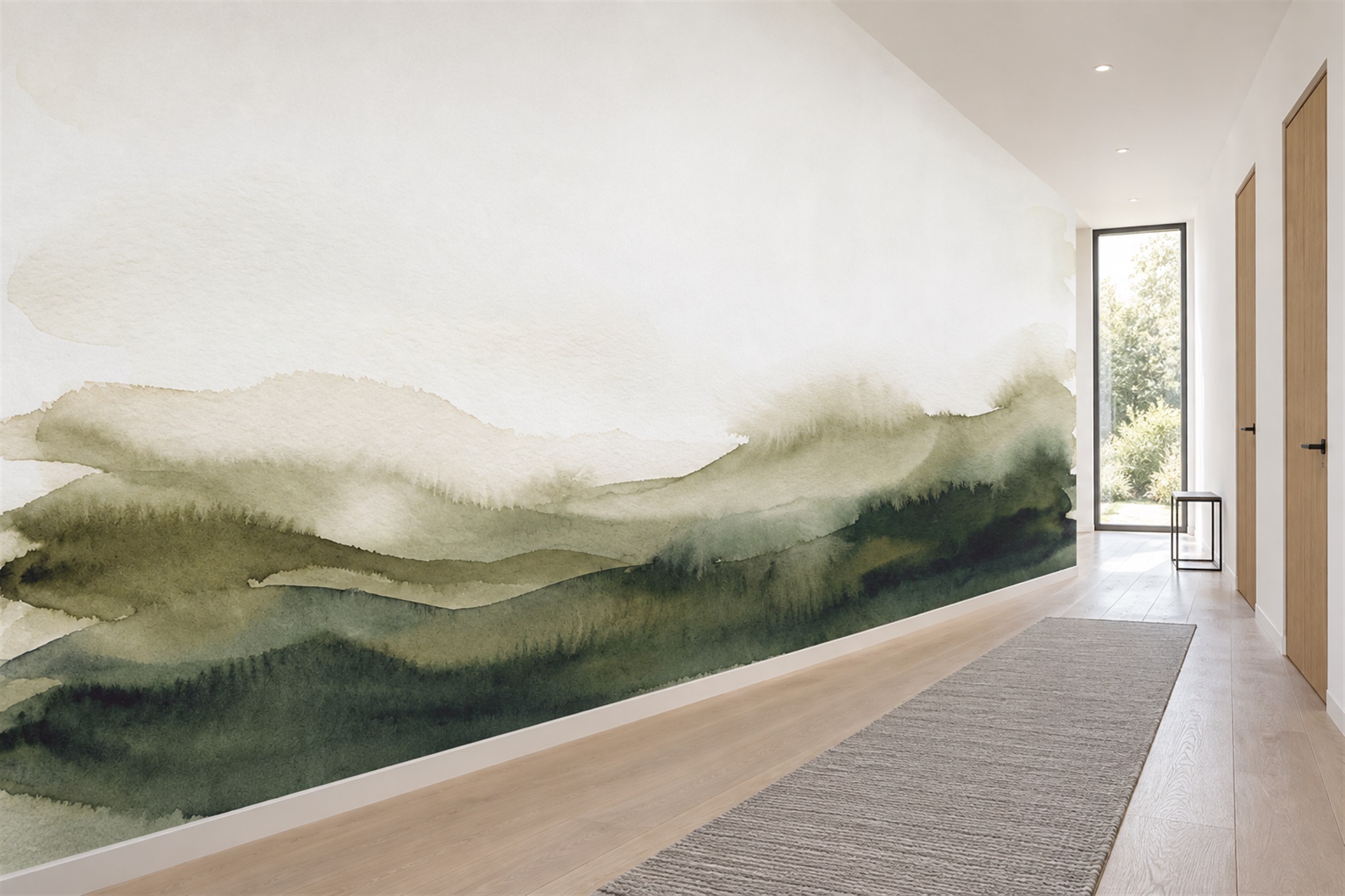
Horizontal movement is useful, but it is not the same as putting a rigid stripe at eye level. If the floor or ceiling is not quite level, an unwavering painted band can make the difference more obvious. On a separate wall elevation, compare the previewed horizon or strong edge with door handles, a dado rail and standing eye height. An irregular watercolour edge is generally more forgiving, though the final crop still needs deliberate placement.
Should a narrow space always use pale colours?
No. The right colour depends on the mood and the available light. In the blue hallway below, navy reeds and dark foreground shapes are balanced by an open blue-white sky; a row of windows opposite brings daylight across the mural. The image creates a stronger, more defined passage than the pale sage ridges. In a corridor without those windows, check a sample under the planned artificial lighting before assuming the deeper detail will remain readable.
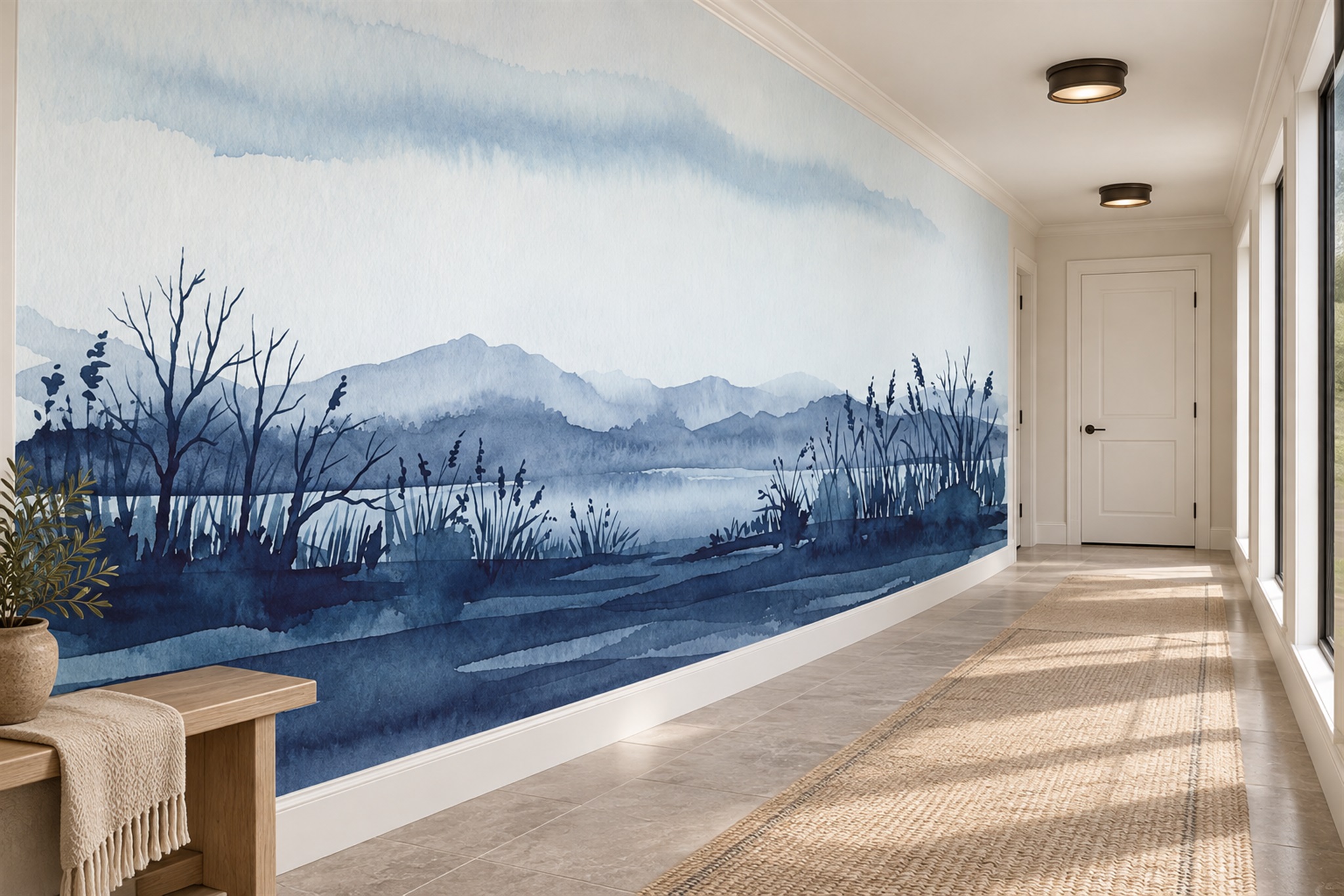
Check a sample at the bright end and at the dimmer midpoint, not only next to the nearest window. In the surf hallway, white foam can stay distinct against aqua even where daylight varies; in the navy scene, subtle middle-blue layers may be more dependent on light. Wall lights and ceiling downlights add their own repeated rhythm. Draw their positions on a wall elevation so an important motif is not lost in a glare spot or fixture shadow.
Scale matters more than the catalogue thumbnail
A short, roughly square image will not automatically become a convincing long mural. Stretching it sideways distorts circles, branches and waves; enlarging it uniformly may remove much of its height. Ask whether the supplier has a genuinely panoramic version, whether the art can be extended, or whether a repeat is part of the original design. If a repeat is proposed, ask to see how its join will appear across the ordered width; an obvious restart may be especially visible down the length of a corridor.
Test motif size at the actual width of the passage. The featured foaming surf is nearly abstract from an arm's-length view, which suits its immersive treatment. Someone expecting to recognise a complete breaking wave from that same position might be disappointed. Likewise, the individual reeds in the navy scene should not be enlarged so far that they become heavy vertical bars. Ask for a representative section at final print scale when size is uncertain, or confirm a familiar motif's dimensions with the supplier before accepting the enlargement.
Plan around doors, mirrors and furniture
First divide the wall into continuous printed stretches. A five-metre wall with two doors is not visually equivalent to five metres behind a low sofa: doorways interrupt the image at full height, while the sofa masks only its lower edge. Draw these shapes over the crop. The sage landscape's open upper field may survive low furniture, but a door cutting through its horizon could leave unrelated sections. A single tree placed on an unbroken end wall might be clearer than trying to carry it across three door openings.
On a long dining wall, add the banquette back, pendants and chair positions to the same drawing. A repeated motif can give each table a complete portion; a panoramic scene can work if its defining ridge or focal area remains above the seating. In a corridor, a bench or coat rail may obscure only one short stretch, so compare the visible fragments while walking. These are different interruption patterns, not interchangeable examples of a “narrow wall”. For the route and door-state decisions specific to passages, see the hallway mural guide.
Measure the actual wall, not the apparent length
Measure the full run from one fixed end and take the wall height at several points. Record the distance from that reference to each doorframe, recess, socket and fitting. A long wall may contain slight changes in surface or ceiling level that are easy to miss in one measurement. Send these dimensions with a straight-on photograph and ask for the design shown at final ordered size, including the supplier's installation trim allowance. The visible crop and the material needed for trimming are not the same thing.
Review panel widths, numbering and the proposed starting edge. If the first panel shifts, a panoramic focal point farther down the hall shifts with it. Check whether joins cross a strong horizon, a foam crest or a recognisable plant silhouette. Before fitting, verify the printed sequence against the proof and follow the manufacturer's instructions. In a confined passage, also plan where long panels can be handled without folding them or blocking the only route through the space.
Choose a finish and composition for the way the space is used
A family hallway may be brushed by bags and coats; a gallery-like passage may have very little contact. The image cannot tell you how a specific wallpaper material will behave under either use. Check the offered material specification and obtain a sample for the intended location. If the lower wall is likely to be touched often, consider whether the mural, a protective dado or another wall arrangement makes the most sense. Do not infer durability from a room photograph or an evocative material name.
Make two tests of the final crop. First, see the entire long rectangle from the farthest normal viewpoint: does the artwork have a readable beginning, middle and end, or does one isolated motif leave most of the wall vacant? Second, cover all but the width normally visible from a nearby chair or between two doors and move that window along the print. The aqua foam offers changing local detail, the sage ridges a quieter continuous direction, and the navy reeds depend on their pale sky remaining visible. A strong choice works in whichever of those two tests the room actually demands; it need not pretend a corridor and a living room are the same space.