How to Use Mural Wallpaper in a Maximalist Room
Balance layered colour, scale, furniture, pattern and visual rhythm when a mural is part of an expressive interior.
Article focus: pricing and measurement
The cost and measurement decision
Start with accurate wall measurements; the final custom mural price depends on area, material and any finishing options.
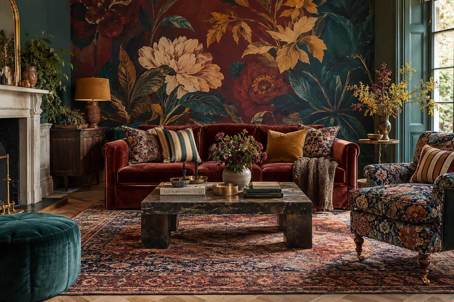
Example application: Living room · pricing and measurement
A maximalist room has permission to be expressive, but expression is not the same as putting every large pattern at the same volume. A mural can give layered furniture, colour and collected objects a visual setting. The most successful choices usually establish a hierarchy: one main scene, a smaller supporting pattern and enough repeated colours to make the room feel connected rather than accidental.
Decide whether the wall is the lead or the backdrop
A dramatic botanical panorama can be the room's lead artwork. If so, let a sofa or large cupboard take its cue from the mural rather than trying to outshout it. A different maximalist scheme may put an elaborate patterned sofa in the lead; the mural can then use a more diffuse garden, shaded architectural scene or tonal abstract. Both rooms can be richly layered, but the focal hierarchy differs.
Look at the wall from the doorway and from the main seat. Where does the eye land first? If a floral chair, patterned rug and gilded mirror all demand attention, a mural with a single central medallion may create one focal point too many. Move the mural's most detailed area away from the mirror or choose a composition with more open ground. The goal is not to remove complexity but to organise it.
Try the same room with two candidate crops. In one, a large flower sits directly behind the patterned chair; in the other, the flower rises to one side and the chair stands against quieter ground. The second arrangement preserves both objects as readable layers, even if neither is subdued. Moving the crop can solve a collision that buying another cushion cannot. If the artwork cannot be shifted without losing its main scene, choose a different wall or design.
Mix pattern scales on purpose
When a mural has large leaves, animals or arches, smaller prints in cushions and upholstery can provide contrast. A broad striped rug can work with detailed foliage because its rhythm differs. Two similarly scaled florals with equally strong contrast may blur together. Lay samples of the actual rug, curtain and chair fabric beside a scaled image of the mural, then step back. The relationship is easier to judge from a few metres than from small product thumbnails.
Pattern categories can cross happily. A graphic stripe, an antique floral and a landscape mural need not share an era if colour and scale connect them. A broad stripe supplies rhythm, a small floral adds close-up detail and a panoramic scene establishes the setting. They do not have to be equal in coverage. Compare them as a room composition: spread the rug image across the floor area of a sketch, place the fabric on the chair and only then judge the mural at wall scale.
Try a three-way pattern edit before buying: keep the mural and swap the chair to a solid; restore the chair but simplify the rug; then keep both textiles and test a less detailed mural crop. Photograph each arrangement from the same doorway. The comparison reveals whether the conflict is scale, contrast or simply too many focal points. The winning scheme can still be exuberant; its individual patterns should remain legible rather than collapsing into one busy field.
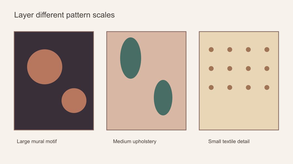 Different scales create a hierarchy instead of three competing copies of the same motif.
Build a colour thread, not an exact matching set
Choose two or three colours from the mural: perhaps a dark teal ground, rusty flower and pale cream highlight. Repeat them in measured doses across the room—a cushion, lamp base, painted trim or small piece of art. The room will feel related without every object being printed in the same design. An exact match is often difficult across ink, velvet, paint and glass, so compare undertones in the room rather than assuming a screen swatch can settle the decision.
A darker mural can give bright furniture definition. A vivid mural can work with older timber and quieter upholstery. If the room already contains many saturated colours, look for a mural whose strongest hues are already present rather than adding an unrelated accent solely for novelty. This is not a rule to limit maximalism to three colours; it is a way to make its abundance feel intentional.
For example, a dark teal and rust garden mural could sit behind a worn red velvet sofa without matching it exactly. A muted rust cushion and a teal glazed lamp would carry the wall's colours into the room, while an ivory ceiling prevents the darker palette from enclosing every surface. In a brighter scheme, a cream-ground mural with coral and olive details could connect a green cabinet to warm timber. The colours work as a thread across different materials; the furniture does not need to reproduce the mural's print.
Undertones still matter when the room is deliberately eclectic. Burgundy can lean violet or brown; cream can feel pink or yellow beside a particular wall. Place printed samples with the actual textiles and paint under the room's daytime and evening lighting. A digital collage is useful for testing proportions but not for approving colour. If a near-match looks wrong, a distinct companion colour may be more convincing than chasing a supposedly exact shade across unlike surfaces.
Use the whole wall without sacrificing the picture
Measure the full intended surface and mark furniture, doors, windows and a fireplace on a wall sketch. A sofa may cover the lower third of a garden scene; that can be attractive if the visible canopy still carries the composition. It is less successful when the main animal or architectural doorway disappears behind the back of the sofa. Use the crop preview at the actual wall dimensions and check the mural from both standing and seated eye level.
Consider whether the artwork should wrap around a corner or end at a clear architectural edge. A fully immersive room can be compelling, but a mural is often a single composition rather than a repeat that can continue endlessly. If more than one wall is involved, ask the supplier and installer how the scene will be divided. Do not order two identical crops and assume they will join as a panorama.
A dining room illustrates why crop matters. Imagine a mural of tall flowering branches behind a sideboard. If the largest blooms sit at sideboard height, much of the defining artwork will vanish. Moving the crop higher, choosing another section of the design or placing the mural on the adjacent uninterrupted wall may solve the problem. For a lounge, check the view from the sofa as well as from the door: the most dramatic part of a mural can land directly behind a tall lamp or mirror when seen from the seat where people spend the most time.
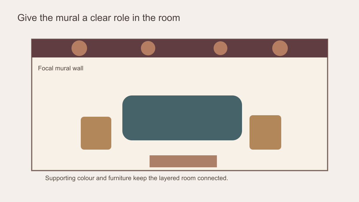 Choose whether one wall leads or the whole room carries the same intensity.
Leave intentional pauses
Maximalism benefits from quieter areas because they make the rich details legible. A plain ceiling, an unpatterned sofa, a generous stretch of wall colour or a simpler window treatment can give the eye a place to rest. This is not a demand for a neutral room. Deep colour can function as a pause when it is relatively uninterrupted. A mural with darker ground and concentrated flowers may provide its own breathing space better than an evenly busy all-over design.
Light changes how a dense mural reads. In a room with limited daylight, very dark detail may merge at the far end; in strong sun, a high-contrast pattern can become more assertive. Order a printed sample in the intended material if available and view it in the room at different times. A small sample cannot show the whole composition, so pair it with a wall-size crop preview.
A pause can be spatial as well as chromatic. Keep a narrow plain wall between the mural and a highly patterned curtain, or let a doorway mark a clear boundary between two strong schemes. In an open-plan room, an uninterrupted paint colour on surrounding walls can hold together several objects even if the mural itself is exuberant. That continuity lets collected pieces feel curated rather than scattered. It is especially helpful when the floor already carries a large patterned rug.
Give framed art and collected objects a readable setting
A maximalist room may already have a gallery wall, mirrors and shelves of objects. If framed art will hang over the mural, test the actual frame sizes and positions against the proposed crop. A detailed print behind every frame can obscure the edge of the artwork, while a patch of calmer ground can make both the mural and the collection easier to read. You need not remove the gallery; you may need to move the most detailed mural subject away from it.
Mirrors require another look because they show a second part of the room. From the usual seat, check whether a mirror reflects the mural's strongest motif directly beside the real one. That doubled focal point can be lively or distracting, depending on the room. Likewise, a tall shelf may interrupt a painted tree or arch so thoroughly that its shape no longer reads. Photograph the room with the mirror and shelf in place, then position the crop around their visible outlines rather than around an empty-wall elevation.
For a room with many small framed works, a mural with a broad landscape or shaded architectural ground may support the collection better than one composed of many separate picture-like vignettes. Where a single large painting already anchors the wall, consider placing the mural on an adjacent surface or choosing a less narrative design behind it. These are spatial choices, not a ban on layering art over pattern: the test is whether individual pieces remain identifiable from the doorway and the main seat.
Approve the full composition, not an isolated swatch
Set the exact mural crop into a straight-on photograph containing the furniture, rugs, art and lighting that will stay. Check three things separately: whether the largest motifs remain visible, whether neighbouring patterns have different enough scales to read independently, and whether a recurring colour connects the wall to the room. Then view the mock-up from the doorway and principal seat. If one view loses an animal behind a cabinet or doubles a bold shape in a mirror, adjust the crop and review it again.
Finally, compare that approved composition with the panel plan if one is supplied. A join through a high-contrast flower or a narrow printed section beside a fireplace deserves a closer look before production. Keep the selected material and installation instructions with the order, but do not let logistical checks replace the design decision. The room should remain richly layered when its everyday objects return, with each major pattern and collected piece still distinguishable.