Which Mural Wallpaper Suits a Minimalist Interior?
Choose restrained composition, quiet contrast, negative space and a clear focal point for a minimalist room.
Article focus: pricing and measurement
What to settle before pricing
Start with accurate wall measurements; the final custom mural price depends on area, material and any finishing options.
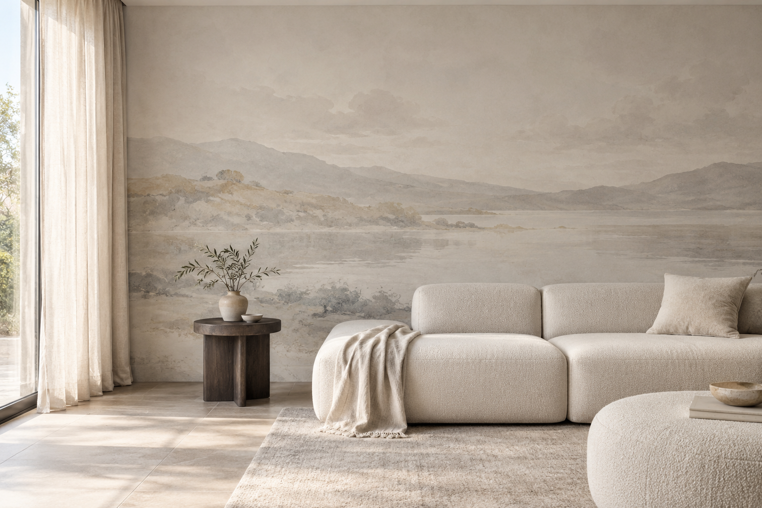
Example application: Bedroom · pricing and measurement
A minimalist room does not have to be a room without artwork. The challenge is choosing a mural that contributes shape, depth or texture while leaving the architecture and furniture space to breathe. A pale design is not automatically minimal, and a dark design is not automatically too much. What matters is the number of competing visual ideas, the scale of the main motif and how the wall reads from across the room.
Choose one job for the mural
Ask what the wall should do. It might soften a plain room with a hazy horizon, introduce a single sculptural curve, or add quiet movement through fine branches. Trying to accomplish all three at once can make the wall feel busier than intended. The most convincing minimalist mural often has a strong organising feature and generous areas where the eye can rest.
Consider the room's existing lines. A long low sofa may sit naturally beneath a horizontal landscape; a tall wall beside a staircase may suit a measured vertical motif. If the furniture already has a strong silhouette or the architecture includes prominent timber slats, a more diffuse mural may be the better partner. Minimalism is a relationship between elements, not a fixed list of approved colours or styles.
Start by identifying the room's current focal point. A sculptural pendant, a broad window view or a large piece of art may already lead the eye. In that case, let the mural act as a background with restrained contrast and a less insistent centre. If the room has no obvious anchor, a single mural gesture can provide one. The decision is not whether a design looks minimal in isolation; it is whether it gives the room a clearer hierarchy after the furniture is in place.
Four visual directions worth testing
An open landscape with distant hills, sky or water can introduce depth without many close-up details. A tonal plaster-like or linen-like print can create surface variation from afar, though it remains a flat print rather than real plaster or fabric. A sparse botanical can bring an organic note when leaves and stems are spaced deliberately. A geometric mural with one or two large forms can echo modern furniture without repeating small shapes across every inch.
These directions can work in different palettes. Soft stone, cream and muted blue are easy to coordinate, but a deep charcoal line on warm ivory may be equally restrained if the composition is simple. What tends to be harder is combining numerous motifs, sharp colour contrasts and multiple focal points on the same wall. Browse the artwork itself, not just a room photograph where careful styling may hide its actual density.
Each direction solves a slightly different problem. A distant landscape can lend a shallow room a sense of recession; avoid one with a crowded foreground if openness is the goal. A tonal print can animate a plain wall without asking to be a focal point, but check that its marks remain visible at normal viewing distance. Sparse botanical linework softens hard-edged cabinetry, provided its stems do not turn into a tight all-over repeat. Large geometry introduces order in a simple room, yet a circle or arc placed behind a tall wardrobe can lose the very shape that makes the design effective.
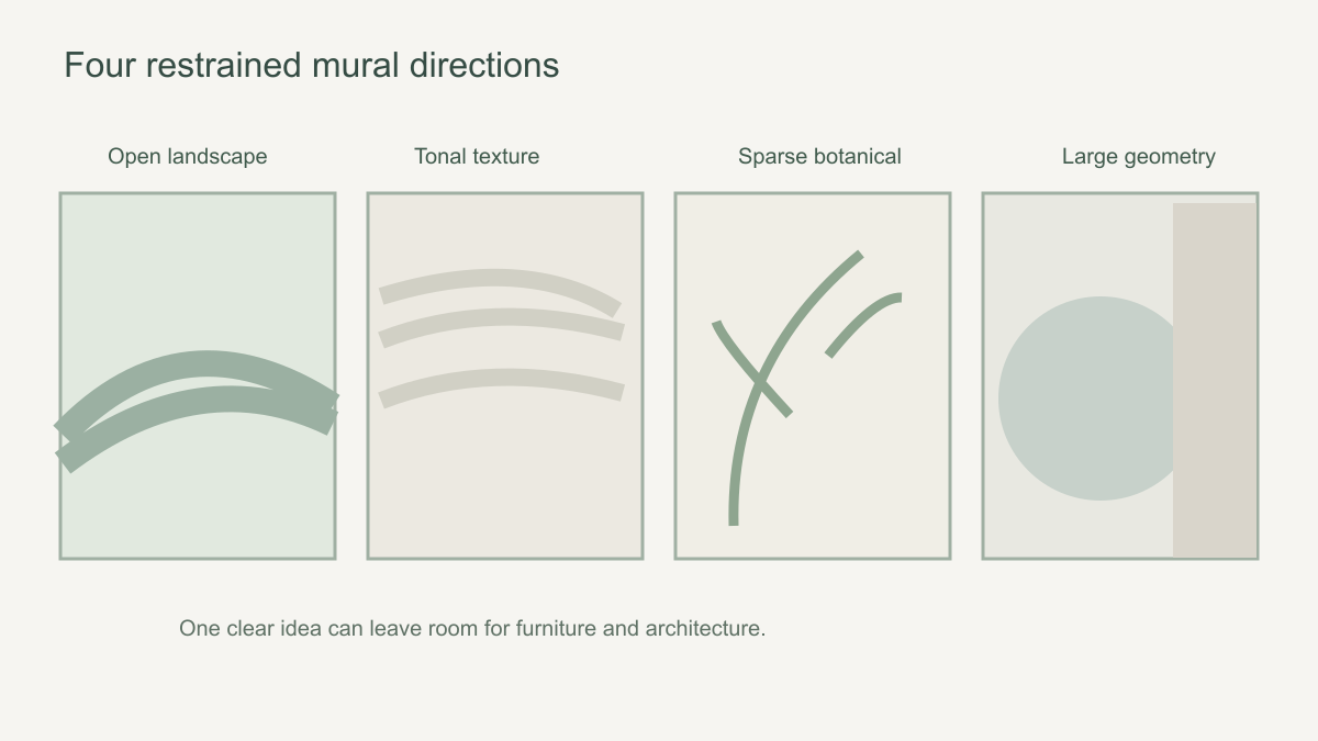 Different styles can feel restrained when each has one clear visual idea.
Leave room for negative space
Negative space is the quieter part of the design around its principal motif. It does not need to be pure white. A broad misty sky, softly shaded ground or generous unmarked area can let a single tree or arc remain readable. Compare how much of the wall is occupied by high-contrast detail. A pattern that looks sparse on a small sample may become dominant at full mural scale, while a busy thumbnail may open up when cropped to a larger wall.
Check the composition at the room's main viewing distance. Stand where you would normally enter or sit, and imagine the height of the printed focal point above the sofa or bed. A mural can be quiet at arm's length but visually noisy across the room if its repeated marks merge into a dense texture. The opposite can also happen: subtle detail may disappear from a distance, leaving only a pleasant tonal field. Neither outcome is wrong, but it should be intentional.
Use two views when comparing candidates. First, look at the full artwork reduced to the approximate proportions of your wall; this reveals the overall balance. Second, enlarge a section to judge the character of its marks and whether they will look like fine detail or a coarse pattern nearby. A thumbnail alone hides scale. A sample alone hides composition. The design that succeeds at both distances is usually safer than one that looks compelling only in a close-up promotional crop.
Coordinate with what the room already contains
Pull one or two colours from fixed elements such as flooring, cabinetry or upholstery. Match undertones rather than assuming that every beige works with every beige: warm oatmeal can clash with a distinctly cool grey-white. A sample placed upright on the intended wall in morning and evening light is more informative than a screen image. Observe it beside the actual floor and paint, not on a desk under unrelated lighting. A harmonious relationship can be more convincing than an attempted exact match between different surfaces.
If you have patterned rugs, veined stone or striped curtains, the mural may need to be quieter. The room need not be empty; a single patterned piece can sit comfortably with a subdued wall. Avoid forcing an exact colour match with a sofa if the material and light will make the hues read differently. A related family of tones is often more forgiving than a near-match that is just slightly off.
Contrast deserves its own check. Put a dark-on-light line drawing next to a low-contrast wash in the same colour family. The former may be the stronger wall even though both are mostly neutral. Equally, a dark mural with one broad silhouette can read more calmly than a pale wall packed with tiny marks. If there are several high-contrast objects in the room already, decide which one should lead and reduce the contrast of the others. Restraint is about controlled attention, not a compulsory white-on-white scheme.
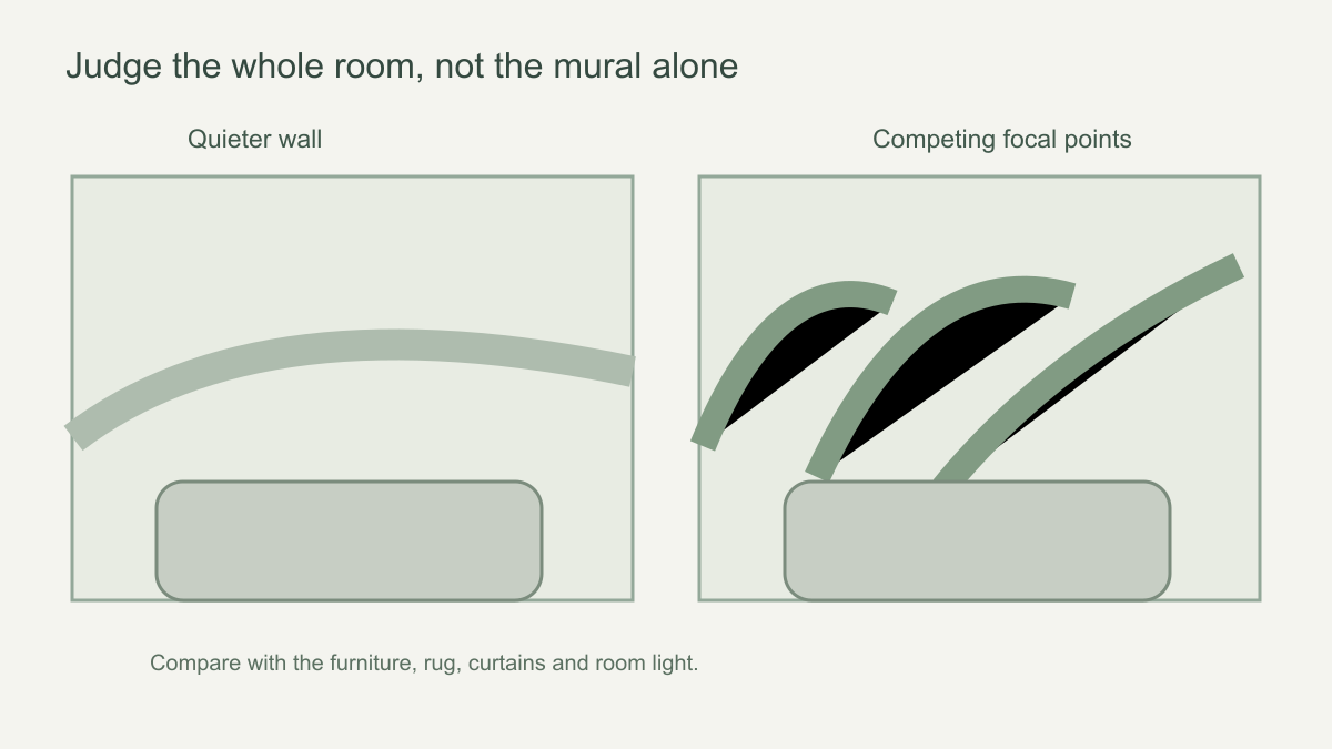 Judge the mural together with furniture and textiles, not in isolation.
Test visual density at two distances
Reduce each candidate to the size it would occupy in a straight-on room photograph. From that distance, ask whether its repeated marks resolve into one calm field or create a busy texture that competes with furniture. Then inspect a close crop. Fine hatching, tiny leaves or speckled plaster marks may be almost invisible from the doorway yet quite active beside a desk. The right choice depends on where people spend time, not on how sparse the catalogue thumbnail looks.
Compare three candidates with the same wall dimensions and unchanged furnishings. One might be a quiet tonal wash, another a single high-contrast line and the third a low-contrast all-over pattern. Count the distinct edges and repeated elements visible from the main seat. The pale pattern may be the busiest of the three despite its soft colour; the dark line may be the most restrained because it appears only once. This makes “minimal” a testable description rather than a colour label.
Finally, crop each candidate as it would actually be printed. If enlarging a botanical removes its open ground, it no longer offers the breathing space that attracted you. If a large arc disappears behind cabinetry, its simplicity stops reading as an intentional form. Reject a candidate when its defining quiet area or complete shape cannot survive the required crop. The modern-interiors guide compares broader style families; this exercise tests the density of the particular image on your particular wall.
Decide where the composition begins and ends
One mural wall with plain neighbouring surfaces can establish a deliberate boundary. The boundary matters: an artwork ending at a corner or doorway reads as a complete plane, while a partial crop stopping halfway across an uninterrupted wall may look accidental unless it has a clear architectural frame. In a small bedroom, a broad low-contrast scene might cover the main wall calmly; a bold arc may need a single, well-defined feature surface. Judge the edge as carefully as the centre.
Look at adjacent walls in the same photograph. If the mural's strongest line points straight into a blank corner, it may make that edge feel abrupt. A fading landscape or an open ground can soften the transition to plain paint. Do not assume a panoramic scene will continue seamlessly around a corner, or that two separately ordered crops will join. If the composition must wrap, ask the supplier for a plan showing both surfaces before ordering.
Choose the candidate that survives ordinary use
Keep the objects that will remain in the room when comparing mock-ups: the floor lamp, everyday books, window treatment and dining chairs. Test the candidates from the entrance, the normal seat and one close working position. A mural that feels perfectly quiet in an empty promotional scene can become restless beside a real patterned rug. Conversely, an open landscape may retain its calm even when the room is occupied because its detail stays concentrated away from the furniture.
Discard any option that needs the room to be permanently cleared to make sense. Of the remaining designs, choose the one whose main form, quiet ground and wall boundary are still legible in the final crop. That may be a single charcoal curve, a sparse branch or an almost abstract horizon; it need not be the lightest candidate. The successful minimalist mural gives the room a reason for the artwork without asking every other object to disappear.