Which Mural Wallpaper Suits Modern Farmhouse Style?
Combine softened landscapes, botanical marks, warm neutrals and practical composition with the texture of a farmhouse interior.
Article focus: installation and removal
Planning the work and the exit
The right installation method depends on the chosen material and wall condition, so prepare the wall before ordering and follow the material-specific instructions.
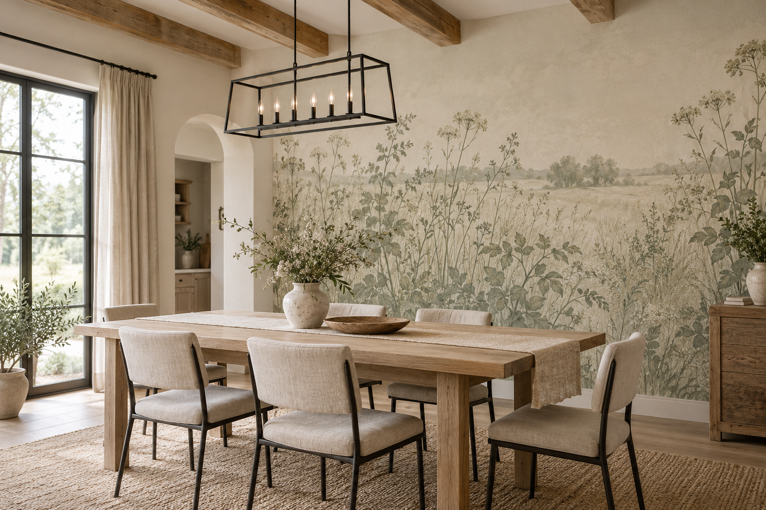
Example application: Bedroom · installation and removal
Modern farmhouse style is at its best when a room feels useful, light and lived in, not when every surface announces “rustic”. A mural should support that balance. An open meadow, a spare botanical drawing or a muted landscape can add a view behind simple timber furniture without making a dining room resemble a themed set. The most suitable choice depends on the warmth of the wood, the amount of black metal, the natural light and how much pattern is already present.
What makes a mural feel modern farmhouse?
Think of the style as a conversation between practical rural references and cleaner contemporary lines. An oak table or exposed beam supplies the grounded part; plain cabinetry, uncluttered lighting and a restrained palette supply the modern part. The mural can connect those pieces through subject, colour or scale. It does not have to show a barn, livestock or faux shiplap. In many rooms those literal motifs add clutter rather than character.
A hand-drawn meadow is a particularly flexible option because it brings a soft outdoor reference without imitating building material. A delicate branch or leaf pattern can do the same in a smaller room. If the furniture is heavy and dark, a spacious landscape can create breathing room. If the room is almost entirely white, a stronger botanical drawing may provide the visual weight it lacks. The right mural is the one that solves a specific imbalance in the room.
The balance is easiest to see from the doorway. A broad timber table, exposed beams and black-framed windows already give a dining room several strong lines. A mural with fine field grasses and open ground can soften those lines. In a room with plain walls and little natural texture, the same faint print may disappear; a larger branch or more defined landscape could be more useful. The style is not a formula for low contrast. It is a way of letting practical surfaces and the artwork share a clear hierarchy.
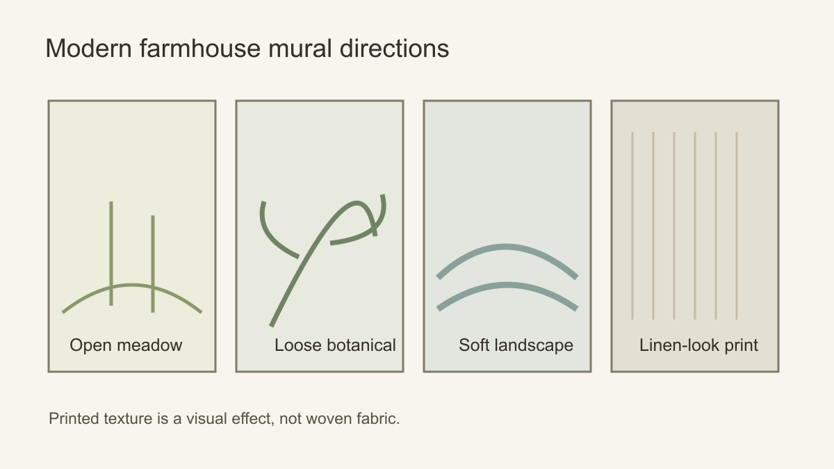 Choose the subject for the room, not for a style label alone.
Start with the real materials already in the room
Before comparing mural swatches, examine the table, floor and cabinetry. Pale oak tends to sit well with oat, chalk, muted sage and warm grey-green. Walnut or stained beams can support deeper olive, umber or blue-grey. Black metal pendants and window frames can be echoed by a little dark linework in the image. The echo can be subtle; a heavy black outline across the whole wall may make a relaxed room feel graphic.
Printed texture needs careful wording. A linen-look ground or faded plaster effect is a visual design on a flat wallcovering, not woven fabric or actual plaster. It can still be useful as a quiet backdrop, especially behind open shelves, but do not expect it to behave like a textured building finish. Order a sample and inspect it from the normal viewing distance as well as close up. Some simulated textures look convincing in a small web image but too repetitive when enlarged.
Natural light changes the reading of colour. A north-facing dining room may turn pale green cooler than expected; warm evening light can make a cream ground more yellow. Compare a physical sample with flooring and upholstery at several times of day. This is more reliable than matching screen colours or choosing a named shade in isolation.
Check where the print will meet a real material. A linen-look ground immediately beside genuine woven upholstery may reveal its flatness; a faux-plaster mural next to a textured old wall can look like an accidental near-match. That does not rule out printed texture. It means judging it as a graphic surface with its own role, not as a substitute for the room's actual timber, plaster or cloth. A meadow or drawn branch can sometimes provide the missing contrast more clearly.
How much detail should the wall carry?
A mural behind a dining table is usually seen from a few steps away, often partly hidden by chairs and a pendant. Strong, simple composition matters more than tiny botanical detail. Keep the primary feature above the chair backs or to one side of a tall dresser. In a living room, the mural may be viewed from farther away; a broad landscape can work where a small scattered repeat might disappear. A narrow hallway needs a different decision: a slender vertical branch or calm texture may read more clearly than a panoramic meadow squeezed into a corridor.
Furniture and wall art also contribute pattern. Striped cushions, checked upholstery, wood grain, pottery and a woven rug each ask for attention. If several are already strong, reduce the mural's contrast or choose a scene with open sky. If the rest of the room is plain, a more detailed hedgerow or larger floral study can create a focal point. Avoid using the same small-scale floral on curtains, cushions and the mural unless the repetition is very deliberately controlled.
A picture of an empty room can mislead you about scale. In everyday use, the dining table may hold a vase, pendant lights cut across the wall and a sideboard hides the lower section. Overlay these objects on a wall-size preview. If the most distinctive flowers sit exactly behind the sideboard, reposition the crop or choose an image whose important forms rise above it. A repeated print tolerates interruption; a single landscape with a focal tree may not.
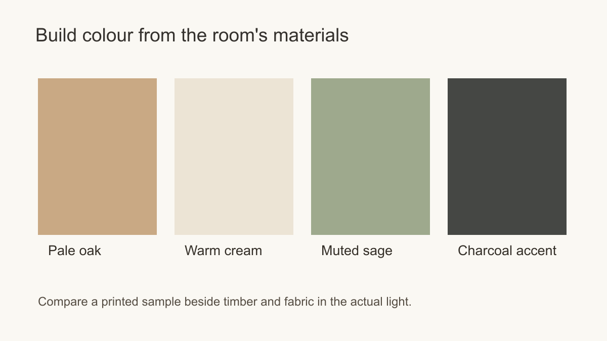 Let existing wood and metal guide the mural's colours.
Keep the rural reference specific, not theatrical
A modern farmhouse room usually contains a few rural cues already: an honest timber table, simple joinery, a woven shade or a view over planting. The mural need not add a barn, livestock and faux boards to make that reading legible. Try one subject that relates to the room: field grasses against straight cabinetry, a spare branch beside a heavy cupboard, or a distant orchard where a long dining wall needs depth. Their purpose is different from wallpaper that imitates another construction material.
Compare the scale of the chosen subject with working furniture. Meadow seedheads smaller than the cabinet handles may dissolve into texture from the dining table; one enormous flower behind the same table may become theatrical. A moderate drawing with visible open ground can sit between those extremes. In a room dominated by exposed beams, broad fields or a quiet botanical may give the eye a rest. Where cabinetry and furniture are plain, a bolder print can carry more of the room's character without needing staged accessories.
Illustration style also changes the relationship. Fine linework can echo black window frames without turning the entire wall dark. A watercolour field can soften sharply edged cabinets; a block-print-inspired branch can add a stronger, more graphic rural reference. Check whether the artwork actually uses those techniques before naming them, and inspect the full composition at wall size. The product label “farmhouse” is less informative than the marks, spacing and scale of the design itself.
Plan the installation around the working room
In a kitchen or dining space, pick a wall where the design can be enjoyed without pretending that wallpaper is a substitute for a suitable splashback. Heat, moisture and cleaning demands vary by location and material; consult the product's instructions and your installer before placing wallcovering near a sink or hob. A dining-room wall away from the wettest work area is often a clearer starting point. In a mudroom or busy family space, also consider where coats, shelves and doors will cover the art.
Choose the decorated field deliberately. In a kitchen, the clear wall between cabinets and a door may be narrow, so a broad panorama can lose its subject at both edges; a distributed branch or field-grass design may tolerate that framing better. In a dining room, a sideboard and pendant divide the visible wall into upper and side areas. Put the important part of the artwork where those objects leave space, then check the exact crop and panel plan. A sample tests colour and printed finish, not the full composition behind installed furniture.
Compare an imitation finish with the room's genuine textures before choosing it. If timber panelling, a woven chair and open shelves already supply close-up detail, another linen-look or plaster-look print may contribute little beyond a near match. Place an open meadow and a restrained botanical beside those real surfaces at wall scale. The meadow can add a distant view where the materials are already tactile; the botanical can supply a readable drawing where the furnishings are very plain. Choose the effect the room lacks, not a printed substitute for a material it already has.
A few room-specific choices
For a pale kitchen with shaker cabinetry and oak stools, a modest botanical on a cream ground can add drawing without competing with cabinet lines; keep it on a wall whose material and cleaning requirements suit the chosen finish. For a dining room with a substantial timber table, a low-contrast meadow may let the table remain the visual anchor, whereas a dense floral could crowd the chair backs. For a bedroom with exposed beams, a hazy landscape behind the bed can supply distance while the wood provides the closer texture.
Make the comparison with the room in everyday use, not with a cleared styling photograph. Put the actual pendants, shelves, table and window frames over two candidate crops. If the mural merely copies the grain and texture already present, try a different visual role. If a motif survives the cabinetry and makes the practical furniture easier to read, it is doing useful work for the room. That is a stronger modern farmhouse choice than adding more rustic symbols.