What Mural Wallpaper Works with Neutral Interiors?
Coordinate warm whites, beige, taupe, oatmeal and soft grey interiors with a mural that adds depth without harsh contrast.
Article focus: pricing and measurement
Budgeting this wall with confidence
Start with accurate wall measurements; the final custom mural price depends on area, material and any finishing options.
Example application: Living room · pricing and measurement
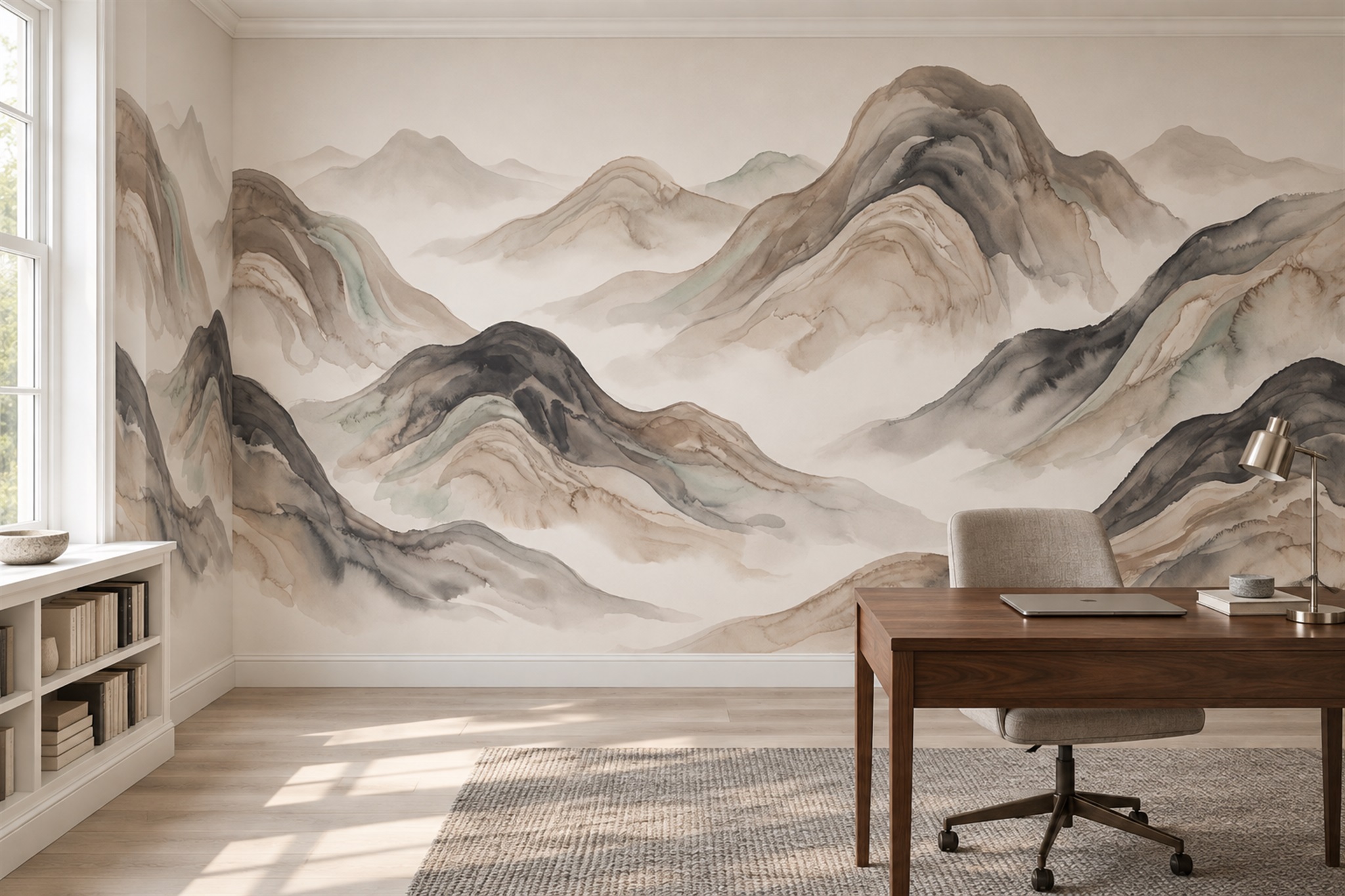
What kind of mural belongs in a room already furnished in cream, taupe or grey? The answer is not necessarily another nearly blank beige surface. The layered mountain scene in the feature image uses stone, charcoal and warm taupe to give a neutral office depth; the cloud and leaf murals below make different choices about colour and scale. To choose well, decide whether your room needs a view, a soft accent or a clear botanical shape, then check that the mural's undertones relate to what you already own.
Read the fixed materials before adding another neutral
List the room's largest permanent surfaces: floor, cabinetry, main seat and the paint or trim that touches the mural wall. Note their texture as well as their hue. A smooth cream sofa beside a matte wall and a grainy timber desk can accommodate an image with charcoal ridges; the same room with veined stone underfoot may already have enough visual movement. The mural does not have to repeat every existing neutral.
In the mountain-office photograph, warm timber, pale upholstery and charcoal ridges each do a different job. The darker printed bands give the eye a reference point without turning the wall into a black-and-white graphic. If your own furniture already contains strong stripes or grain, compare that mountain scene with a more diffuse cloud mural rather than adding another pronounced line merely because the colours match.
Check what happens where the print meets the adjacent paint or woodwork. A slightly different ivory can look like an unintended near-match across a long boundary; a deliberately deeper taupe can make the relationship clearer. For a close decision between similar greys, creams or greens, use a physical sample and the separate undertone guide. This article's larger question is what visual job the mural should do among the materials already in the room.
Do not give a small removable accessory more authority than the floor or fitted cabinetry. A metal lamp can move; a stone floor is likely to remain. If the mural bridges a warm timber floor and a cooler upholstered chair, let one direction lead and the other appear in a smaller printed accent. An equal mixture of every existing finish may make the wall feel indecisive rather than integrated.
Decide what the mural should add
Neutral rooms can need depth, movement or a focal point. These are different jobs. A misty landscape can suggest distance and make a sitting area feel open. A broad abstract wash can introduce movement without adding objects. A fine botanical can add close-up detail to an otherwise simple corner. Choose the job before choosing the motif; otherwise it is easy to select a pleasant image that does not improve the room.
For depth, look for layered values rather than a flat beige field. A pale horizon above slightly darker hills or clouds gives the eye a foreground and background. For movement, check the direction of lines and brushwork. A horizontal wash can extend a wide wall; vertical stems can draw attention to height. For a focal point, consider a single concentrated subject and enough clear space around it.
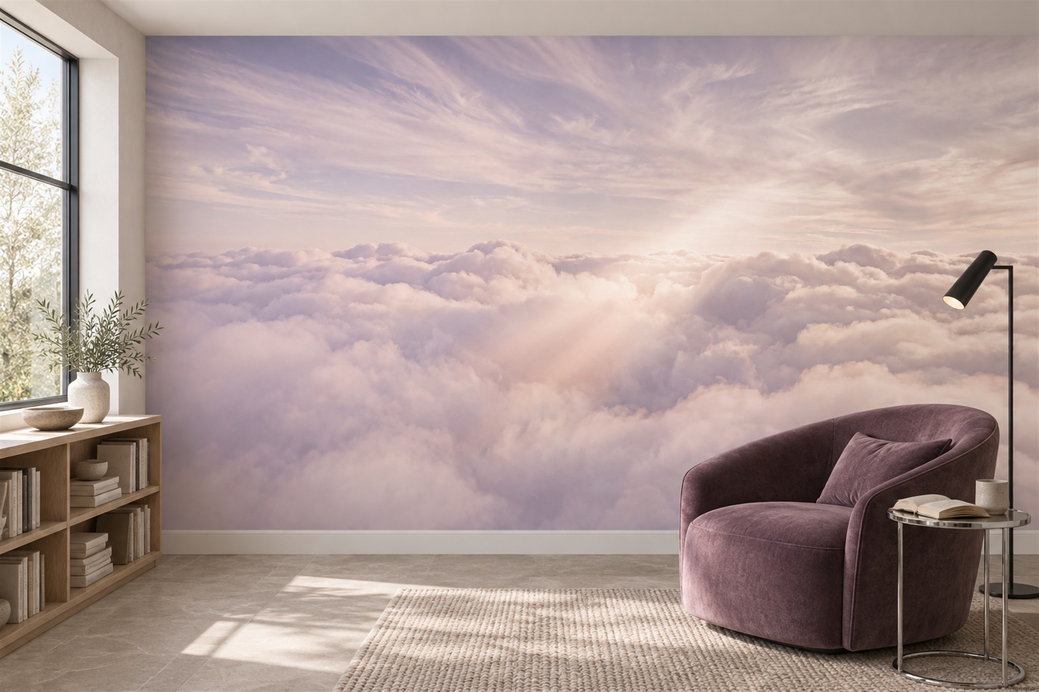
The cloud mural shown here uses soft lilac, cream and a muted peach glow. It is not strictly monochrome, yet the broad transitions allow the colour to sit beside restrained furniture. In the photograph, a mauve chair picks up one of its cooler notes; timber and a pale rug keep the space from becoming uniformly purple. A neutral interior can take an accent, but that accent should have a reason to be there.
Keep contrast deliberate
A room of pale neutrals can feel flat if the mural is equally pale everywhere. Add a measured dark note—a charcoal branch, olive foreground or deeper taupe shape—to anchor the wall. The accent should relate to something already present, such as a dark frame, lamp or table leg. Too many unrelated dark marks may make the mural look busier than the room can support.
Conversely, a high-contrast black-and-white mural may overwhelm a quiet interior even though both colours are technically neutral. Evaluate the pattern from across the room. If the eye immediately jumps to a repeating grid or a cluster of hard edges, that graphic energy needs to be intentional. Neutrality is not the same as visual silence.
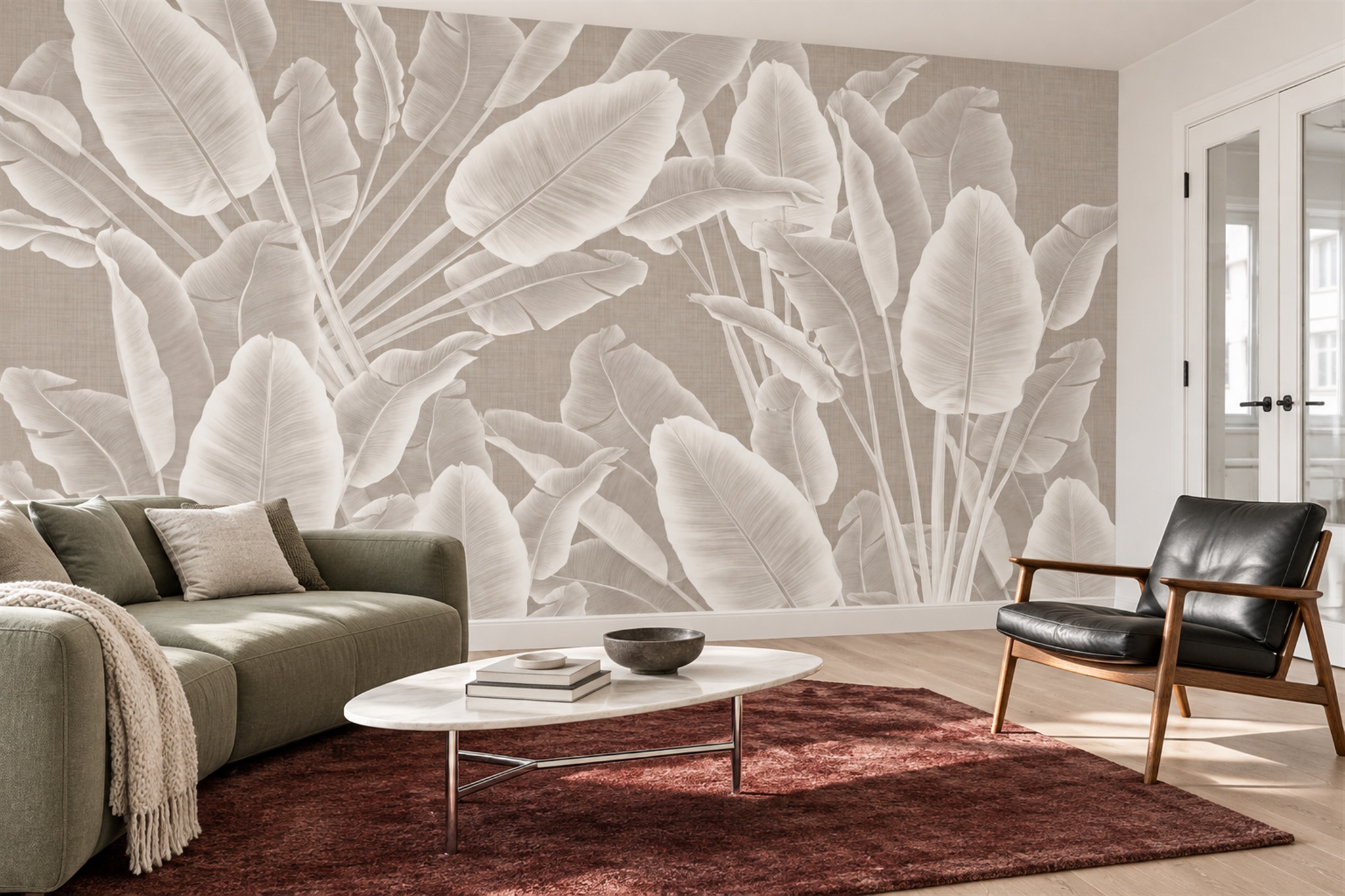
Scale matters particularly in minimal interiors. The large pale leaves in the second image are recognisable across a living room despite being close in colour to their taupe ground. Their outlines, not a bright hue, supply the drama. A much smaller leaf repeat would read as texture from the same distance. Decide whether you want a pattern visible at a glance or discovered close to the wall, and compare the crop with a separate sketch of the sofa height.
Relate the image to materials, not just paint
Timber, woven fibres, plaster and stone have their own visual texture. A mural printed to resemble heavy brushwork or veined stone may compete with a similarly active floor. You can either echo one texture in a quieter register or contrast it with a smoother image. For example, a grainy oak cabinet may sit well against a soft cloudscape because the wall does not add another sharp grain.
Remember that printed texture is usually an image effect, not necessarily a raised surface. A photograph of plaster or paint within the artwork does not prove the wallpaper has that physical texture. Check the material sample if tactile finish matters. Also consider sheen: side light from a window can change how a printed neutral appears. Avoid choosing a finish solely from a styled room photograph.
The botanical living room offers another lesson about materials. Its wall has a printed linen-like ground behind pale leaves, while the actual room also contains a woven rug, upholstery and a dark leather chair. Those textures are visually distinct because the mural uses large, smooth shapes. Do not infer a raised fabric finish from the printed ground; check the selected wallcovering's physical sample if surface feel matters to you.
Test a restrained palette in real light
Subtle differences between neutrals are easily misread on screens and under different lamps. Place a sample beside the floor, woodwork and upholstery in the intended room, then check it in daylight and after dark. A warm lamp may bring out yellow or pink undertones in a pale ground, while cooler daylight may make the same print appear greyer. The result depends on the actual light and finish, so note what you see rather than assuming a named colour will stay constant. If you plan to repaint, test the proposed paint beside the print rather than choosing from separate catalogues.
Look at the mural from the main doorway. Does it blend so completely that the room loses a focal point, or does it create a clear but measured destination for the eye? Then sit where you normally sit. Close up, is there enough detail to be interesting, and does any fine pattern become distracting? A neutral scheme benefits from that two-distance test.
Let the furniture decide which kind of detail is missing
Put the mountain, cloud and large-leaf candidates behind the same photograph of the furnished room. If the floor and rug already have strong linear grain, the mountain's horizontal bands may repeat too much structure; a cloud-like wash can provide relief. If the sofa and cabinets are plain broad shapes, the pale leaves may supply a clear subject without asking for saturated colour. Where the room already has a sculptural pendant, the mountain's quieter distant layers may support it better than another oversized focal shape.
Check the choice from the doorway and the principal seat. The mountain needs enough ridge separation to read as distance, the cloud needs visible tonal change rather than disappearing entirely, and the leaves should be recognisable above furniture. These are different tasks for a neutral mural, not three interchangeable ways of avoiding colour. Keep the room's actual rug, curtains and artworks in the mock-up; removing them solely to make a new wall fit hides the real decision.