Can Mural Wallpaper Suit an Open-Plan Room?
Use a mural to define a zone while keeping colour, scale and sightlines connected across the wider open-plan space.
Article focus: pricing and measurement
Budgeting this wall with confidence
Start with accurate wall measurements; the final custom mural price depends on area, material and any finishing options.

Example application: Living room · pricing and measurement
An open-plan room has no door to mark the end of one activity and the start of another. A mural can give a seating or dining group a visual address, but it will also be seen from the other side of the shared room. The black brushstroke photograph above shows a possible sitting-area anchor, not an entire open-plan layout. If a quiet dining zone were connected to that room, the same bold wall would have to work from the table too. The question is not simply whether a mural fits its own wall; it is whether its presence makes sense from every connected area.
Define a zone without pretending it is a separate room
Start by identifying what the furniture already does. A sofa and rug may establish the sitting area; a pendant and table may locate dining. Place the mural behind one of these groups rather than treating a random stretch of wall as a new zone. In the brushstroke room, the curved pale sofa, dark round table and rug form a complete sitting composition against the print. The art does not need to continue across the whole floor plan to make that area legible.
Look at the mural's boundary from both sides. If it ends at the kitchen cabinetry, a return wall or a recess, the transition has an architectural reason. If it stops halfway through a continuous wall, the edge may seem arbitrary unless a furniture group or change in ceiling height aligns with it. Before ordering, tape the proposed stopping line on the actual wall and view it from the far side of the room. When no convincing boundary exists, covering the full wall may be cleaner than adding a narrow, unexplained strip.
Test the longest view first
In an open-plan home, the mural may be visible from the entrance, kitchen island and sofa. The farthest view reveals visual weight: the broad black strokes in the feature image would remain bold even across a long room, while tiny detail could merge into a tonal field. Stand at the farthest everyday viewpoint and compare the proposed image with the furniture beneath it. Then sit nearest the wall. The dining chair next to a mural experiences its scale very differently from a person crossing the room.
The quiet organic composition below shows how a mural can provide a sitting area with its own identity without a hard visual border. Broad, warm shapes sit behind the sofa, while the simple furniture repeats their curves and neutral colours. In a shared room, that sort of relationship can make a feature wall feel connected to the adjacent zones rather than pasted onto a separate stage.

Carry colour across the room selectively
A mural's main colour need not appear everywhere. One or two connections can be enough: the dark coffee table and cushion in the brushstroke sitting room echo the black wall without repainting the adjoining space. In a green dining scene, chair upholstery or a plant can provide a lighter link. Let other surfaces stay quieter. Matching every cushion, cabinet and accessory to the print can make a shared room feel contrived rather than coherent.
The amount of contrast matters from a distance. A black-and-ivory abstract mural can create a dramatic anchor at one end of a long room, but it may overpower a pale dining area if there is no dark element elsewhere to balance it. Conversely, a muted print can disappear beside a highly patterned kitchen floor. Lay out samples of the flooring, cabinetry and upholstery together. The mural should participate in the room's existing hierarchy, not force every other element to change.
Use the wall behind dining furniture carefully
A dining mural is seen up close at the table and from further away in the living area. Keep important detail above a banquette back or at the visible ends of the wall. The green watercolour scene below marks the dining side beside white kitchen cabinets. Its low layered landscape remains visible around the table, while the broad pale upper field leaves room for the pendant and cabinetry. It divides activities by backdrop rather than by a new partition or flooring change.
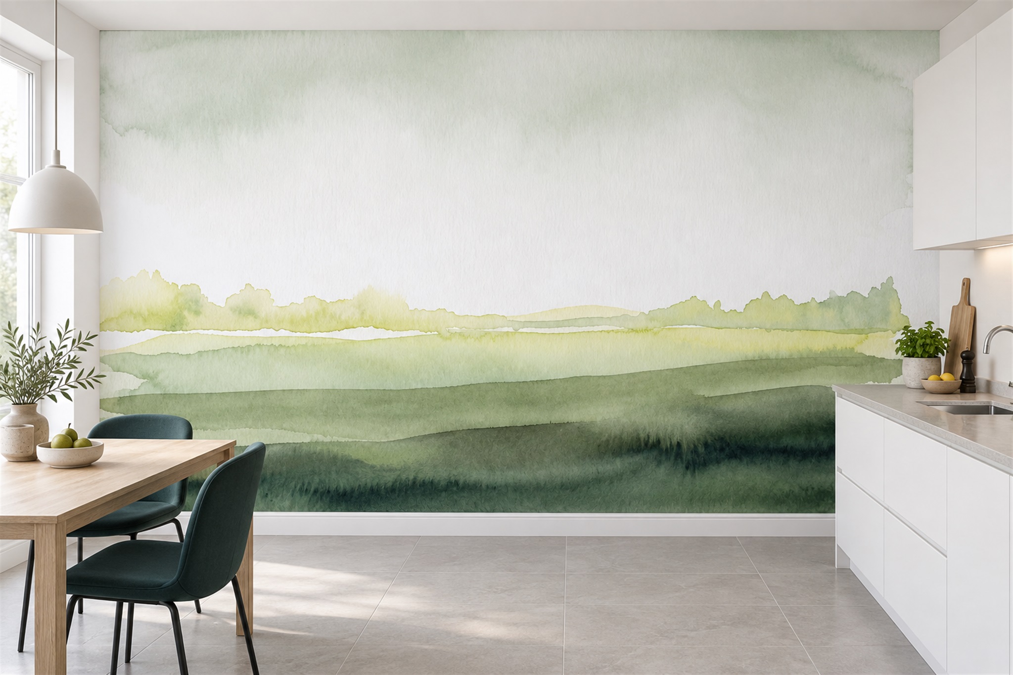
Do not assume that a low horizon will always be the right crop. If tall chairs or a sideboard hide most of it, the design may need to be raised or replaced with a composition distributed higher on the wall. Put the furniture heights on your own wall sketch and compare them with the crop preview. The goal is not to preserve every centimetre of artwork, but to preserve the parts that explain the scene.
How many mural walls should an open-plan room have?
One well-positioned wall is usually easier to manage than several competing scenes. If two mural walls face each other across the same open space, view them together from the centre and each entrance. The bold black brushstroke wall and a second equally forceful image could pull attention in opposite directions. They can coexist when one is clearly quieter, their colours relate and there is enough plain surface or furniture between them. Judging each design alone misses that interaction.
A continuous mural wrapping a corner can work when the artwork was prepared for that geometry and the corner is measured accurately. But do not assume an image printed for one flat wall will align gracefully after a turn. A horizon may appear to jump, or the central subject may disappear at the junction. If a wrap is essential, ask the supplier whether a two-wall layout proof can be prepared; the ordinary single-wall preview cannot confirm the turn.
Let lighting and circulation inform the choice
Open-plan rooms often have different light in each zone. A mural next to a large window may read much paler at midday than it does under dining pendants at night. Test a physical sample at both times. Also stand in the circulation path: a dark mural placed where everyone passes close to it has a different effect from the same artwork at the far end of a lounge. The best wall is not always the largest; it is the one that supports the room's movement and use.
Keep practical surfaces in mind. A dining chair may brush a wall, while a kitchen-adjacent wall may face splashes or cleaning demands. Check the specific wallpaper finish and the manufacturer's guidance for that location. Do not infer durability or washability from how a mock-up looks. A beautiful photograph cannot establish the performance of the material you will actually order.
Measure and preview the entire shared view
Use one marked-up floor plan and one wall elevation to make the final decision. On the plan, draw the sightline from the kitchen, dining chairs and sofa; on the elevation, mark the mural's proposed end, furniture heights and any cabinetry. If the image defines a seating zone from all three viewpoints and stops at a credible boundary, it is doing useful spatial work. If it looks complete only from the sofa but abruptly cut off from the kitchen, adjust the boundary or choose another wall. This test is about the shared room, not the isolated feature-wall photograph.