Can Mural Wallpaper Work in a Reading Space?
Choose a calm composition, comfortable contrast and furniture-aware crop for a reading nook or library wall.
Article focus: pricing and measurement
What to settle before pricing
Start with accurate wall measurements; the final custom mural price depends on area, material and any finishing options.
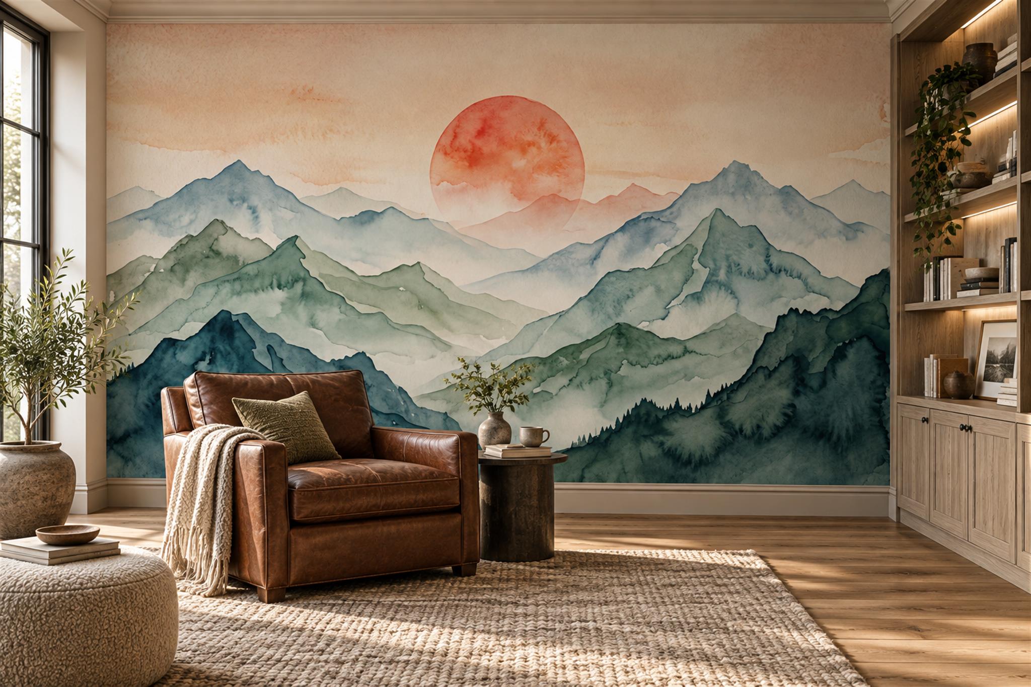
Example application: Living room · pricing and measurement
Yes, mural wallpaper can work in a reading space, but the best choice is not simply the calmest-looking picture. A reading chair may face a window, a bookcase or the wall itself. Daylight fades, a task lamp comes on, and the reader alternates between the page and the room. The mural should give that place an identity without putting its busiest details where the eye repeatedly lifts from the book.
Define the reading zone before choosing art
A reading nook can be a chair beside a window, an alcove between bookcases or a corner of a shared living room. Each has a different wall. Start with the chair position: where does the reader face, and what is visible over the top of the book? A dramatic image directly ahead may be enjoyable during a pause but distracting while concentrating. Behind the chair, it may provide atmosphere without entering the main sightline.
Consider the height of shelves. A mural with a narrow central subject may vanish behind bookcases, while a broad wash or landscape can remain legible around them. Mark fixed shelving on your wall sketch and compare it with the proposed crop. If books cover most of the wall, it may be better to mural the adjacent surface and let the shelves remain the functional focus.
Think about who uses the space. A child's reading corner can tolerate playful detail that invites questions and storytelling. An adult study area may call for a quieter scene, although there is no age-based rule. The chosen artwork should support the type of attention the space is for: exploration, concentration or both.
Use composition to create a destination
A landscape can make a compact alcove feel like a view beyond the room. The mountain image at the top of this article places a warm sun above layered blue-green ridges. A leather chair occupies one lower side while shelves frame the right; neither obscures the sun. That does not make the mural automatically suitable for every reader. If the chair faced the wall at close range, the bright circular sun might draw more attention than intended. Position matters as much as subject.
A botanical mural creates a different kind of enclosure. In the library image below, small fern forms spread across a dark olive field between shelves. There is no single central subject to lose behind a lamp or chair. The room is deliberately intimate, but its darker wall would need enough task lighting to make actual reading comfortable. A styled picture can suggest atmosphere; it cannot tell you whether the page is adequately lit.
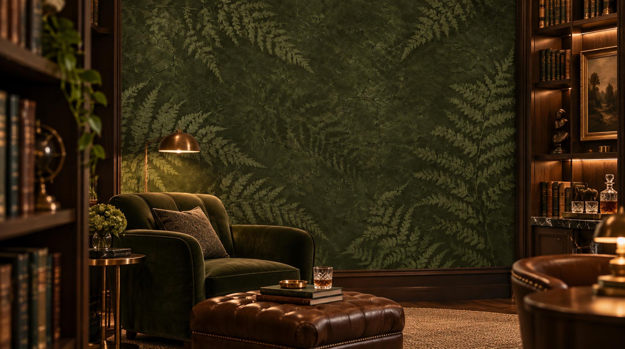
A close, all-over repeat can work too, but assess it from the seated distance. Tiny sharp marks may be more noticeable than they appear in a product thumbnail. A broad low-contrast field can sit comfortably in peripheral vision. Compare the full mural from the chair, not only from the doorway. The best image may have a clear focal area outside the reader's immediate visual field.
Plan light for reading and for the mural separately
Reading light should illuminate the page without throwing glare into the reader's eyes. That is a task-lighting decision; a decorative mural cannot replace it. Sit in the intended chair with a book and test the floor, wall or table lamp at that height. Notice whether the lamp itself masks the mural's subject and whether its beam lands on a bright horizon or illustrated face. Shift the lamp or the crop before committing to a composition that only works when the light is switched off.
Natural light can change the artwork's colours dramatically. A pale mural near a window may be luminous by day and almost invisible under a single warm lamp. A dark forest can feel intimate in the evening but heavy on a dim afternoon. Put a print sample on the intended wall and inspect it under both conditions. Use the digital preview for composition and the physical sample for colour and finish.
Do not assume a printed illusion of canvas, paint or stone has the corresponding physical surface. Material sheen can affect glare from lamps. Confirm the exact wallpaper finish and any installation conditions separately from the image choice. The room's usability should not depend on unverified product claims.
Choose the right amount of narrative
For children, a mural can be something to talk about before the book opens. The illustrated wall below includes a balloon, an airship, a fox in a small plane, animals and a train. Two low chairs leave many of those elements visible at a child's height. It is a lively choice for a shared reading corner, though it would be a poor match for someone who wants a visually quiet place for sustained concentration. Decide which kind of reading happens there before choosing the artwork.
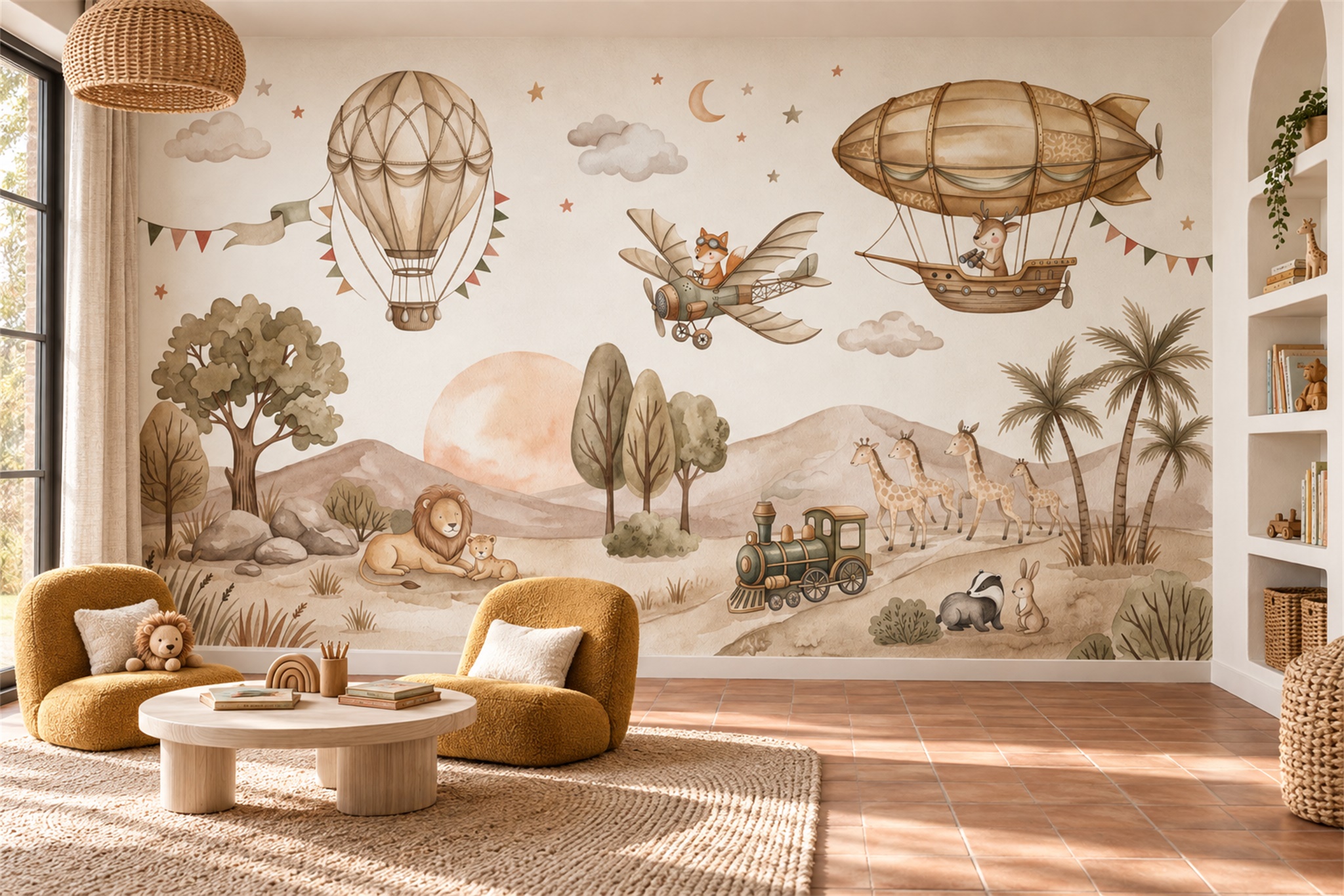
For a quieter adult reading room, narrative may come from atmosphere rather than many objects: a misty forest, a distant coastline or a soft botanical field. Still, some readers enjoy a strong visual story. The choice depends on whether the mural will be in direct sight during long periods of concentration or mostly seen on entering and pausing. Compare candidate mock-ups from the chair; a style label cannot answer that question.
A library already contains visual texture through book spines. A highly detailed mural behind open shelving may produce visual noise. Consider placing artwork on the wall opposite the shelves, or choosing a simplified image with space for books to remain the detailed element. If shelves and mural must share one wall, ensure the image does not rely on a small central subject hidden by furniture.
Make the final choice from the chair
Put a real book and the intended lamp in the seating position before settling on a crop. In the mountain nook shown here, the warm sun remains visible between the chair and shelving; from another chair angle it could sit directly in the reader's line of sight. The olive fern image distributes detail across the wall, so a shelf can interrupt it without hiding one essential subject. The children's illustrated journey invites a pause to find its animals and vehicles. These are three different reading behaviours, not interchangeable versions of a “calm” background.
Look up from the page several times under both daylight and the lamp you will actually use. If a bright focal point repeatedly pulls attention, shift the artwork or choose a different wall. If the bookcase hides most of a small central scene, favour a broader composition. If the page is hard to read, fix the task lighting before judging mural colour; the wall cannot compensate for poor illumination. Only then approve a made-to-measure crop around the chair, shelving and the portion of the artwork that will remain visible.