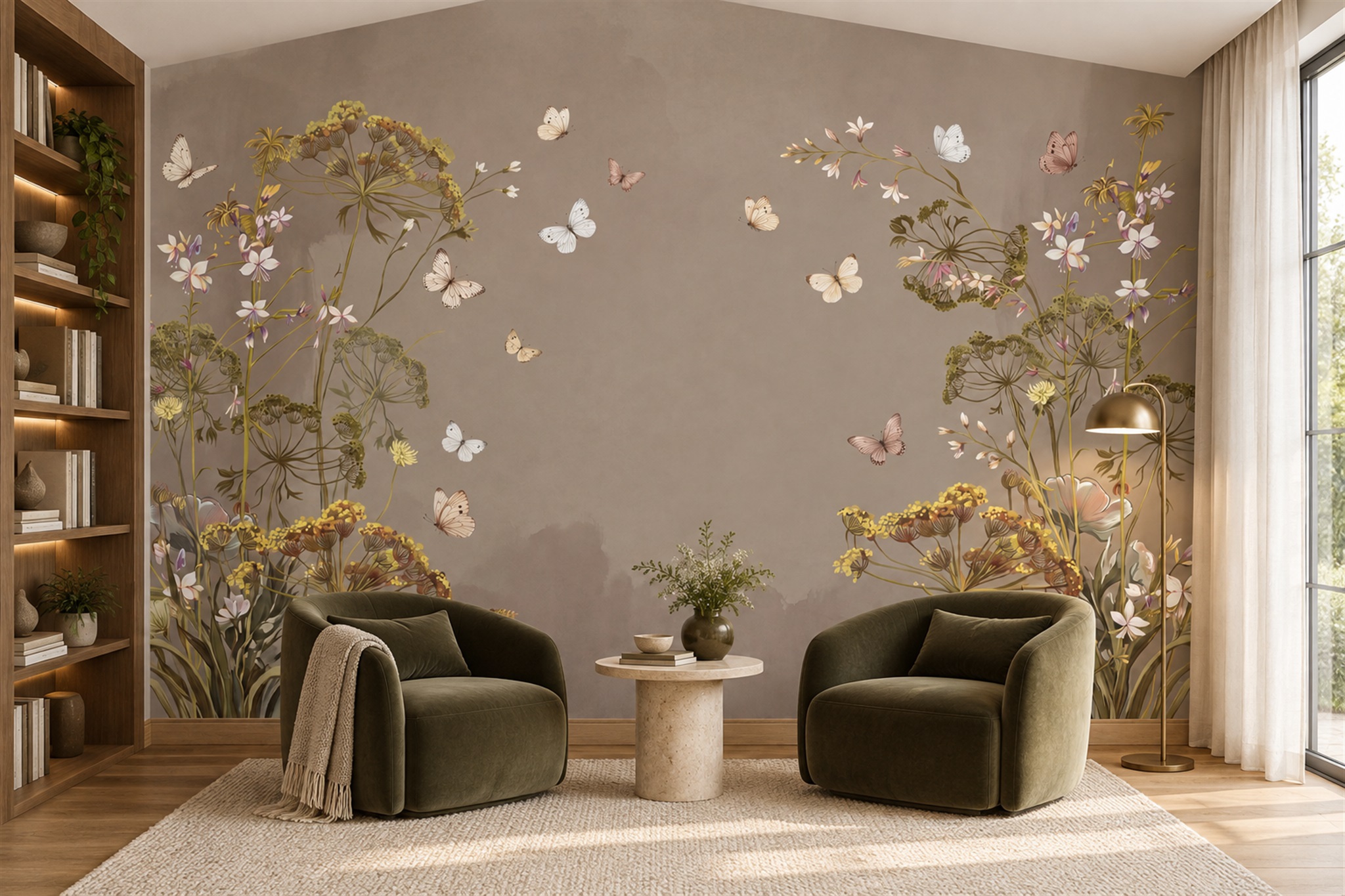
Which Mural Wallpaper Styles Suit Traditional Interiors?
Consider painterly landscapes, chinoiserie, toile, botanical and heritage-inspired murals for traditional interiors.
Article focus: pricing and measurement
What to settle before pricing
Start with accurate wall measurements; the final custom mural price depends on area, material and any finishing options.
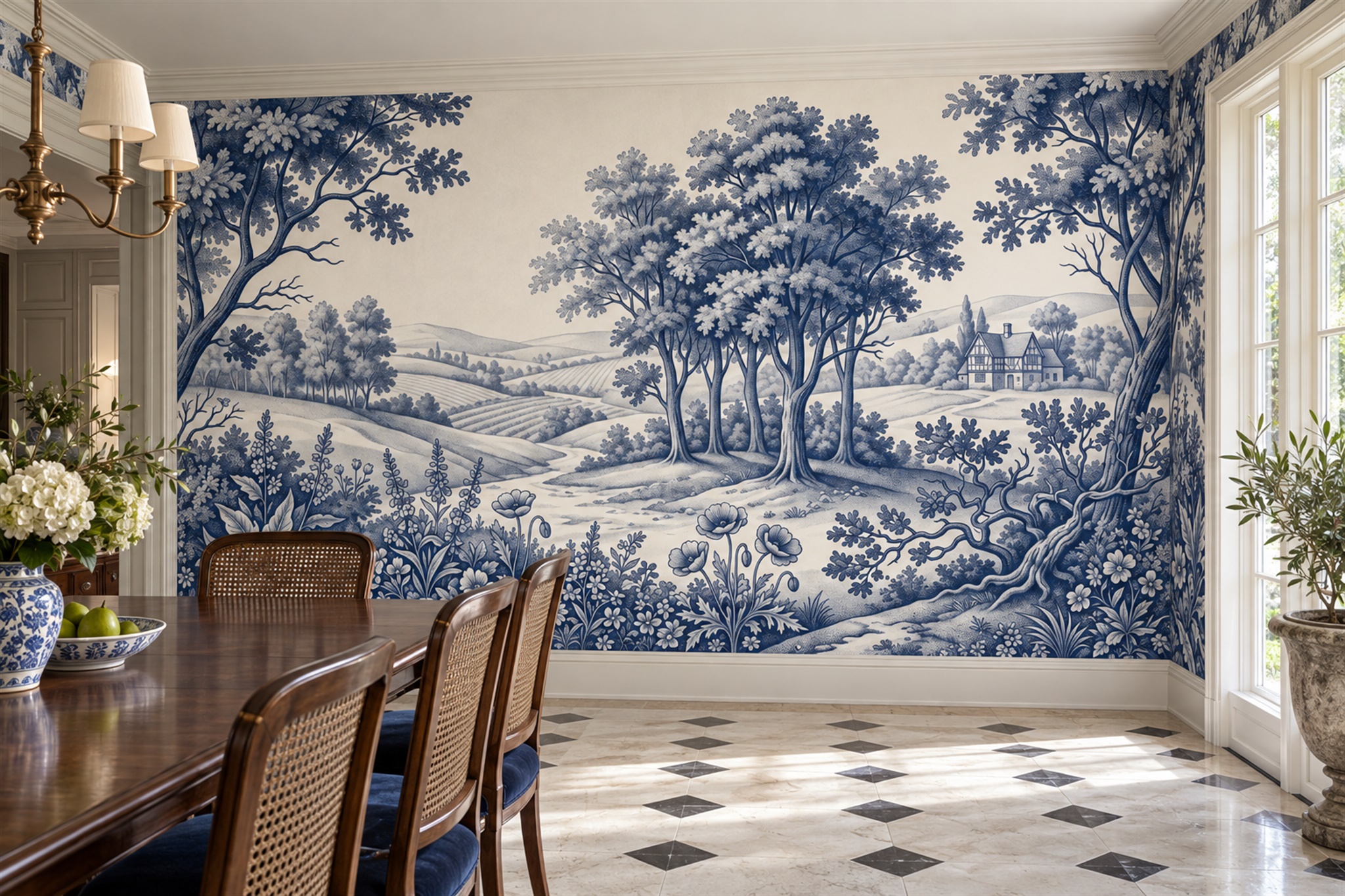
Example application: Dining room · pricing and measurement
In a traditional room, the mural has to converse with what is already there: cornices, panelling, timber furniture, woven chairs or patterned textiles. A blue-and-white pastoral drawing can behave like decorative wall art; a quieter garden scene can extend the view behind a desk; flowers can soften dark joinery. None of these is automatically “period correct”. The useful test is whether the image’s scale, colour and placement respect the room’s existing frame.
Let the architecture set the frame
Picture rails, cornices, wainscoting and fireplace surrounds create natural boundaries. A mural above panelling can read like a large decorative scene framed by the room itself. A full-height mural can also work, but the crop should respect the height of mouldings and the position of a mantel or mirror. Measure the actual surface after trim is installed, and compare its crop with a sketch showing that trim.
Older rooms are often not perfectly square. Measure widths and heights at several points. A crooked ceiling may require a little more printed margin for trimming. Keep a face, bird or architectural detail away from the cut zone. A panoramic scene that depends on a perfectly level horizon can reveal an uneven ceiling more strongly than a loose garden composition, so preview how the image meets the room.
Not every traditional room is grand or heavily ornamented. A cottage room with simple painted woodwork may suit a quiet meadow or botanical mural, while a formal dining room can carry more detailed chinoiserie or scenic work. The point is proportion and relationship, not applying a single “period” print everywhere.
The blue-and-white dining room in this article’s feature image makes the framing visible. Cornice, window trim and skirting contain the pastoral scene; the dark timber table and cane-backed chairs provide weight in front of it. The image has trees, rolling fields, a small building and a winding path, so it offers more than a repeated blue motif. Its central detail remains above the chair backs. That relationship would be lost if a tall sideboard were placed across the same part of the wall.
Compare heritage-inspired image types
Separate the look of a period from a claim about origin. A blue line-drawn pastoral scene may be toile-inspired without copying a documented historic textile; a softly painted garden is not an original fresco simply because it sits beside old panelling. If authenticity matters, ask for the artwork's provenance rather than inferring it from a catalogue tag. If the aim is a compatible interior, judge the drawing style and scale beside the actual cornice, timber and upholstery, where an invented historical label adds nothing.
A painterly landscape can offer depth behind antique furniture. Distant hills, trees or a garden path allow the eye to travel beyond the wall. Choose the crop so the focal point remains visible above a sideboard or sofa. A very dark or dense landscape may feel rich under warm lamps; a light scene may keep a smaller room airy. Neither effect is guaranteed by the style label alone.
Botanical murals can connect naturally with timber, linen and traditional upholstery. Large branches create a different effect from fine leaves scattered across a wall. If the furniture and curtains already contain florals, vary the scale or contrast so the patterns do not blur together. A loose botanical scene may be easier to place around a mirror or doorway than a symmetrical print whose centre must remain exact.
Toile and engraved-style designs often rely on fine lines and repeated or narrative scenes. At mural scale, check that the print retains detail and that a face or building is not cut awkwardly at an edge. Chinoiserie-inspired compositions may include branches, birds or architectural motifs arranged with deliberate open space. Use those labels only when the visible design actually supports them; not every floral wallpaper is chinoiserie.
Work with an existing palette
Traditional rooms often contain several warm materials: timber, brass, wool, leather or aged stone. A mural can share an undertone with one of these without copying its exact colour. Soft olive, parchment, dusty blue and warm cream are possibilities, not a prescribed heritage palette. Compare a physical print sample beside the actual furniture and paint. Digital screens can make muted colours appear cleaner or cooler than the printed material under warm interior light.
Decide whether the mural will be a quiet backdrop or the room’s main statement. A detailed rug, patterned upholstery and heavy curtains already create visual richness. A subtle scenic mural may support them better than another dense print. Conversely, a room with plain panelling and simple furniture can give a more elaborate mural space to breathe.
Trim colour is part of the composition. Pale painted moulding can frame a darker mural; deep woodwork can ground a light landscape. Test the border between the mural and trim, especially when the printed background nearly matches the paint but differs in undertone. A deliberate contrast may look more convincing than an imperfect near-match.
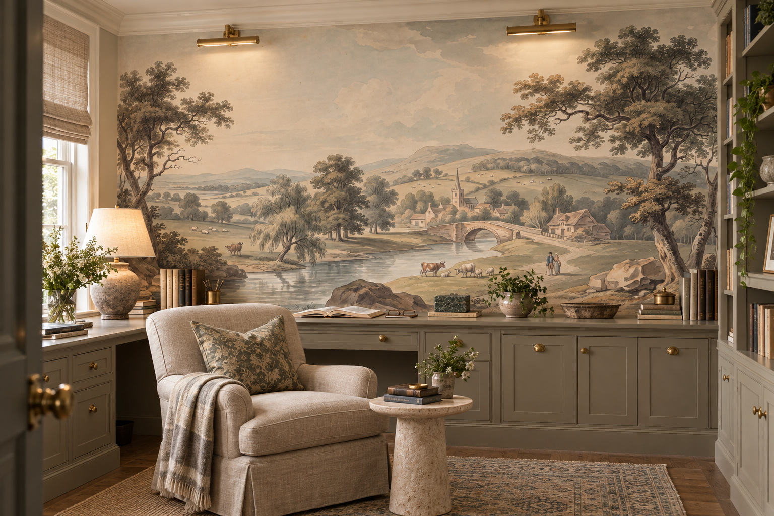
The pastoral study illustrates a different balance from the dining room: its river and distant hills are warm grey and parchment rather than strong blue. Trees frame the edges, and bookshelves occupy one side of the space. It is still detailed, but the quiet centre allows the desk to remain the working focus. If the same study had a patterned rug, heavily upholstered chair and ornate curtains, test whether that much imagery would be too much; a label such as “vintage” cannot make that judgement for you.
Avoid false age and forced symmetry
An “antique” effect can be attractive, but avoid choosing a distressed print solely because the room has old furniture. If the image imitates cracked plaster or faded fresco, make sure that texture looks intentional at wall scale rather than like damage. Check a print-size detail sample. A digital thumbnail can hide repetitive texture or blur.
Symmetrical artwork can be elegant over a mantel or bed, but an off-centre doorway or window may break it. Mark architectural openings on your wall elevation. A more flowing composition can be a better fit for an irregular wall than forcing a central medallion into a space that is not centred. The room’s proportions should lead the artwork, not the reverse.