What Mural Wallpaper Works with Mid-Century Furniture?
Consider organic shapes, controlled colour, scale and the clean lines of mid-century furniture when choosing artwork.
Article focus: installation and removal
What the installer needs to know
The right installation method depends on the chosen material and wall condition, so prepare the wall before ordering and follow the material-specific instructions.
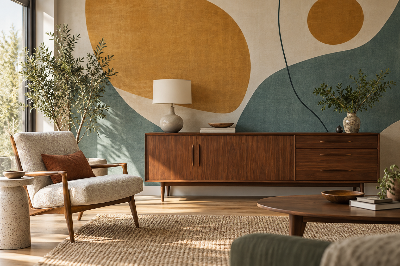
Example application: Living room · installation and removal
A mural beside mid-century furniture should respond to the furniture's shape, not merely repeat a decade's most familiar colours. A low walnut credenza, tapered legs or a sculptural lounge chair already has a strong silhouette. An abstract field of broad curves can complement those forms, while a restrained geometric composition can sharpen a softer room. The useful question is what the wall should do behind the objects people actually see and use.
Look at the furniture before selecting the art
Mid-century furniture is not a single palette or one fixed look. A light timber dining set, a dark walnut sideboard and a vividly upholstered chair can each suggest different wall art. Begin by noting the dominant timber tone, the outline of the largest piece and the amount of empty wall visible around it. A mural partly covered by a wide credenza needs a different focal point from one behind a compact reading chair.
Low furniture often leaves a large uninterrupted field above it. That is an opportunity for one generous shape or a carefully placed cluster rather than a tiny busy repeat. The wall can also remain relatively quiet if the furniture includes a patterned textile or an iconic sculptural profile. Respecting the silhouette is not about hiding the mural; it means arranging the artwork so both elements can be read.
Draw a rough elevation before browsing. Mark the top and width of the sideboard, the lamp, any pictures and the door swing. The visible wall above a credenza may be much larger than the strip beside it. A large motif can occupy that upper field, while a mural with many small marks may merge with the grain, books and objects below. If the furniture is an heirloom, leave enough quiet area around its outline so its proportions remain the first thing you notice.
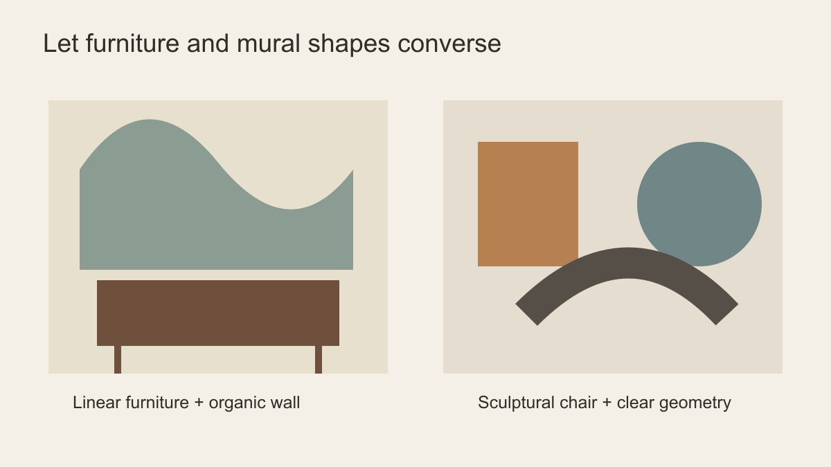 Let the furniture's outline influence the mural's geometry.
Organic or geometric: which is better?
Neither is automatically more authentic. Mid-century design includes both organic curves and structured geometry. A room full of straight cabinet edges, slim legs and rectangular shelving may benefit from an abstract mural with rounded forms. A curved chair or rounded sofa may instead look clearer against a composition of spacious rectangles, arcs or diagonal lines. The contrast gives each form a role.
Watch the density. A tight grid behind open shelving can create a distracting collision of lines. Large circles immediately behind a round mirror may feel repetitive unless their scale is clearly different. A broad asymmetrical form beside a credenza can create movement while allowing the timber grain to remain visible. View a mock-up from the doorway and from the usual seat; a pattern that works close up may fragment from across the room.
Botanical and landscape subjects are also possible. A simple leaf silhouette or abstracted hillside can soften a room of angular furniture without turning it into a retro stage set. The deciding factor is the relationship between the artwork and furnishings, not whether a subject appears in a list of mid-century motifs.
Try an opposite-shape test. Put an image of the furniture in front of two candidates: one echoing its main outline, the other contrasting it. If a curved chair and a mural of similarly sized circles produce a tangle of arcs, a mural with broad vertical planes may give the chair definition. If a rectangular sideboard looks rigid against a grid of rectangles, a single large curve can release that stiffness. The winning design is the one that makes the actual furniture easier to read.
Build colour around wood and upholstery
Walnut often works with warm ivory, muted teal, rust, olive and ochre, but that does not mean every one of those colours belongs in a single mural. Choose one or two to connect to the furniture, then give them space. A strong orange chair, for example, may need a wall with small ochre accents rather than an entirely orange field. Against pale ash or teak, an overly dark mural can reduce the lightness that makes the furniture appealing.
Consider the finishes already in the room: brass, black metal, leather, wool or a woven rug. A mural can bridge two materials by using a warm ground and one cooler accent. If the room already has a bright textile, a mostly neutral abstract composition may be more useful than another bright print. If the furniture is understated and the architecture plain, the mural can carry stronger colour. Samples matter because screen colour does not reliably predict how a large printed surface reads next to real wood.
Light also changes timber. A walnut cabinet may look reddish under warm lamps and cooler by a window. Hold a printed sample upright behind it at the times the room is used. Compare the mural's lightest ground with the paint and its strongest accent with the upholstery. A deliberate difference often looks better than a near-match that misses by a shade. Do not try to include every familiar mid-century colour in one composition; one well-placed accent can be enough.
Give the focal point clear sightlines
Map the furniture silhouette and the principal view before deciding where a mural's strongest form belongs. A long sideboard leaves a broad upper field but hides the lower centre; a lounge chair occupies a smaller, taller island of wall; a dining group creates moving interruptions as chairs are pulled out. The same image cannot be cropped as though those pieces have identical footprints. Mark the real heights and widths on a wall elevation rather than judging an empty product-room photograph.
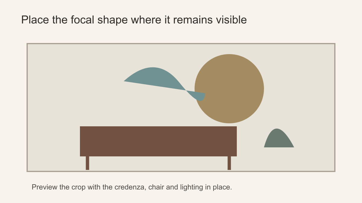 This sketch keeps the main shapes visible above the credenza; add your own chairs and lighting to the crop preview.
With a sideboard, test whether the mural's shape remains complete above the cabinet and whether a table lamp cuts through its edge. With a chair, leave enough contrasting ground around the back and arms that the chair's profile can be read. With a dining set, look from the usual seated position as well as the doorway: a motif placed neatly above empty chair backs may be broken by heads and a pendant during use. These are different crop failures, not one generic instruction to move the artwork higher.
Scale changes the wall's role too. A close repeat of arches can read as a decorative field behind a table; one arch enlarged across the whole wall becomes the dominant architectural gesture. Compare candidates at the ordered dimensions, not only as thumbnails. If shifting the crop saves one shape but cuts another at the wall edge, review the entire approved print rectangle before deciding. A slightly quieter composition may preserve the furniture's character better than endlessly adjusting an incompatible image.
Pairings that tend to work
A walnut cabinet with a pronounced horizontal grain can sit against a broad, muted curve whose ground leaves the cabinet outline clear. A grid of equally narrow lines behind it would repeat the furniture's rhythm until both lose definition. A teak dining set with many slim legs may work with a softly layered hillside or a few generous botanical forms rather than another tight grid. The subjects differ, but each provides contrast to the piece's existing geometry.
A single vividly upholstered lounge chair asks for a different response. If the chair is the collected object you want to notice, let the mural carry only a small echo of its colour and keep strong shapes clear of its profile. If the chair is modest and the room otherwise plain, a larger abstract form can take the lead. A sculptural pendant may be a third focal object; include it in the room photograph before declaring that the wall has space for a central sunburst or circle.
None of these pairings requires a reproduction of a historical wallpaper. Vitra Design Museum's Verner Panton exhibition illustrates one especially colourful and spatially adventurous strand of twentieth-century design, not a rule that every room with mid-century furniture needs saturated geometry. Let the actual furniture, its condition and its placement determine whether the wall should be energetic or restrained.
Make the choice durable beyond a trend
Compare two candidate crops in the same furnished room photograph. Check whether the main furniture silhouette remains legible, whether the mural's strongest shape survives real lamps and door swings, and whether its colour connects to rather than copies the upholstery. Repeat the comparison under the room's usual daytime and evening lighting. A choice grounded in those fixed relationships will outlast a mural selected only because it resembles a familiar retro graphic.
Further reading
- Vitra Design Museum: Verner Panton — Form, Colour, Space documents one vivid strand of mid-century colour and form, rather than a single rule for every room.