Can You Use Mural Wallpaper with Patterned Furniture?
Learn how to balance visual scale, repeated colours and negative space when a mural shares a room with patterned upholstery.
Article focus: pricing and measurement
Budgeting this wall with confidence
Start with accurate wall measurements; the final custom mural price depends on area, material and any finishing options.
Example application: Any room with a suitable, prepared wall · pricing and measurement
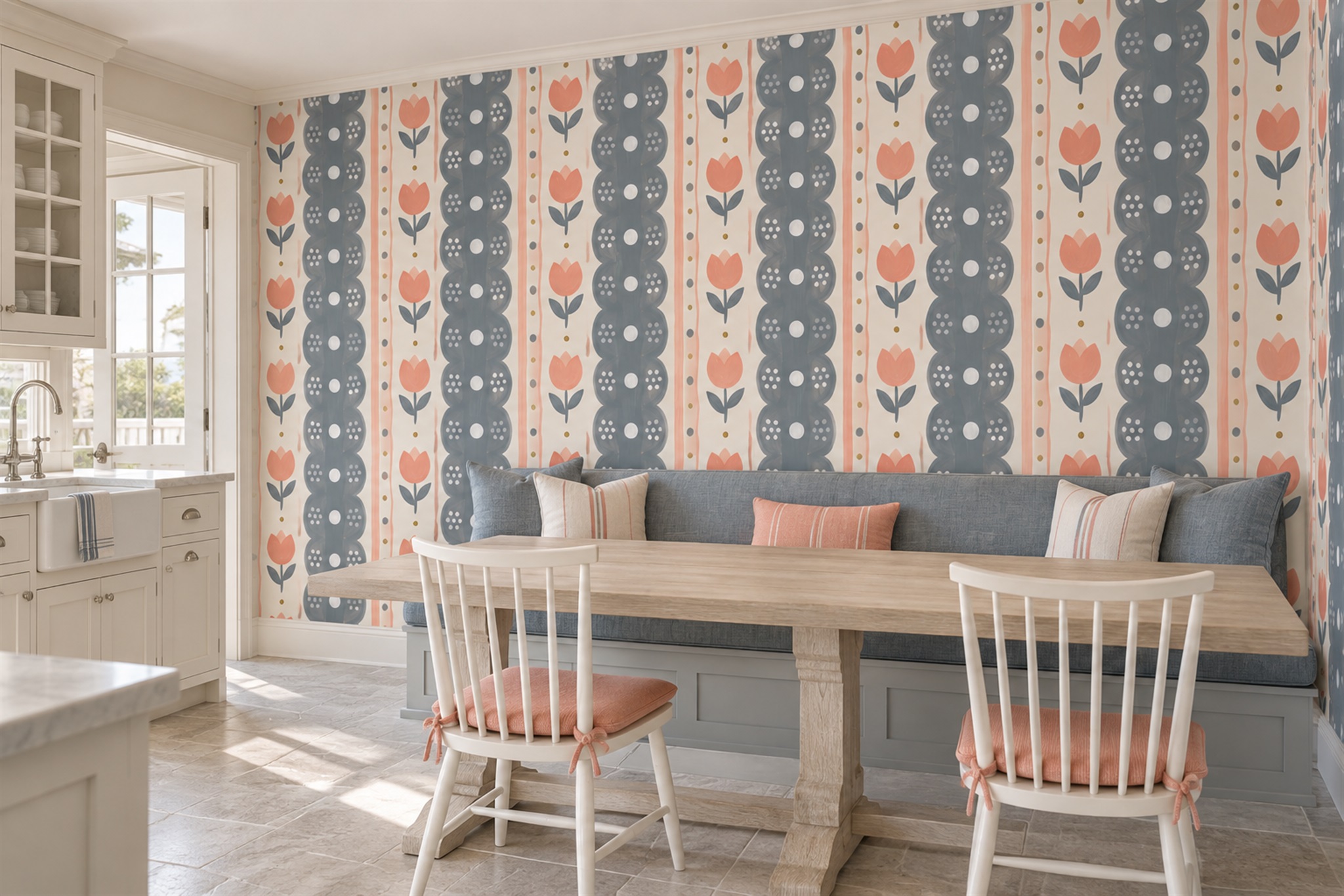
Can a mural share a room with a striped chair, floral sofa or checked bench? Yes, but the size of each pattern matters more than a rule about how many prints are allowed. In the dining nook shown here, small striped cushions sit below a much larger blue-grey and coral wall pattern. Their limited area and shared colours make them a secondary note. If the entire banquette carried the same stripes, the balance would be different. Judge the amount of pattern actually visible from the doorway.
Find the dominant pattern first
A narrow stripe, a broad floral and a tightly repeated check make different demands on a room. Sit back and look at the furniture as a whole. Does the pattern read as a clear motif, a field of colour or a fine texture? If it is a bold focal point, the mural need not compete for equal attention. If it reads as a small, low-contrast texture, the wall has more room to carry a distinctive scene.
Take a photograph from the main doorway. Close-ups can exaggerate the detail in a fabric; the room view shows how much of the pattern is actually visible. A patterned armchair in one corner may be a small accent, while a long floral sofa dominates the wall below a mural. Use the room view to decide which element should lead.
Include the rug and curtains in the assessment. They may be the third and fourth patterns in the scheme. The issue is rarely “two patterns are too many”; it is whether every surface asks for attention at the same scale and contrast. One visually quiet plain wall or large solid-colour textile can provide relief.
The feature photograph makes that hierarchy concrete. The wallpaper repeats broad vertical bands with coral flowers and dark circular shapes. The upholstered banquette is mostly a plain blue-grey, while two small striped cushions borrow blue-grey and coral. The room therefore contains more than one pattern, but not two wall-sized patterns competing for the same sightline. If your existing sofa is already strongly patterned across its whole length, use this image as a contrast exercise, not a ready-made recipe.
Mix scales deliberately
A large scenic mural often works beside a small-scale upholstery pattern because the eye can separate foreground furniture from the broad wall composition. The reverse can also work: large floral upholstery against a soft, fine mural texture. Two similarly sized motifs with equally strong outlines are harder to reconcile. They can create an accidental rhythm where neither element has room to be understood.
Do not judge scale from website thumbnails. Use the measured-wall crop preview and ask for an approximate motif dimension if it is not clear. Compare it with a separate photograph or sketch of the sofa at roughly the correct proportion. A tiny pattern seen in a thumbnail may become a metre-wide motif when printed, while a repeated fabric can look surprisingly quiet from the doorway.
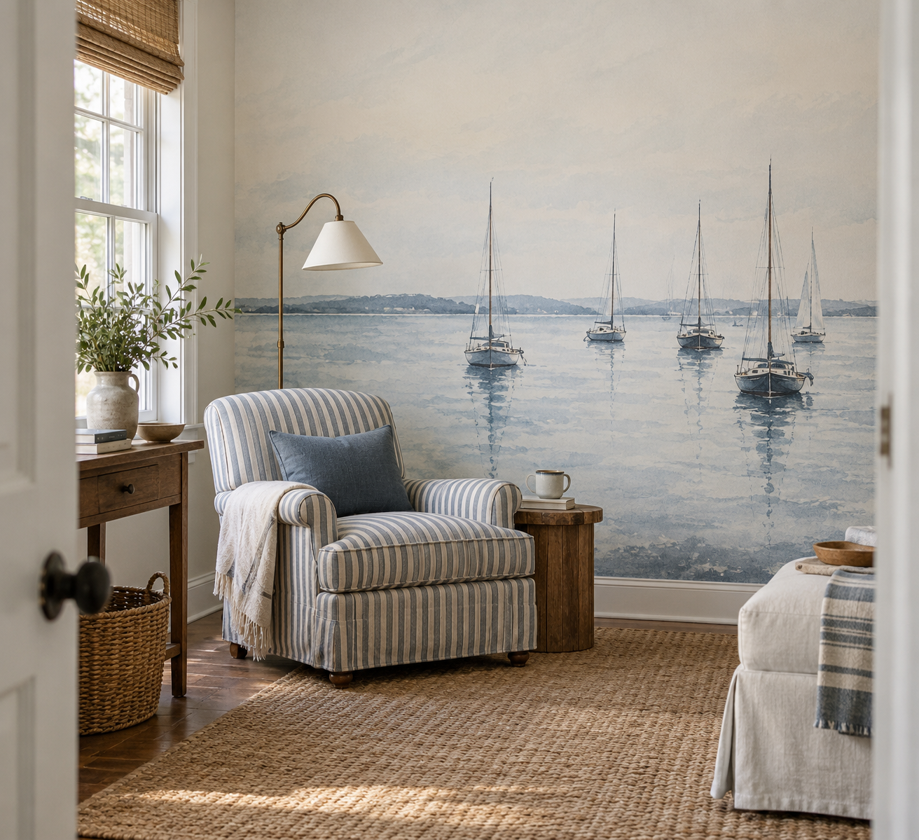
The illustrative pairing below makes that comparison visible. Slender sailboat masts rise above a blue-and-cream striped chair, but the broad pale sky gives the two vertical rhythms some separation. At the doorway, the chair reads as one compact foreground pattern rather than a second wall of stripes. A larger striped sofa or a mural crop with boats packed behind the seat would change the balance. Use the example to test your furniture's actual patterned area against a wall-size crop; it is not a photograph of a specific product order.
Use colour as a link, not a command to match
Pick one or two hues already in the upholstery and look for a mural that uses them in a different proportion. If a blue patterned sofa contains cream and a touch of warm ochre, a mural with a blue field and small ochre marks can relate without looking identical. Matching every colour exactly is often too rigid, particularly because print, woven fabric and painted surfaces reflect light differently.
Undertones still matter. A blue that appears greenish in the sofa may sit awkwardly beside a violet-blue mural, even when both are called “blue”. Compare a physical mural sample directly with the fabric in the room. Daylight and warm lamps can change that relationship. If the dominant hue does not quite match, a repeated neutral or accent colour may bridge them.
Allow a difference in value. Dark upholstery against a lighter mural is easy to read, as is a pale chair before a deeper wall. Two mid-tone patterns of similar contrast may blur into one busy mass. This is especially noticeable when furniture sits directly against the mural. Test the combination at normal viewing distance, not just with two small samples side by side.
Make room for a focal point
Decide what you want someone to notice first on entering. A beloved vintage sofa may deserve to lead, with the mural acting as atmosphere. A panoramic artwork may be the room's anchor, while the patterned chair becomes a smaller accent. Neither choice is inherently better; the difficulty comes when both demand the same position in the visual hierarchy.
Furniture placement can adjust that hierarchy. Moving a chair away from the mural wall gives each pattern its own space. A plain throw across part of a patterned sofa can reduce its visible repeat without replacing the upholstery. A solid cushion or rug can link mural and furniture while quietening the transition. These are inexpensive tests to make before committing to a wall-size print.
Beware of a focal motif disappearing behind the furniture. In the sailboat artwork, many boats cluster near the horizon. A tall, patterned headboard placed across that band could hide much of the subject and leave mostly blue sky. A low sofa might preserve more of the fleet, depending on wall height and crop. Use the actual furniture outline on a separate wall sketch rather than assuming the uncropped image represents the finished wall.
Different pairings need different solutions
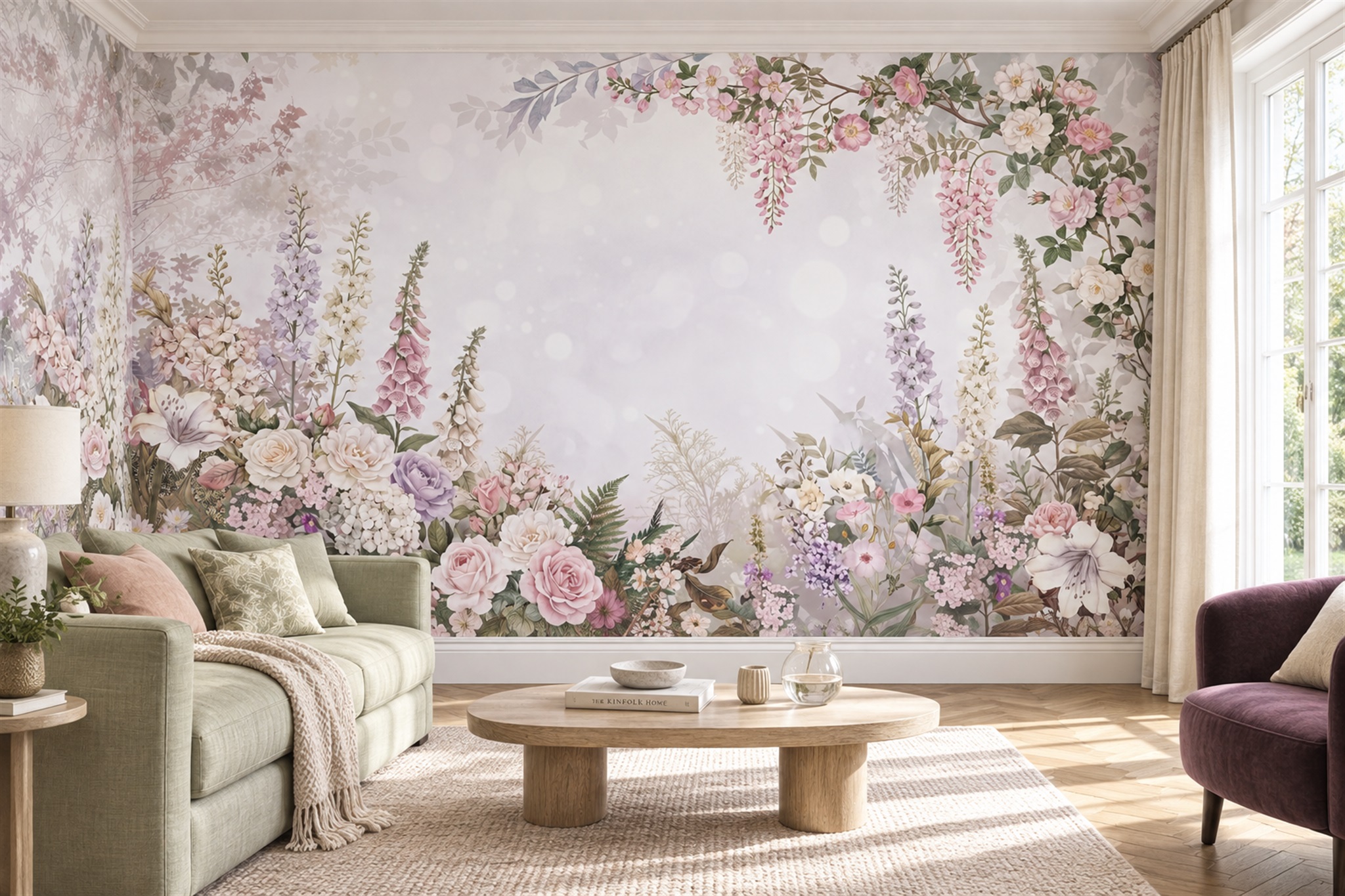
With a floral sofa, avoid assuming the wall must also show flowers. A quiet landscape can offer depth while sharing one leaf or petal colour. If you prefer botanical-on-botanical, change the scale or drawing style: a fine upholstery sprig can sit beside broad painterly branches. The pictured blush garden is a useful boundary case: its flowers are extensive, but the sofa itself is plain and only one cushion has a small botanical pattern. Covering the whole sofa in another dense floral would change the hierarchy completely.
With striped furniture, a mural with broad horizontal layers can either create a useful counter-direction or feel like a second set of bars. Check the exact furniture orientation and room architecture. A loose landscape often softens strict stripes more easily than another tightly linear image. With a geometric armchair, a botanical or abstract wash can similarly provide movement.
Patterned furniture can also be an asset to a mural that would otherwise seem isolated. A small repeated shape in the upholstery can echo a colour or line within the artwork. The connection should be noticeable on second look, not necessarily identical. Deliberate relationships tend to age better than trying to buy a perfect matching set.
If the furniture cannot be replaced, reverse the usual design process. Photograph the sofa or chair first, including a close view of its fabric and a room-distance view. Then shortlist murals that share one hue but differ in scale. A small blue check might sit against a broad coastal scene; a large floral sofa may need a more open abstract. Reject a candidate if its most detailed area falls directly behind the busiest part of the upholstery and both remain equally strong from the doorway.