What Paint Colour Should You Use with Mural Wallpaper?
Choose a supporting wall colour by comparing undertones, contrast, trim, ceiling and the quieter tones in the artwork.
Article focus: installation and removal
The installation choice in practice
The right installation method depends on the chosen material and wall condition, so prepare the wall before ordering and follow the material-specific instructions.
Example application: Any room with a suitable, prepared wall · installation and removal
There is no single paint colour that suits every mural wallpaper. The most reliable choice depends on what you want the surrounding walls to do: disappear behind the artwork, carry one of its main colours through the room, or provide a deliberate frame. Begin with the mural's broad ground, dominant image and smallest accent. Then test large paint samples at the real junction in daylight and lamplight, with flooring and trim still in view.
Read the mural in three colour layers
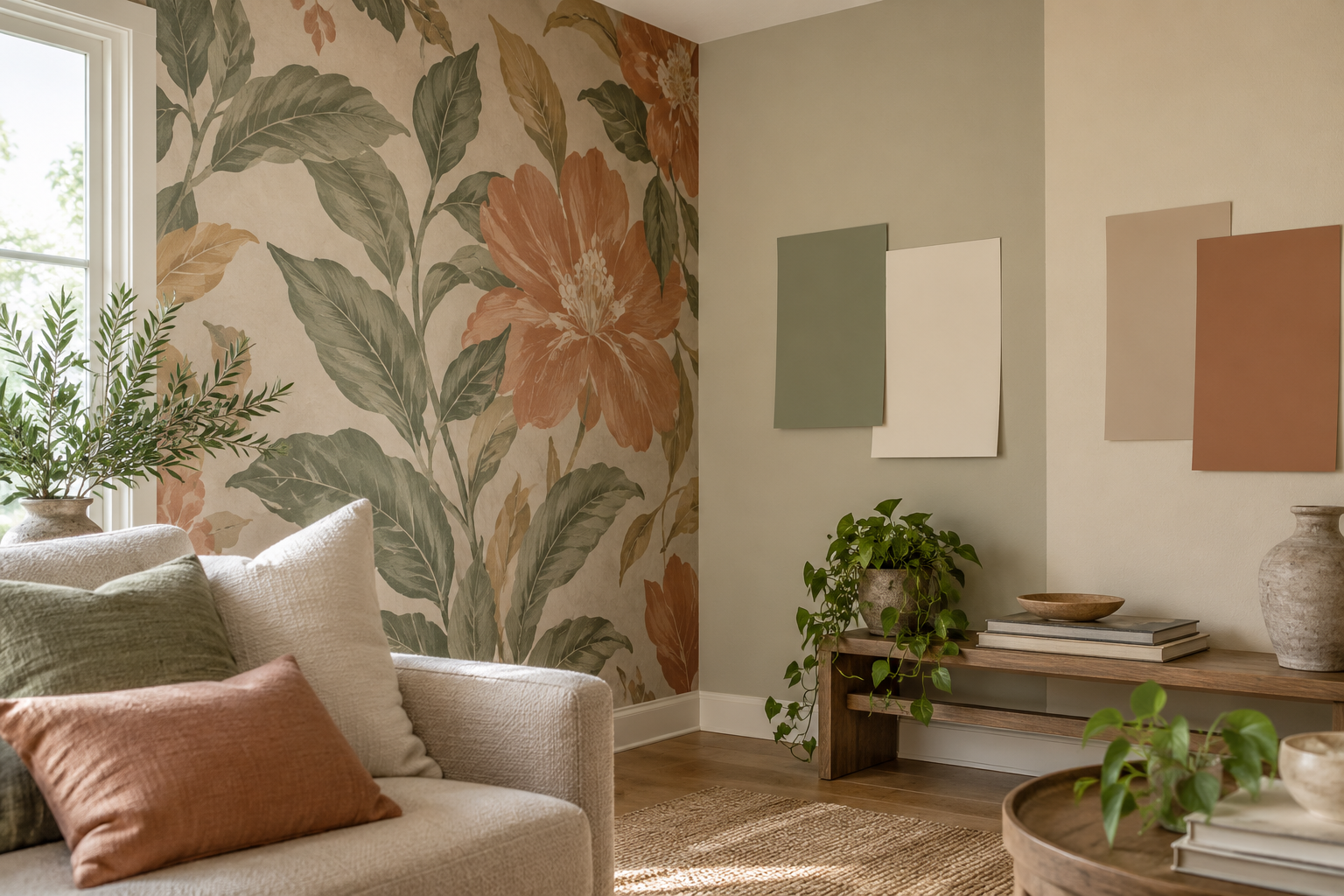
Look past the most eye-catching flower or shape. What colour occupies the largest uninterrupted area? What colour makes up the main subject? Which hue appears only briefly? Those three answers produce different paint directions. The mural in the feature room has a warm cream ground, muted olive leaves and terracotta blossoms. Cream on the adjacent wall allows the flowers and foliage to remain the main event. Olive makes the whole corner feel greener. Terracotta turns a limited floral accent into a much stronger room colour.
None of these choices is automatically wrong, but they are not equivalent. A small colour in a print can become dominant when spread across three walls. If you want the mural to lead, start with a related ground colour rather than a vivid accent. If you want a more enveloping scheme, extending a leaf colour into surrounding paint may be intentional. Name the effect you want before searching for a particular paint code.
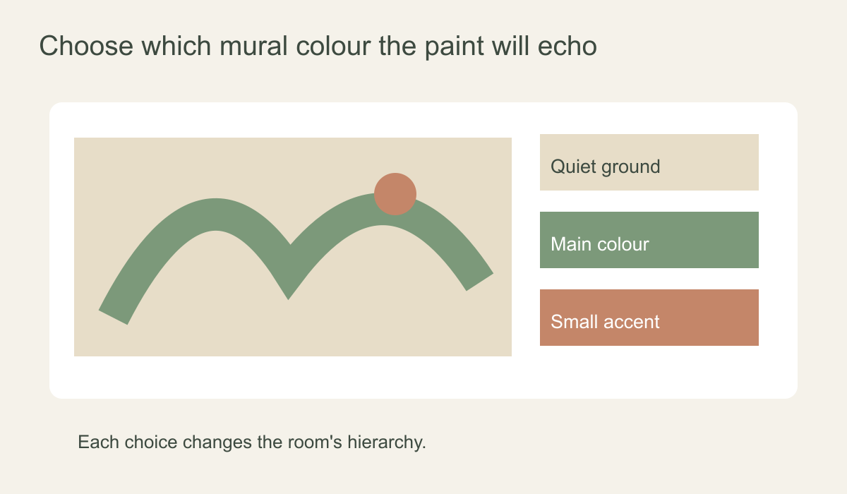 The ground, principal motif and small accent each give paint a different role.
The ground is not always the best choice. A pale landscape may lose its edge beside a paint that is almost, but not quite, the same pale grey. A slightly deeper tone can define the mural without making the rest of the room loud. Conversely, a dark architectural print may benefit from a light adjacent wall that offers relief. Think in large areas rather than extracting colours with a digital eyedropper.
Set the lightness before refining the hue
When several colours seem plausible, compare their lightness first. A pale wall generally gives darker printed forms more contrast. A middle-value wall can connect to the mural's shadows. A deep wall may create an intimate envelope in which the mural feels embedded rather than framed. Stand back until the small printed details merge; the broad relationship between light and dark is what you will notice first on entering the room.
Test one pale, one middle and one deeper candidate in the same colour family. Place boards where the painted area will actually be, not clustered on a table. If a deep olive board works beside a small part of the mural but would cover three whole walls, imagine that greater area before deciding. A colour's visual weight changes dramatically with the amount of surface it occupies.
Only after the value feels right should you compare close variations in hue. Two creams may have similar lightness but different undertones; one may look yellow beside the print while the other leans pink. A paint that looks perfect beside a terracotta petal may clash with the timber floor. Keep the fixed surfaces in view so a small improvement at the mural edge does not create a larger disagreement elsewhere.
Choose a relationship, not an exact match
A quiet echo uses a paint related to the mural's background. This is useful when the print is detailed and the room needs visual breathing space. A gentle contrast can set off the printed scene without repeating any of its colours exactly: a warm stone wall beside a cool blue landscape, for example, may define the boundary while still feeling calm. A stronger continuation carries one hue into adjoining walls, alcoves or joinery so the mural becomes part of a larger scheme.
For the botanical example, the warm cream wall in the photograph is a quiet echo. The olive sample shown nearby would make the corner feel more immersed in foliage; the terracotta option would let the blossoms set the mood of the whole room. If you already have a cream sofa and warm timber, the quiet choice may feel coherent with little additional styling. In a room with dark furniture, a deeper paint might provide a better balance. The mural alone cannot answer the question.
Do not assume more matching makes a design more polished. A printed leaf, a painted wall and several cushions in precisely the same green can feel rigid. Small variations in tone and material often create a more natural connection. Let the mural retain its printed colour complexity while the paint performs one clear supporting role.
Test paint and print at the actual corner
Put a physical mural sample vertically on the intended wall. Paint large movable boards with the shortlisted colours and hold each one on the neighbouring surface. Move the boards around the corner because daylight can strike the two planes differently. Benjamin Moore's paint-sampling guidance recommends looking at larger samples throughout the day and under both natural and artificial light. A phone photograph is useful for remembering a layout but should not decide the final shade; screens and camera exposure alter colour.
View the samples at the junction, then from the doorway. A colour may look harmonious on an isolated board but create an unwanted cast where it meets the print. Check morning light, the brightest part of the day and the lamps used in the evening. Warm lamplight may strengthen the peach in a mural, while cooler daylight may reveal yellow in a cream paint that looked neutral at night. Keep the boards in place long enough to see both conditions.
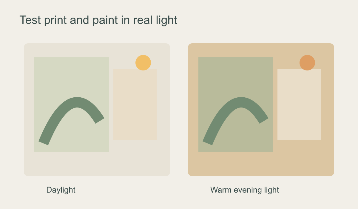 Test the physical print and painted board together as the room's light changes.
Consider sheen as well as colour. The sample board should use the intended finish where possible, because a different sheen can alter how the paint appears near windows and lamps. Consult the paint maker's instructions for the final product; a small colour-sample pot may not represent its long-term finish or durability. The purpose here is a trustworthy visual comparison, not a claim about paint performance.
Include trim, ceiling and the next room in the view
White skirting, a doorway and the ceiling form additional borders around a mural. Brilliant white trim against a warm ivory print can look unexpectedly sharp. A softer off-white can make the transition gentler; a deliberate crisp border can be useful around a dark or highly graphic design. Test the trim sample alongside the wall colour and mural rather than treating it as an automatic default.
Stand in the adjoining room or hall and look through the opening. The painted wall may occupy more of that view than the mural does. A saturated colour across the doorway can become the first thing you see, even if it seemed secondary when you stood beside the print. In an open-plan room, compare how the candidate colour joins the next zone and whether it clarifies or fractures the space.
Flooring and larger furniture matter more than a handful of cushions. A warm taupe may connect a blue mural to timber flooring, while a cooler grey may pull the wall away from everything else. If the paint only works after you imagine replacing the rug, sofa and curtains, test another candidate first. The surrounding room should support the decision you make at the corner.
What if the walls are already painted?
Treat existing paint as a real material, not as the colour name remembered from an old tin. Hold mural samples against the current wall in several places, particularly at the intended join. Wear, touch-ups and different daylight across the room can make that finish appear uneven. If the mural's ground works with the existing wall, you may not need to repaint at all. If the junction brings out an unwanted pink or yellow cast, compare another mural colourway before taking on a whole-room paint job.
If repainting is worthwhile, reduce the choice to two large boards: one related to the mural's broad ground and one deliberate alternative. Check each at the corner, from the doorway and against trim in both daylight and evening light. Record the chosen product, colour and finish after the physical comparison so the final paint is not selected from a screen approximation. For the separate question of where the two finishes should stop and how to sequence the decorating work, see the mural-and-paint guide.
The right paint colour is the one that makes the mural's intended role clear in the actual room. It may echo the ground, deepen a main tone or frame the artwork by contrast. Testing those roles at full scale is more useful than chasing a supposedly perfect numerical match to one printed leaf.