How Pastel Mural Wallpapers Work in Interior Schemes
Consider softness, contrast, undertones and surrounding materials when using pale colour without losing visual definition.
Article focus: installation and removal
What the installer needs to know
The right installation method depends on the chosen material and wall condition, so prepare the wall before ordering and follow the material-specific instructions.
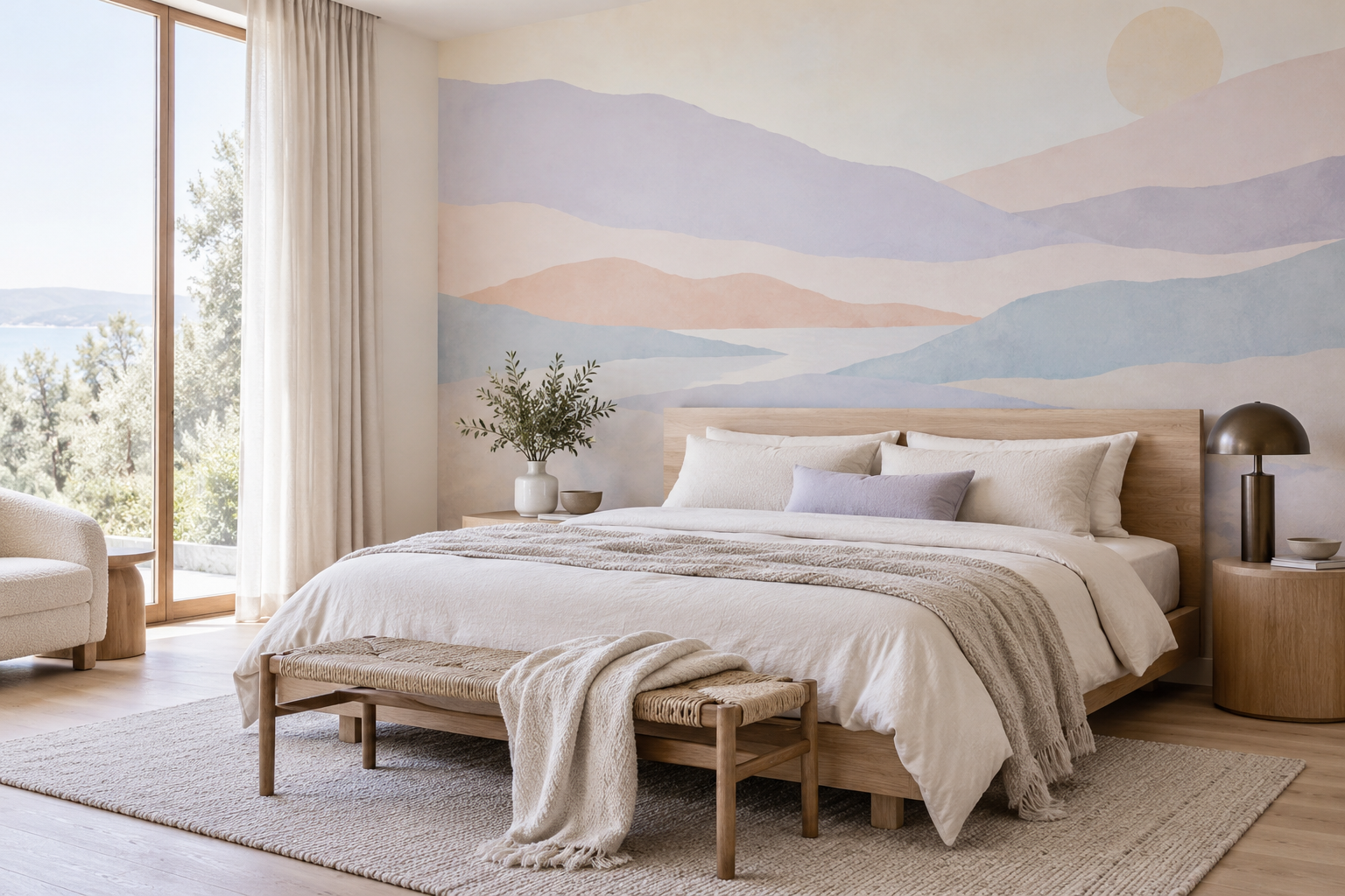
Example application: Bedroom · installation and removal
Pastel mural wallpaper works when its softness has a purpose. Pale lavender, powder blue, peach and mint can build a gentle landscape, define a bedroom wall or soften a room of hard furniture. They can also disappear if every surface is equally light, or feel sugary if several unrelated shades compete. The useful question is not whether pastels are “in style” but how their value, undertone and shape help the particular room.
Start with value before choosing a hue
A pastel is a light colour, but light colours still vary in strength. A washed blue may be visible beside white upholstery yet almost disappear against a greyed cream wall. A pale peach may read as warm from a distance, while lavender could give a cooler edge. View the proposed mural in the context of flooring, bedding, curtains and daylight. The colour's name is less useful than seeing how it behaves beside those real surfaces.
Pastel murals often need one stronger value for definition. That can be a darker line in the artwork, a dark bedside lamp, a medium-toned headboard or a deeper timber frame. Without any anchor, a room of pale wallpaper, pale furniture and pale textiles can become visually diffuse. The goal is not to make the room dark; it is to keep its major shapes legible.
Check the balance of pastel colours within the print. A mural containing four light hues can still feel controlled if one dominates and the others act as accents. If each has equal area and contrast, the wall can become restless despite the softness of individual colours. A limited scheme is usually easier to connect to existing furniture.
For instance, a mural that is mostly chalky blue with small areas of peach can relate to a blue-grey rug without demanding peach upholstery everywhere. A print split equally between lilac, mint, peach and yellow asks much more of the room, especially if the furniture already has colour. Look at the wall from the doorway and decide which colour you read first. If there is no answer, the scheme may need a simpler mural or quieter surrounding textiles.
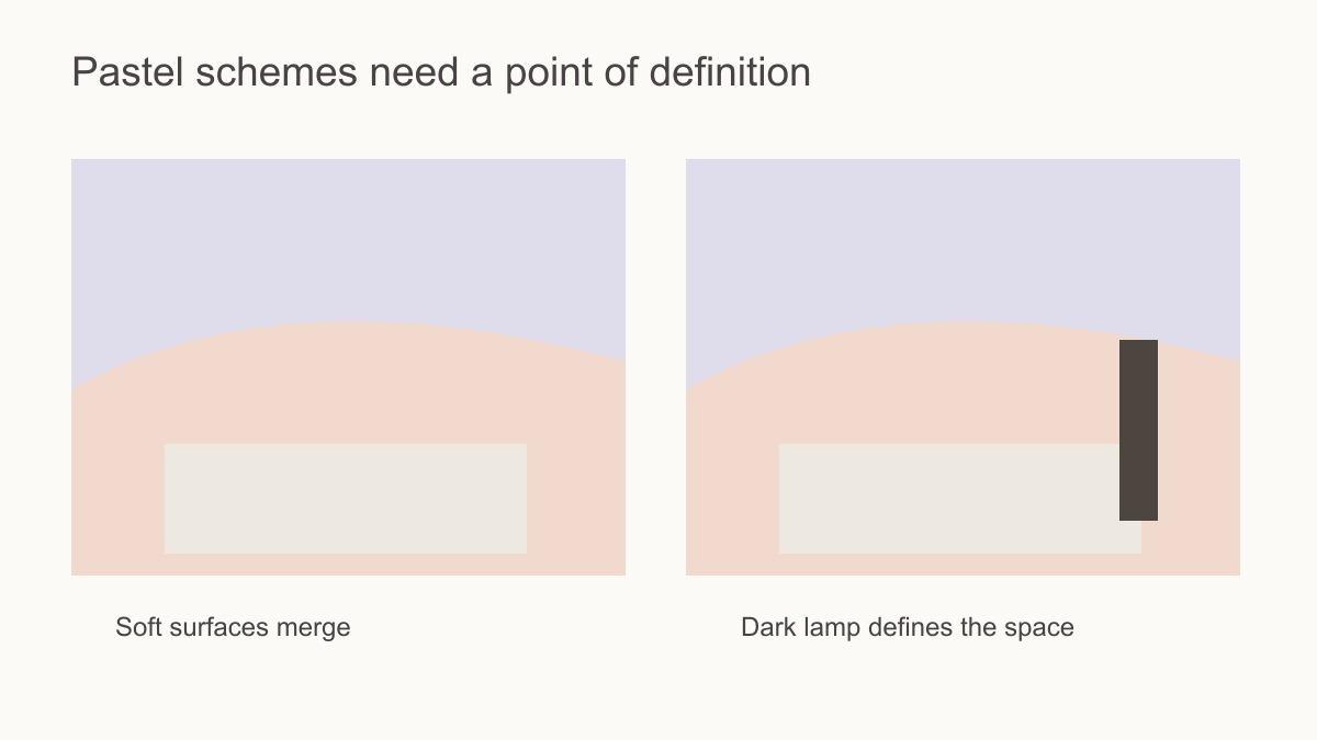 A darker detail keeps a light scheme from losing its shape.
Which subjects suit pastel colour?
Layered landscapes can use pale shades to suggest distance, especially when nearer forms have slightly more colour than far ones. A botanical mural can use one principal pastel with a neutral background, letting leaves or petals provide detail. Abstract shapes can bring movement to a minimal room without a literal scene. The subject should make sense at the intended wall scale, not just look attractive in a small thumbnail.
The drawing changes the role of pale colour. Broad peach and blue bands can read as a quiet abstract landscape behind a bed, while a pale geometric with firmer edges can bring order to a study lined with dark shelves. A botanical in mint and cream may be more decorative at close range, especially in a dining area. Choose by line weight, spacing and the view from the room's usual seat rather than treating every soft hue as the same kind of mural.
For a room with ornate furniture or many textiles, a mural with broad open areas may be more useful than a dense pastel repeat. For a very plain room, a more detailed illustration can become the focal point. Pattern scale and line weight matter as much as hue.
View the artwork briefly without its colour if two candidates seem equally soft. Overlapping hills, spaced stems or one sweeping abstract shape should still give the eye a route across the wall. Dozens of equally faint little marks may merge into a wash from the doorway. That can be desirable as a background, but it is a different choice from a mural whose landscape or geometry remains recognisable.
How should pastels relate to materials?
Light oak and linen can reinforce an airy pastel design, but the combination may need a dark or medium note. Walnut can supply that contrast naturally. Black metal may sharpen the scheme; brass can warm it. Stone and tile introduce their own undertones. Hold a printed sample beside them, because a pinkish beige floor can change the apparent peach in a mural, while a cool grey floor may make pale lavender more pronounced.
Do not try to match every accessory to the mural. Repeating one colour in a cushion or ceramic can establish continuity; repeating all of them in equal amounts can make the room feel overly coordinated. Let a neutral ground or a material with natural variation act as a bridge. The mural should be part of the room, not a colour chart the room must obey.
Assign each shade a role instead of carrying every one into the furnishings. In the illustrated palette, powder blue leads, peach is a small secondary note, cream connects to bedding and bronze marks an edge. The peach does not need to reappear in a chair, rug and curtain. In another room, mint might lead while walnut supplies the outline. This hierarchy lets a multicolour pastel mural read as one composition rather than a wall of equally prominent samples.
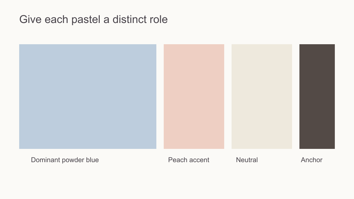 Give each colour a role rather than equal attention.
Use daylight to test subtle differences
Pastels can exchange prominence as the light changes. In a print with blue, lavender and peach, a warm evening lamp may make the peach more noticeable while the blue recedes; strong daylight may make the faintest boundary hard to see. Place a printed sample on the intended wall beside the main furniture, and look at it under the lighting used most often. The useful observation is not merely that the colour shifts, but whether the intended lead shade and large forms remain apparent.
In a dim room, clearer linework or a medium-toned shape can preserve a pale composition without making the whole print darker. In a bright room, a soft transition may be exactly the desired effect if the design still reads from the doorway. Compare the full artwork as well as the sample: a small swatch can confirm hue and print character but cannot show whether its low-contrast forms carry across the width of a wall.
The bedroom scene here offers a useful distinction. Its pale blue and lavender bands remain broad enough to register beside a bright window, while the timber headboard and bronze lamp define the lower edge. If the same image were reduced to tiny pastel marks, the room might look almost blank from the doorway. Preserve the large movement of a light mural; do not rely on close-up detail to carry it across the room.
Plan around furniture and interruptions
A pastel mural may contain subtle focal areas rather than one obvious central object. Map them anyway. A faint sun, distant ridge or main botanical stem can disappear behind a headboard, tall dresser or curtain. Preview the artwork with those objects in place. A narrow wall may require a different crop from the full image shown online.
A narrow crop can change a pastel scene more than its gentle colouring suggests. In the pictured bedroom, the headboard covers part of the lowest blue band, yet lavender and peach still sweep across the visible wall. The pale sun remains above the bed. Remove that sun in a narrower crop and the mural may still work, but more as an abstract wash than a landscape. Compare both versions with the bed at its true width; ask which story you want the wall to tell.
Also check where doors, curtains and panel joins interrupt the palest transitions. A repeated motif needs to continue coherently across joins; a panorama needs enough of its overlapping layers to remain legible. These checks are not about preserving every shade. They are about keeping the structure that makes the soft colours intentional rather than accidental.
Choose the job of the light colour
In a bedroom with pale oak, a lavender-and-blue horizon can contribute a gentle view without making the bed wall busy. In a bright living room with white upholstery, a peach botanical may need more definite leaves to remain visible across the room. In a compact study with dark shelving, a pale geometric can relieve the shelves' visual weight while retaining a clear grid. Each uses pastel differently: as scenery, as a warm decorative subject or as a light structural counterpoint.
Before choosing, name the role you want, then test the mural at the wall's actual size. If a vivid rug already dominates, let the pastel wall be quieter. If the room lacks any graphic shape, choose stronger lines rather than multiplying pale hues. A successful pastel scheme is not simply light; its main shade, drawing and furniture contrast still have a clear order.