How to Choose Sophisticated Pink Mural Wallpaper
Use dusty, blush, coral and muted rose tones with balanced imagery for bedrooms, sitting rooms and considered interiors.
Article focus: pricing and measurement
Budgeting this wall with confidence
Start with accurate wall measurements; the final custom mural price depends on area, material and any finishing options.
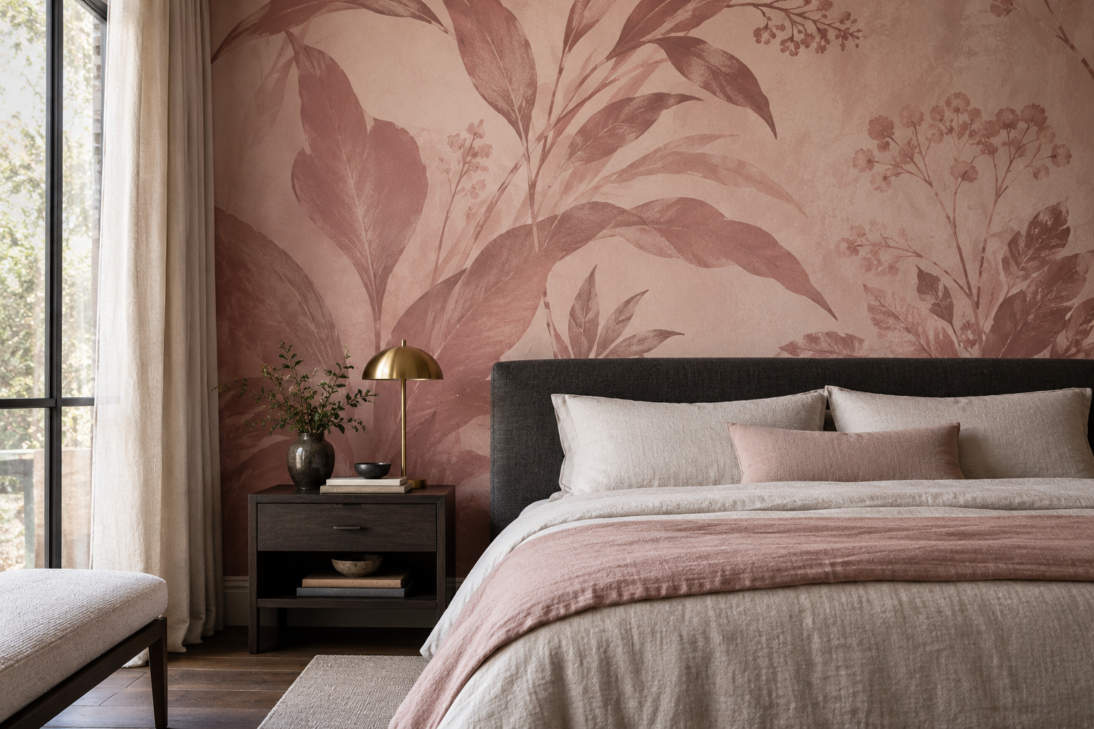
Example application: Bedroom · pricing and measurement
Sophisticated pink mural wallpaper is less about avoiding pink than about controlling its undertone, scale and companions. A dusty rose botanical beside dark timber can feel entirely different from a bright pink floral on a white ground. Clay, blush, plaster and muted coral each bring their own character. Choose the mural by the room's architecture and furnishings, not by an assumption that pink belongs only in a nursery or that “grown-up” must mean almost colourless.
What makes a pink mural feel considered?
First, give the design a clear visual structure. An abstract wash may add warmth without a literal motif. A large floral can be dramatic if its shapes are well spaced. A fine botanical drawing can feel almost like an engraving when its linework and background are restrained. Bright, tightly packed small flowers are not inherently childish, but they do create a different energy. The question is whether that energy suits the room you are furnishing.
Second, distinguish the pink from the overall value of the wall. A mural can have pink accents on a warm ivory ground, or it can cover the whole wall in deep rose. The former may act as a quiet backdrop; the latter becomes an architectural feature. Neither is more mature by default. In a small room with light furniture, a deep pink wall may be exactly the focal point needed. In a room with ornate upholstery and artwork, a lighter composition may allow those elements to breathe.
Finally, let the surrounding materials provide contrast. Charcoal, walnut, smoked oak, warm stone and antique brass can give dusty pink a firm frame. Pale timber and cream linen can keep it airy. Using pink on every textile and accessory often weakens the mural because there is no visual counterweight.
There is also a difference between a pink motif and a pink room. A pale ground with scattered rose forms gives the eye frequent resting points. A mural whose entire background is rose creates a broad colour field even if the drawing is delicate. Before deciding, stand in the doorway and estimate how much of the finished view will be pink, how much will be furniture, and how much will remain neutral. This simple proportion check is often more revealing than a close-up of the print.
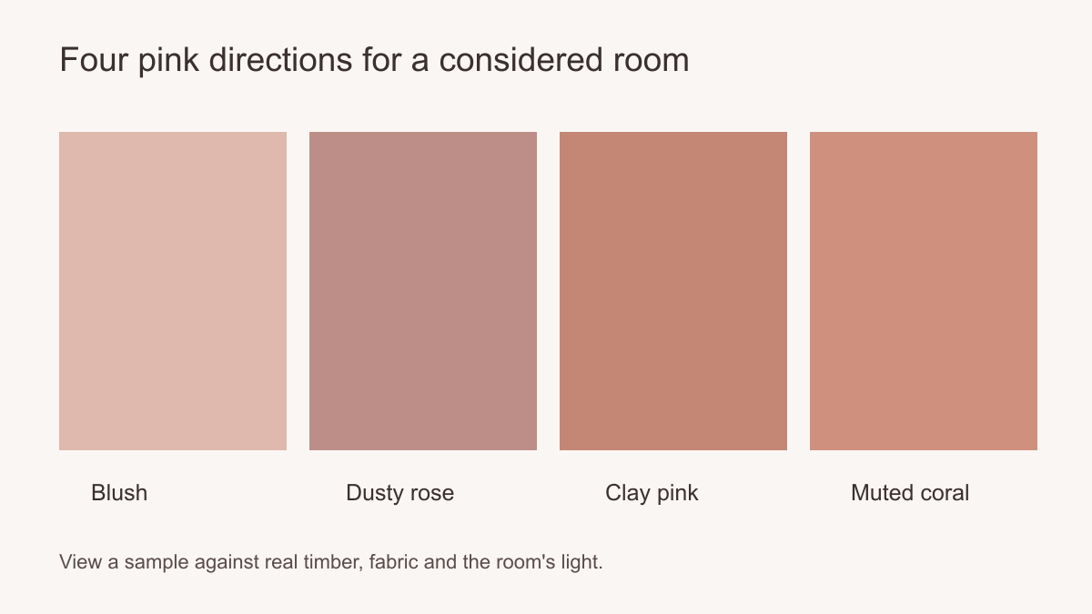 Undertone and contrast matter more than the word “pink”.
Choose the shade in the actual light
Begin with two separate questions: what colour is the pink, and what colour surrounds it in the print? Blush marks on ivory leave much of the wall pale. The same marks on a clay ground produce a substantially warmer room. Compare both areas against permanent finishes before considering movable cushions or throws. A grey floor, a marble fireplace or dark window frames can make a pink feel sharper; a warm timber floor may bring out a peach undertone.
View a printed sample vertically on the intended wall, if one is available, in daylight and under the lights normally used after dark. Hold the actual curtain or upholstery fabric beside it rather than relying on a screen image. If the pink looks quiet beside white paper but assertive beside an olive sofa, the sofa comparison is the useful one. If a clay sample appears orange beside the floor, try a cooler rose or a more neutral ground instead of adding more pink accessories to force a match.
Step back to the doorway as well as looking closely. Fine painted variation may merge into a single colour field from that distance, while strong outlines remain visible. The sample tests colour and print character; it cannot tell you how much of the full-size wall will be pink. Use the crop preview for that separate proportion decision, especially where a dark headboard or large cabinet covers the lower portion.
How does the drawing change pink's character?
A floral is not automatically youthful, nor does an abstract design automatically feel restrained. Look at the line rather than the label. Fine, dark botanical outlines give rose petals definition; softly blurred edges make the same colour feel more diffuse. A tightly repeated little flower reads as surface pattern, whereas one oversized stem becomes a focal object. In a dining room, check whether that stem will still be visible above chairs and the sideboard.
Pink can also belong to a horizon, a geometric arc or a plaster-like sweep. In an abstract design, decide whether the pink marks are scattered accents or one connected shape. A single broad arc can hold its own behind a sofa; several similar curves may compete with curved chairs and a round table. Straight-lined shelving provides a different counterpoint. The aim is to decide which shapes lead, rather than to declare one motif suitable for every adult room.
Architecture changes the reading too. Detailed cornices already draw the eye upward, so a mural with open upper space may leave them visible. On a plain wall, a more emphatic pink shape can provide the missing structure. Compare the top and bottom of the actual artwork, not just a cropped thumbnail: a beautiful detail near the base may be hidden by furniture, while an empty sky or ground can make the whole room feel calmer than the close-up suggests.
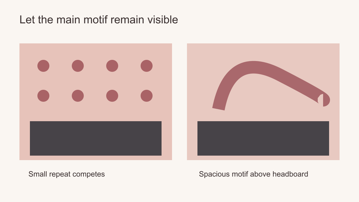 Leave room around the motif and keep its focal point above furniture.
Pair pink with a stronger material language
In a bedroom, a charcoal upholstered headboard can set a quiet boundary against a dusty rose mural. The contrast keeps the bed visually anchored. Dark timber side tables bring warmth without matching the pink. Linen bedding in ivory, stone or taupe can soften the scheme; a single pink accent is enough to connect it back to the wall.
In a living room, pink can be paired with olive, tobacco leather or dark brown furniture for a more layered effect. The proportions matter. A full-wall dusty rose mural, a green sofa and a patterned rug may all work if one pattern leads and the others are quieter. If each item is equally saturated and detailed, the room can feel crowded. Consider the mural as part of a composition rather than an isolated decorative purchase.
In a dining room, a mural with pink and warm stone tones can sit alongside a timber table and simple metal lighting. If the room already has a strong pendant or patterned chairs, choose a less intricate wall. In a study, a pink abstract can warm a room dominated by shelves and equipment without introducing another literal object to look at.
Plan the wall at full scale
Measure the wall and draw its doors, sockets and furniture at their real heights on the crop preview. Mark the doorway and usual seated view. A flower centred on the empty wall may vanish behind a headboard, while an off-centre branch can balance a tall wardrobe. On a narrow wall, check that the crop retains more than half of a large colour shape; a distributed repeat may be easier to use where several openings interrupt the surface. Approve the pink composition with the furnished room in view, not the product thumbnail alone.
Choose the role pink will play
Put three candidates into the same furnished wall view. In the first, rose stems on ivory may read as drawing, with the wall remaining mostly light. In the second, a clay-pink abstract can become the room's warm architectural field even if no single shape dominates. In the third, a brighter floral may work as an energetic focal point if there is enough open ground around the blossoms and the nearby textiles stay quiet. These are three different uses of pink, not a scale from childish to sophisticated. Choose the one whose colour area and drawing serve the room you actually have.