How Room Proportion Affects Mural Wallpaper Choice
Match artwork scale, line direction, crop and negative space to the width, height and viewing distance of the room.
Article focus: pricing and measurement
The cost and measurement decision
Start with accurate wall measurements; the final custom mural price depends on area, material and any finishing options.
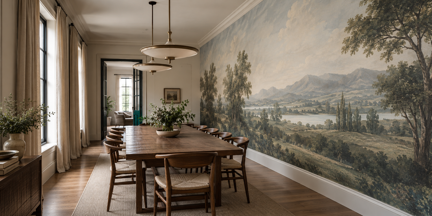
Example application: Dining room · pricing and measurement
Room size alone does not tell you which mural will work. Two walls can have the same area yet ask for entirely different images if one is long and low and the other narrow and tall. Start with the uninterrupted shape that will actually show, then consider how far away people will stand or sit. Choose artwork whose subject survives that shape without stretching, and approve the crop with doors, furniture and lights marked on it.
Measure the visible wall, not just the room
Photograph each candidate wall straight on and draw the boundary that can receive the mural. Mark windows, doors, sloping ceilings and built-ins. Add the headboard, sofa or sideboard that will conceal part of the lower print. A four-metre wall broken by two openings may offer less coherent picture space than a shorter blank wall. The most useful dimension is the continuous visible field, not the room's floor area.
Compare width and height separately. A broad rectangle gives a landscape space to unfold; a narrow vertical field may suit a rising branch or architectural form. This is a clue about composition, not a rule about motifs. A botanical image with generous open ground might crop well to a wide wall. A landscape whose only focal tree sits at one edge might fail on a narrow wall because the crop removes it.
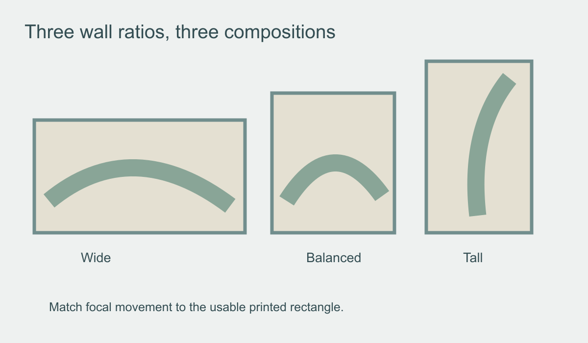 Different wall ratios call for different movements within the artwork.
Draw the printable rectangle at the correct proportion and place candidate images within it. Slide each image to see what disappears at the sides or top. If every plausible crop loses the main subject, do not squeeze or distort the image to make its colours fit the room. Choose another composition or another wall.
Let a long wall unfold as people move
A long dining room or corridor is often experienced in sequence. Someone enters at one end, walks alongside the mural and sees different sections from different seats. Artwork with a developing shoreline, repeated trees or broad abstract movement can reward that journey. A single tightly centred subject may look impressive from one spot but weak from the other end of the table.
In the feature room, the lake and mountain ridge extend along a long dining wall. The table points towards the far end, while trees and open sky give the eye landmarks along the route. Pendants interrupt the upper sightline, but the scene remains readable between and below them. Put a full-width mock-up on that wall and walk the length of the table: does each seat see part of a coherent landscape, or does one guest see only an empty edge?
Horizontal movement can emphasise the room's length. That may feel elegant; it may also exaggerate a tunnel-like impression if the corridor is already narrow. Vertical tree trunks, architectural breaks or intervals of open space can vary the rhythm. The answer lies in the actual image and room, not in a promise that horizontal lines always widen or lengthen a space.
Give tall walls a focal zone at human height
A high wall can accommodate an ascending botanical, a vertical abstract or an expansive sky. Yet a composition with all its important detail near the ceiling may be difficult to enjoy from ordinary positions. Mark standing and seated eye levels on the wall elevation. Place the principal subject where it can be read comfortably, then let secondary detail continue upward.
Check scale at the proposed print size. Fine engraved lines may require a higher-quality source image than broad painterly shapes; a small online preview cannot establish whether the final enlargement will look crisp. Ask the supplier for a proof or a close-up at intended scale. If the wall is double-height, discuss installation access and panel planning with a qualified installer. The right composition does not by itself make a very high installation straightforward or safe.
Blank space can be useful on a tall wall. It may keep a high window, picture rail or pendant from colliding with the image's subject. A mural does not have to fill every centimetre with detail. The arrangement should still make sense from the occupied part of the room, not only in a straight-on elevation of an empty wall.
Judge motif scale from the real viewing distance
Wall proportion and room depth interact. Across a larger room, fine foliage or tiny architectural detail may merge into texture; the broad light-dark structure of the mural matters more. In a compact room, the viewer may be close enough to notice line weight, repeated joins and the way a large printed object breaks at the edge. Neither distance dictates that the mural must be small or subtle. It changes which qualities you should inspect.
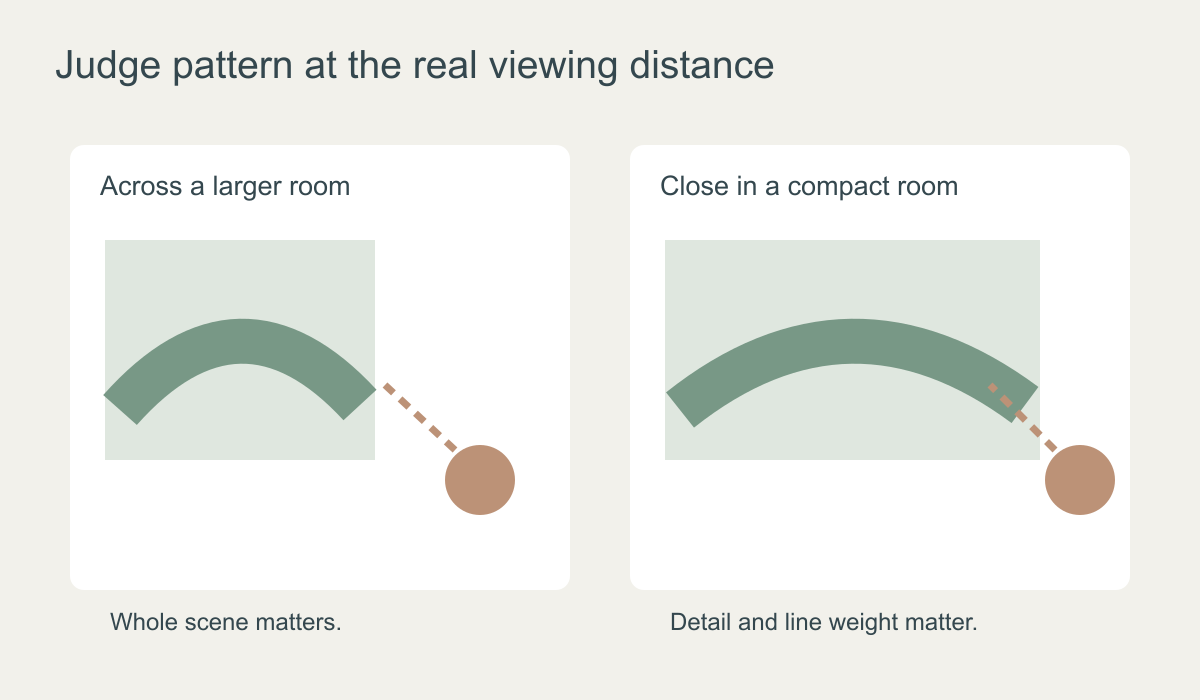 Check the whole composition from afar and printed detail from the closest normal position.
Stand where the room's users will actually view the wall. In a dining room, try the far doorway and seats along the table. In a narrow hall, walk past the mural at arm's length. A broad painted gesture may feel atmospheric from the doorway but overwhelming at close range; a fine repeat may reward close viewing but disappear from across the room. Review both positions if the room provides them.
This is not the same as deciding whether a small room needs a particular motif. Even a compact space can support an expansive landscape if the crop and sightlines work. Likewise, a large room can suit delicate detail if people often approach the wall closely.
Crop for shape; do not stretch the artwork
Made-to-measure means the printed composition can be planned for the wall, not that every image should be widened or heightened independently. Non-uniform stretching can turn circles into ovals, narrow trees unnaturally and alter faces. Ask for a crop, a repositioned focal point or artwork created for the wall's aspect ratio. Compare the entire proposed print with the original so you know what has been lost.
Check the position of a horizon or key figure after cropping. A low horizon behind a sideboard may leave the upper wall empty; a high horizon crowded under a low ceiling may give too much weight to the foreground. In the long dining room pictured, the ridge and sky have enough height above the table and chairs to carry the view. Another landscape might put its only interesting shore behind the diners.
Doors and windows create more than a ratio problem. They remove pieces of an image. Overlay their actual outlines on the proof. A door cutting through open sky may leave a scene coherent, while one removing a person, tree or architectural opening can make the print confusing. A smaller uninterrupted wall may therefore be a better choice than the largest wall in the room.
Treat irregular boundaries as part of the composition
Under a sloping ceiling or stair line, the visible mural may be triangular or stepped even when supplied in rectangular panels. Draw the final trimmed edge over the proof. Keep faces, important branches and strong architectural lines away from areas that will disappear. Discuss positioning and trimming with the supplier and installer rather than assuming the image can simply be pulled to follow the slope.
For an alcove or wall with several openings, compare two proofs: one showing the large broken surface with all obstructions masked, and one showing a smaller clear wall. The second may preserve the image's subject far better. The aim is not to cover the maximum measured area. It is to place an artwork where its movement and focal details can still be understood.
Approve the exact composition the room will show
Before ordering, save the wall dimensions, the selected crop and a marked proof showing furniture, windows and doors. Review that proof from the normal standing and seated positions. On a long wall, ask whether the image develops along the route. On a tall wall, ask whether its main detail falls where people can see it. On a broken wall, ask whether the remaining pieces still form a coherent picture.
A physical print sample can help judge colour and linework at close range, but it cannot solve a poor wall-shape fit. If the supplier provides a panel layout, check the focal placement against it as well. The strongest mural choice is not the one that fills the most square metres; it is the one whose composition survives the architecture and the way the room is actually used.