Which Mural Wallpaper Suits a Scandinavian Interior?
Choose airy landscapes, pale botanicals, muted geometry and light tonal contrast for Scandinavian-inspired interiors.
Article focus: pricing and measurement
The cost and measurement decision
Start with accurate wall measurements; the final custom mural price depends on area, material and any finishing options.
Example application: Bedroom · pricing and measurement
A Scandinavian interior can be bright and restrained without being colourless. The most useful mural choice begins with the room itself: where daylight falls, how pale timber reads beside the wall and whether everyday furniture leaves the image visible. A birch grove, deep conifer forest or simplified mountain can each belong, but they do different jobs. Choose the artwork for the light, rhythm and practical use of the space, not because its product name sounds Nordic.
Let daylight and furniture set the direction
Scandinavian rooms often rely on available light and approachable materials rather than elaborate ornament. Start by observing the room's daylight: how much reaches the mural wall, and at what time? A pale design can keep a dark corner open, while a deeper blue-green forest can provide a pleasing anchor in a bright, spacious room. Neither choice is automatically more authentic.
Consider furniture silhouettes. A long, clean-lined sofa can sit against a scenic mural with many soft layers because its low back leaves much of the picture open. An open bookcase full of objects may need a simpler design behind it. A room with a patterned rug or striped textiles may benefit from a broad landscape rather than another small repeated pattern. The wall should support the lived-in setting, not demand that it be cleared for a photograph.
Wood is not a single colour. Pale oak may sit well with misty blue, warm grey or sage. Darker stained wood can hold richer forest tones. Compare a printed sample with the actual floor and furniture. A screen image may make a cool blue appear more neutral than it does beside warm timber.
Choose a landscape that works at two distances
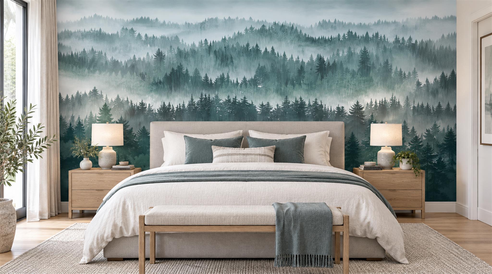
A layered forest can be atmospheric from across a room and reveal individual trees as you come closer. In the dark blue-green bedroom image at the top of this article, the shadowed pines form a deliberate counterweight to white bedding and pale timber. That contrast works because the other large surfaces remain light. Transplant the same dense foreground into a narrow, poorly lit study and it may feel much heavier.
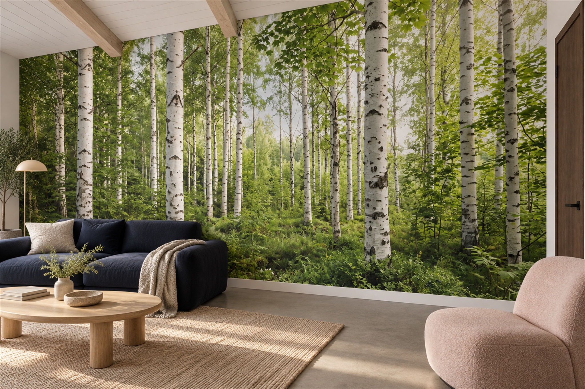
The birch grove below takes another route. Bright leaves and white trunks give the living room a more immediate, summery presence; the navy sofa grounds it. From the doorway, the repeated upright trunks create a strong rhythm. Up close, individual leaves are more noticeable. If you want a quiet background for artwork or shelving, this may be too active, despite its light ground. Compare the image from your usual seat, not just as a full-screen photograph.
A simplified mountain mural has a different role. Its clear bands can echo the clean lines of furniture and architecture. Large fields of colour may be easier to read from a distance than individual leaves. But a sharp peak placed behind a central lamp or chopped by a window can lose its intended shape. Compare the crop preview with your own sketch of openings and furniture.
Coastal and lake scenes can work too, but avoid assuming every blue-and-white landscape suits the room. Consider the actual horizon height and the relationship to windows. If the room already has an attractive outdoor view, the mural may need to complement rather than imitate it. A quiet abstract or simple botanical can be the better decision.
Balance graphic clarity with softness
Scandinavian interiors can accommodate both crisp geometry and painterly effects. A flat, stylised mountain sequence can feel modern and direct. A watercolour forest can feel atmospheric. The choice depends on what the room lacks: a strong graphic anchor or a soft background. If most surfaces are flat and pale, a little variation in the mural may prevent the room from feeling sterile. If textiles and objects already provide variation, a cleaner composition can calm it.
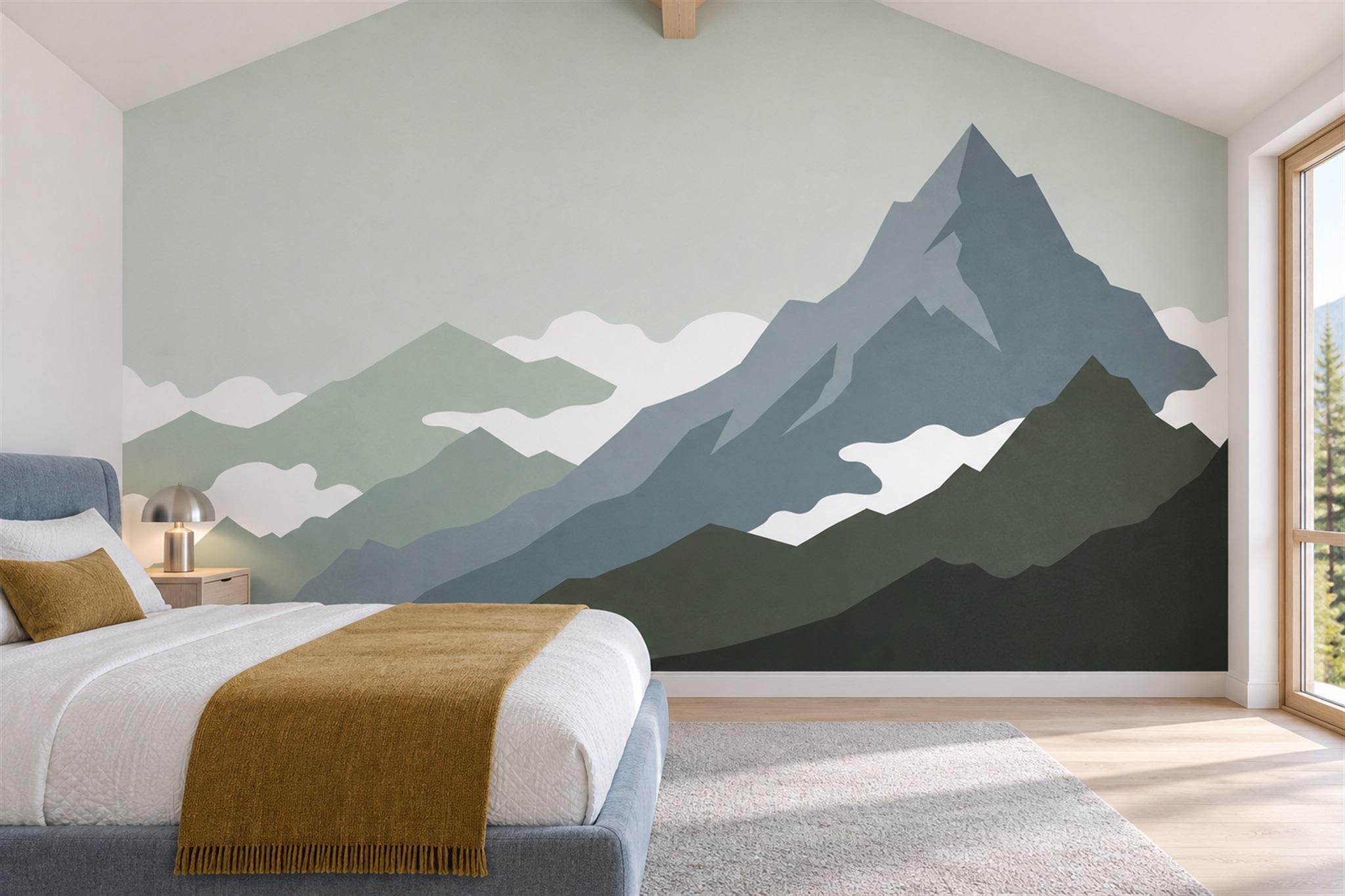
Limit competing accents. A blue-green mountain with a mustard cushion can feel deliberate when that accent is used sparingly. Repeating the same mustard in every accessory may turn a subtle scheme into a set. Likewise, a forest mural does not require pine trees on the curtains and cushions. One visual reference is usually enough.
The graphic mountain example below uses broad sage and blue-grey shapes with an open upper field. It demonstrates how a relatively bold motif can still sit beside uncomplicated bedding and pale wood. In a different room, the dark lower band might be too heavy; compare it with the floor and the furniture before deciding.
Use the wall proportion as a design tool
Long living-room walls can support a panoramic landscape, especially when the foreground runs behind low furniture and the pale distance stays visible. A shorter bedroom wall may suit one strong motif or a cropped portion of a broader view. A narrow hall sees the artwork obliquely; a design with distributed interest may work better there than one delicate central subject.
Mark windows, doors, sockets and large furniture on a separate wall elevation. Some trees or peaks can be hidden without harming the scene; others are essential to its balance. A pitched ceiling may cut into the upper open space. Use that elevation alongside the measured-wall crop to judge the visible composition.
Viewing distance matters. A very fine woodland image can become a tonal field from across a living room. In a tiny office, the same detail sits close to the user and may feel busy. Ask for a sample of the print and inspect a full-size section of a recognisable element when motif scale is uncertain.
Make room for warmth
A blue landscape can look chilly if it is paired only with cold white walls and hard grey flooring. Linen, timber and warm lamplight can help, but do not assume styling will rescue a poor colour match. Test the mural sample with actual upholstery and paint. A slightly warmer blue-grey may be easier to integrate than a stark icy blue; a moss green may need a lighter adjacent wall.
The printed finish changes the effect as well. A photographed texture in the artwork does not tell you whether the wallcovering is physically textured or matte. Ask for the exact material sample and review the installation guidance. These practical details are separate from the room's style and cannot be inferred from a styled image.
Test the wall with ordinary household activity
A styled photograph cannot show what happens when a room fills with the things used every day. Add the standing lamp, books, folded blankets and children's belongings that normally occupy the floor or shelves to a wall mock-up. Against the birch grove, upright lamp stems and shelving may multiply the vertical lines until the mural reads as visual noise. A broader mountain shape may stay legible behind those objects. The dark conifer image might still work if pale furniture provides a distinct foreground, but a dark bookcase placed against it could disappear.
Look once from the doorway and again while seated. If the subject survives both views with the normal contents present, the design has room to be lived with. If only a cleared, brightly lit photograph makes it coherent, try another crop or a simpler image. This practical test is separate from the quieter editing question in the Japandi-inspired mural guide: here the aim is to let the wall retain a readable rhythm alongside everyday furniture and objects, not to make the room look empty.