What Terracotta Mural Wallpaper Suits a Warm Interior?
Coordinate earthy red, clay, sand and muted peach tones with natural materials and comfortable room lighting.
Article focus: pricing and measurement
What to settle before pricing
Start with accurate wall measurements; the final custom mural price depends on area, material and any finishing options.
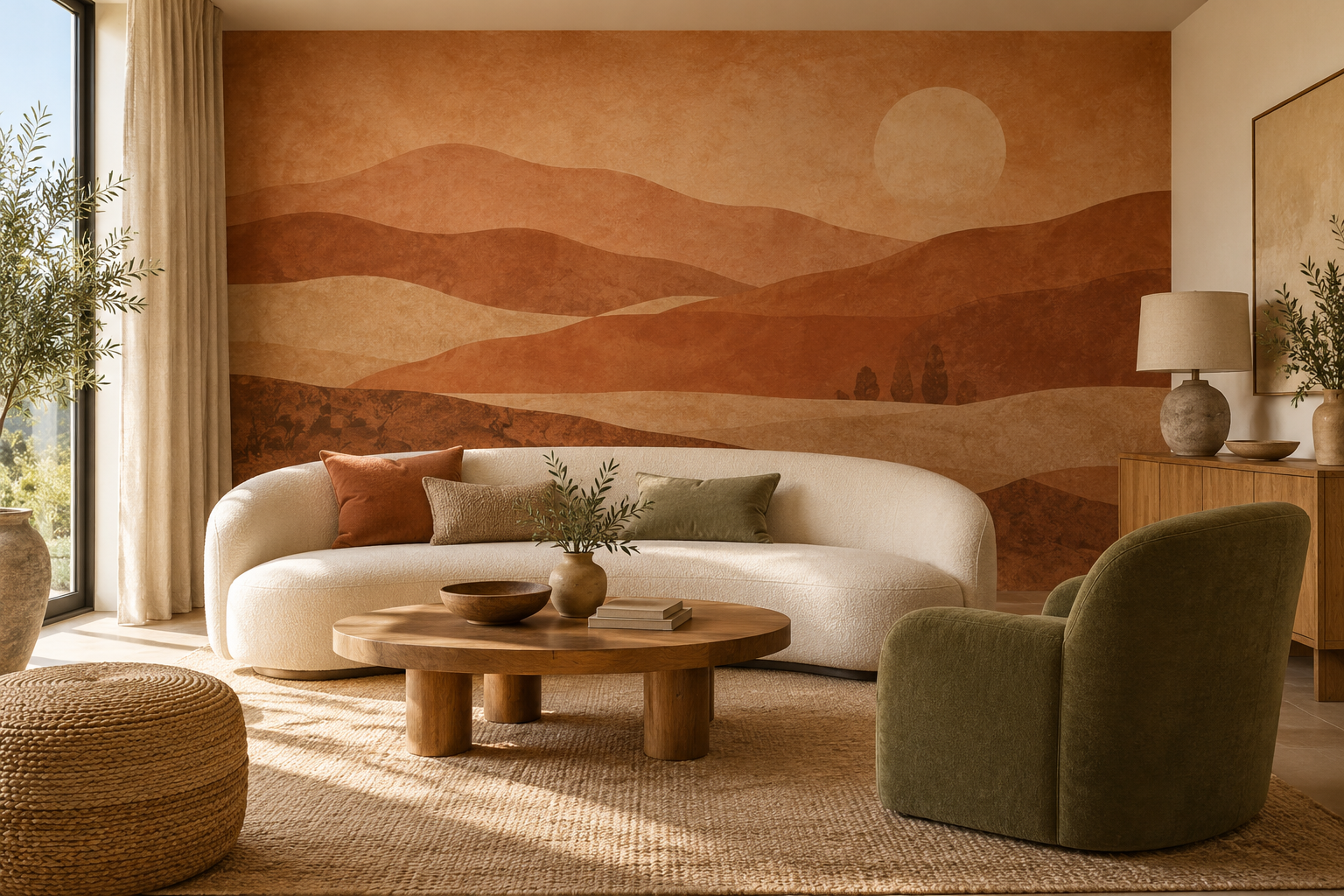
Example application: Bedroom · pricing and measurement
Terracotta can make a mural feel grounded and warm, but a warm interior does not need an orange wall from floor to ceiling. Clay-toned landscapes, softened geometric shapes and restrained botanical drawings can each connect to timber, stone and woven textiles in a different way. The right choice depends on how much warmth the room already has. Often the most considered scheme uses terracotta as one note among sand, cream, olive or charcoal, rather than repeating it everywhere.
Read the existing warmth before adding more
Start with the largest fixed surfaces. Honey-coloured timber, a cream sofa, warm stone and an ochre rug already create a warm foundation. A saturated red-orange mural may push the room towards one continuous colour. A design that includes pale sand and a controlled clay accent can give those surfaces definition. In a cooler room with grey flooring and black metal, a richer terracotta mural may be exactly the counterweight needed.
Terracotta is a family of colours rather than one fixed swatch. A clay pink beside honey oak can read softer than a brown-red, while an orange-rich version may amplify the floor's golden cast. Compare printed samples against a permanent finish, not just against a white sheet of paper. The useful question is whether the mural adds a new layer to the room or merely repeats what its timber and textiles already say.
Think about contrast as well as hue. If the sofa and wall are similar in tone, the furniture may disappear into the background. A lighter mural ground or a darker accent can keep the outlines clear. Likewise, a dark timber sideboard may need a lighter section of the print behind it. Warmth is most effective when its elements remain distinguishable.
Judge intensity by the area of clay, not just the swatch itself. Small clay shapes on cream can read as a mostly light wall. Wide terracotta hills on sand establish a warm focal point with pauses for the eye. A near-solid rust ground takes over the room's colour balance. Place those three options next to the same floorboard and sofa fabric under the room's usual light; the right proportion will be different in an oak-and-ochre room from one with grey flooring and black metal.
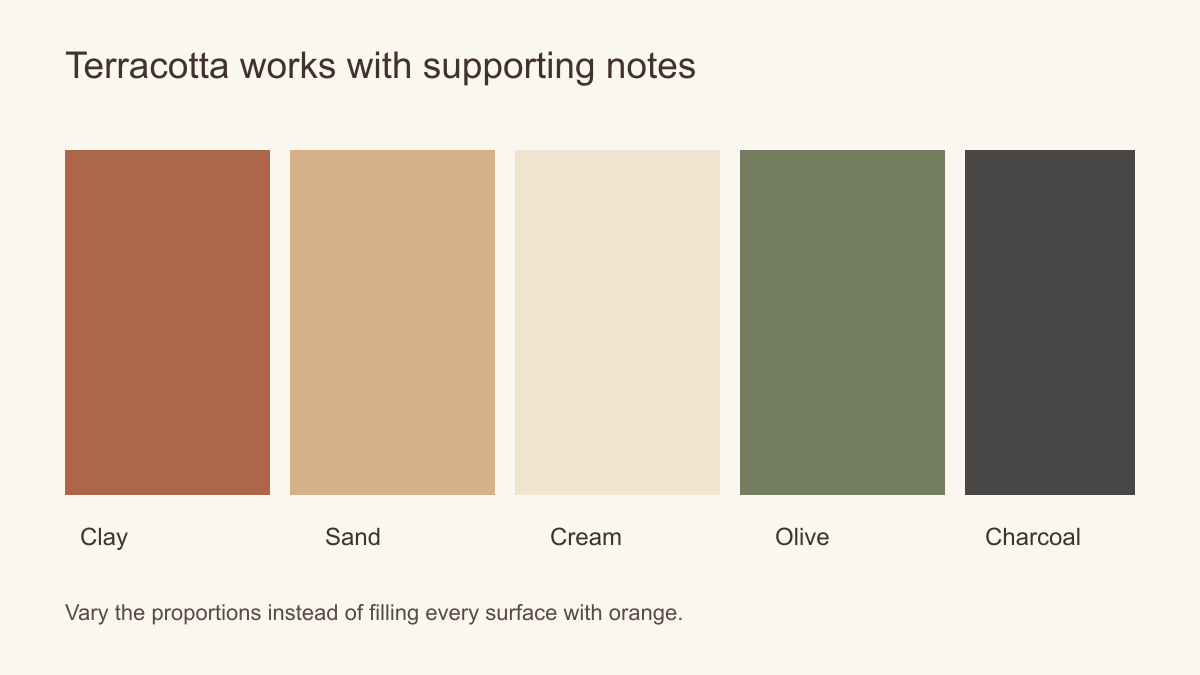 Use clay as part of a palette, not as the only note.
Which subjects suit a warm room?
A layered landscape can use terracotta in foreground hills with pale sand behind them. That arrangement gives the wall a sense of distance and keeps the colour from becoming a flat block. An abstract design can bring curves or broad bands to a room full of straight furniture. A botanical with clay-coloured leaves can connect to plants and timber, though a very dense leaf pattern may compete with woven rugs and cushions.
Geometric designs can work especially well when the furniture is simple. Large arcs or blocks of clay, cream and muted olive can provide structure without a literal landscape. If the room contains a strongly shaped sofa or architectural arch, avoid repeating the same curve at almost identical scale on the wall. A change of scale makes the relationship more deliberate.
A faux plaster or stone effect is a printed visual texture, not an actual mineral finish. It can provide a quiet backdrop, but inspect a sample for repetition and colour variation. If the room already has real textured plaster or stone, a clearer graphic mural may be a better partner than another imitation surface.
Let the wall's shape narrow the subject choice. A long uninterrupted surface gives a ridge or desert horizon room to develop. Between two doors, that same scene can become a cropped fragment; an all-over botanical or a large shape without a single focal point may survive better. If an existing arch already gives the wall a strong curve, compare an abstract arc with a straighter landscape before doubling that shape. The motif should work with the architecture even when the colour is exactly right.
Introduce a counterpoint
Warm does not have to mean monochrome. Muted olive, deep brown, charcoal or a small blue-grey note can give terracotta a useful counterpoint. A green chair or plant may make the wall's clay colour feel more intentional without turning the room into a colour exercise. Cream and pale stone provide breathing room. Black or bronze details can define edges, but too many high-contrast outlines may overpower a soft landscape.
Take the counterpoint from an object that already belongs in the room: the olive chair, dark window frame or walnut table. It need not appear in every cushion. Contrast can also come from value rather than a new hue. A cream curtain gives a saturated clay field a light edge; a charcoal lamp stem gives a pale sand-and-clay print definition. Decide whether the scheme lacks a cooler note, a darker outline or simply some open light ground before adding more colour.
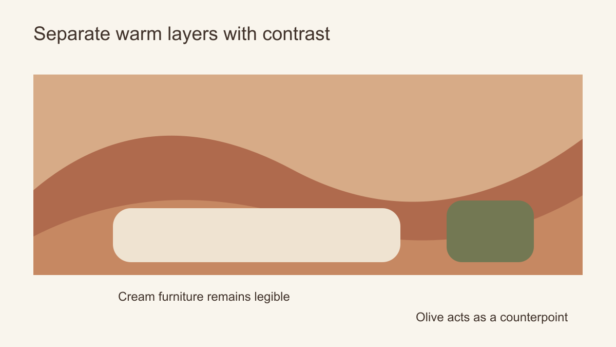 Light upholstery and one cooler accent can separate warm layers.
Plan for the actual wall and furniture
The position of a mural's darker clay area matters. Behind a cream sofa, it can create a clear silhouette. Behind a cognac leather sofa, it may flatten both into one band. Try a crop that puts a paler area behind the furniture, or choose a design with more value variation. If a landscape has a sun or horizon, check that it is not hidden by a tall cabinet or cut awkwardly by a window.
In a dining room, consider what remains visible when people are seated. A low horizon can disappear behind chair backs, while large abstract forms higher on the wall retain their effect. In a bedroom, a calm upper field may be preferable behind a headboard. In a narrow hallway, an all-over terracotta repeat might be easier to accommodate than a panoramic landscape interrupted by doors.
Measure wall width and height, note fixed obstacles and preview the image at the correct proportions. If the mural is made to measure, follow the supplier's stated trim allowance. A tiny thumbnail does not show how large shapes will relate to the sofa or table. A full-room mock-up is the more useful test.
Compare the same print in two possible rooms. In a living room with a cream sofa and oak table, deeper clay ridges can define the seating area if they remain visible above the sofa. In a dining room with ochre chairs and a timber table, that much clay may simply repeat the existing warmth; a lighter line drawing could give the table breathing space. The print has not changed, but its task has. Choose a mural for the colour relationship it creates in this room rather than for an attractive isolated thumbnail.
How much pattern is enough?
Warm interiors often contain natural texture: wood grain, woven rugs, linen, ceramics and plants. Each adds detail even when the colour palette is quiet. If several of those elements are prominent, a mural with broad areas of sand and clay may be more effective than intricate foliage. If the room is sparse and architectural, a more detailed landscape can supply interest.
Compare pattern at two distances. From the doorway, broad bands of clay and sand may feel calm and clearly structured. Across a small dining table, the same mural's fine marks may be much more apparent. If the room already has a patterned rug or strongly grained timber, ask whether its small-scale detail competes with the mural's detail. One can lead while the other recedes; there is no numerical rule for how many patterns a warm room can hold.
Choose between an accent and a colour field
For a room already rich in honey timber, ochre upholstery or cognac leather, begin with a mural whose clay is a distinct accent on sand or cream. The furniture keeps its outline and the wall adds another note rather than repeating the same one. For a cooler room with grey flooring and sparse black metal, a broader terracotta field can supply the warmth that is otherwise missing. In either case, place the actual furniture silhouette over the crop. If a leather sofa vanishes into a rust foreground, move the paler ground behind it or choose a different composition. That is a more useful decision than asking whether terracotta is simply warm enough.